August 20, 2020No Comments

How to design a case study page (tutorial)

As creative people, we know that presentation means everything. Yet when it comes to presenting our own work, we tend to sell ourselves short.

Case studies are our chance to put our work in its best light. But too often, we drop a half a dozen images on the page and call it done. So while we've talked a lot about writing portfolio case studies, now we're diving into how to present the work visually.

For this tutorial, we'll be using Semplice to lay out a visual project case study and show just how easy it is to present our work – rather than leaving our visitors to form their own conclusions.

Get inspired

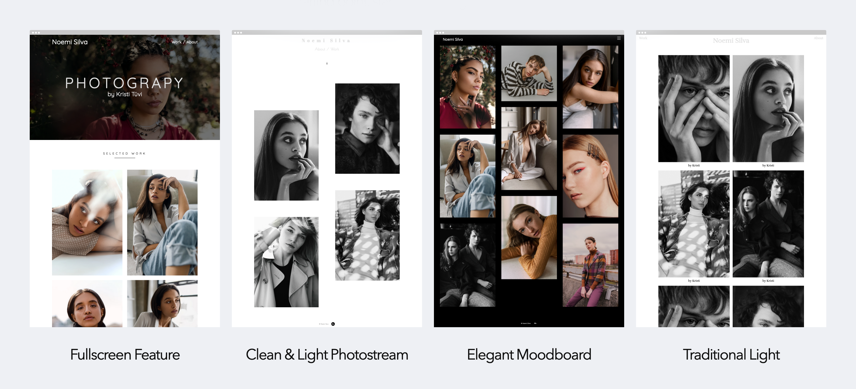
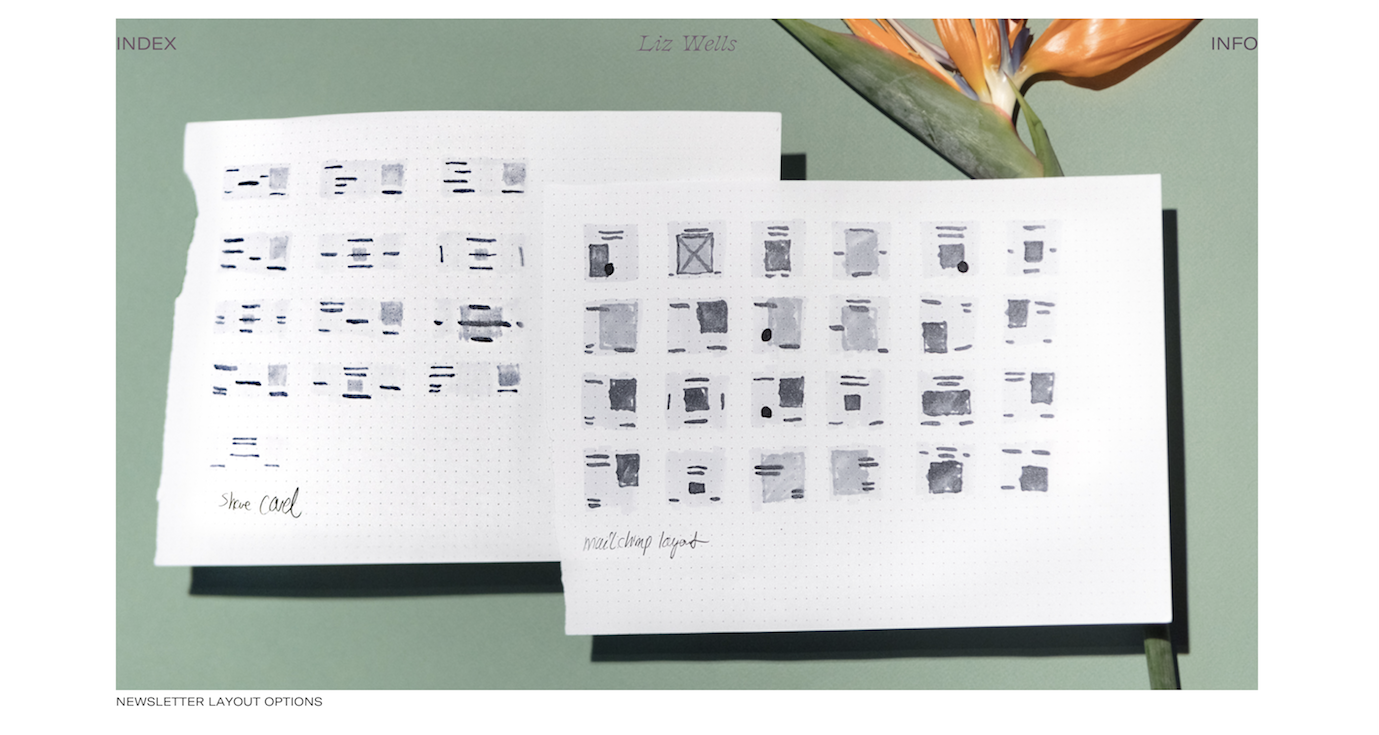
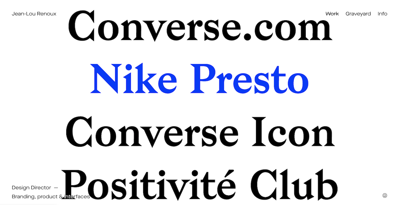
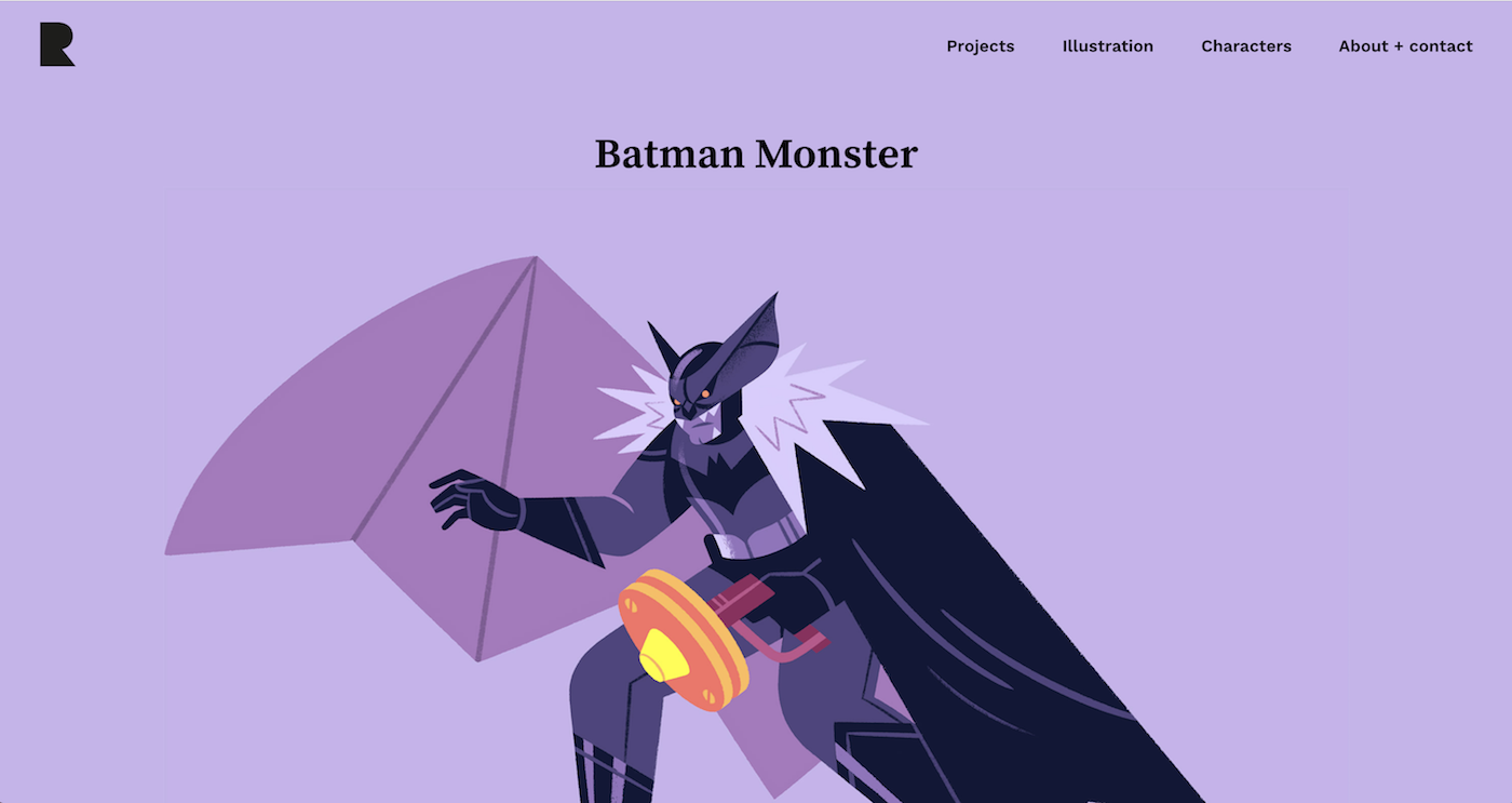
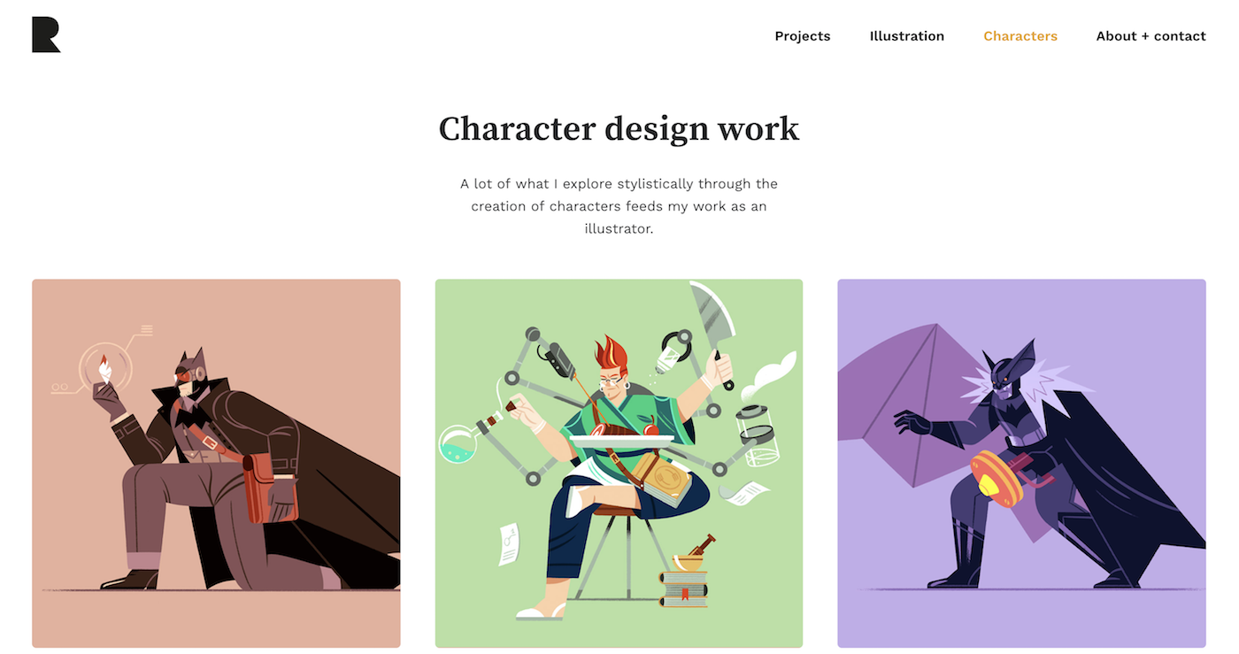
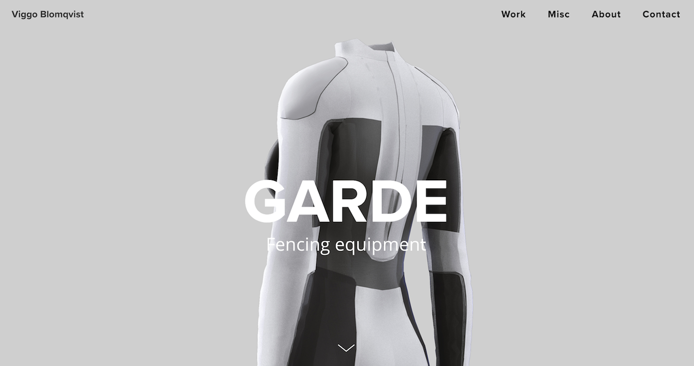
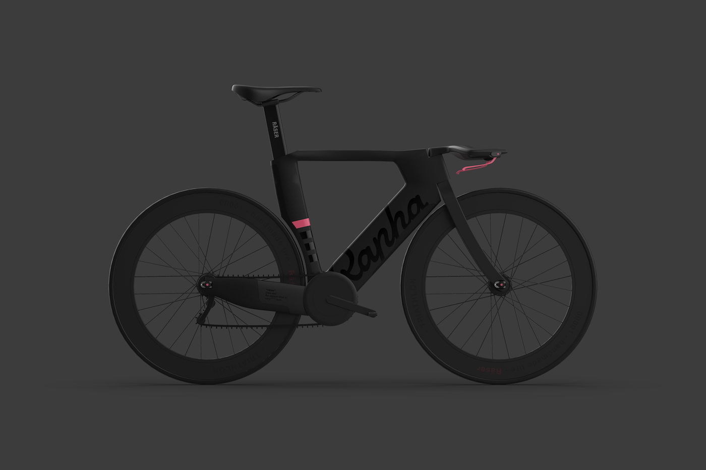
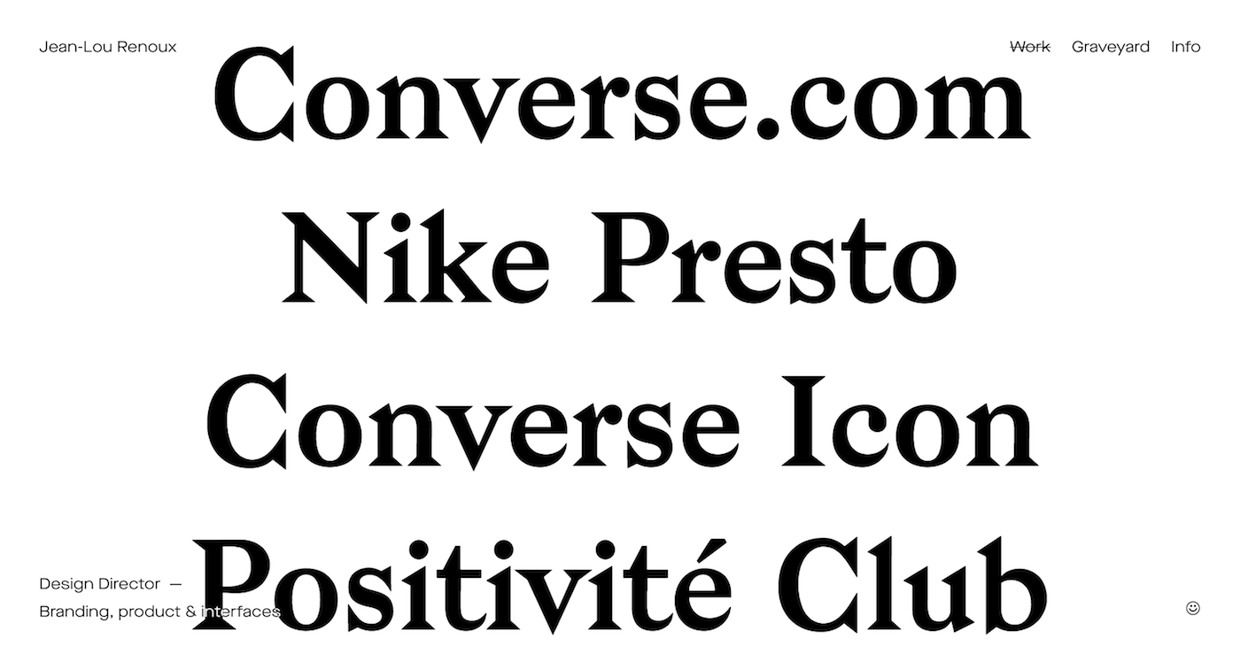
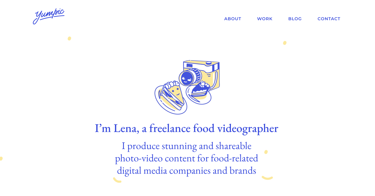
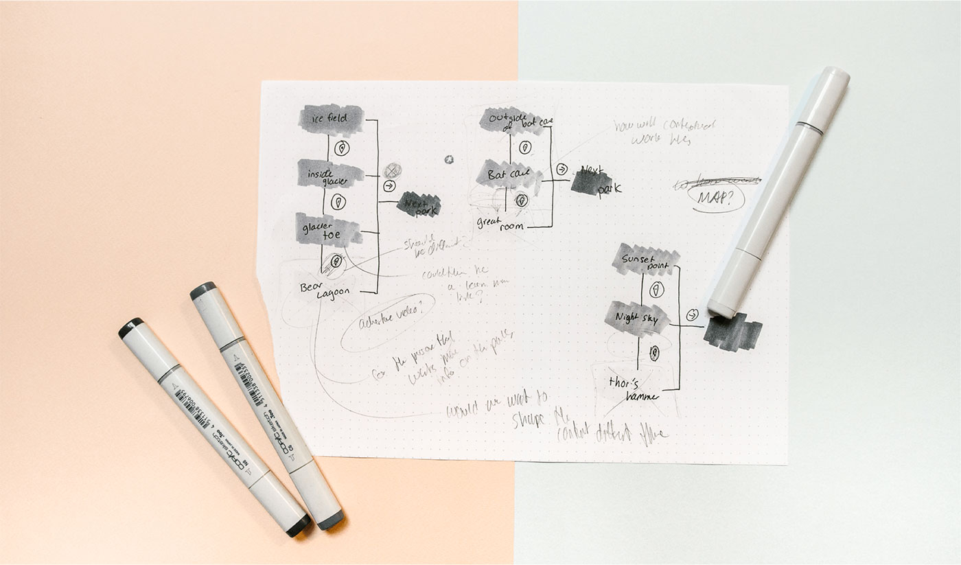
First, it's helpful to view case studies of other designers you admire to see how they explain their projects. Observe how they visually walk you through their project story, what elements or devices they use, how their projects flow, what makes you want to keep reading, where you find yourself losing interest.

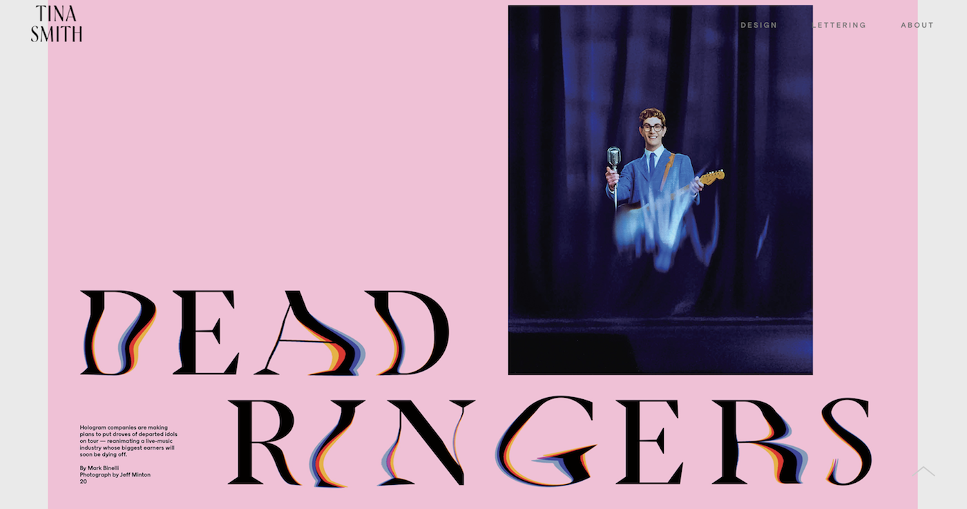
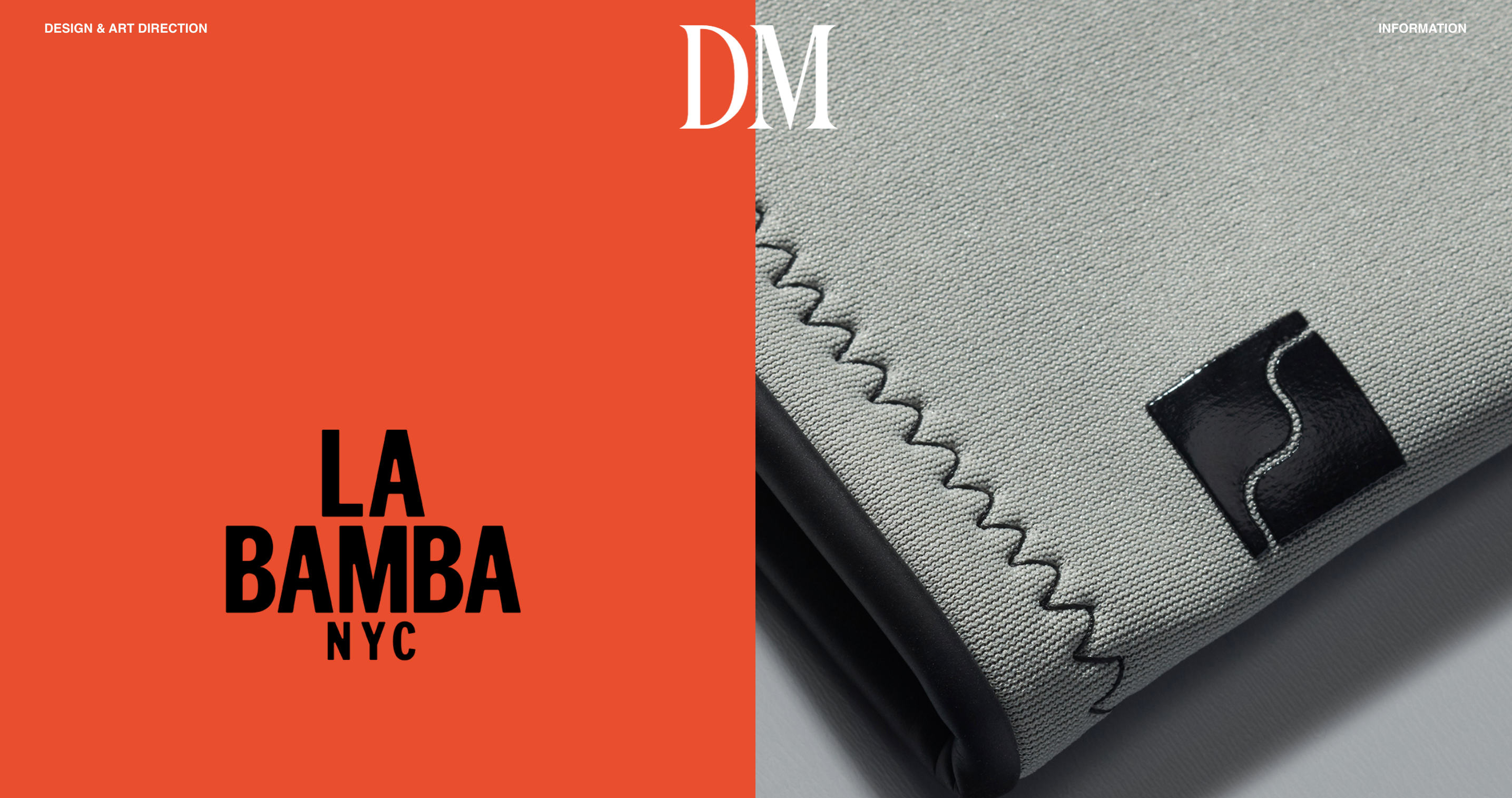
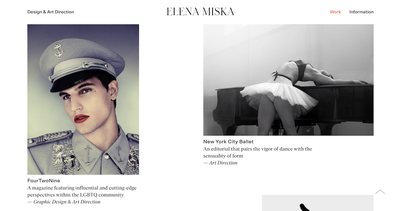
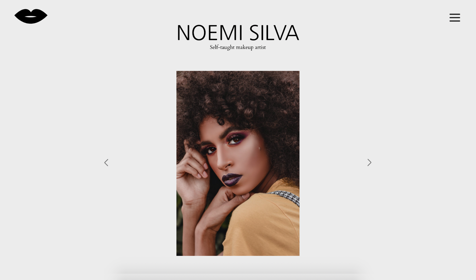
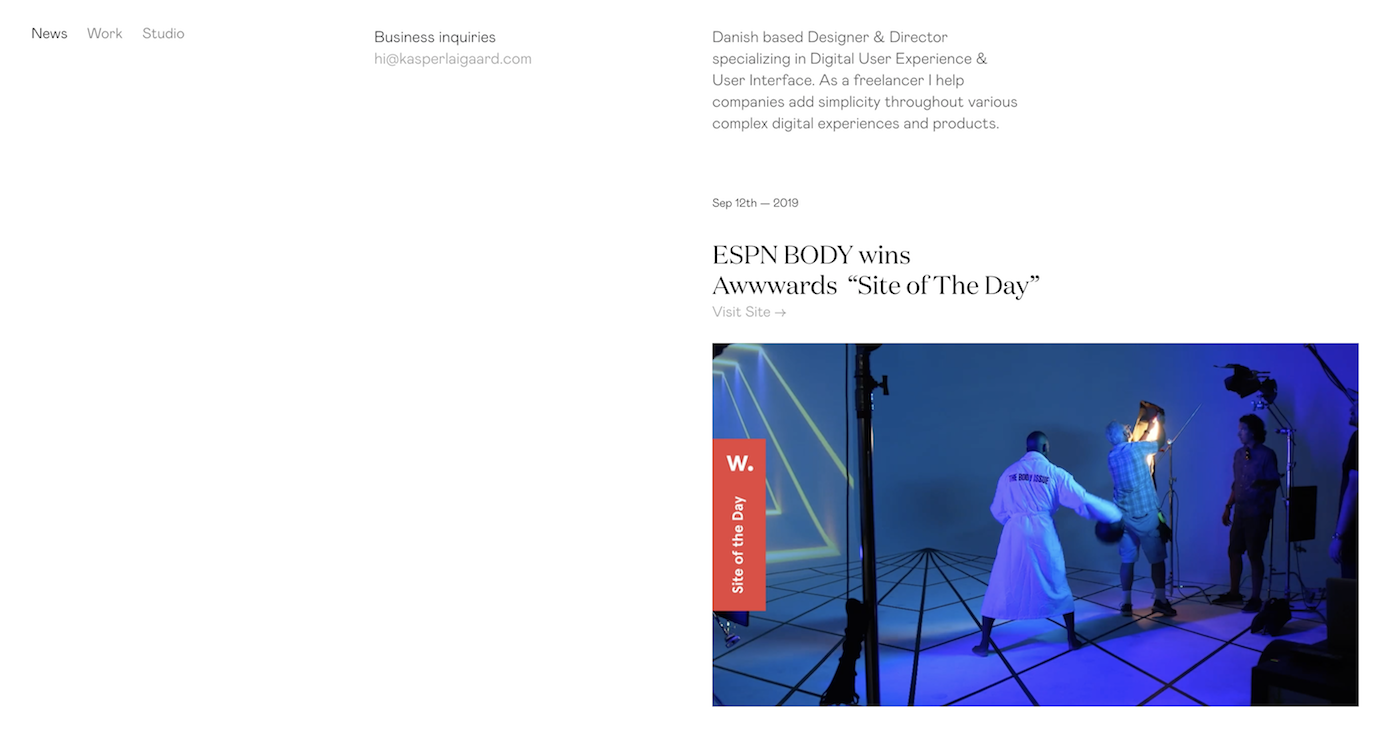
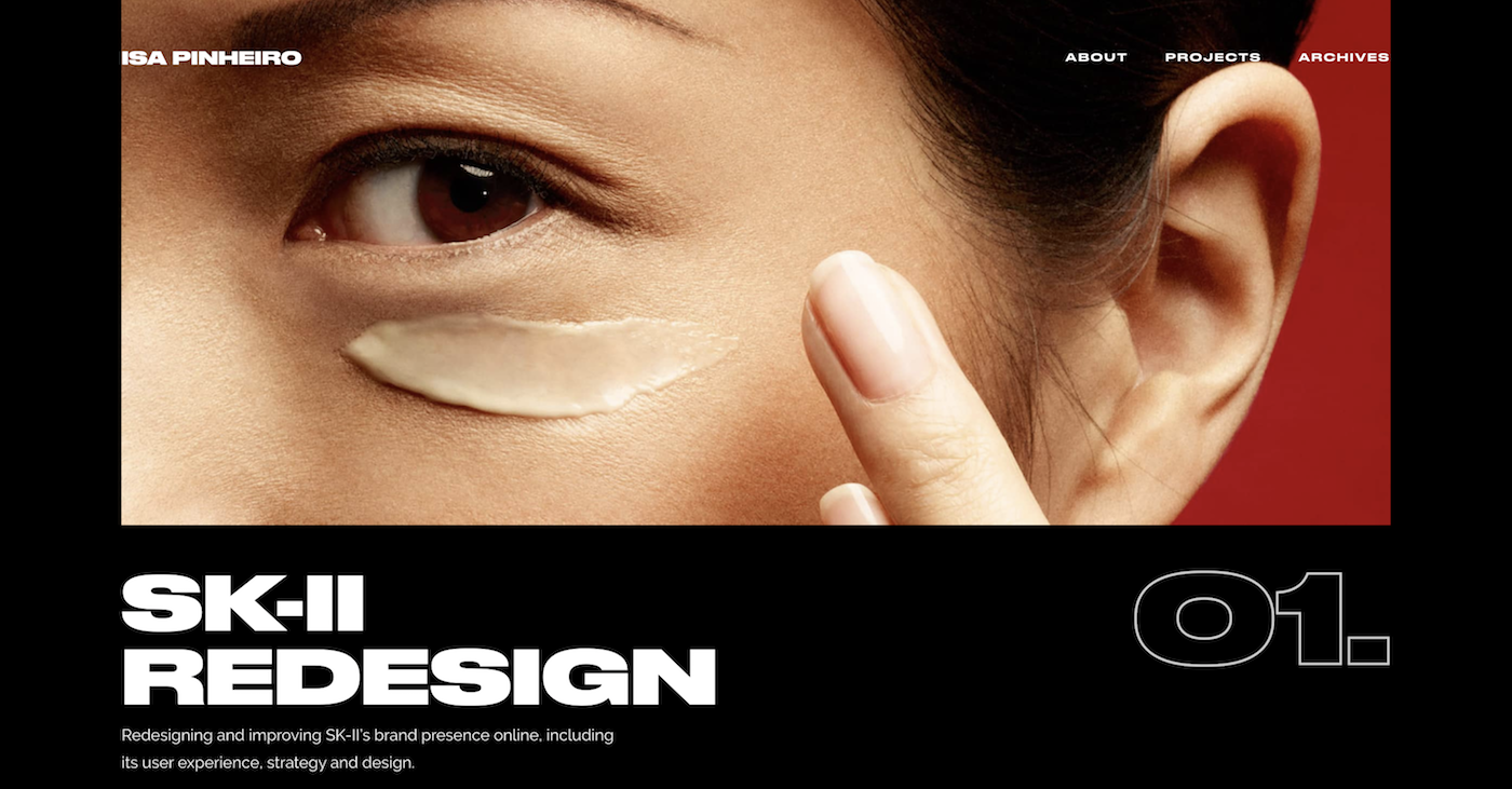
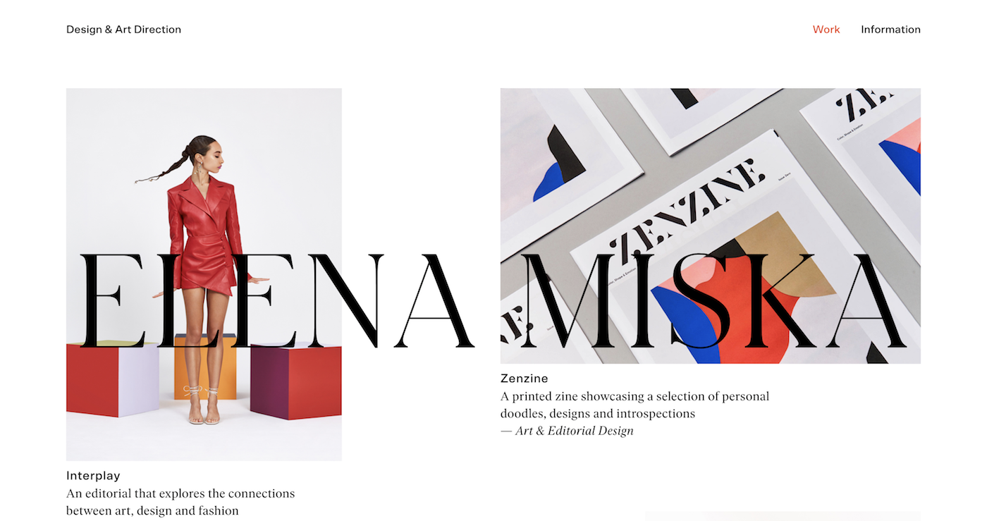
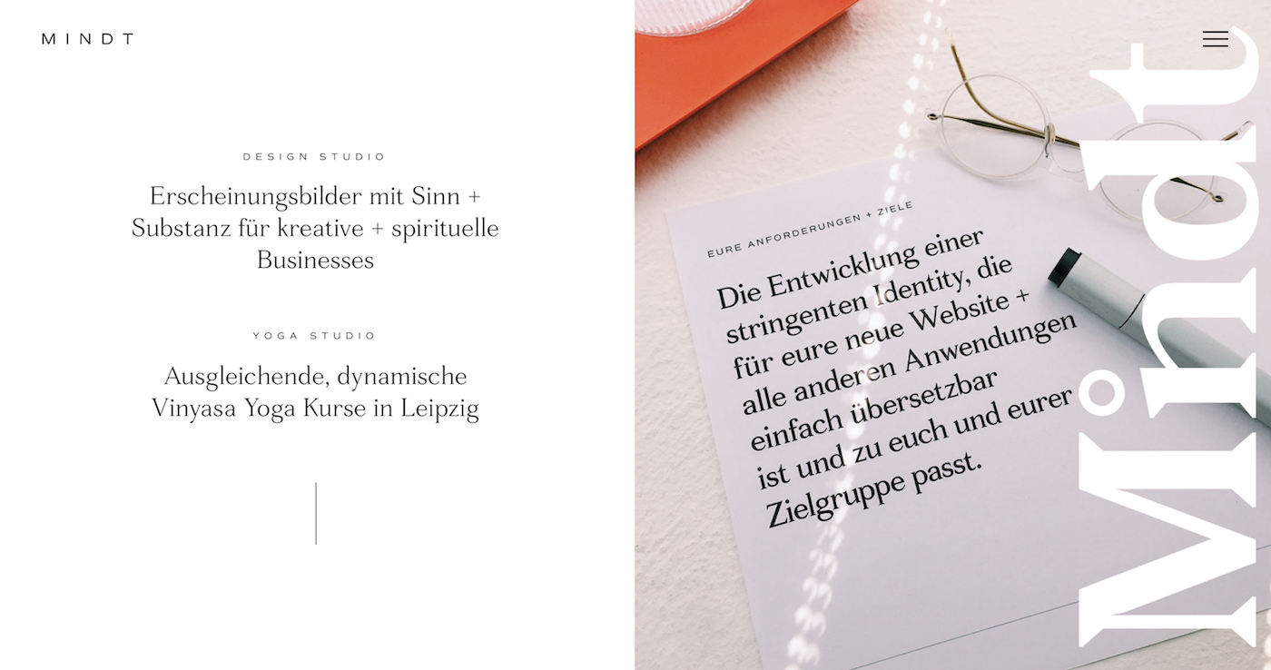
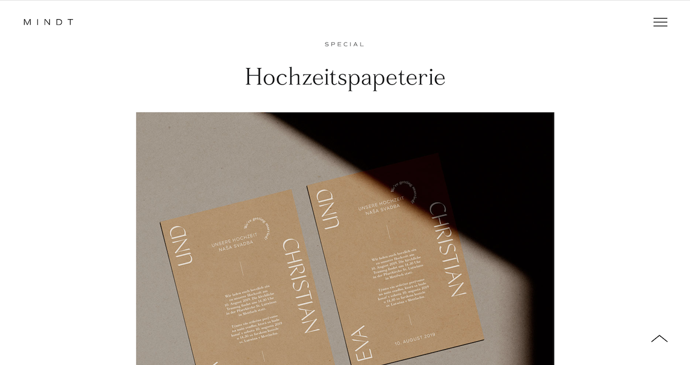
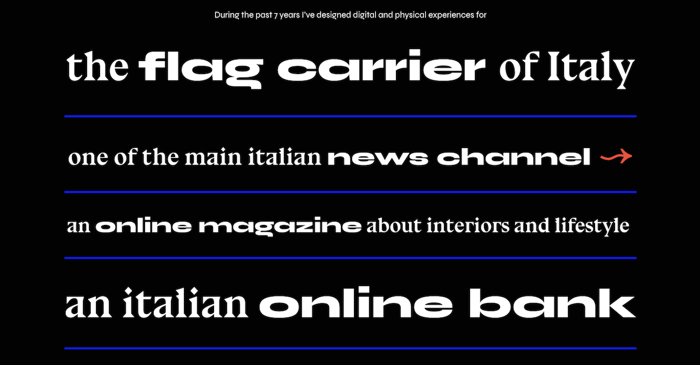
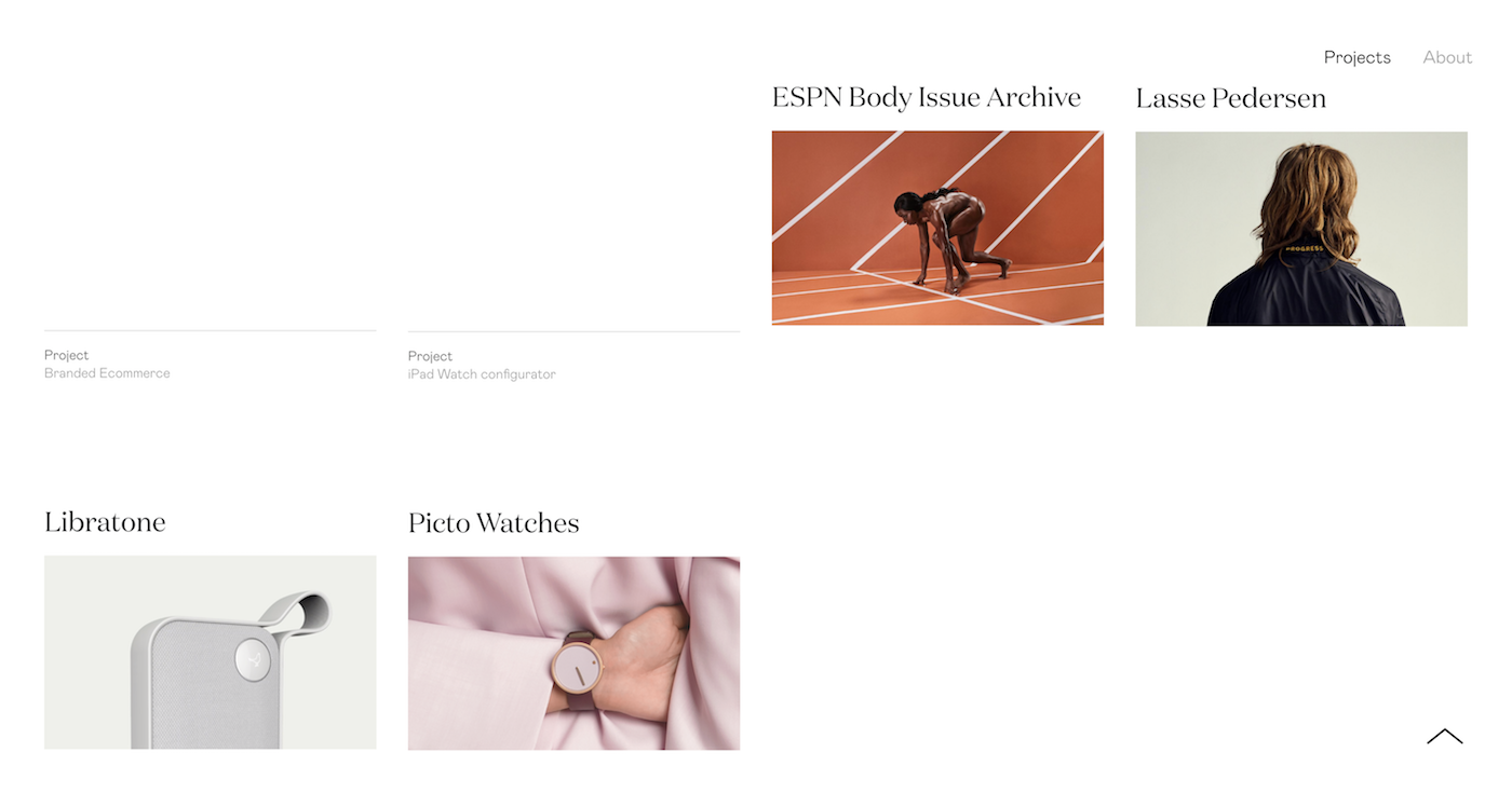
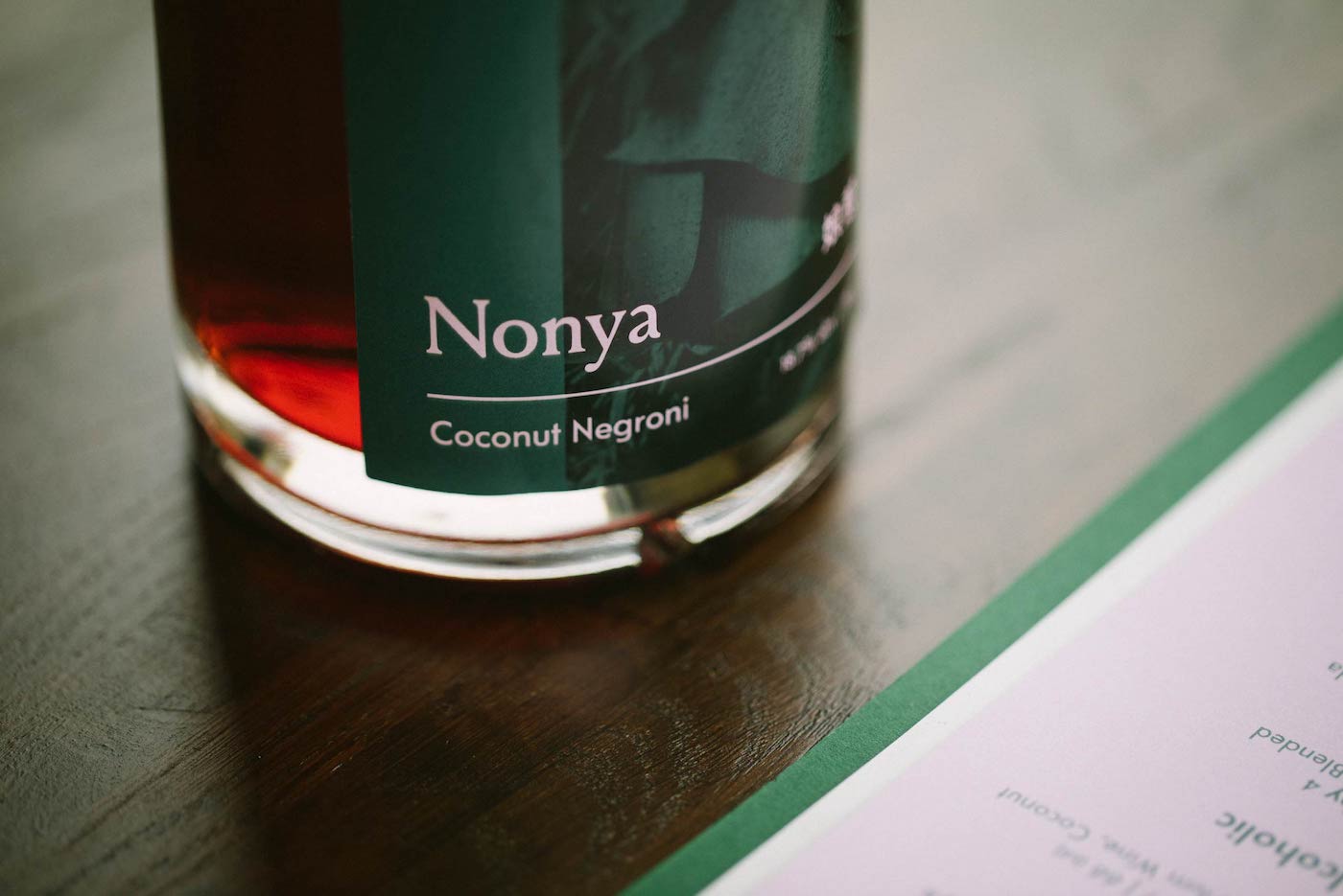
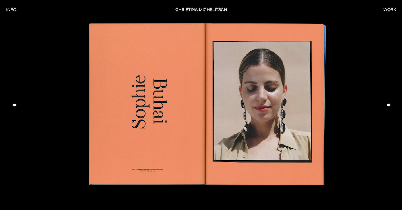
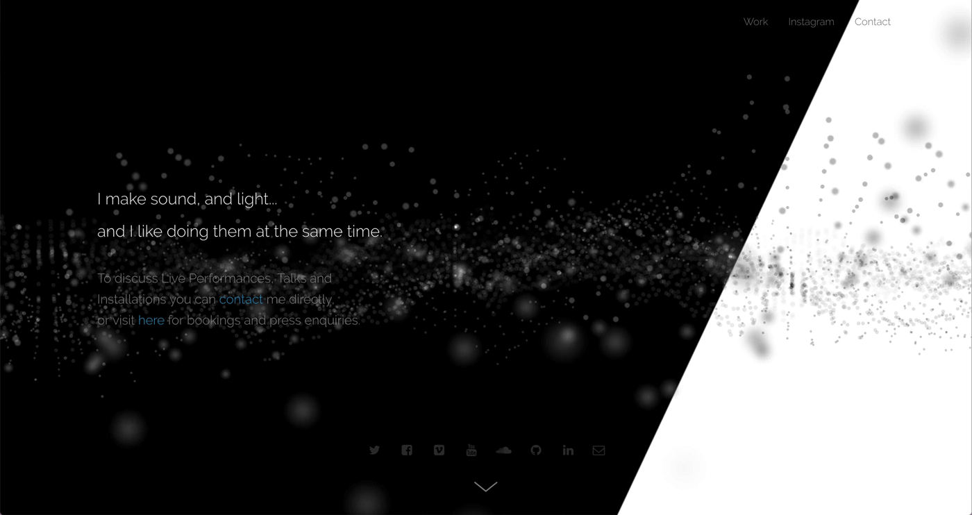
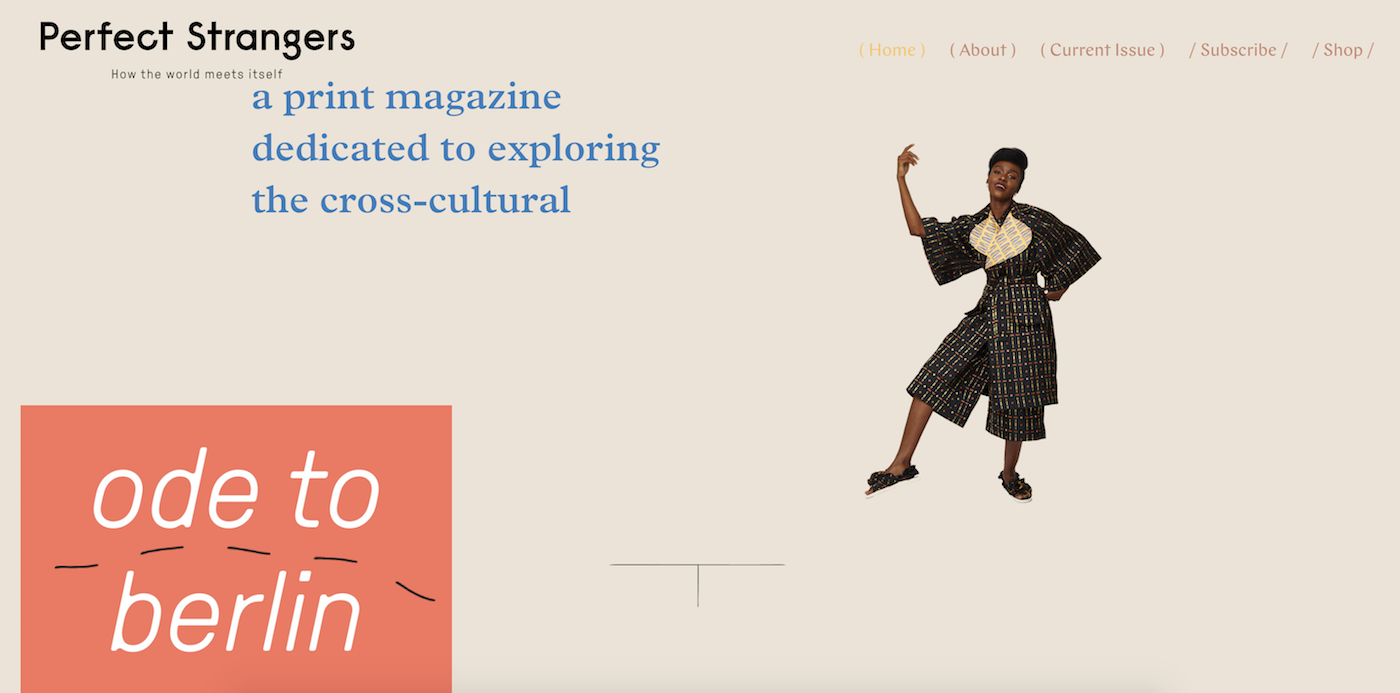
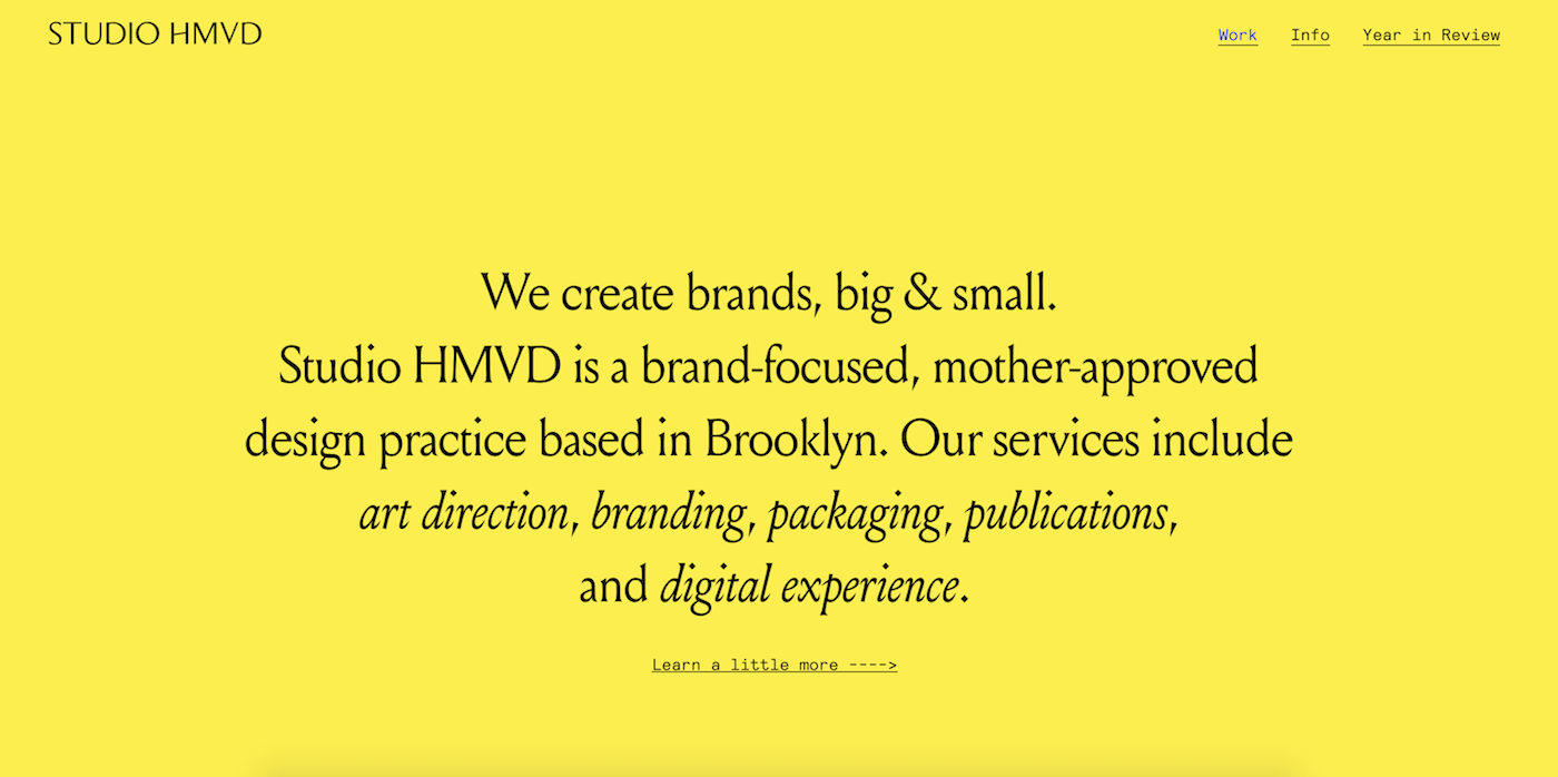
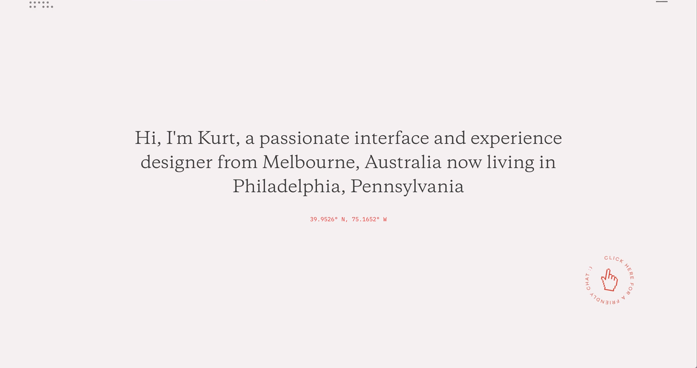
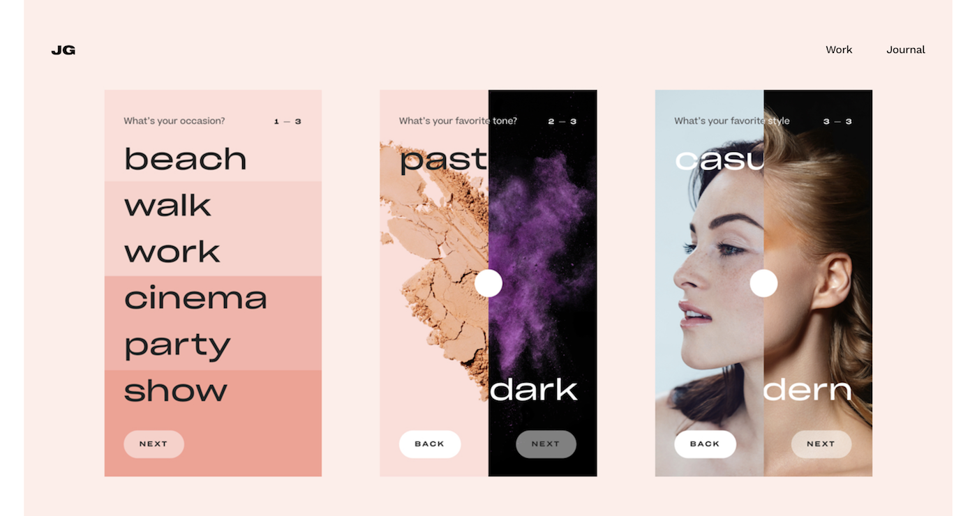
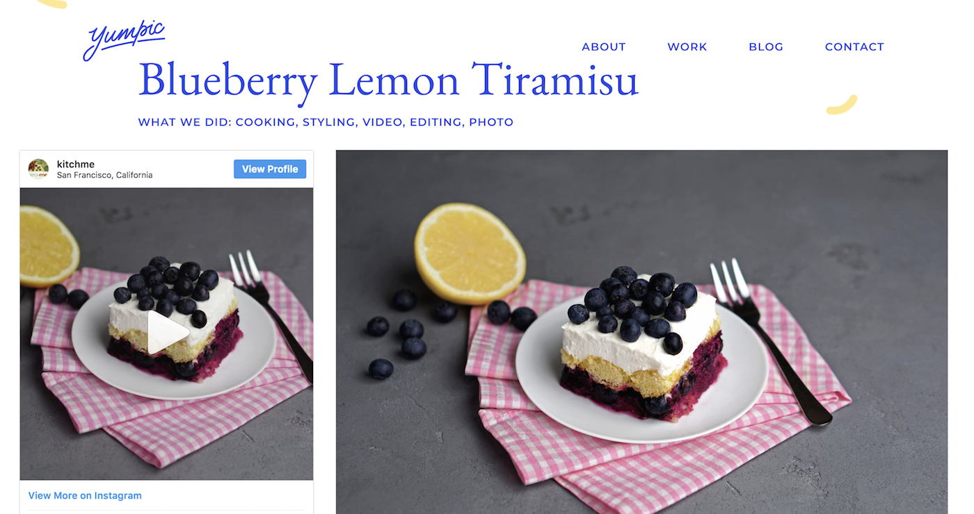
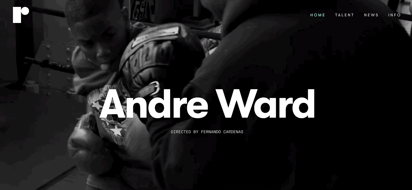
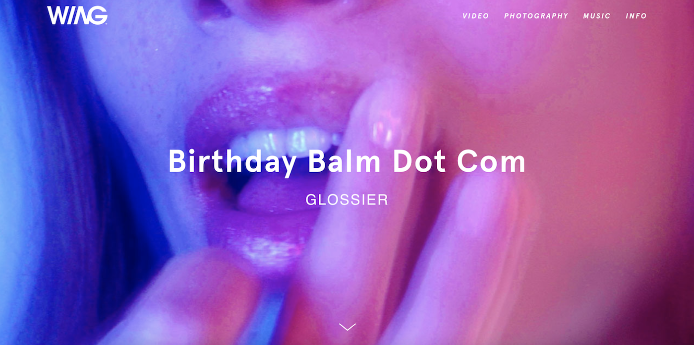
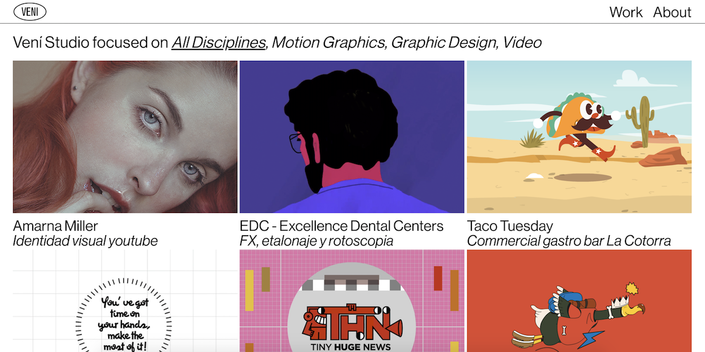
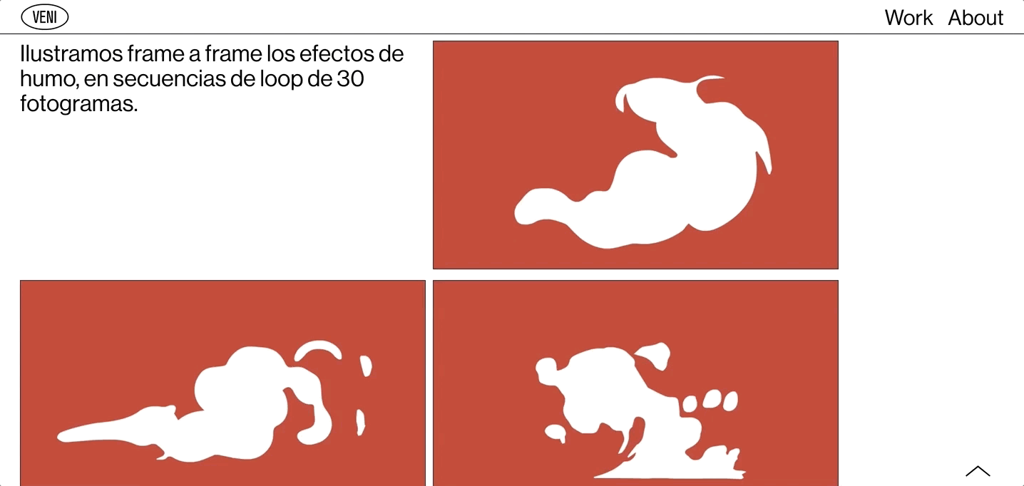
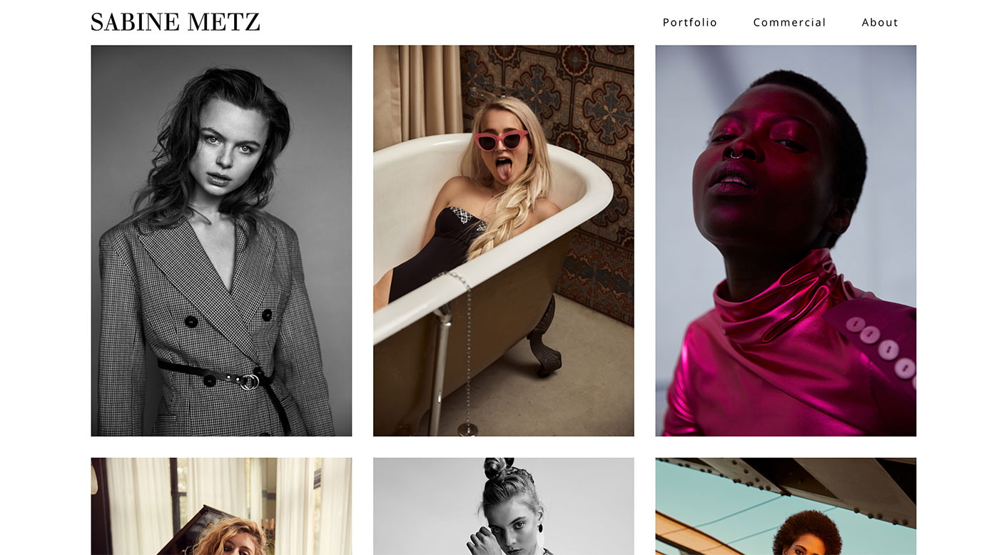
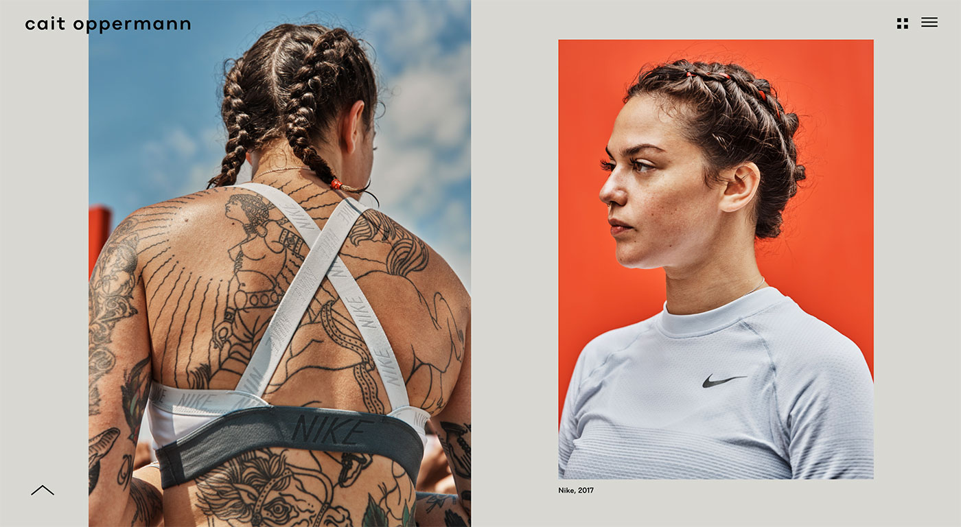
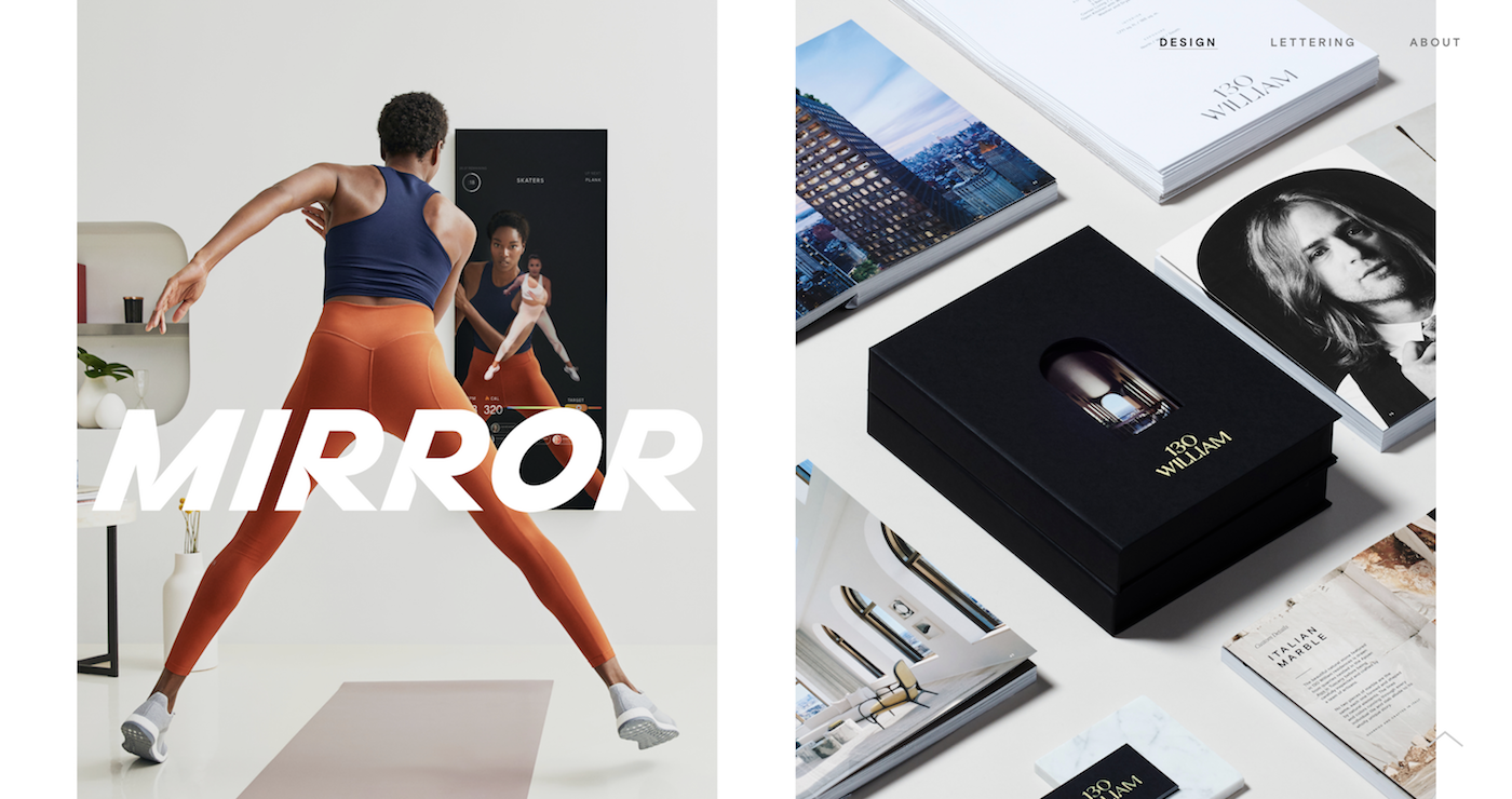
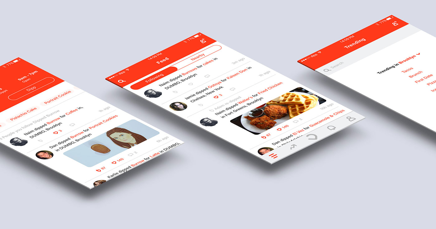
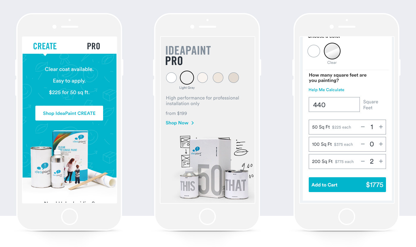
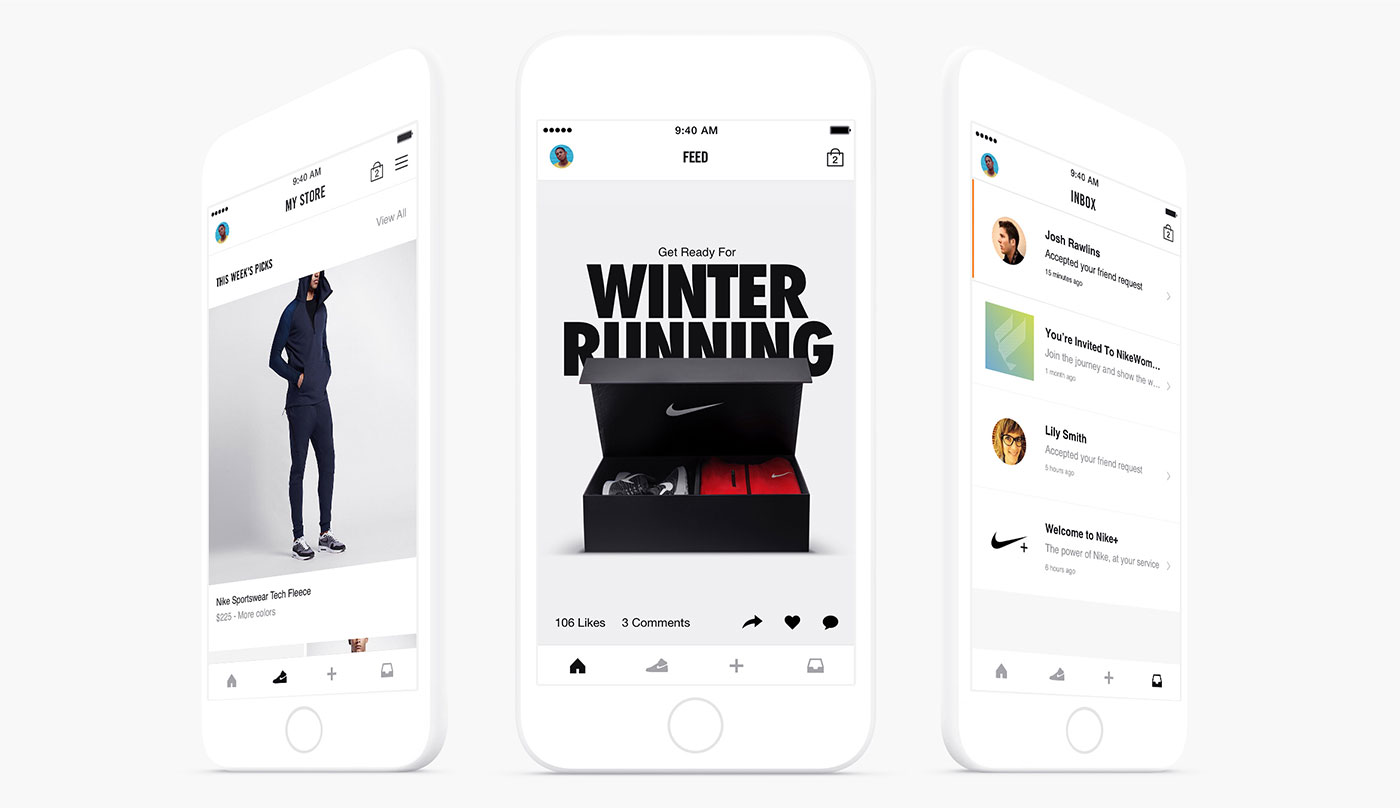
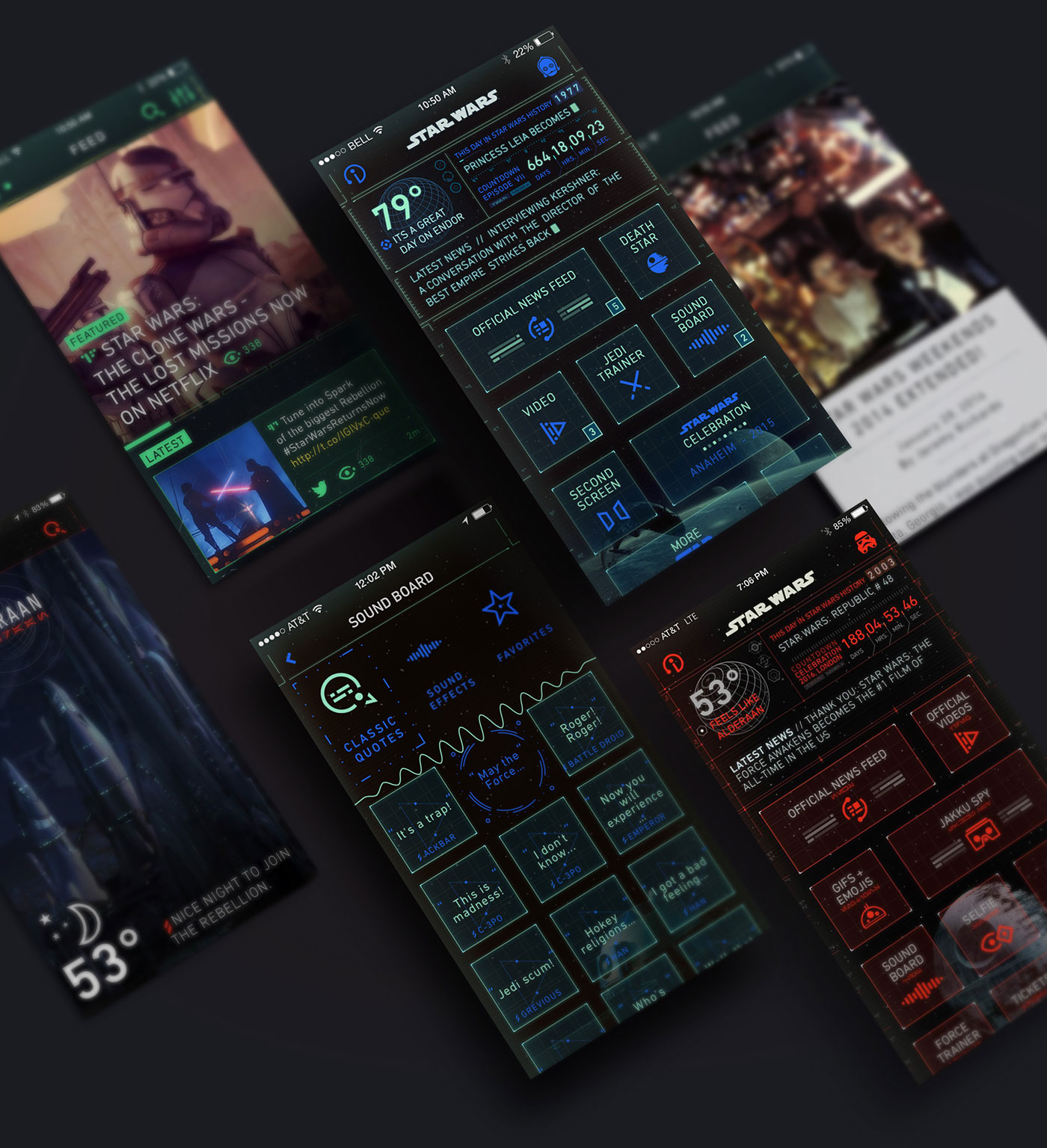
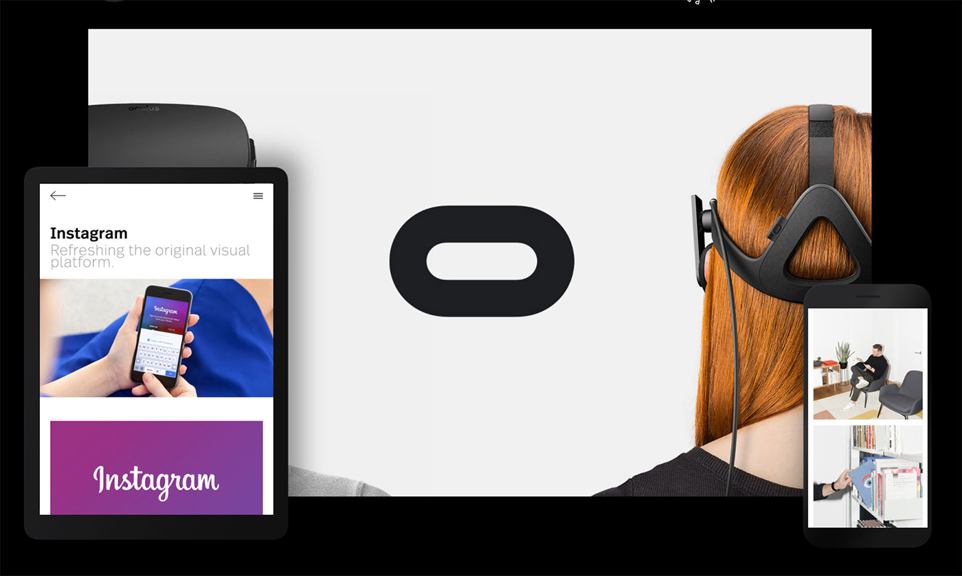
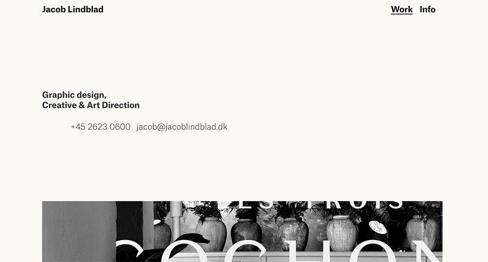
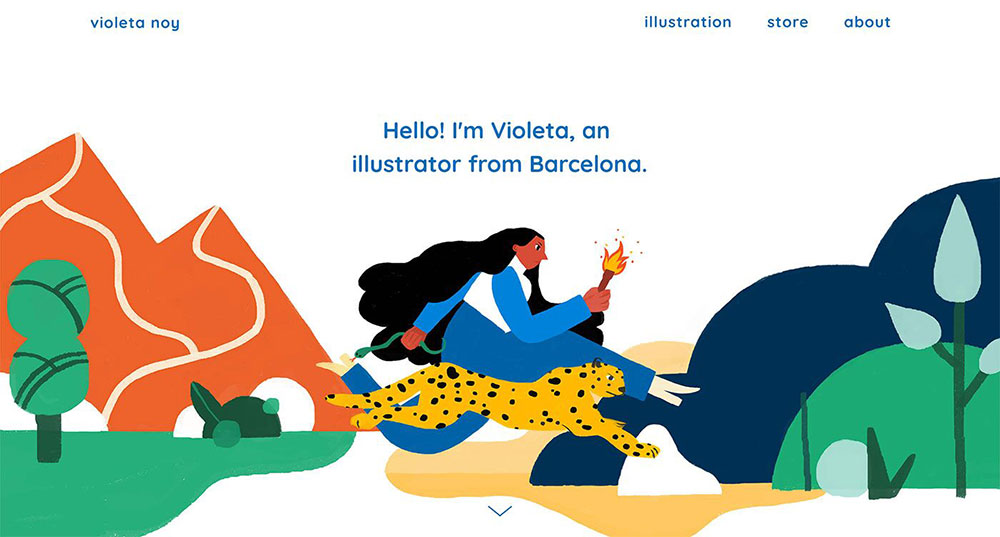
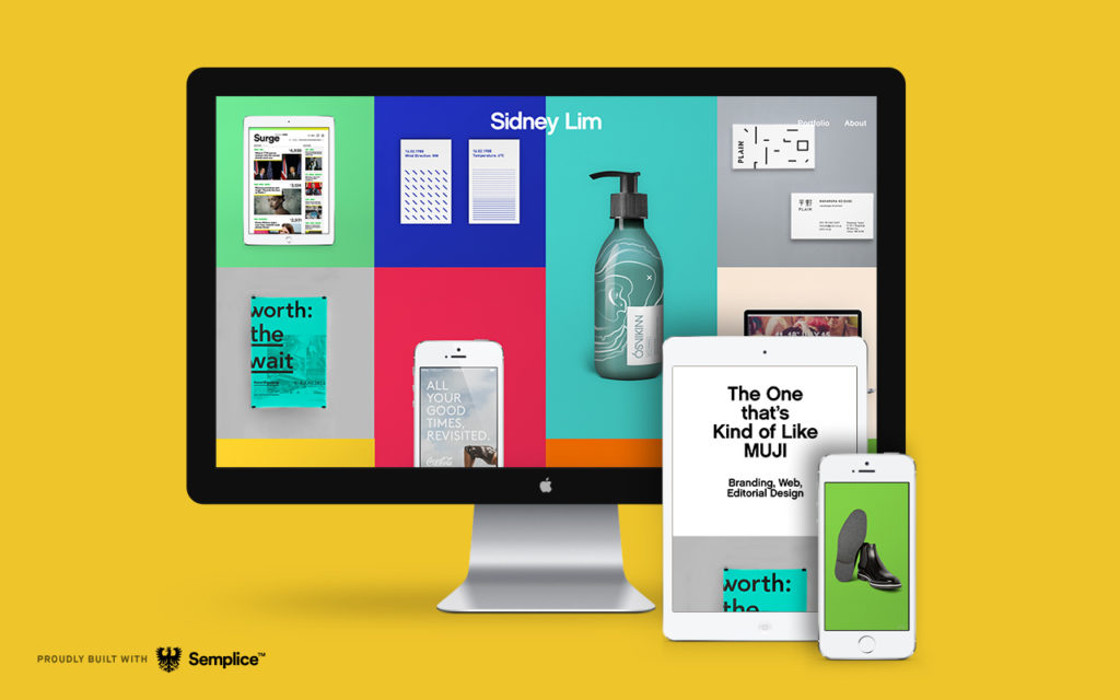
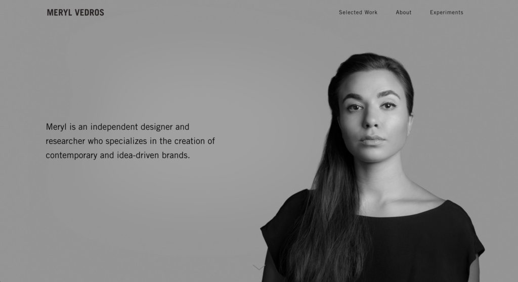
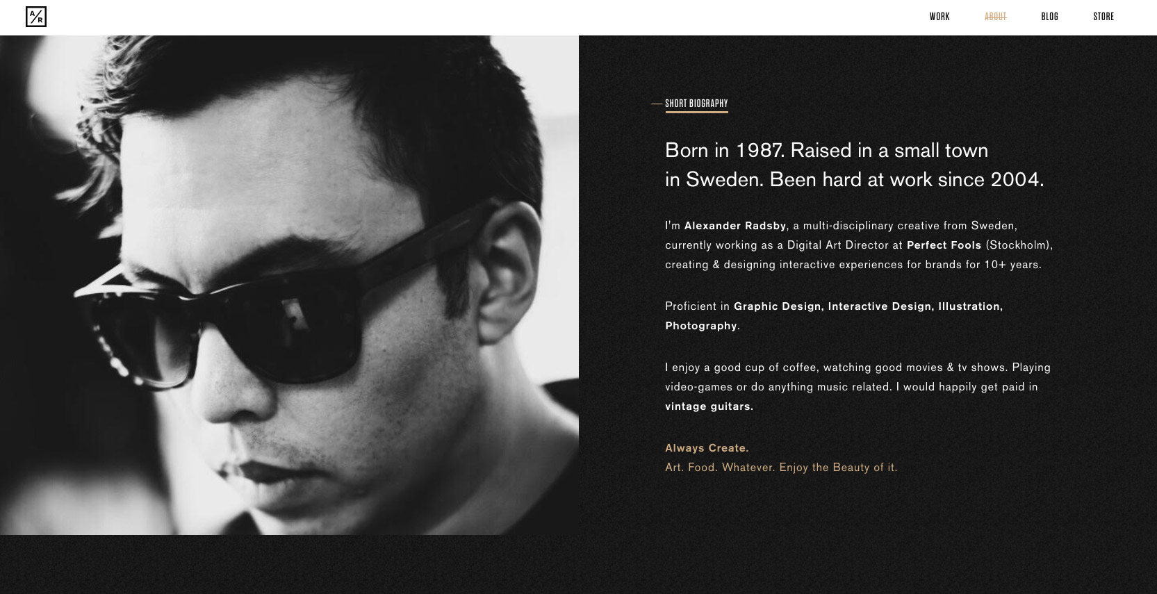
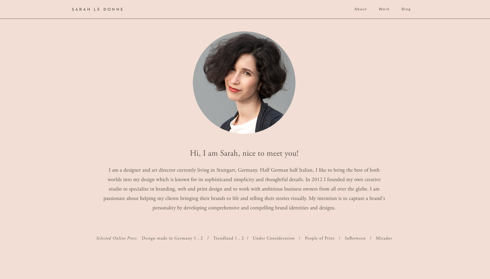
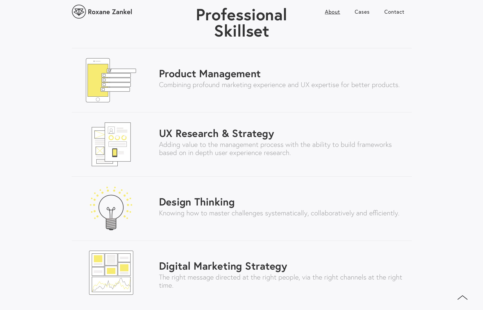
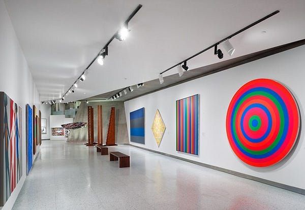
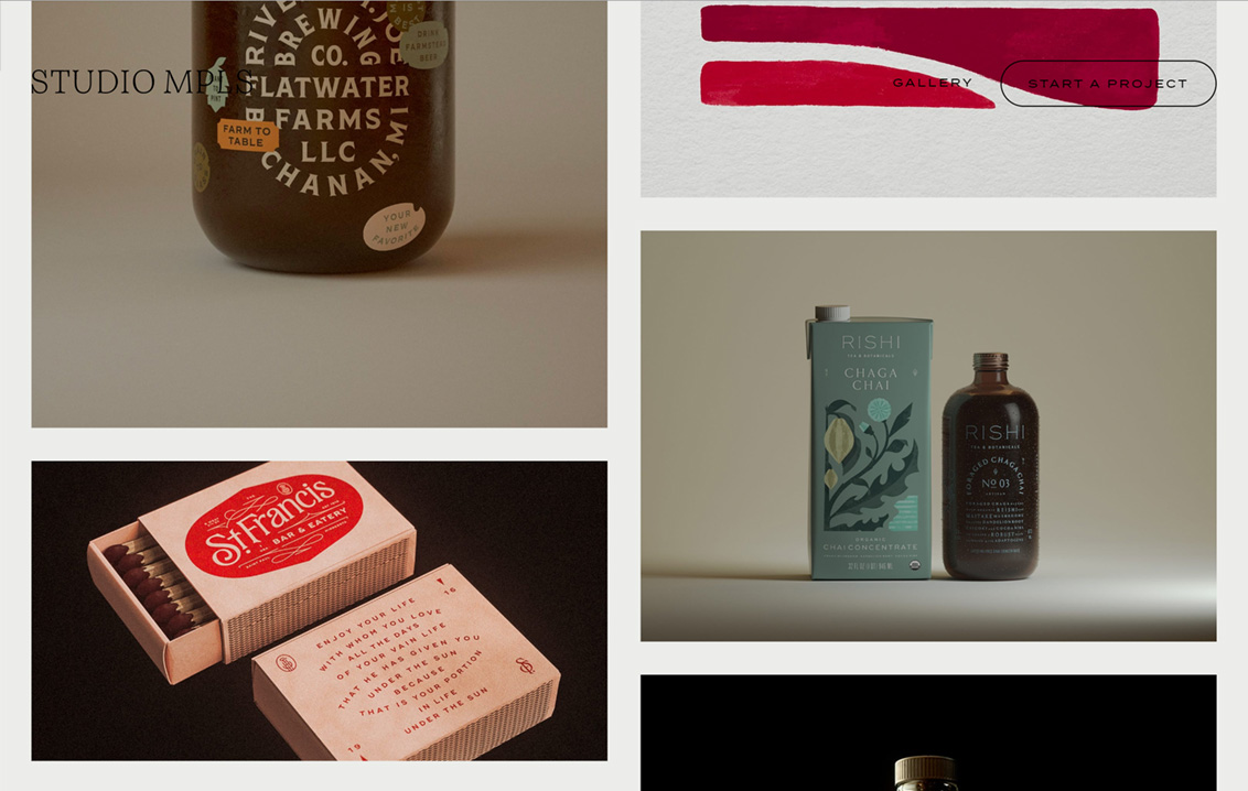
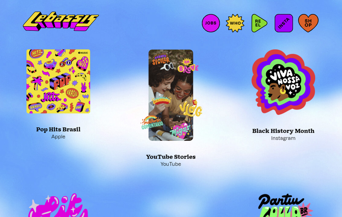
You'll ultimately do things your own way, of course, but seeing what works and what doesn't will guide that, and motivate you. Here are a few case studies we've enjoyed lately from our Semplice Showcase, for example (click image to view case study):


What we'll be making

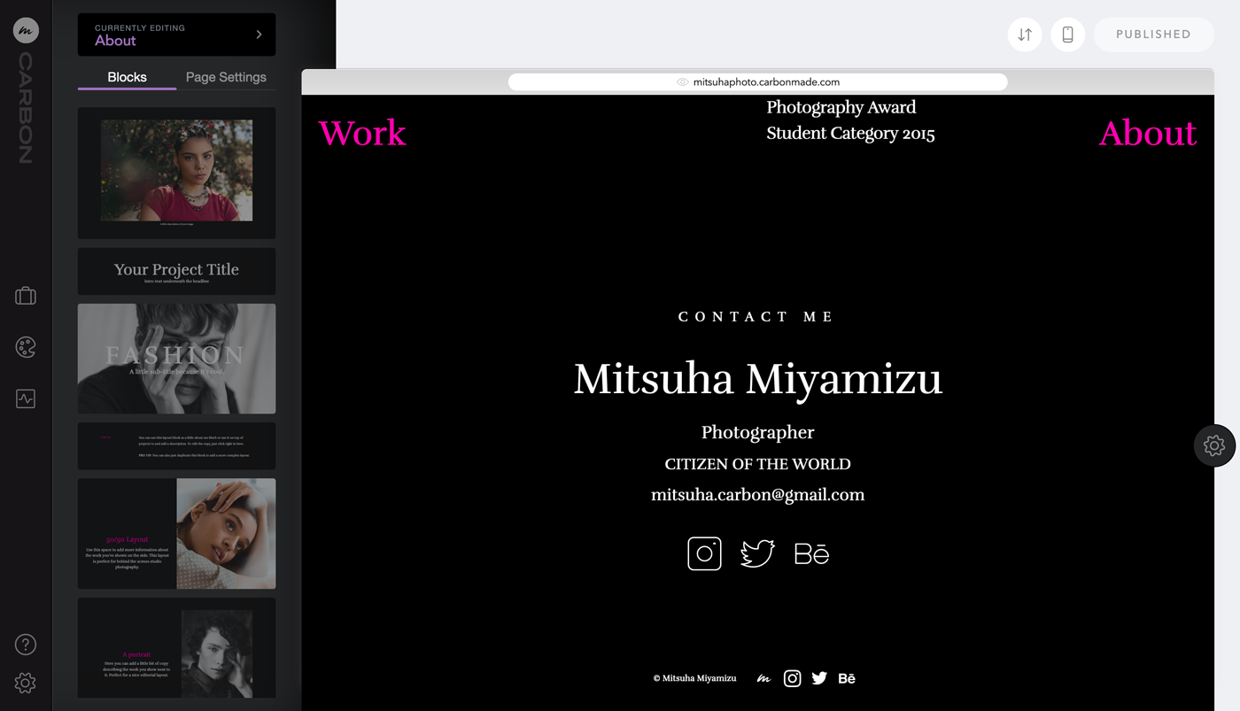
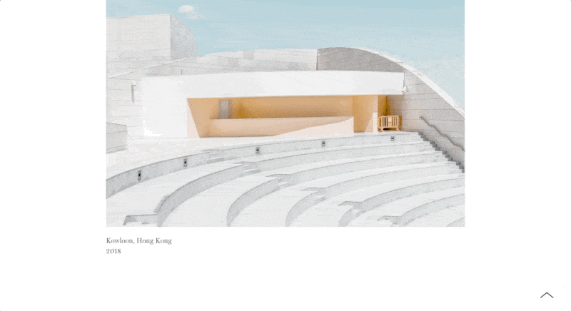
Now let's start creating our case study page. I'll be making mine using my own work, for a fictional design studio.

I've made a demo using Semplice, our own portfolio tool. Semplice is centered around creating custom case studies for your unique projects, so you can design everything from your nav to your footer to complement each unique project.

VIEW THE LIVE DEMO

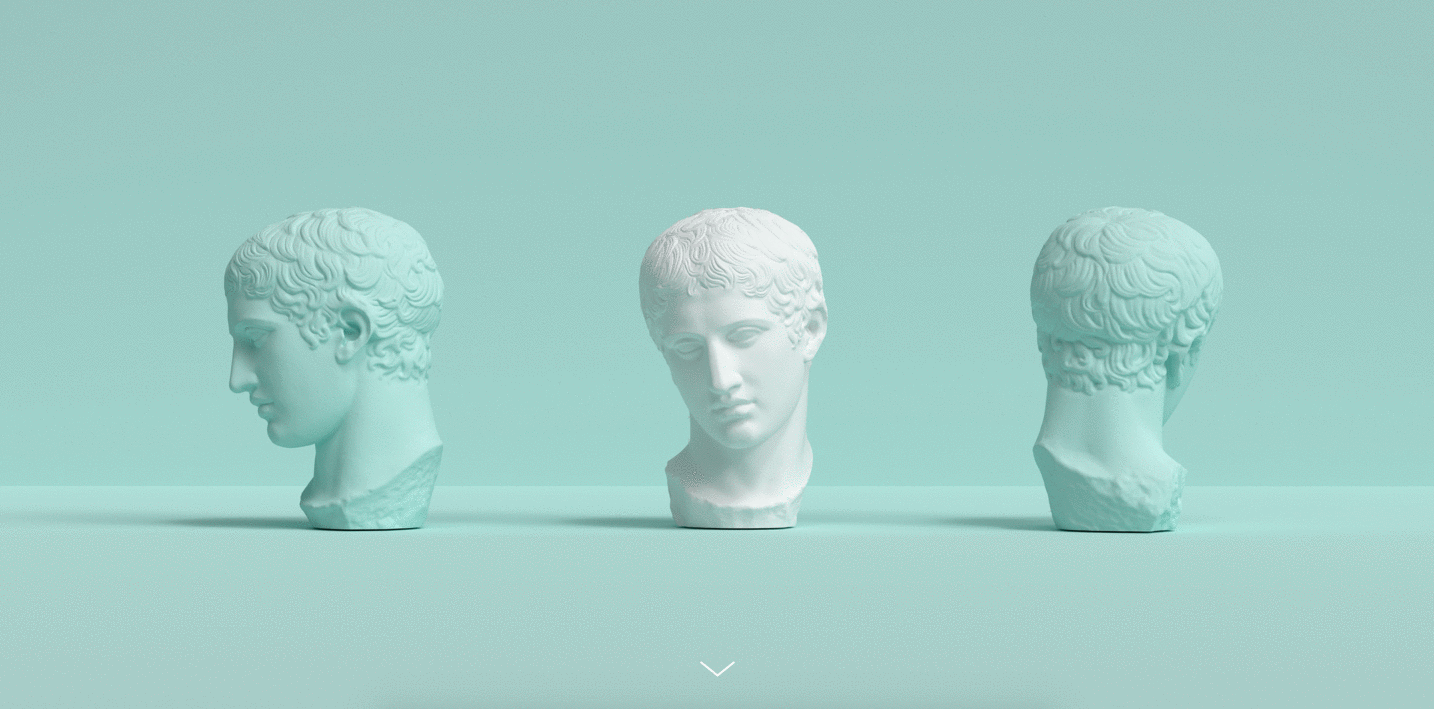
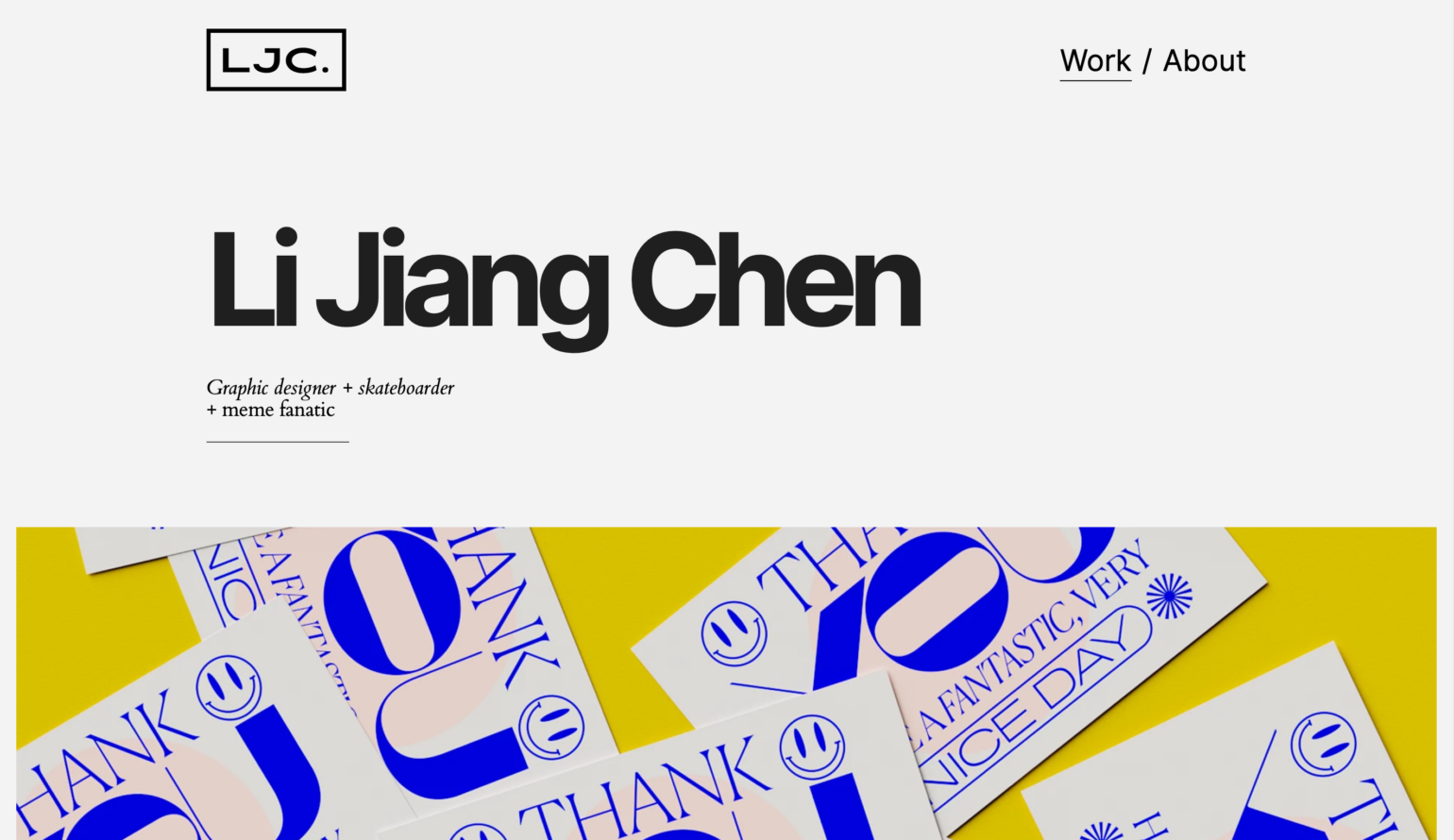
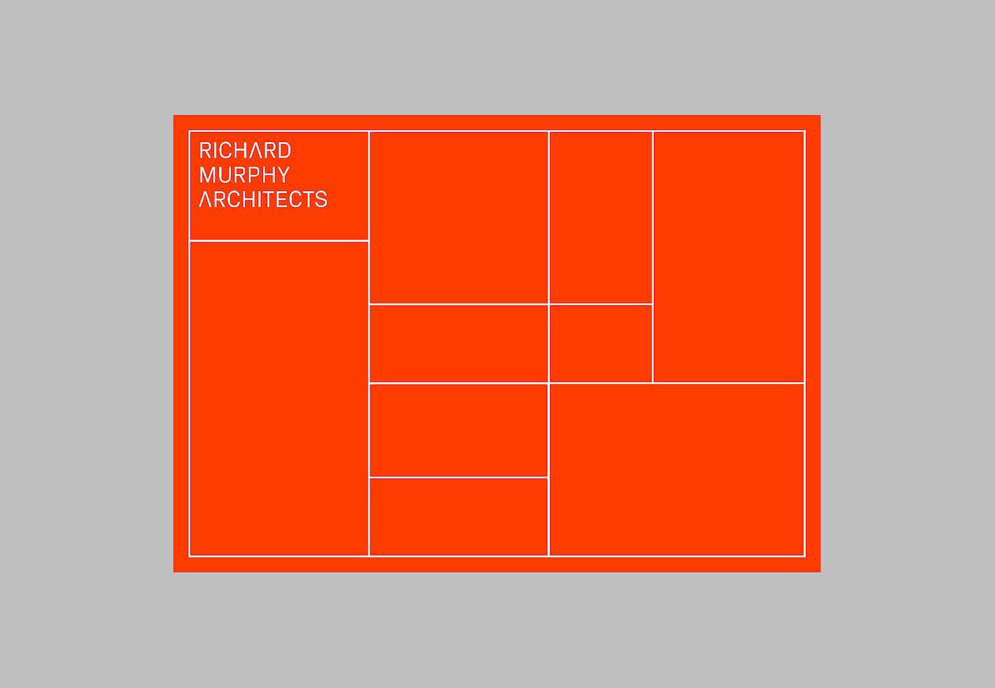
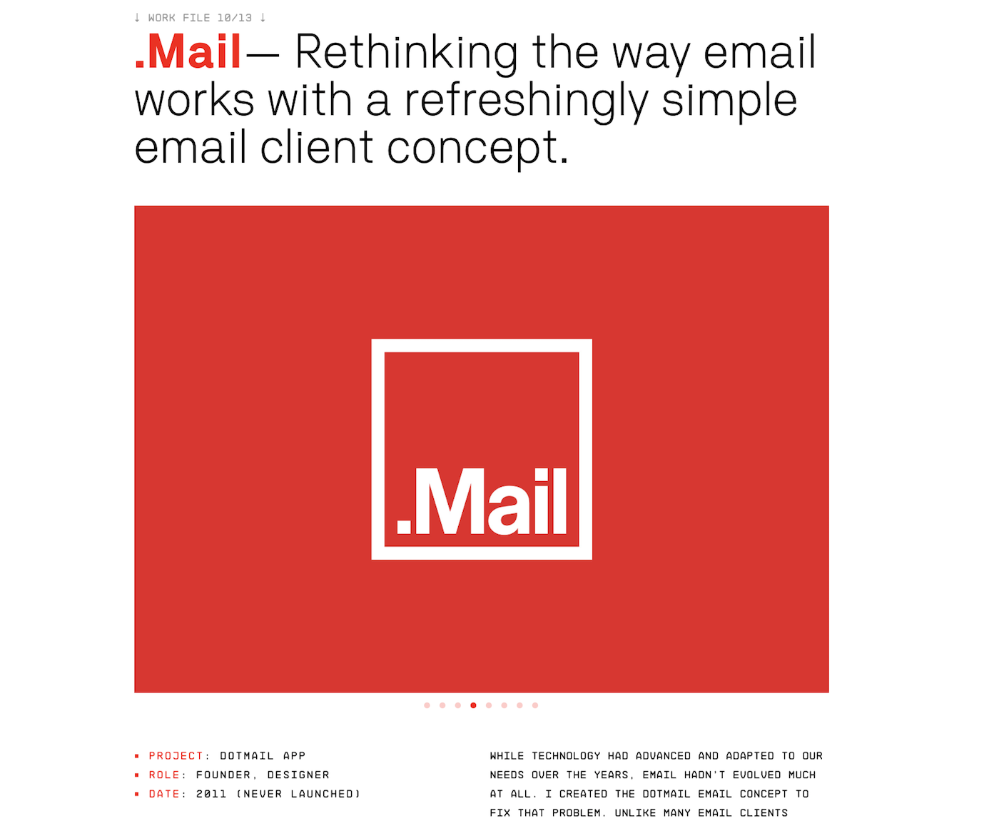
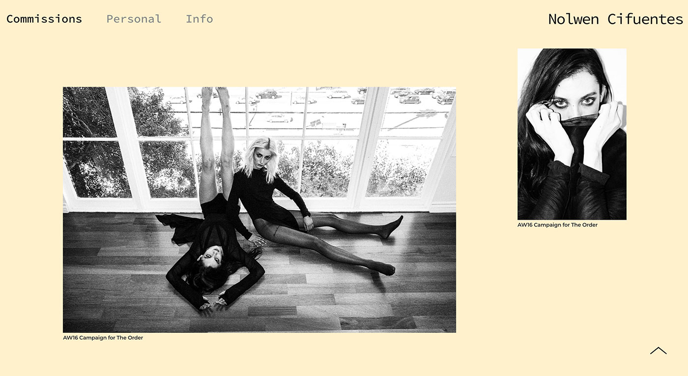
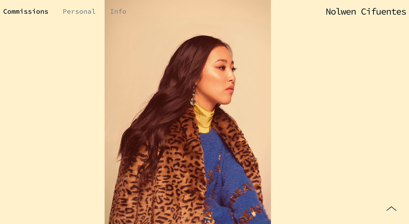
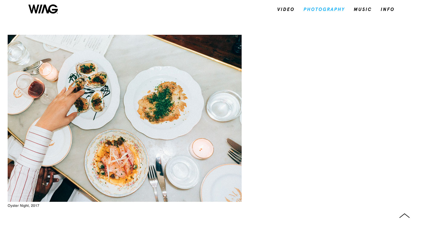
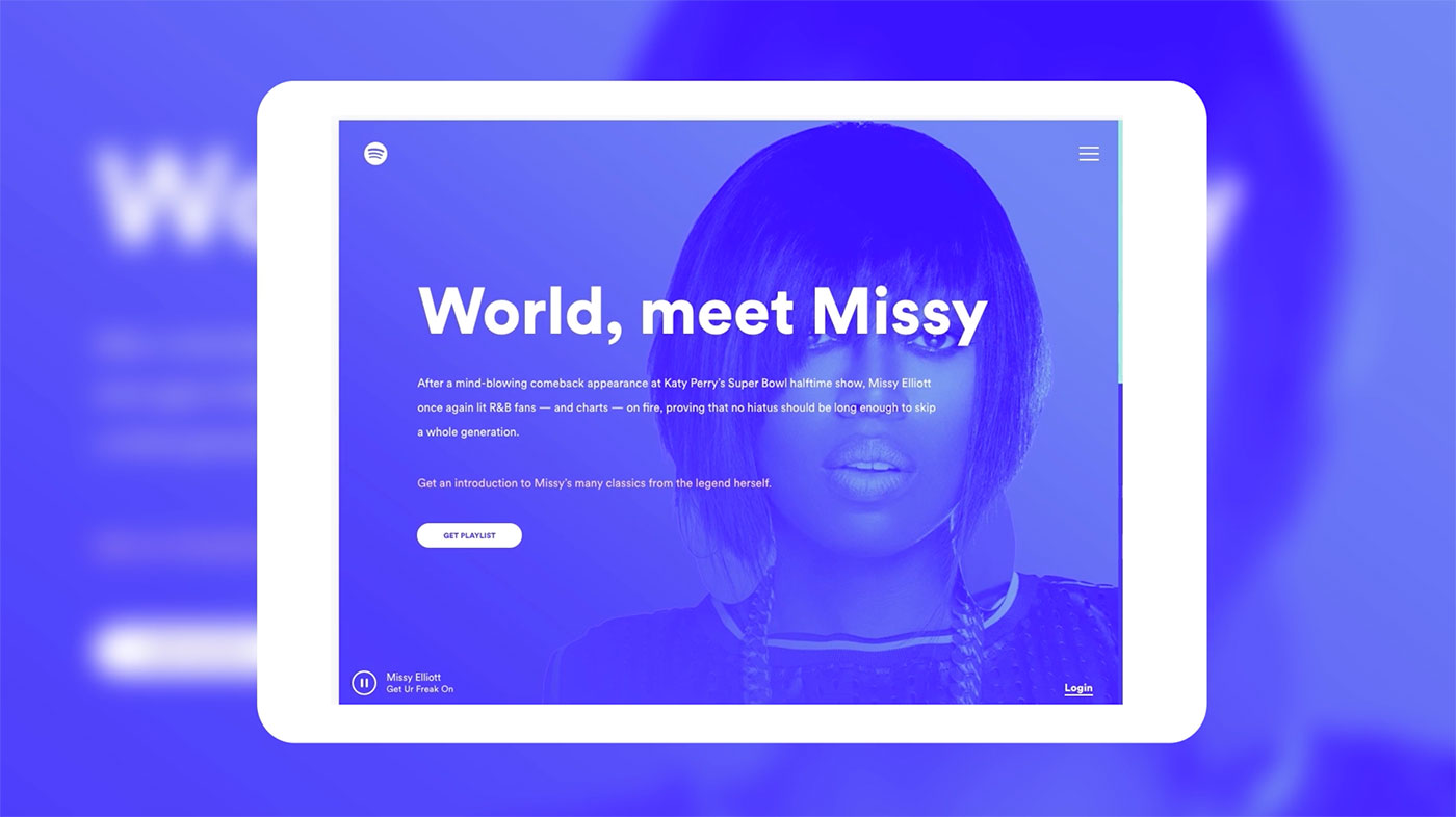
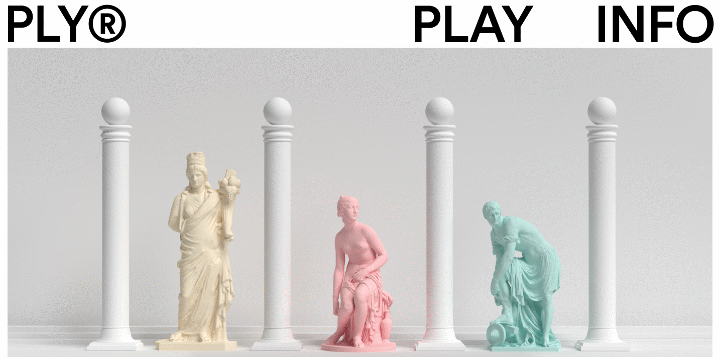
The case study example page we will be recreating

Getting started

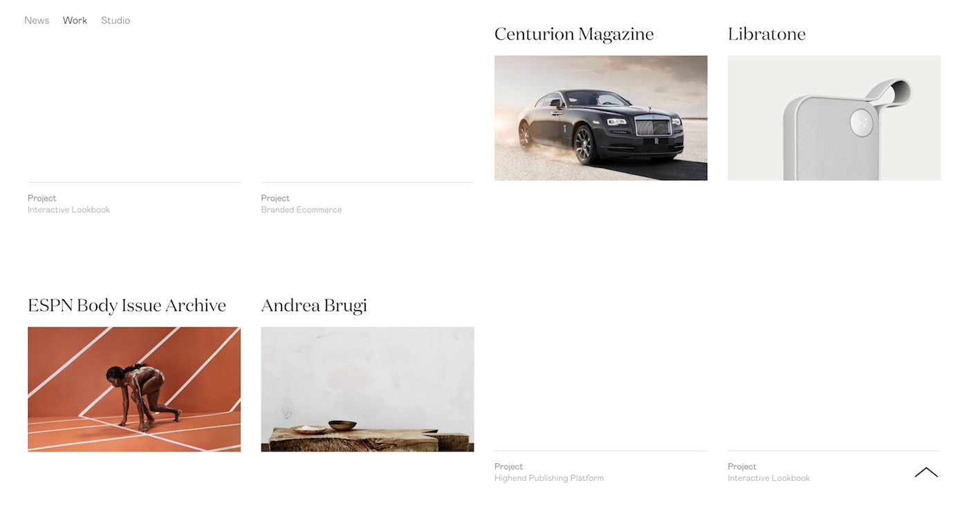
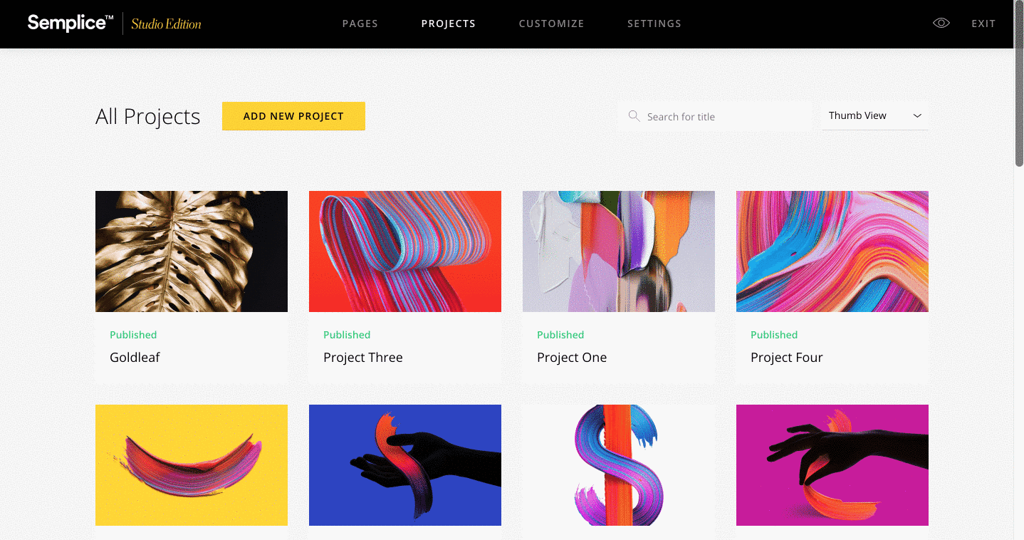
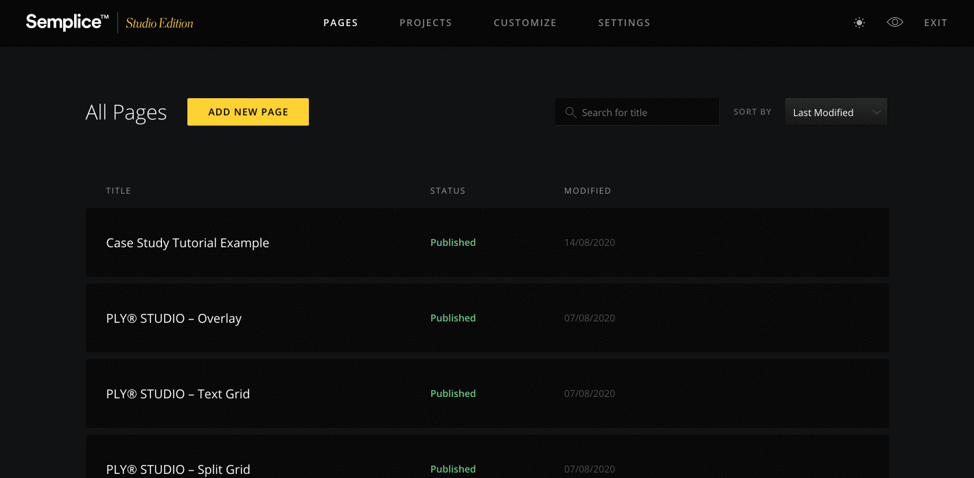
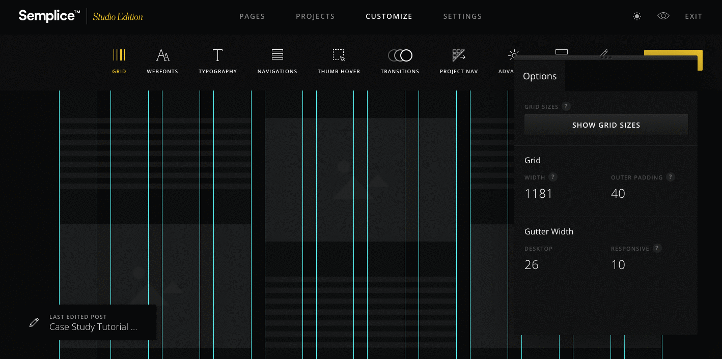
To begin, let's head on over to the Projects area to create our first project. Projects in Semplice serve as your case studies. They automatically connect with the Portfolio Grid module, so you can display them on your homepage or Work page.

Creating the Cover

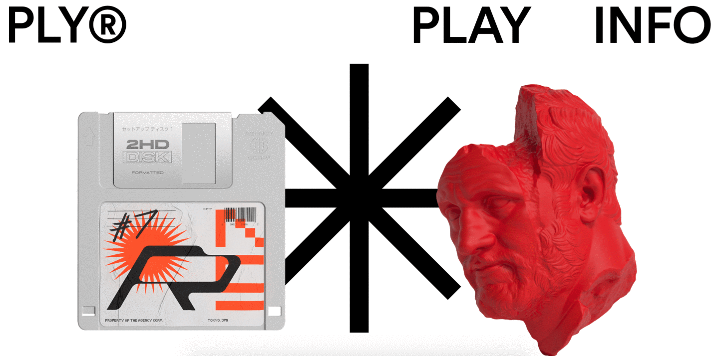
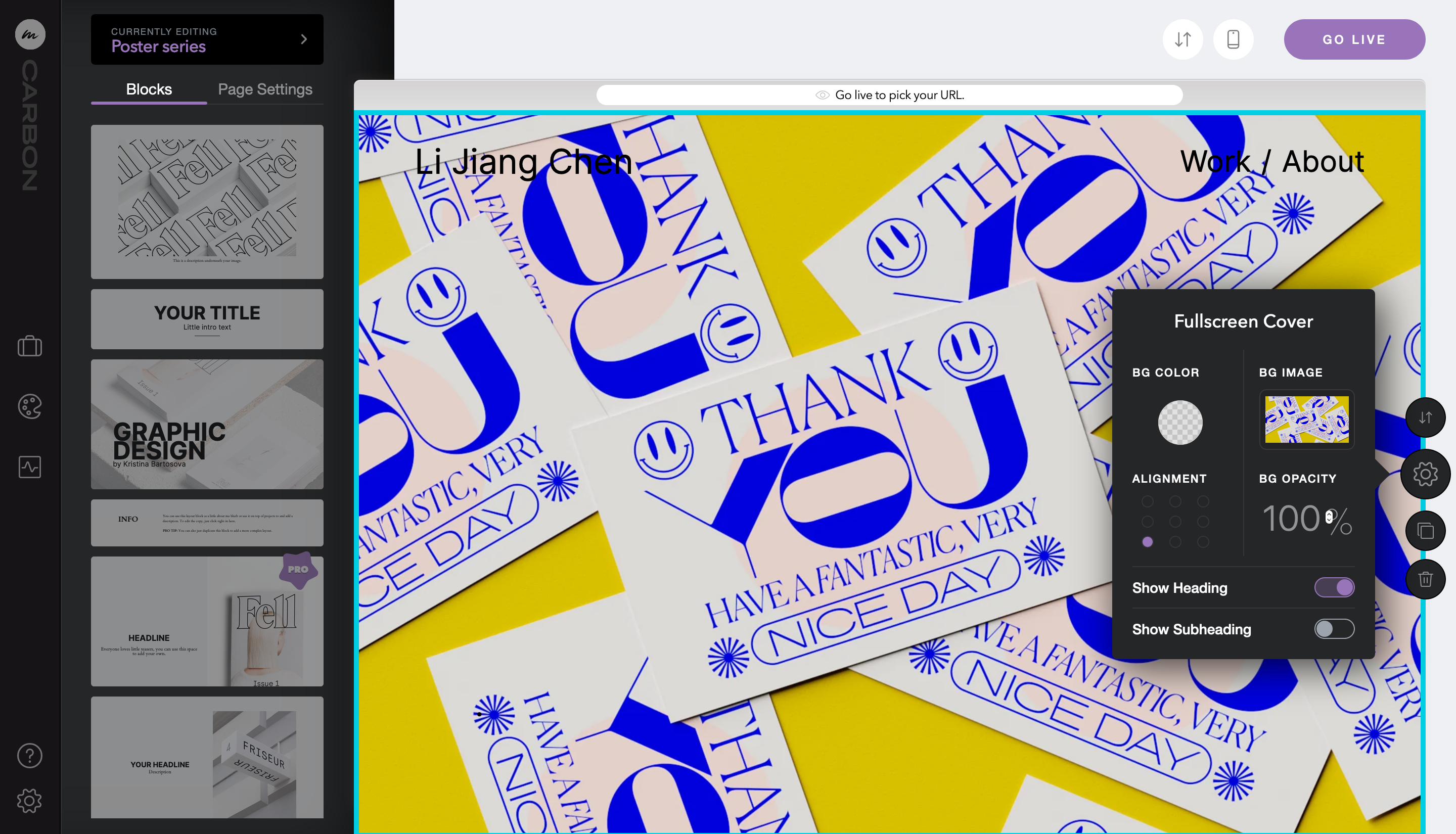
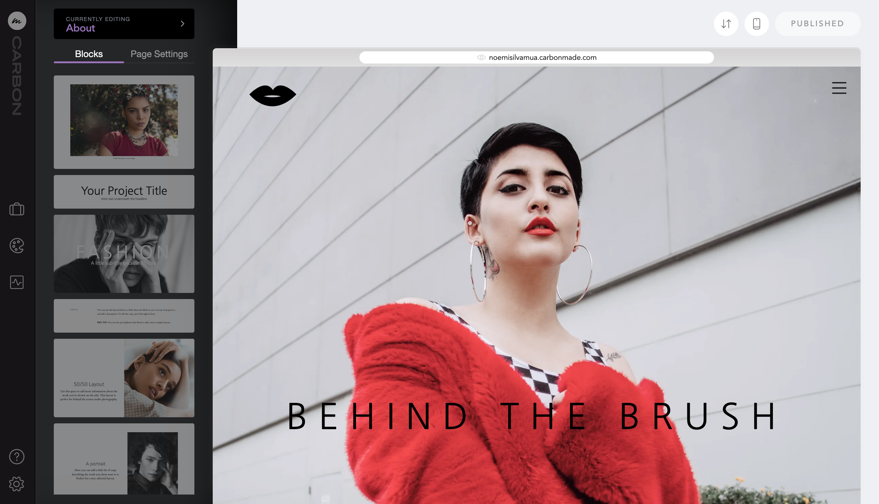
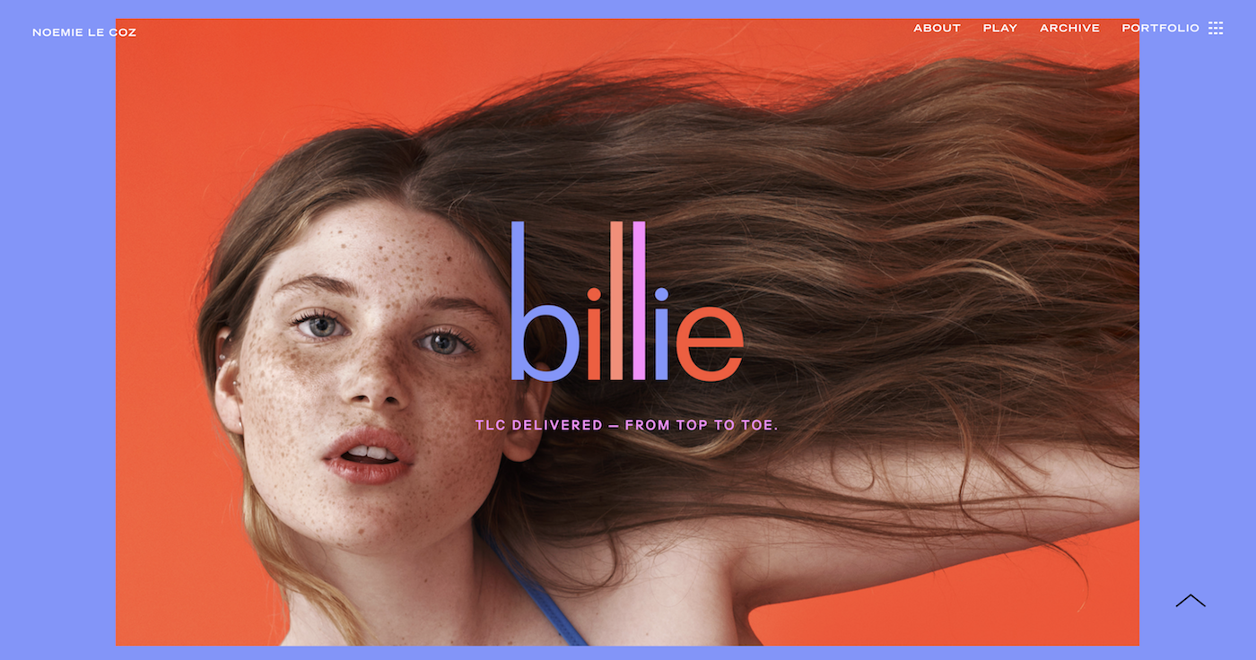
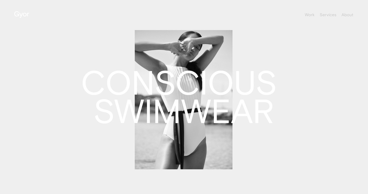
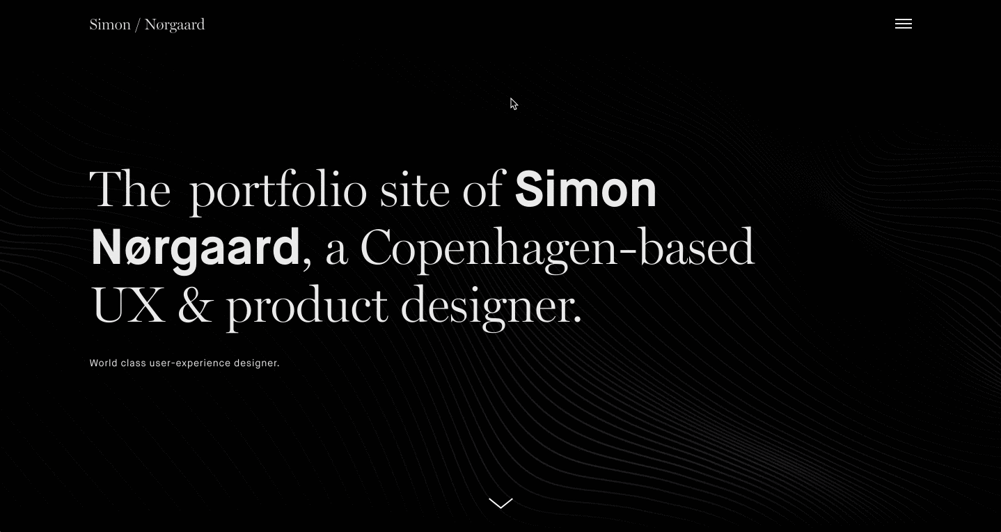
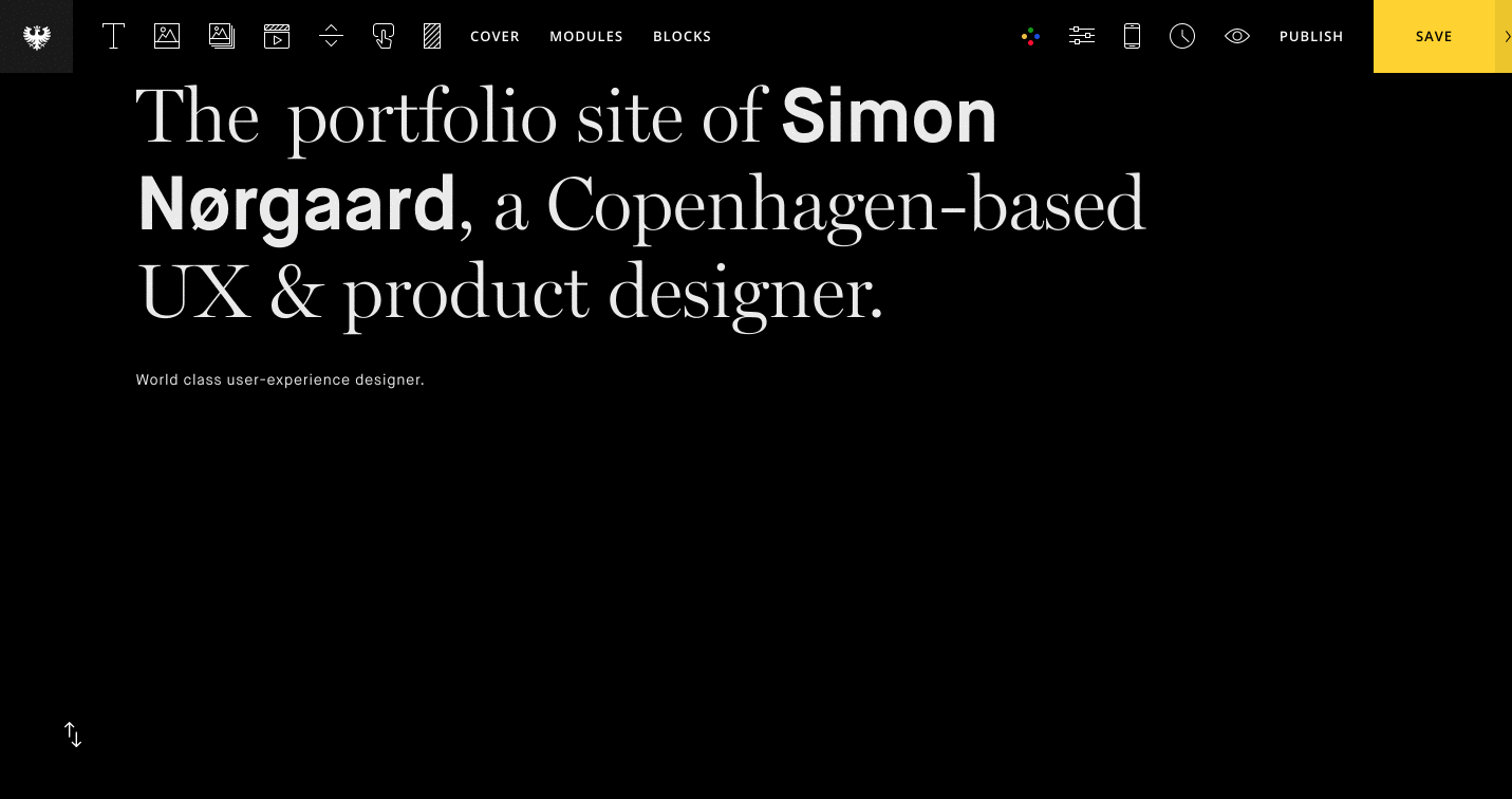
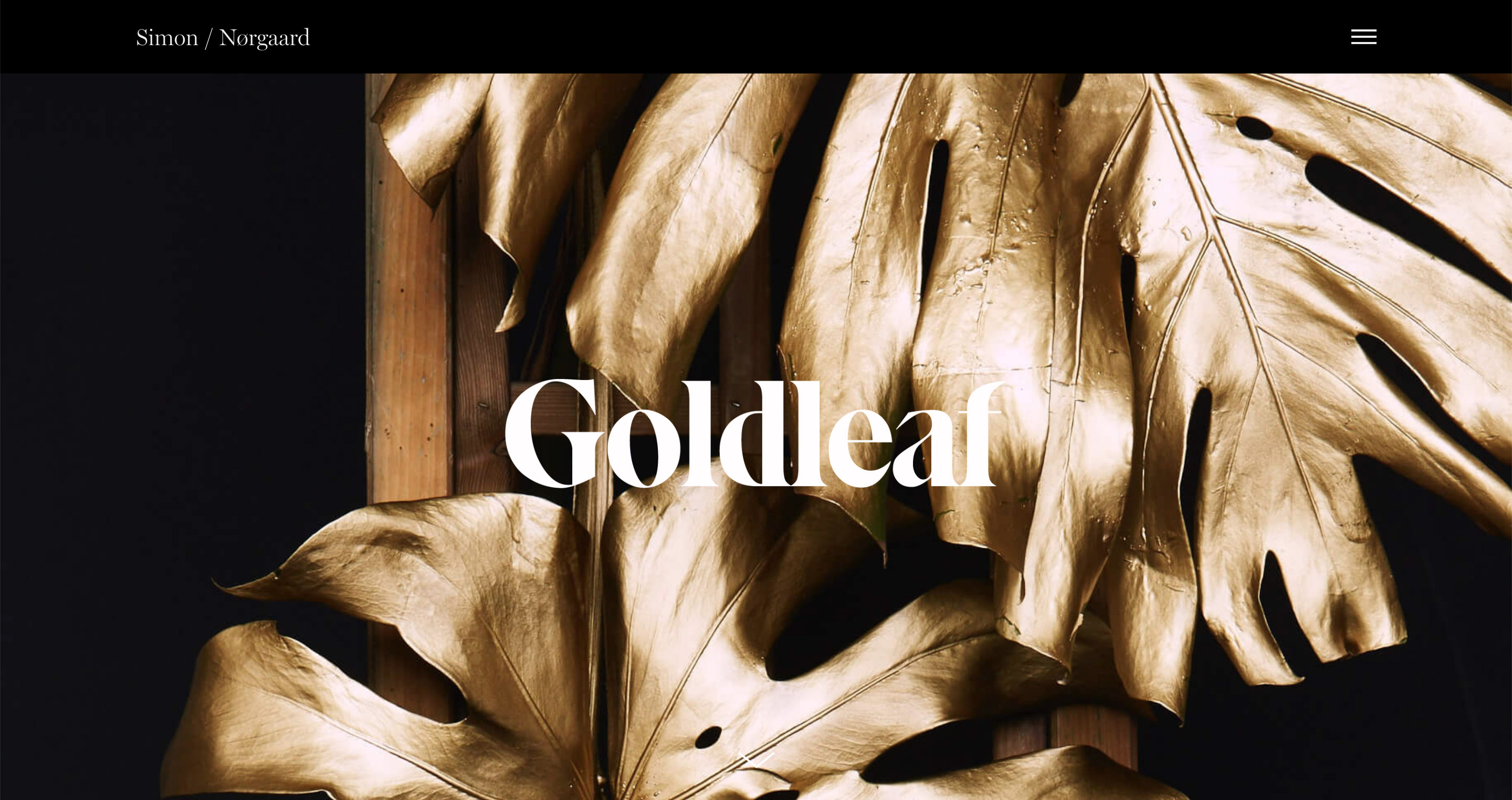
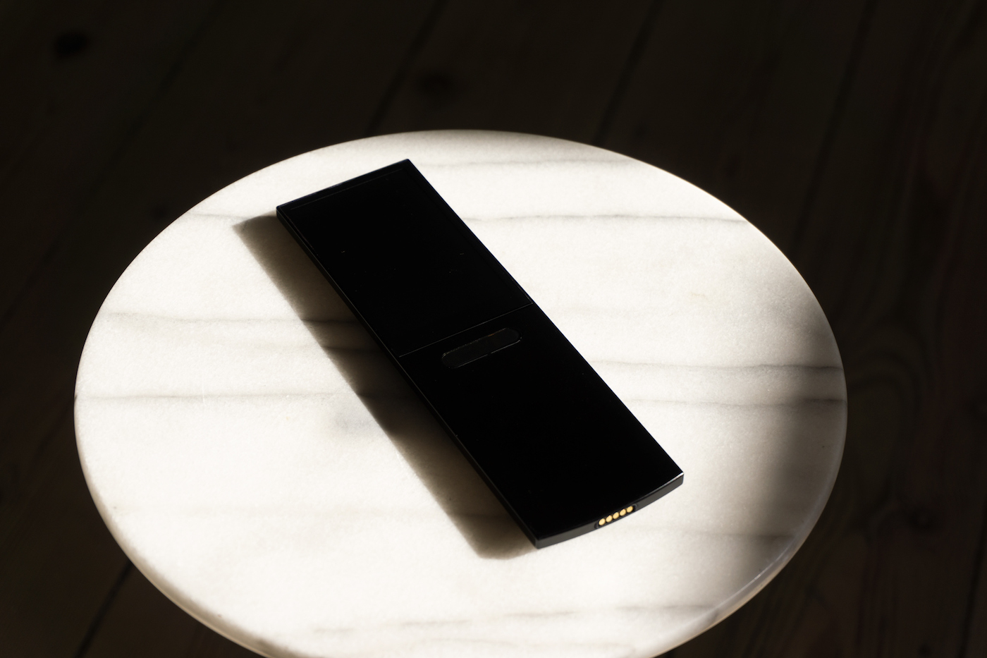
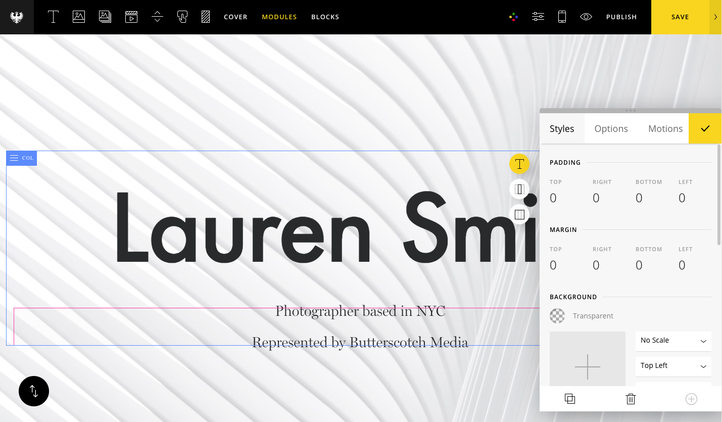
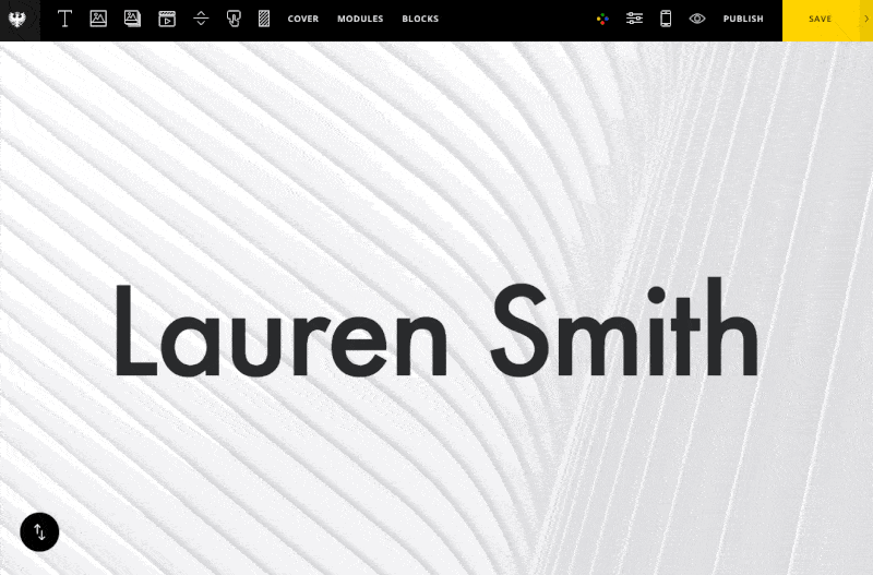
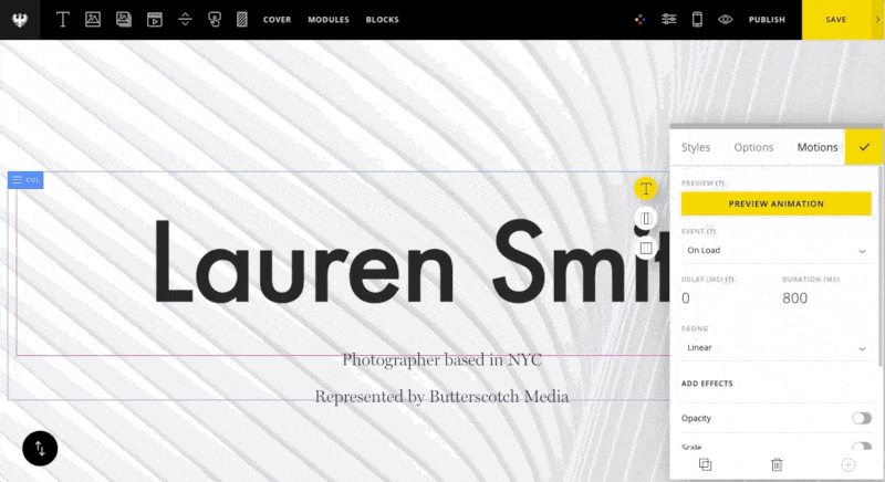
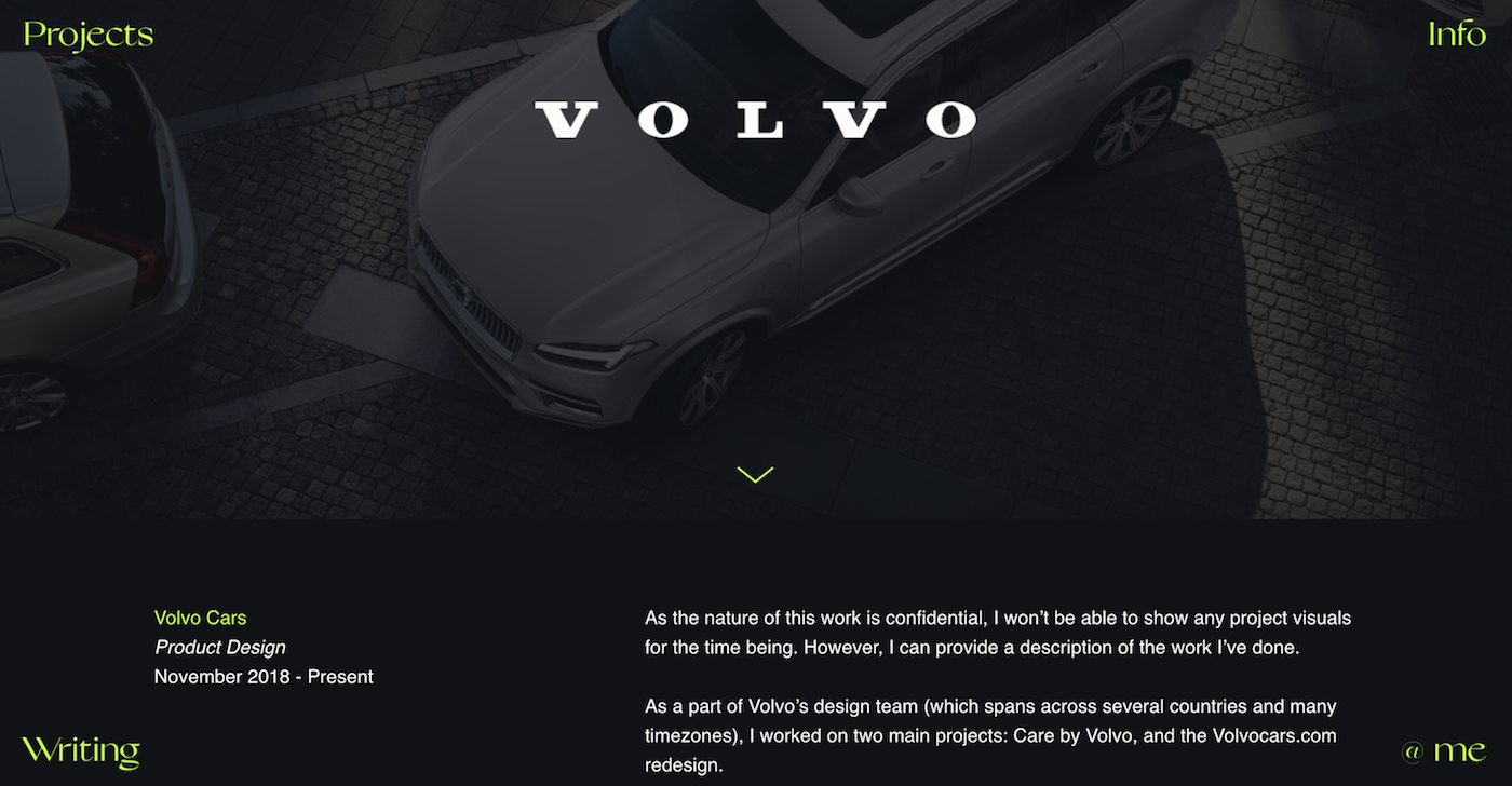
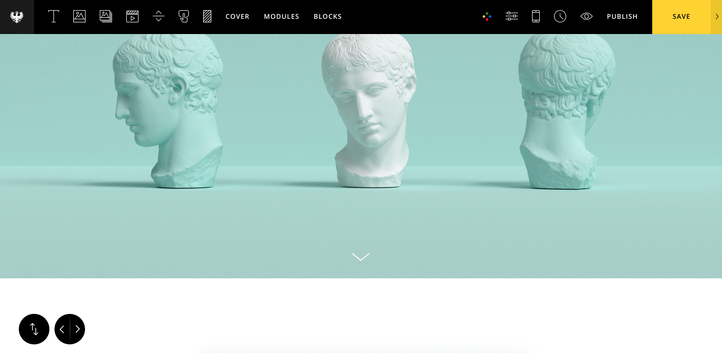
Now that we've set up our Project, let's add a Cover section. In Semplice, Cover sections are like hero sections, and are typically used with large headlines or full-width imagery for maximum visual impact.

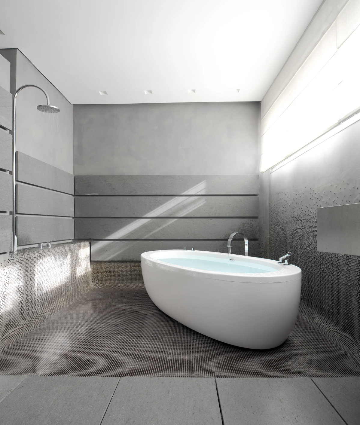
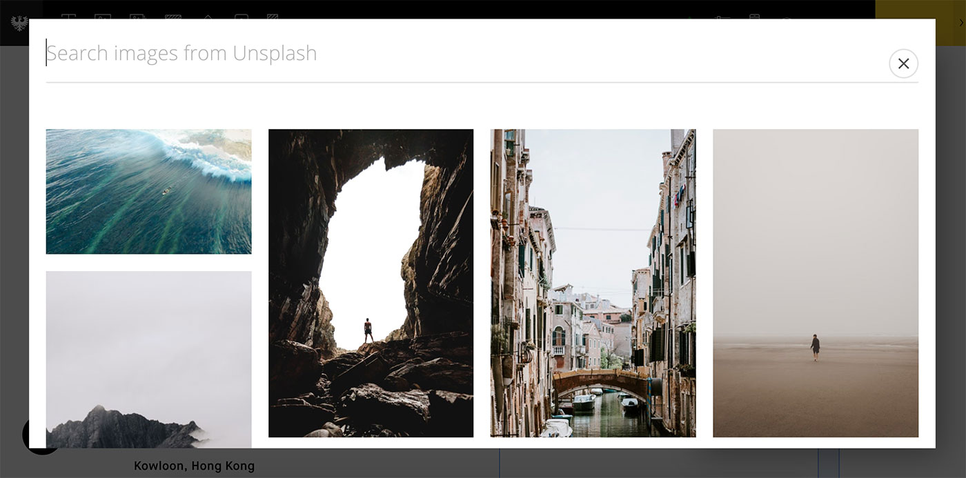
For our purposes, we will use a nice, large image to introduce the page and set the stage. Go to the Cover tab from up top, and from the pop-up editor select "Cover (full-width)" from the dropdown.

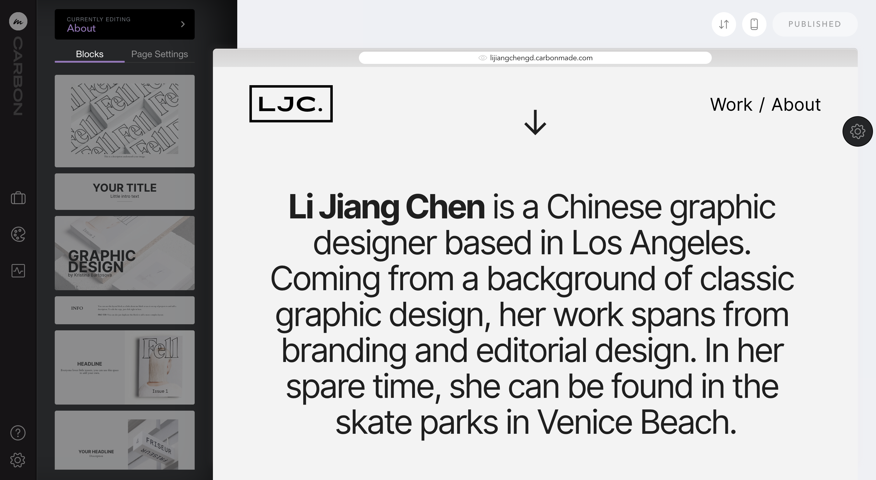
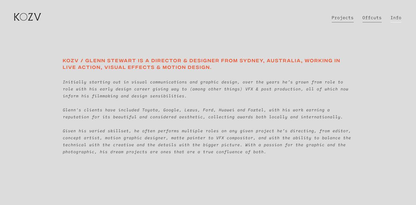
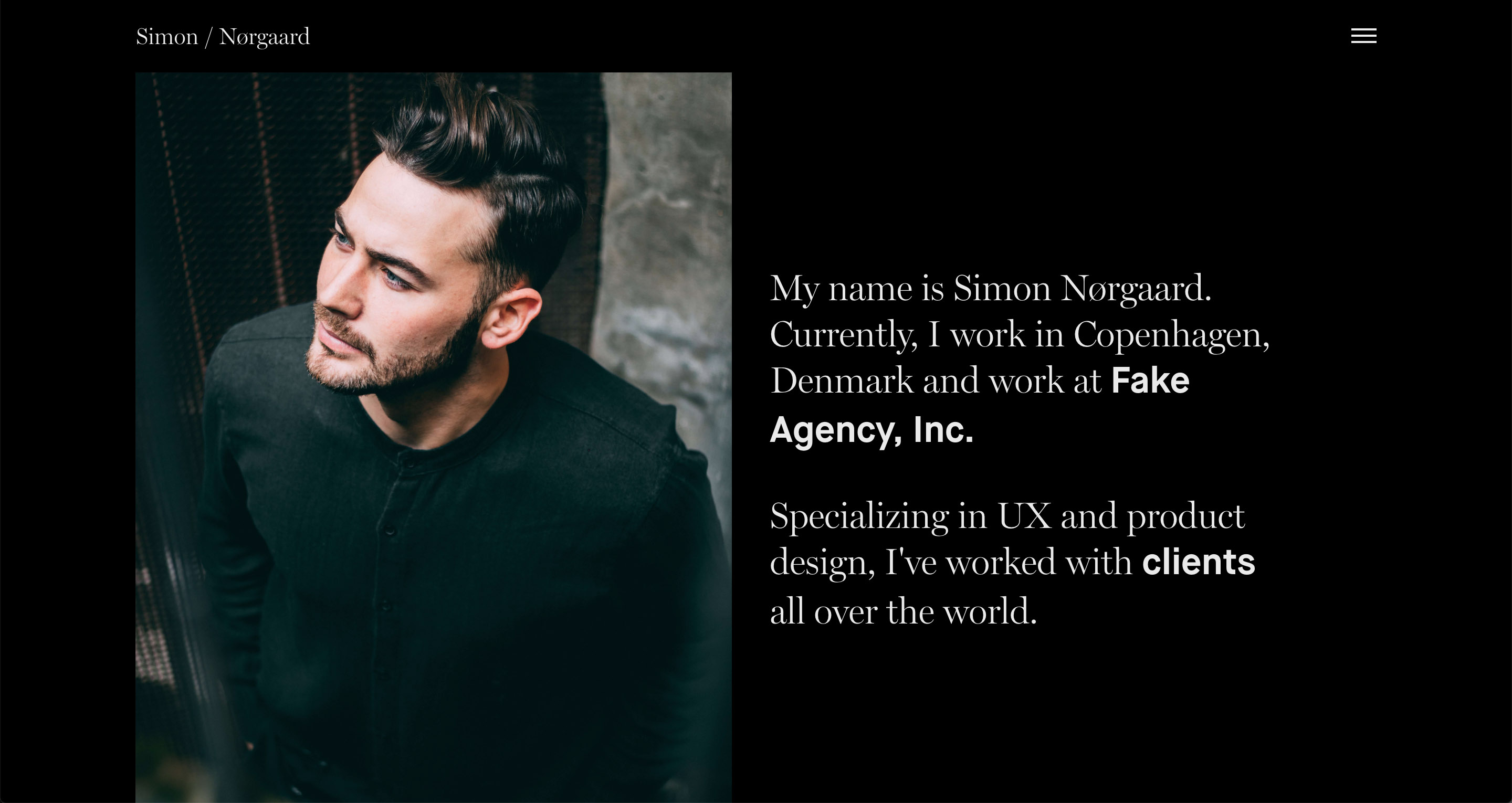
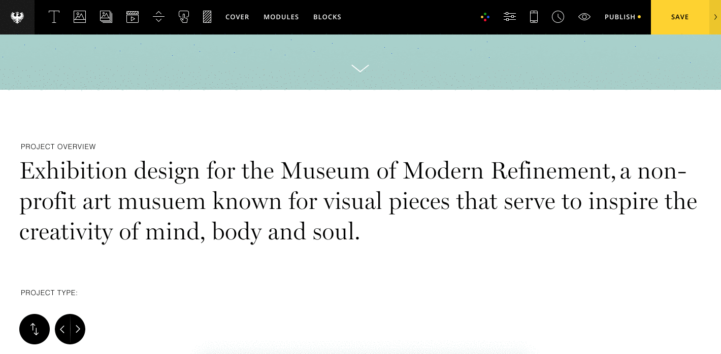
Creating the introduction section

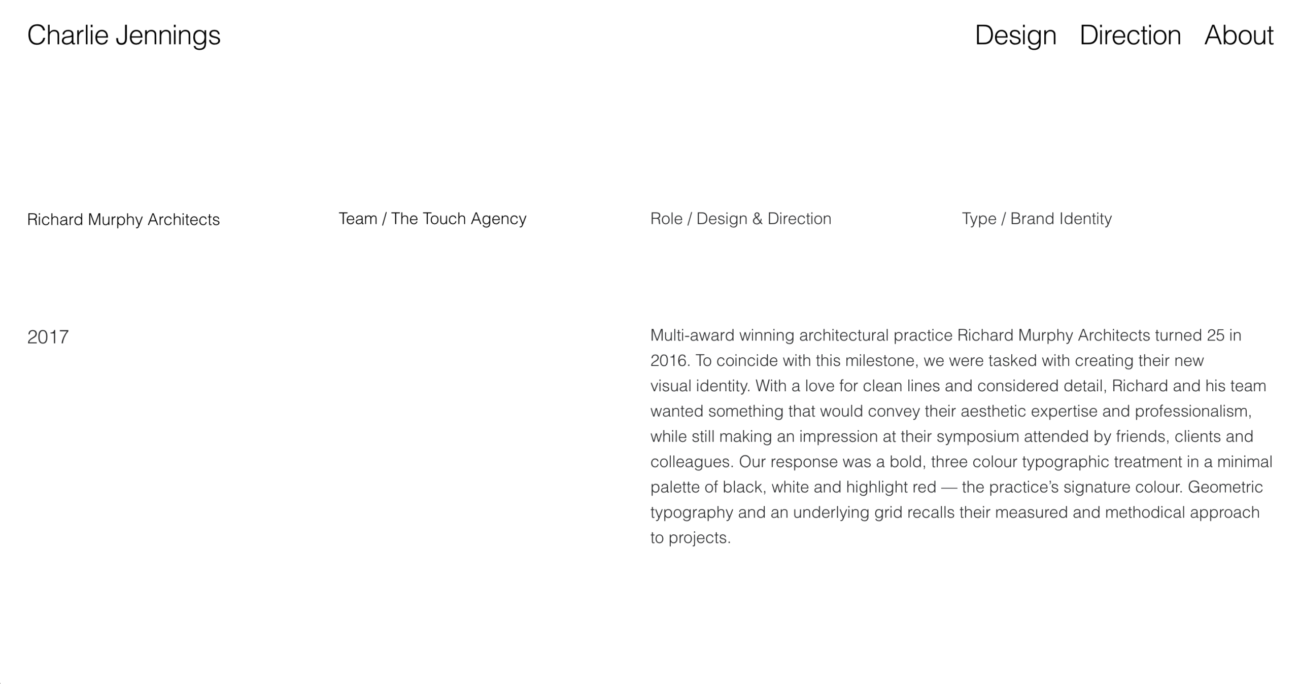
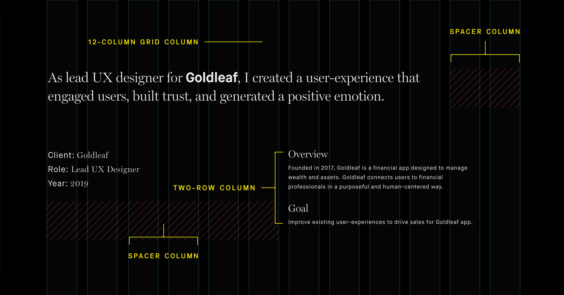
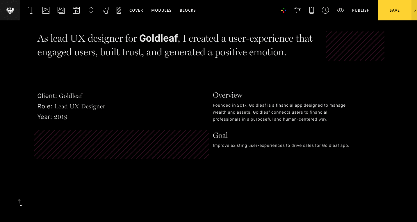
This section will serve to introduce the project and include necessary details like year of completion and credits.

First, let's add a text module with some larger text to serve as the project overview. Just add a simple sentence or two to briefly summarize the project. We will go in further detail below.

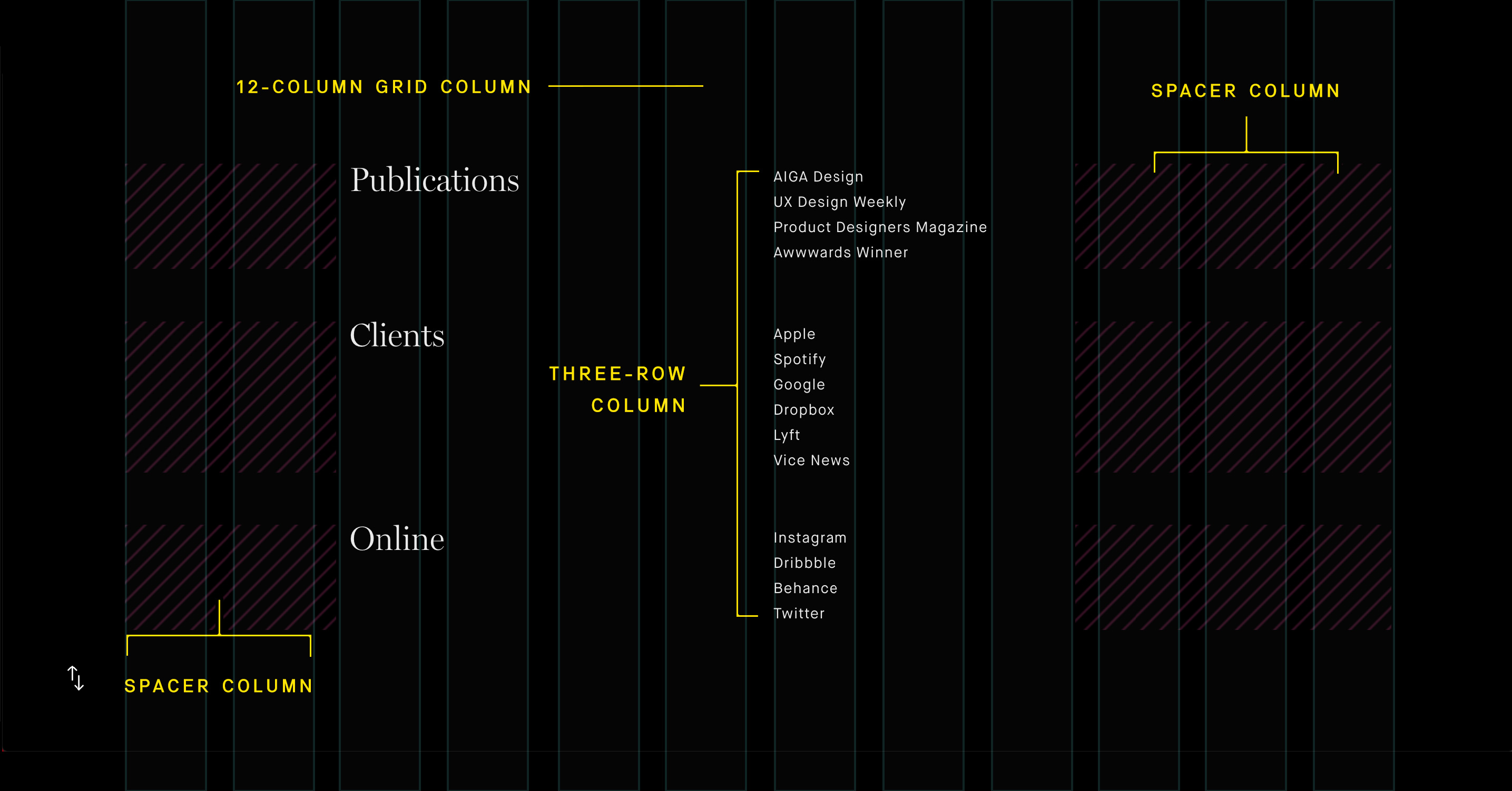
Next, let's add some of the smaller details such as credits. You can place Text modules stacked in rows to create both the subheadings and text lists for these areas. Once we have our text styled the way we want it, we can duplicate the column to quickly recreate our layout. If needed, we can also use spacer columns to offset the columns and create white space.

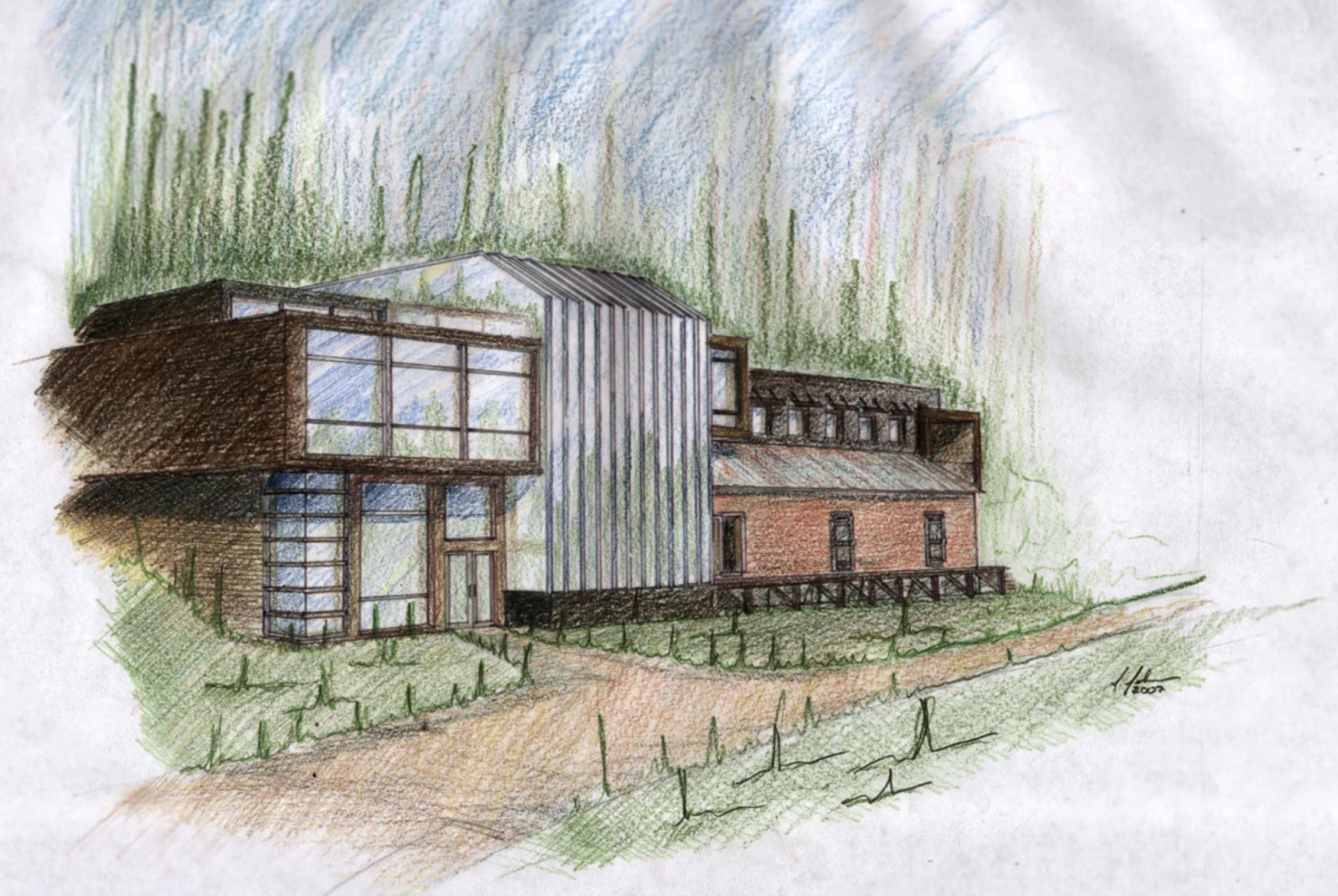
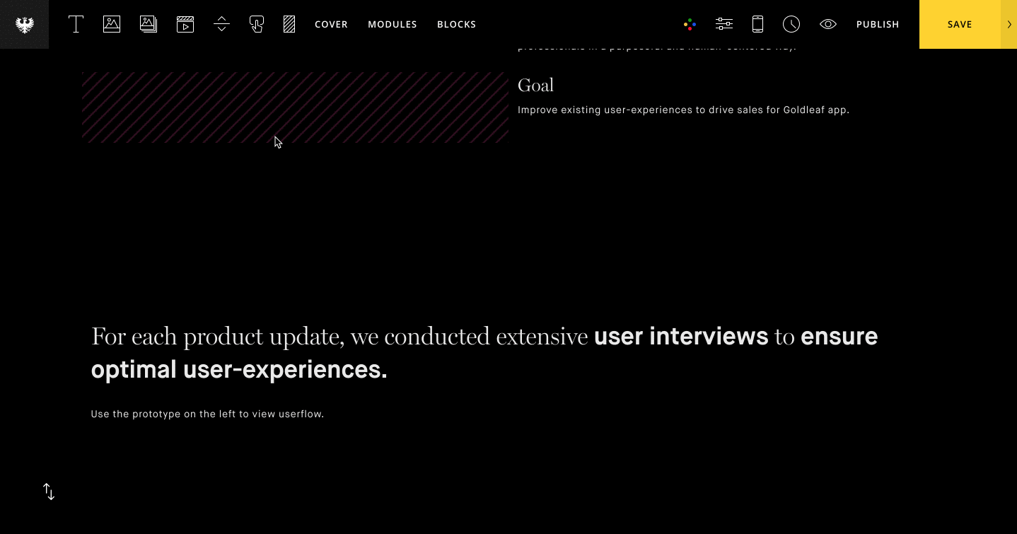
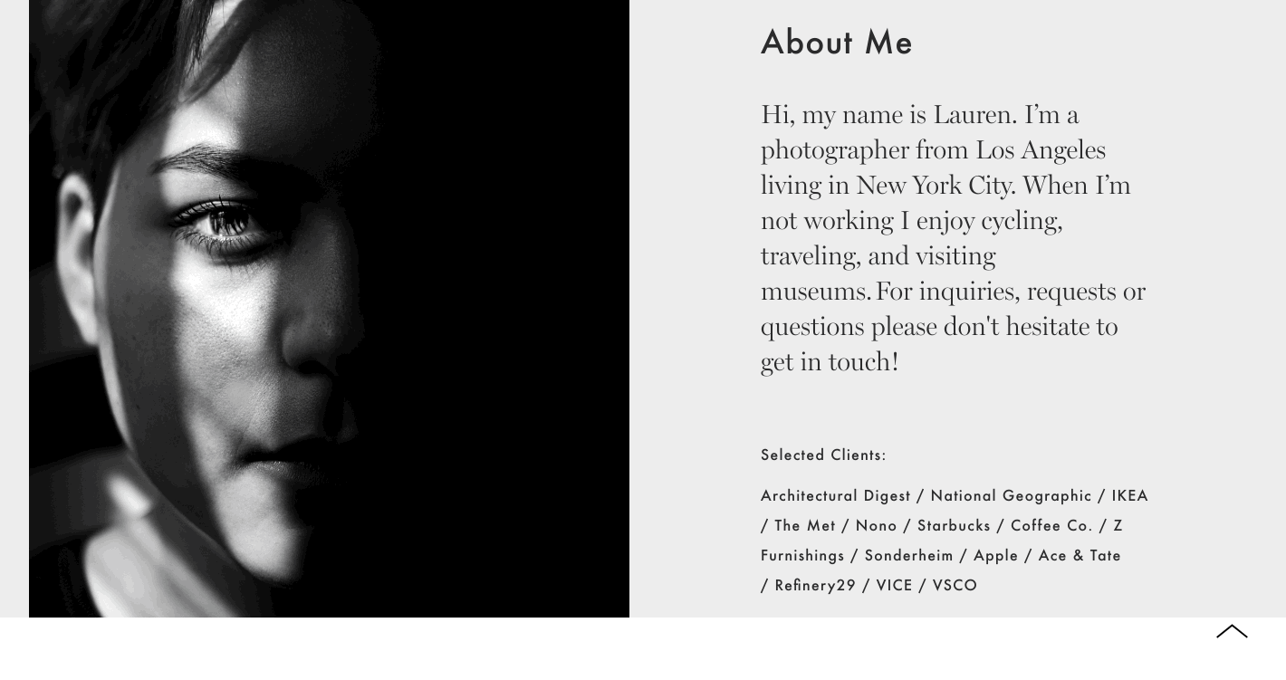
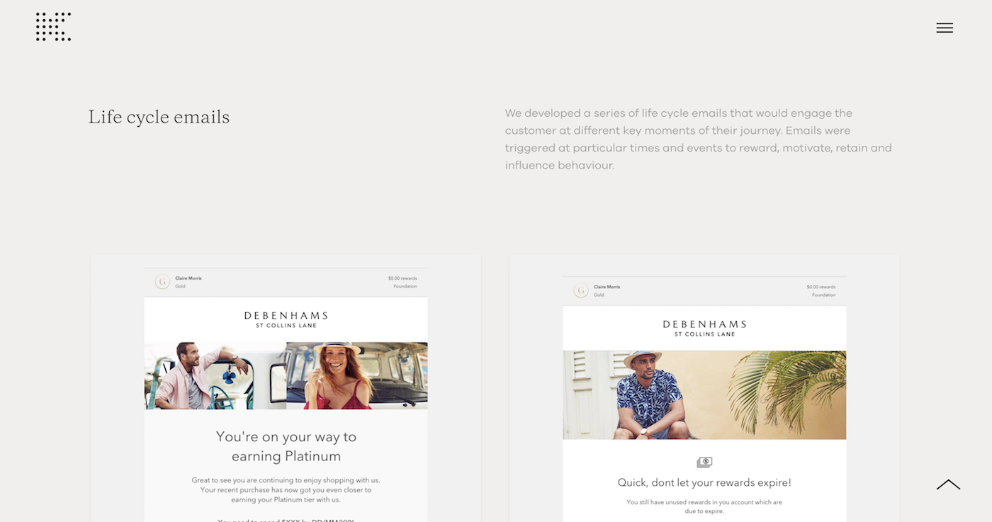
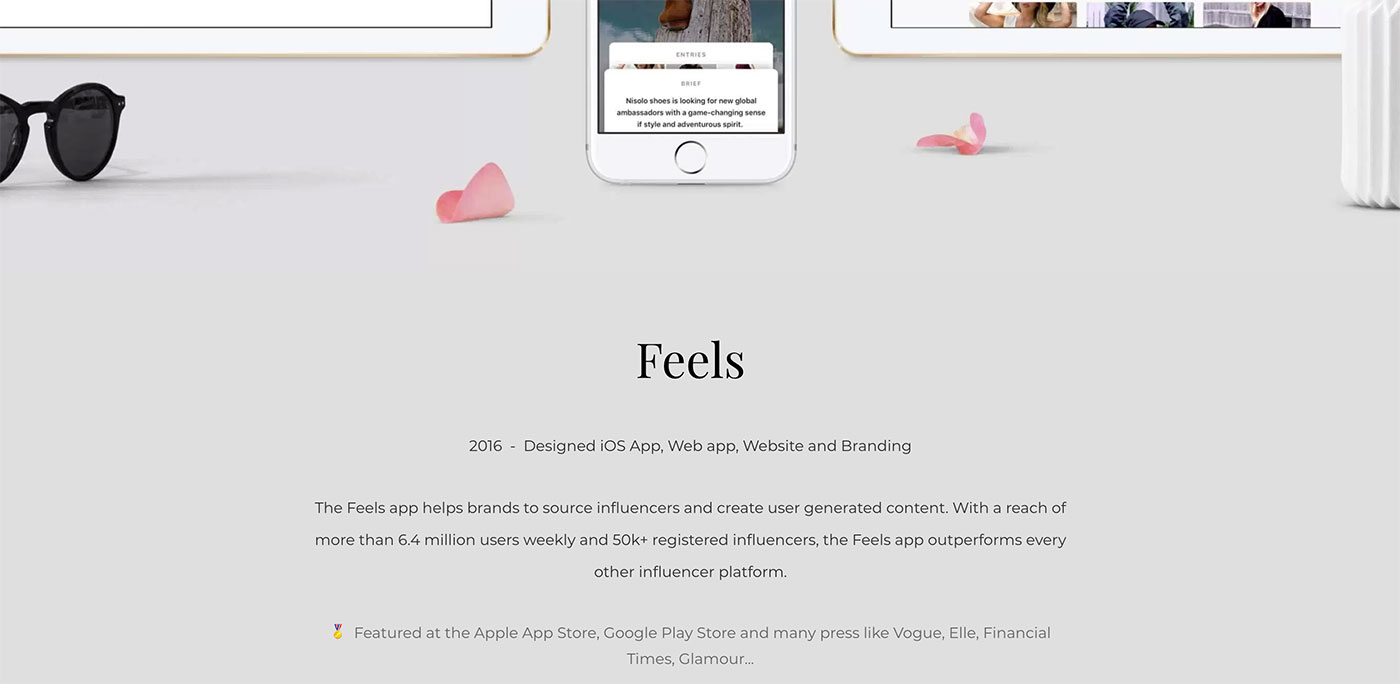
Now, below our overview, we'll go more in-depth about the project and explain our involvement. A simple text module and image module side-by-side will do the trick. If you need tips for writing the copy in your case study, read this article.

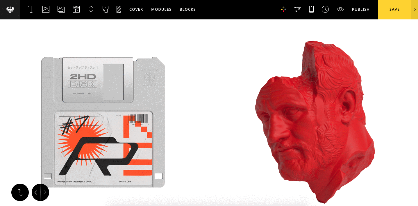
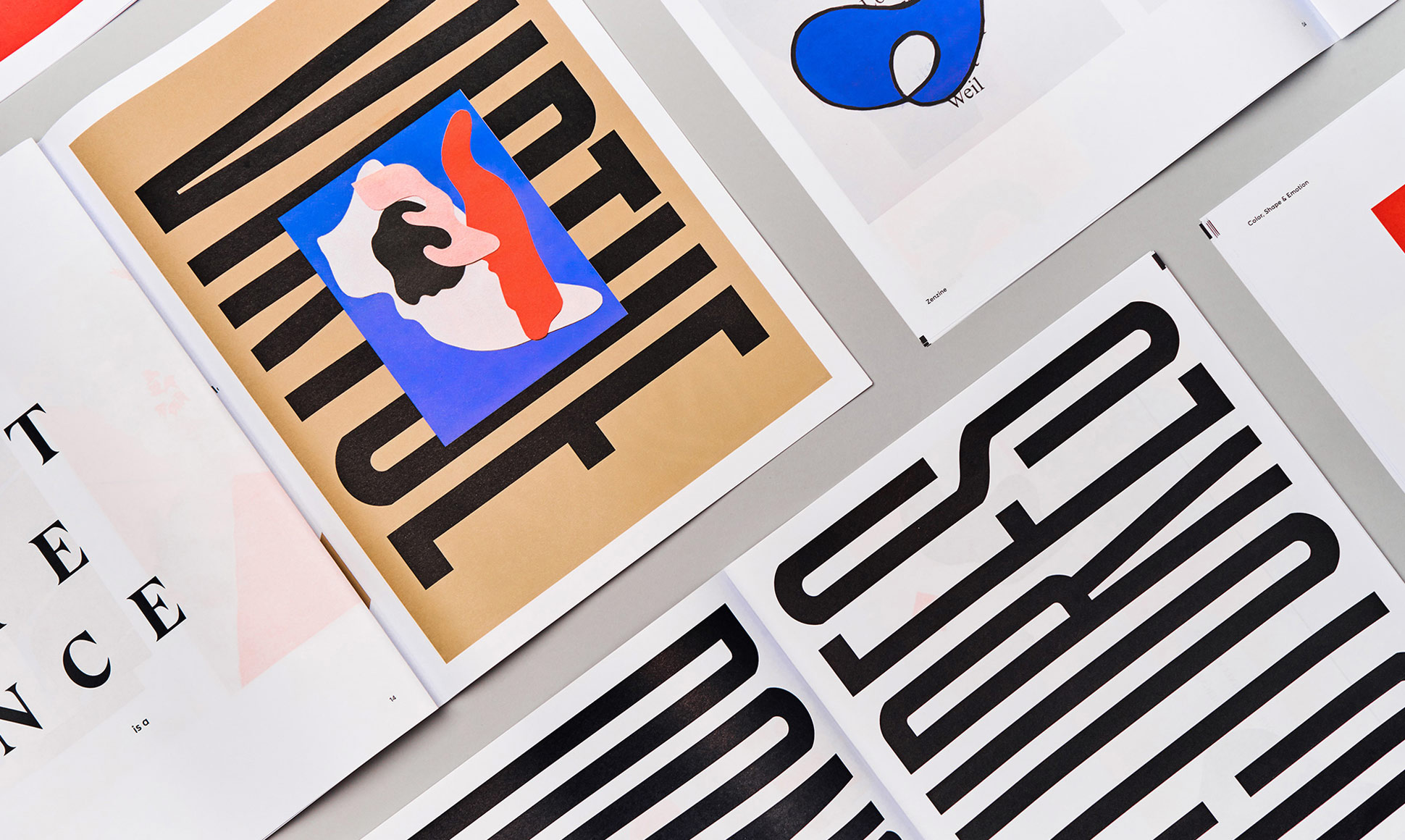
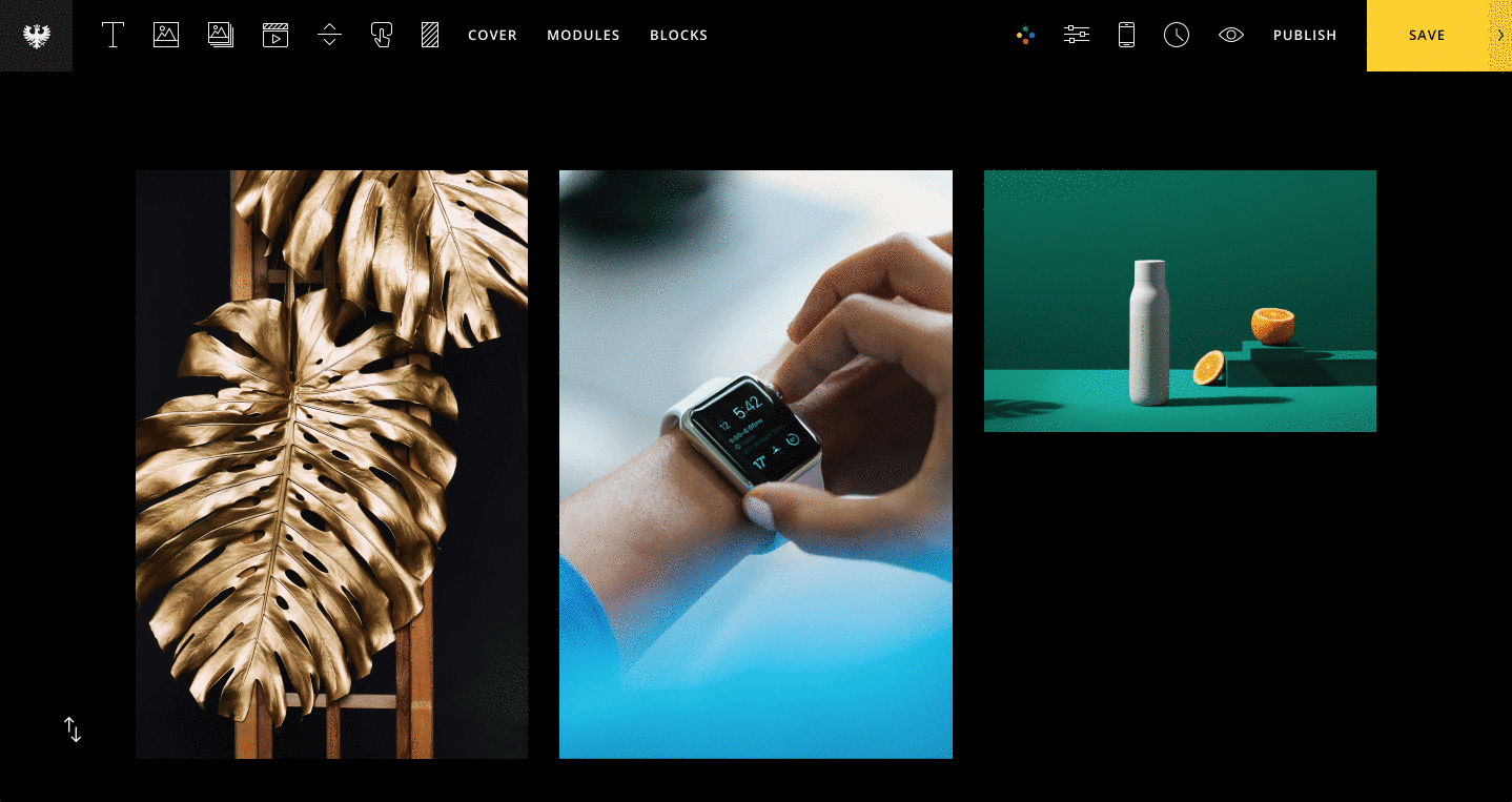
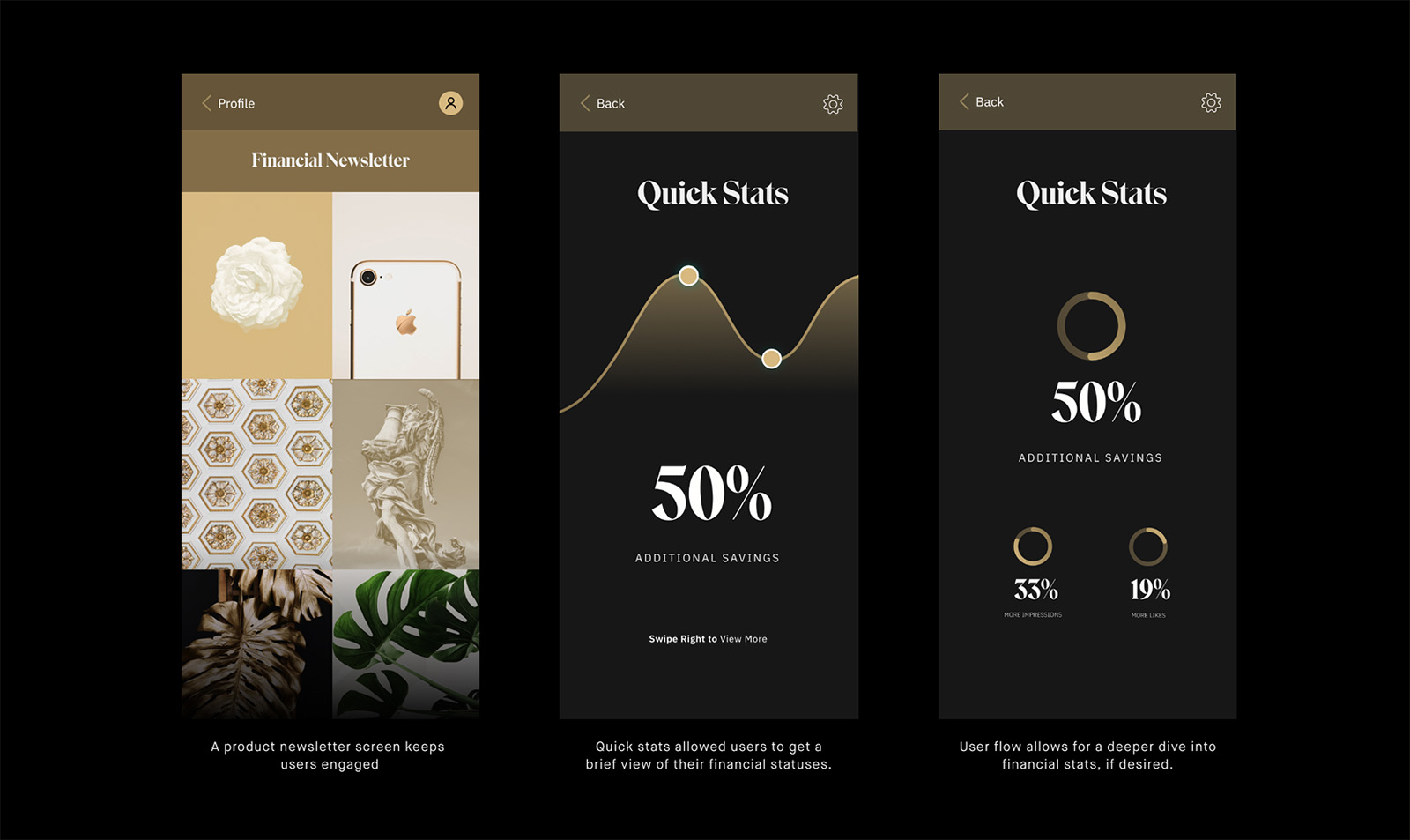
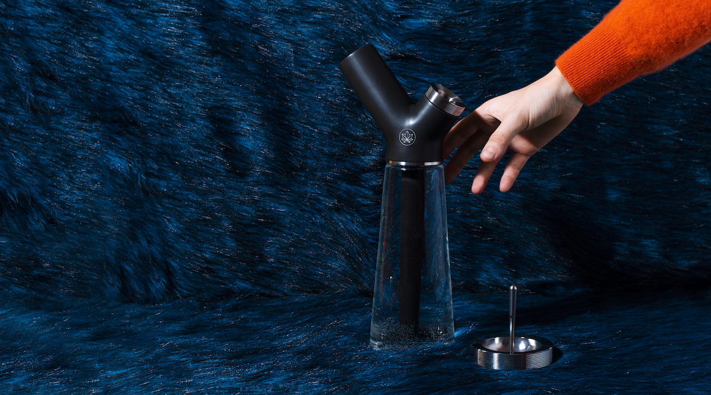
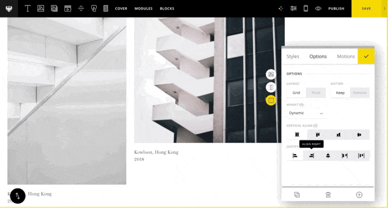
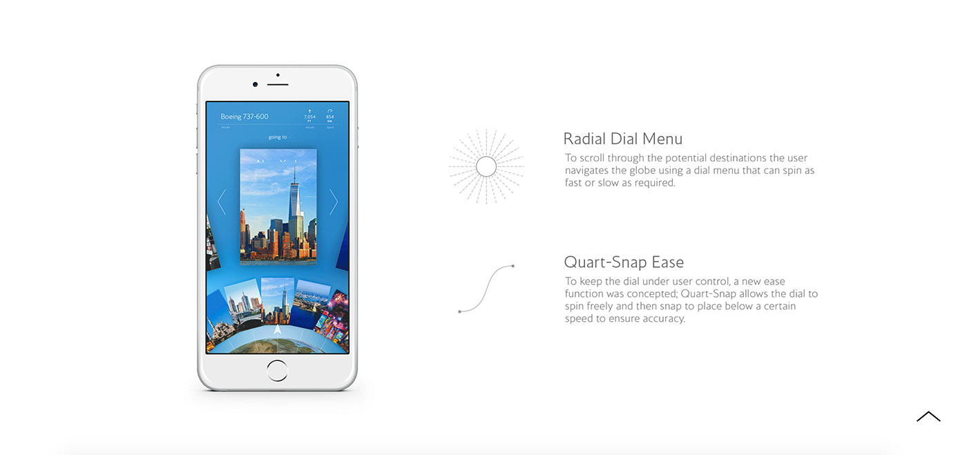
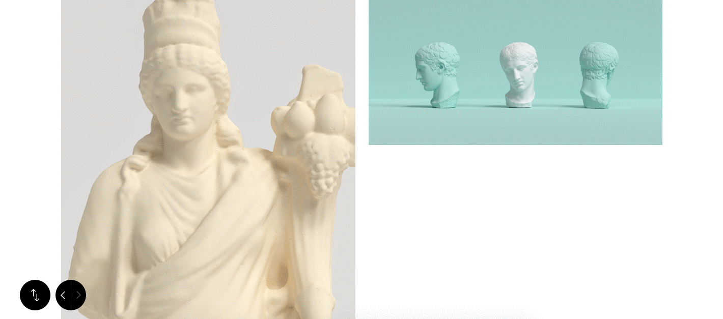
Adding detail images

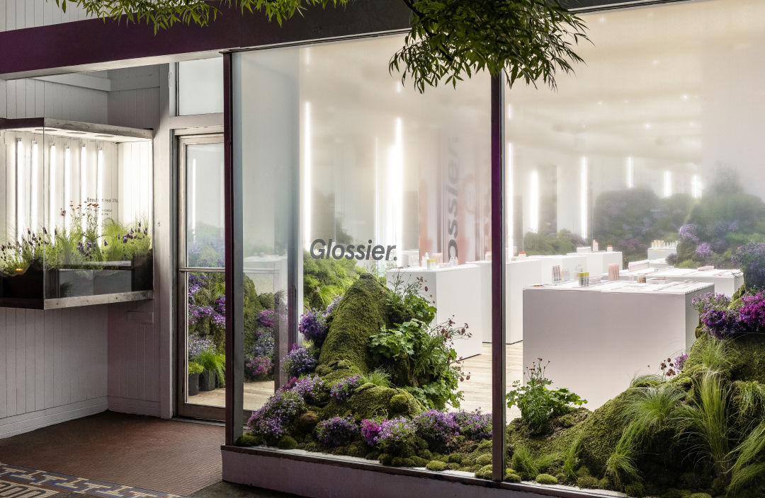
Next, let's create a section where we can add images that support our case study. Think of your case study like a spread in a magazine, and put images alongside relevant copy, to make the reading experience highly visual and easy to scan.

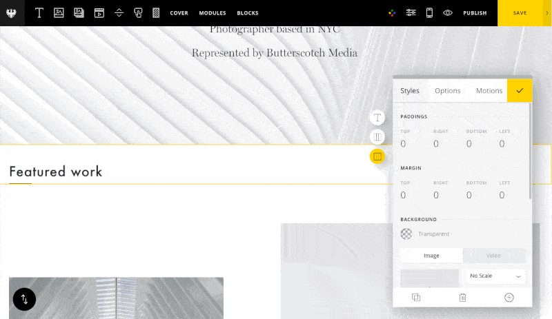
For this section, I'll make some of the images "bleed" to the edge of the screen. This will add break up the visual flow of the page nicely. To do this, go to the section options and set the gutters to "off."

Setting our section to be full-width with no gutters.

I will also use spacer columns once again to offset the image columns and create some interesting variations in the layout.

Adding a spacer column to create white space

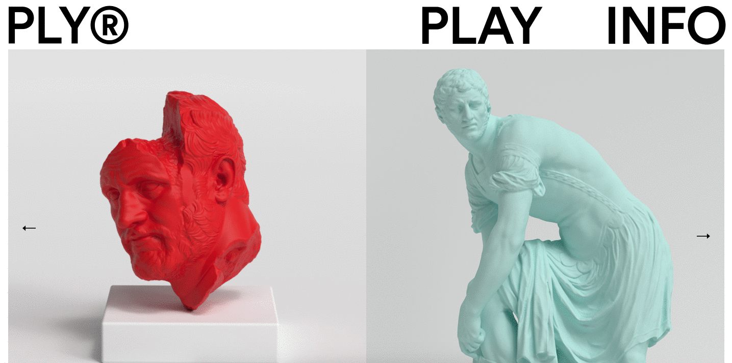
I've also placed text modules beneath each image for a caption, so we can give context to each image and allow those who want to scan (let's be honest, most readers) to understand our project story at a glance.

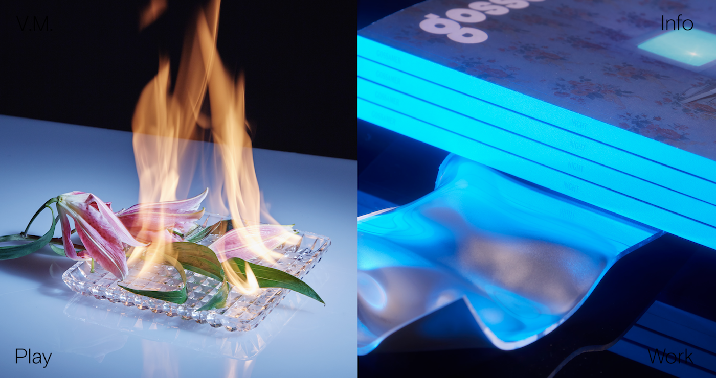
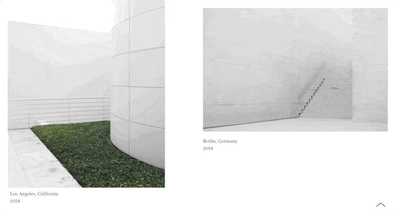
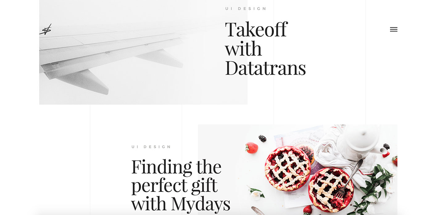
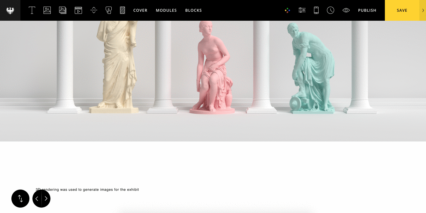
Adding a full-width image section

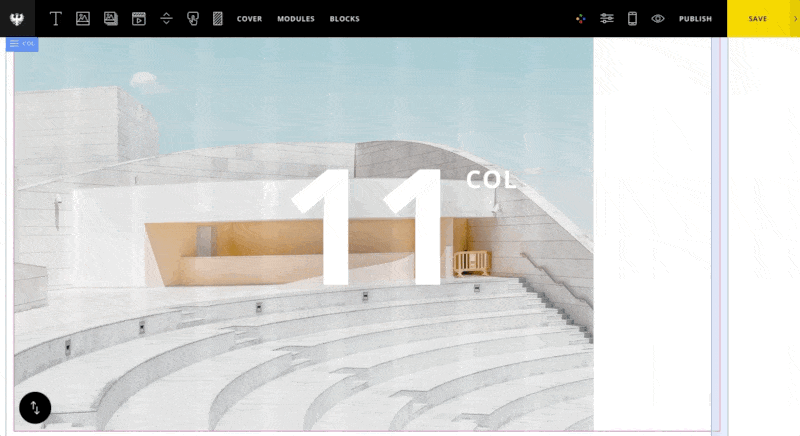
Now we'll add some full-width images to break up our page between paragraphs. For our full-width image section, simply place an image module on the page. In the image options, set the image size to "grid width" and in the section options, set the width to "full-width" with gutters removed.

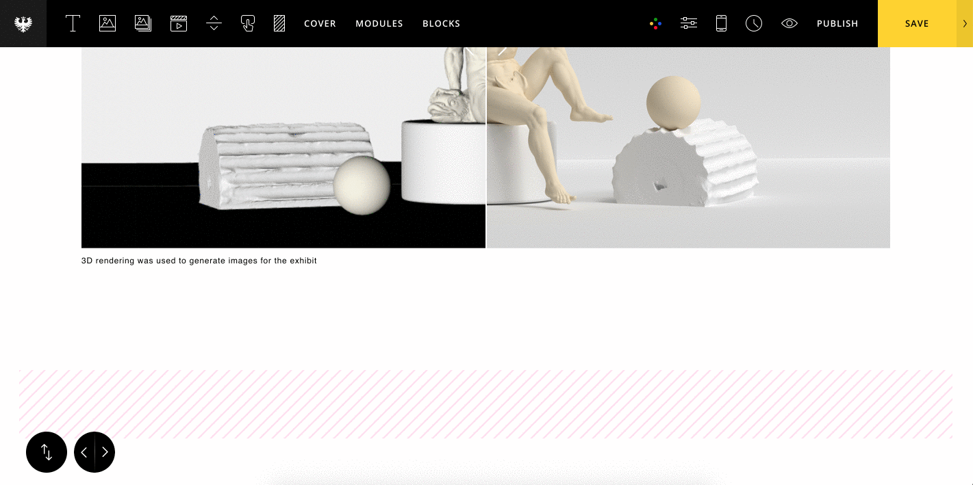
Before/After comparison

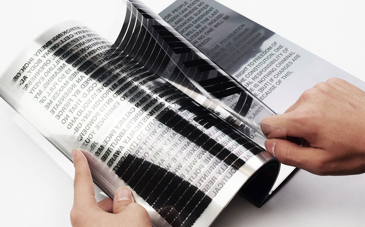
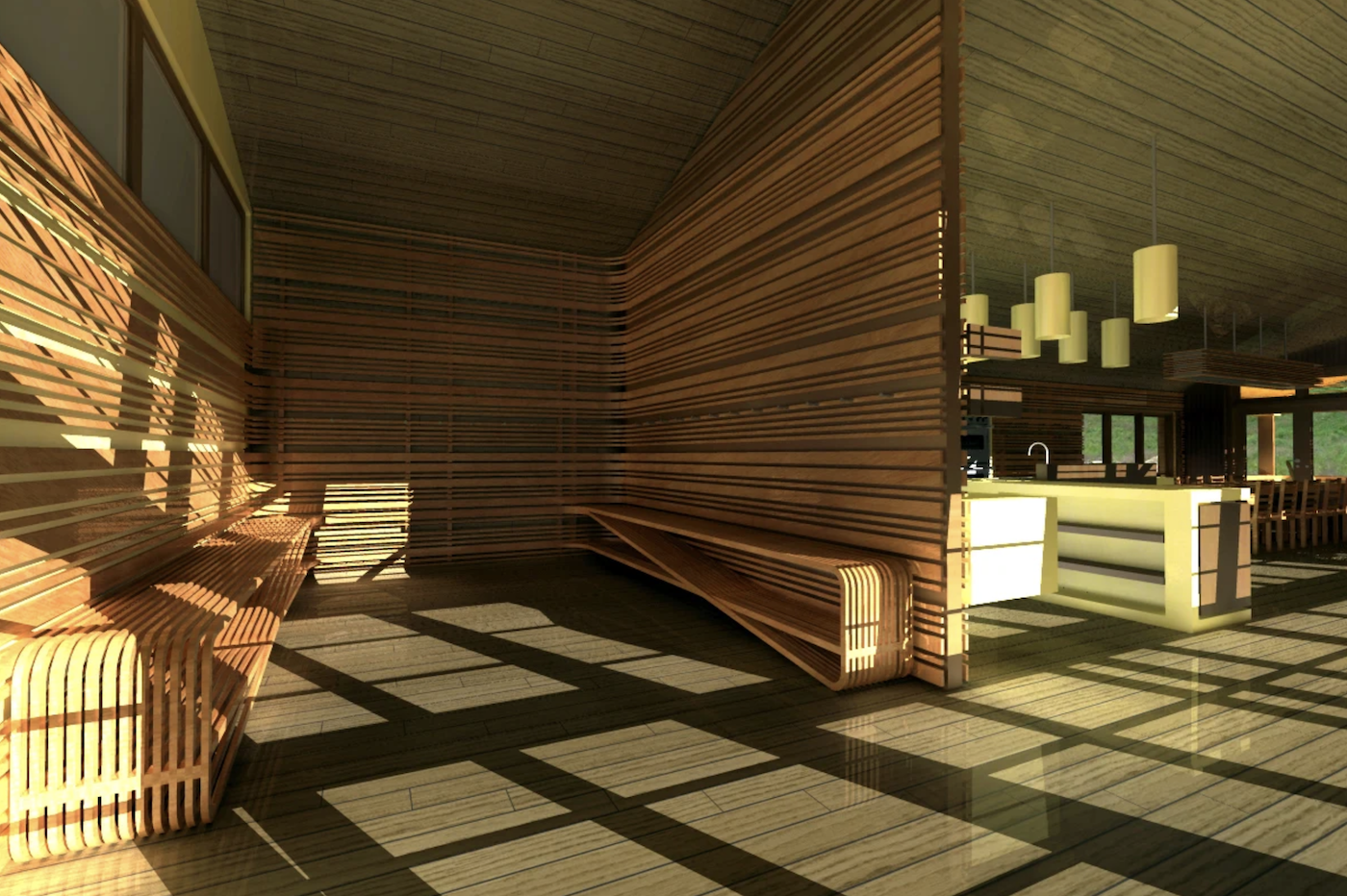
Now for the fun part. To visually explain our process and help readers appreciate the work that went into our project, we'll use the Before/After module to display our final result. In this case, we will show a behind-the-scenes view of our prototype in the 3D rendering program, sliding to reveal the final outcome. You can do the same with a UX prototype next to your final screen design, for example.

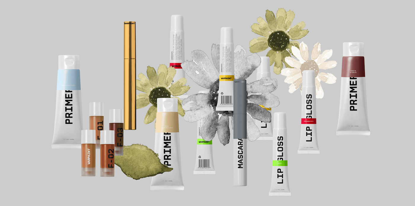
Adding image galleries

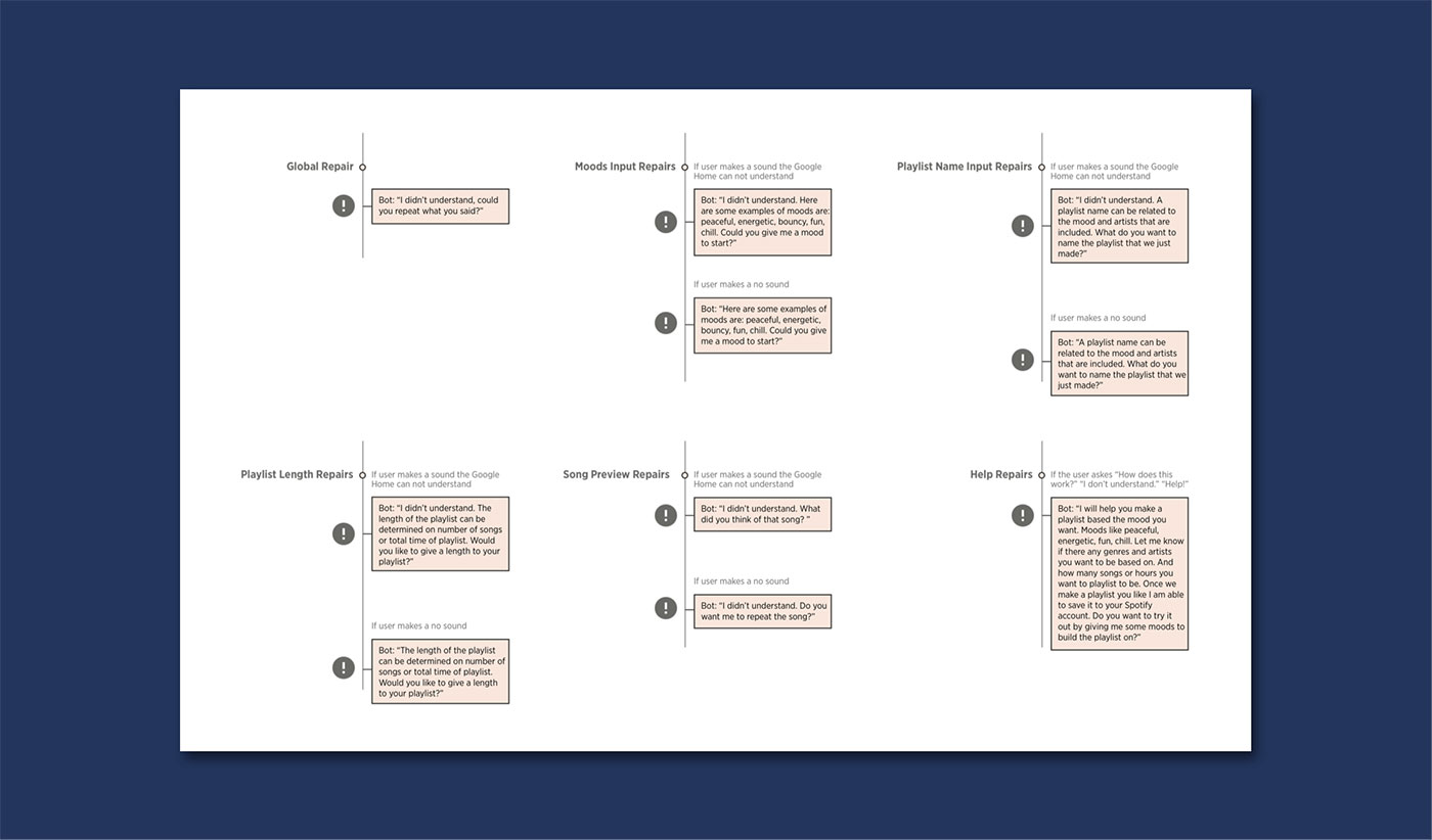
If you have lots of images for your project, or a collection of similar images, you can also add image galleries to your page.

Let's place some offset galleries onto the page. We will also use this section to talk about the final results of our project and how it was successful.

Wrapping up

To wrap up the case study, we'll give a little shoutout to our team.

We'll also make sure the Next/Previous feature is enabled. This is a feature in Semplice that allows viewers to quickly jump between projects at the bottom of a case study to continue browsing.

Thank you

We created everything here with the Studio edition of Semplice, which gives you all the latest Semplice features. No matter what tool you use to create your case study, we hope this tutorial inspired you to create thoughtful, unique case studies to tell your project stories. We can't wait to see what you make!

August 10, 2020No Comments

How to make a great work page for your portfolio: A Semplice tutorial

Your Work page (often your homepage), is your first impression. It tells the story of your work when you're not there to do it. And with Semplice, there are many ways to tell that story.

From our Advanced Portfolio Grids to the traditional Portfolio Grid to manually building your page, Semplice allows you to create essentially anything you design, without templates.

Here are just a few recent examples we've enjoyed lately from the Semplice Showcase:

Yu Rong

Instead of using your standard thumbnail format, Yu opts to use mockups and devices overlaid on top of large, marquee typography. It makes for a fun scrolling experience as you scroll and immediately shows how Yu Rong thinks outside-the-box.

Ayaka Ito

Ayaka uses the Advanced Portfolio Grid feature (comes with Semplice Studio) to showcase her work. She makes every element her own, using beautiful type, custom hover effects and colors that complement each thumbnail.

Studio MPLS

Studio MPLS uses a more traditional approach to the portfolio grid, but makes heavy use of the thumbnail hover effect. This effect gives you a visual preview of each project on hover, adding to the visual excitement and encouraging a click.

Leandro Assis

Like Yu Rong's site, Leandro makes use of a fixed background image with overlaid portfolio grid items. The design highlights Leandro's personality and creates a joyful scrolling experience.

Tracy Doyle

For her portfolio, Tracy used a minimalist approach. Instead of relying on visuals, she uses a simple text grid that puts emphasis on the high-profile clients she's worked with.


What we'll be creating

For this tutorial, I'll show you how you can quickly and easily create a compelling work page using Semplice. We'll explore a variety of four different approaches to the work page design, giving you just a sample of different options and layouts you can use to show off your work.

I've created fake studio called PLY® Studio featuring some of my own personal work. This is what we will use to build out our Work page.

We will use a fake studio to create our portfolio site. Work samples by Jon Vio.

Getting started

First, we need to create some projects that will appear on our Work page. If you're just starting out with Semplice, here is a help guide for creating your first project.

With our projects created, let's open up a fresh page in Semplice. Name the page "Work" or something similar.

1. The standard grid

The standard grid of thumbnails, what we call the Portfolio Grid in Semplice, is a tried and true way to show off your work in a clean and simple way:

VIEW THE LIVE DEMO

The Portfolio Grid consists of a masonry-style, 12-column grid comprised of your project thumbnails. Each project thumbnail can be given a custom column width. There are a variety of options to customize your Portfolio Grid width, including adding a thumbnail hover effect, live project filtering, and more.

Let's go ahead and place the Portfolio Grid on our page:

You'll notice right away the Portfolio Grid is populated with our projects. If you don't see your projects right away, make sure they are PUBLISHED and not set to DRAFT.

Let's now adjust our project thumbnail widths to evenly space out our thumbnails and create a nicely aligned grid. I've set my first project to 12 columns, which will give us a full-width effect. To get the two-column format, we'll set the next two projects to have column widths of 6. For the smaller images, we can set these to display three rows across by setting each column width to 4.

PRO TIP: You can quickly adjust individual project settings by hovering over the thumbnail from the Portfolio Grid and clicking the edit settings icon.

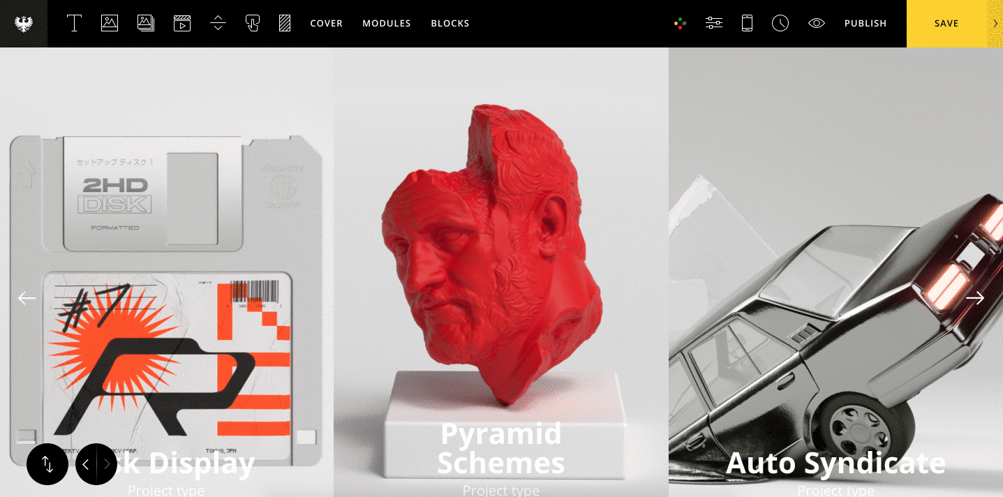
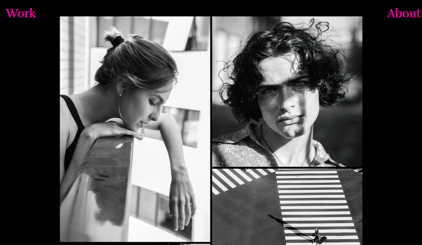
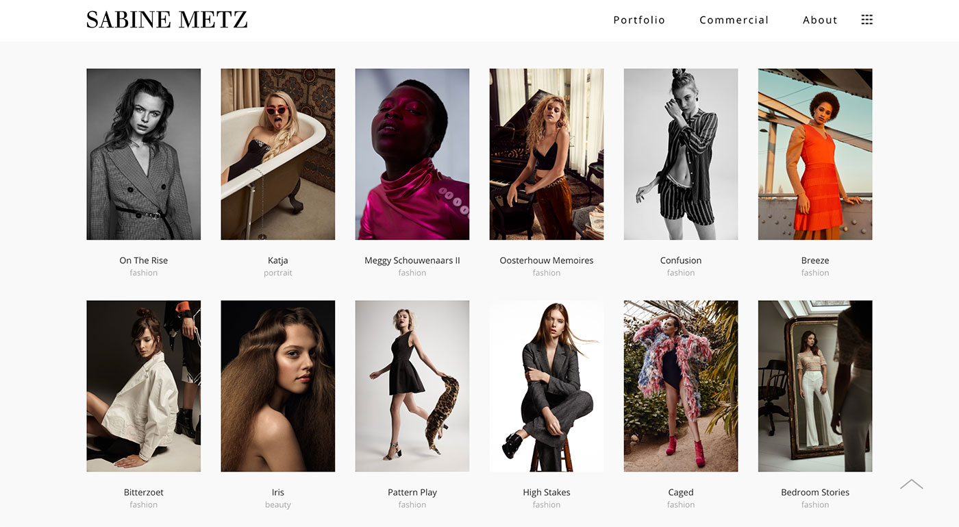
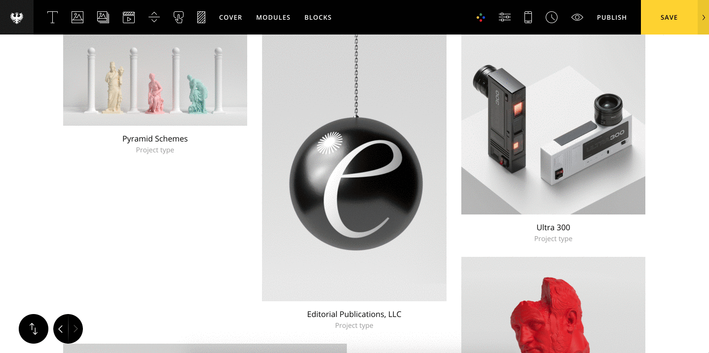
Let's also display our project title and category underneath each project thumbnail. To do this, set "Title & Type Visibility" to show both the project title and category.

2. Text Grid

Another interesting way to display your work is in a Text Grid. The Text Grid is a layout preset included with the Advanced Portfolio Grid as part of Semplice Studio edition. To learn more about the Advanced Portfolio Grid, read this guide.

VIEW THE LIVE DEMO

To create our Text Grid, we'll drag & drop an Advanced Portfolio Grid (APG) module onto our page. You then have the option to choose which pages or projects you want included in your APG grid, so let's go ahead and add them.

After adding our projects, go to "Change Grid Preset" and set the preset to Text Grid. Once done, you'll notice the APG has automatically populated our projects in a vertical text list.

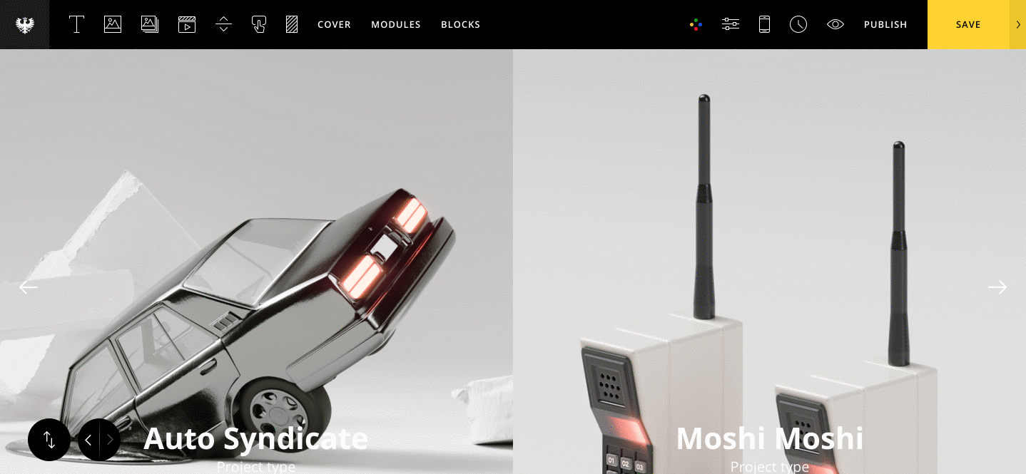
I'll keep the Title direction option to the default Vertical setting and style the grid accordingly. To get the cool mouse hover effect, set the Mouseover effect to "Original (Stick to Mouse)." I've also enabled the Title Mask effect. Note: this effect will only work if the Title direction is set to Vertical.

3. Overlay Grid

This is a popular style right now for Work pages: Overlaying your project thumbnails on a fixed background image or text:

VIEW THE LIVE DEMO →

For this portfolio effect, we will place a standard Portfolio Grid on our page. Next, we will need to create images of all of our thumbnails as PNG files with transparency. The transparency will allow the background to show through while the scrolling through the Portfolio Grid.

With our transparent PNG thumbnails set, let's now add a fixed background to sit behind our Portfolio Grid. Go to the Look & Feel tab from the editor and set a background image. Adjust the size and placement to your liking. Finally, under the Background Attachment option set the background image to be fixed.

Alternatively, you can also use our hack guide to create a fixed section that will sit behind your portfolio grid. Just be sure that the section where you placed your Portfolio Grid has a higher Z-index value (located under Section Styling) than your fixed section. Otherwise, the Portfolio Grid will not sit on top of your fixed section.

4. Split Grid

Another interesting way to showcase your work is to use the Advanced Portfolio Grid module and create a two-column fullscreen grid. This grid is really great for putting the focus on your work and simplifying your presentation.

VIEW THE LIVE DEMO →

Once again we will use the Advanced Portfolio Grid for this effect, and choose the Horizontal Fullscreen layout preset. Place a new APG grid on your page. The default layout preset will already be on the Horizontal Fullscreen option, so no need to select it.

Also, I recommend setting all of your images to the same dimensions for best results.

Next, let's set the" Images Per Row" to 2, and the image size to "Cover." I've also opted to hide the Project title and category.

Lastly, we can add a nice Mouseover effect for our thumbnails. I've opted for a nice zoom effect.

That's it!

It's really that easy to get a variety of different ways to display your projects with Semplice. Of course, these are just a sampling of different layouts and effects. It's really up to your imagination. We hope you enjoyed this tutorial!

July 29, 2020No Comments

The top 10 DESK portfolio articles of all time

We talk a lot about portfolio building on DESK. We’ve always been interested in helping creative people do their best work and share it in the most compelling way possible – so they can get more work that makes them proud. 

Good work feeds your portfolio, and a great portfolio leads to more good work. The two fuel each other, and that’s what we’ve always found exciting. 

In our effort to motivate and inspire the creative community, we share everything we know about creating a portfolio. Between Semplice, our more advanced portfolio tool, and Carbonmade, for anyone who wants a beautiful online portfolio, we’ve learned a lot and see fresh, new portfolios every day.

We review analytics every month to see what our readers find most useful, so we thought it may be helpful to share those insights with you now and then. These are the most-read portfolio articles on DESK of all time, in order. 

1. How to write project case studies for your portfolio

Writing case studies might be the most dreaded part of building a design portfolio. You already did all the work – now you have to sit down and EXPLAIN it all? But case studies are the heart and soul of your portfolio. They’re your chance to put your work in its best light and tell the story the way you intended it to be told.

Read article →


2. The most important page on your portfolio

And if there is one thing we’ve learned, it's that a single page on your portfolio always gets the most views. And funnily enough, it's not your most popular project.

Read article →


3. How to make a portfolio when your work can’t be shared

An online portfolio is critical to a designer's success. But what do we do when we work on a confidential project where we’ve signed a non-disclosure agreement? Or what if we worked on something that hasn’t launched yet, but we really love the project and want it on our portfolio now? Or what if the nature of our design work doesn’t really make sense for a visual portfolio?

Read article →


4. What leading companies never want to see in your portfolio 


Through our How to Get a Job at X series, we've talked with creative directors and recruiters from companies like Nike, Spotify, Pentagram, Disney, Shopify and BBDO. These people see dozens of design portfolios a day and might make their decision about a candidate within seconds of landing on their page. So we asked them for the secret to a successful portfolio – one that gets us a job at their company.

Read article →

5. How to make a portfolio as a UX designer


No matter what type of design you do, an online portfolio is a must. In most cases, companies and clients simply won’t consider you for a job without one. While a UX designer may believe their work doesn’t translate well to a visual platform, a portfolio is even more important for UX work.

Read article →

6. Avoid these 5 things when building your portfolio 


For some reason, when creating our design portfolio, everything we praise about good design seems to be forgotten as we work in perfect isolation. 

Read article →

7. How to build a design portfolio as a student


Building a portfolio as a student or young designer is a catch-22: A portfolio is all about showing your design experience, but to have experience you first need a job. Here we share how to build a portfolio when you’re just starting out.

Read article →

8. 15 ways to quickly refresh your portfolio

The only thing worse than not having a design portfolio is having one that’s poorly made or out of date. Here are some quick tips to refresh your portfolio and start getting more of the work you want to do.

Read article →

9. How to create a one-page portfolio with Semplice

A tutorial for designers or studios that want to create an elegant and interactive one-page portfolio or landing page using Semplice.

Read article →

10. Wild idea: work on your portfolio while you have a job

Read article →

We’ve written a lot more than this. Visit our Portfolio Project series to learn how to write your portfolio bio, how to photograph your work for your portfolio and other tips for presenting your work online.


May 25, 2020No Comments

How to make a graphic design portfolio in 15 minutes with Carbonmade

Designers tend to put off their portfolio until it becomes a big, looming task hanging over their heads. It doesn't have to be so dramatic. With Carbonmade, you can build & launch your design portfolio in just 15 minutes.

Follow these five steps to create a personalized graphic design portfolio with Carbonmade – in a fraction of the time you've spent avoiding it.

Here's what we'll be making.

Let's get started!

Requirements

The only thing you need for this tutorial is Carbonmade, which is free to use until you launch.

Sign up for Carbonmade here and pick a starting point for your layout based on your work and style. I'm choosing the "Big Layer Style."

Step 1: Edit the intro on your homepage   

First, edit the headline and add your introduction. Don't overthink this – just tell us your name and what you do.

Step 2: Create your first case project

Now we'll create your first project. Click "Project" in the left-hand sidebar and upload a thumbnail to represent the project. Hit "Publish" under the thumbnail and it will appear on your homepage and link to your project page.

Now within the project, drag & drop your hero image onto your default "Fullscreen Cover" block. I'm deleting the text to put the focus on the full-screen image.

Next, drag the "Title & Teaser" block onto the page and type in the title and the type of project.

Now drag & drop the "Text/Embed" block onto the page and paste in your project overview. This can be just a few sentences summarizing the project and who you made it for.

Now we'll finish building out the project with the rest of our images. Alternate "Image/Video/Audio" blocks and "Text/Embed" blocks to describe your project in phases, from challenge to solution. For tips on writing case studies, read this article.

PRO TIP: Carbonmade is not limited to just JPEG or PNG images.  You can drag and drop other file types like Photoshop files or video, and Carbonmade will optimize it like magic.

Step 3: Upload your logo

Have a custom logo? Under the Design tab on the left, click "Logo & Title" and drag your logo file into the Upload section.

Step 4: Create your About page

Now we'll get personal. Go to your default About page and drag your best photo into the default “Image/Audio/Video” block. You look 🔥

Now click to edit the text and tell us a little about yourself. Where are you from? What is your main focus in design? Do you believe parallel universes exist? Show a little personality here. Make sure we remember you.

Now add the “Experience Details” block to list out your work history and any special press links, awards or speaking engagements you're proud of. You know, something your grandma can brag about.

Don't forget your contact info! To add your email address and social links, simply drag in a "Contact info" block onto the page and swap out the text.

Step 5: LAUNCH

That's it! Now it's time to launch. Simply click the GO LIVE button, add your payment info, choose a domain name and you're LIVE.

Check out our completed demo right here.

In less time it takes to pay your home loan debt in Animal Crossing, you created a beautiful, personalized portfolio to showcase your graphic design work. Now share it with everyone!


To see examples of other portfolios built with Carbonmade,visit this page. And you create your portfolio with this tutorial, be sure to let me know on Twitter. We want to see it!

April 24, 2020No Comments

My favorite art director portfolios made with Semplice

A great portfolio requires an eye for curation and attention to detail, and nobody knows that better than an art director.

I always enjoy seeing portfolios by art directors and creative directors, because they just get it. They are masters of presentation and meticulous about typography, about consistency, about the story they are telling. It's their job, after all. And it makes for beautiful portfolios.

These are just a few great online portfolios I've seen lately from art directors who used Semplice to build their site.

Diego Gallego

Estudio Diego Gallego is an independent graphic design consultancy based in Seville. The typography and layout lends a clean, editorial look to this portfolio without being predictably minimalist. 

SEE PORTFOLIO

Tina Smith

Tina Smith is an art director and designer based in New York. When I talked about meticulous, polished art director portfolios before, this one came first to mind. 

SEE PORTFOLIO

Darcy Moore

Darcy Moore is a graphic designer and art director currently works for Apple in California. There's much to love about this site: The bold imagery on the black background, the exclusion effect in the nav, the full-screen images in the case studies. All of it artfully and tastefully done.

SEE PORTFOLIO

Elena Miska

Elena Miska is an independent designer and art director based in New York. I love the typography pairings on this site, as well as the scattered grid layout on the homepage with the unexpected hover effects. All of it adds up to be strong and elegant, right in line with Miska's personal brand.

SEE PORTFOLIO

Davy Denduyver

Davy Denduyver is a freelance graphic designer and art director based in Bruges, Belgium. This site has so much style without feeling overly done or distracting. The 3D tilt on the homepage along with the four-corner nav made this an instant favorite for our Semplice team.

SEE PORTFOLIO

__

Cover image by Elena Miska

April 12, 2020No Comments

How to create a makeup artist portfolio in 15 minutes

As a makeup artist, you have to be the champion of your work. Your portfolio is the one place where you're not merely credited as part of a full look – the spotlight is fully on you. Thanks to Carbonmade, your portfolio can be primed and ready in just 15 minutes.

Creating a makeup artist portfolio is similar to creating a photography portfolio. Your site should complement your work and showcase it in all its crisp, beautiful detail. You can create a personalized makeup portfolio in five steps using Carbonmade — the same amount of time as a quick face (or maybe less).

Here's the final result.

Requirements

The only tool you are required for this tutorial is Carbonmade, which is free to use until you launch.

Begin by signing up for Carbonmade and pick a starting point for your layout based on your work and style. No pressure – this can be customized or changed later.

Step 1: Add an intro on your homepage   

Start by giving yourself an introduction. Drag the “Title & Teaser” block and edit the headline with your name and the subhead describing yourself and the kind of work you do.

Step 2: Add images to your gallery

Now let's add your work highlights with the “Gallery Slider” block. Drag the block onto the page, then drag & drop five or so photos of your best work from your desktop right on to the block.

Next, drag the "Gallery Grid" block on to your page. Drag and drop your curated photos from your desktop onto the block. Your body of work will be automatically optimized and fall into place within the grid to display.

Adjust the grid by simply clicking the gear ⚙️icon in that section to switch up. Change the padding, image size and more as needed.

Optional alternative to the Gallery Grid: Creating projects to categorize 

If you prefer organizing your photos into categories (ie. Editorial, Beauty, Bridal etc.), you can create Projects instead of using the Gallery Grid. Separate pages for each category will appear as a thumbnail link on your homepage.

If you're happy using the Gallery Grid to show individual images for now, meaning your photos won't click through to a case study page, delete the Projects block and skip to Step 3.

Step 3: Add your social icons

Next, let's link your social accounts. Drag the “Social Links” block and click on the gear ⚙️icon to manage links. Add them by selecting the social media networks and typing your @handles.

PRO TIP: Only link to active social accounts you want potential employers or clients to see. If you don't use Twitter regularly or haven't updated your YouTube channel recently, don't link them up.

Step 4: Upload your logo

Have a cute custom logo? Under the Design tab, drag and drop your logo under "Logo & Title" to upload.

Step 5: Update your About page

Now let's get personal. Go to your default About page and paste in your work history, client list and headshot. Name drop those clients and brands to give yourself some credibility. C'mon, brag on yourself a bit here – we give you full permission!

Finally add your Contact details, simply drag in a “Contact” block and swap out the text with your name and email.

Step 6: LAUNCH IT!

Now's the best part: Launching. Simply click the GO LIVE button, add your payment info and choose a domain name, and you're live. In less time than it takes to learn the latest TikTok dance or make another dalgona coffee, you created a beautiful, personalized portfolio to showcase your makeup work. You should be proud.

Now flaunt it – share it with everyone!

__

Carbonmade is made for makeup artists. Upload a photo and it's automatically optimized and resized to fit your site perfectly. You can crop an image straight from the page instead of messing with photo editing tools. Carbonmade will even magically suggest complementary colors and effects based on your decisions as you build.

To see examples of other portfolios built with Carbonmade, visit this page. If you create your portfolio with this tutorial, let me know on Twitter. I'd love to see it.

April 8, 2020No Comments

3 reasons to work on your portfolio right now

No, you don't have to use the quarantine as an opportunity to be productive or improve yourself. However, from what I've picked up from my friends and the creative community online, there's a lot of fear around work and our income right now. Rather than letting that panic or paralyze you, you can do whatever you can to be proactive and set yourself up for success. That begins with your portfolio.

The competition for creatives is high right now. With more designers, artists and illustrators looking for work, it's more important than ever to position yourself well online. Here's why your portfolio might be the perfect project while you're stuck at home.

1. The future is uncertain

As you’re well aware, the creative industry hasn’t been spared in this crisis. Many have been laid off from their agency jobs, are freelancers struggling to line up new projects (while competing with an increase of new freelancers) or simply don’t know what the next week or even the next few days hold for their company.

Whether you feel secure in your job and financial situation right now or not, it’s worth being prepared. And this applies outside the context of the pandemic too. We simply can’t predict what will happen with our job or our company, financial crisis or not.

Update your portfolio and you’ll remove the added stress of doing so in the middle of a job search.

2. We all need the distraction

I don’t know about you, but I need a break from the news and social media to stay sane right now. Giving myself new projects, new skills to learn (yes, I’m caring for a hungry and healthy yeast starter like everyone) and new goals has proven helpful.

Working on your portfolio on those sleepless nights or wide-open afternoons, or hopefully more-open evenings (for those with kids) might be more fulfilling than turning the same anxious thoughts over and over in your head. Or, you know, a long bath might do the trick. You decide what's best for you.

3. It’s a unique creative challenge

You don’t have access to your studio’s photography equipment right now. You can’t print anything, secure special backdrops or props, or get any in-person videos of your work for your site. This makes it fun.

Can you stage your own photoshoot for your work using natural light and the props you have at home? Can you collaborate with a friend online to build their site while they design yours? Use the constraints to your advantage and create your site with the resources available to you right now.

__

The good news is that you have everything at your disposal to do this from home. Of course, I'll shamelessly recommend using Semplice.com or Carbonmade.com for your portfolios because I (naturally) believe they are the best portfolios tools on the market.

But whatever platform you decide to use, I wish you luck and hope our portfolio articles will be useful to you. As always, reach out on Twitter if you need help deciding or want specific portfolio tips. We can do this!

April 1, 2020No Comments

How to make a UX portfolio in 15 minutes with Carbonmade

If we spent half the time working on our portfolios as we do talking or thinking about working on our portfolios, we'd have launched two decades ago. The good news is, you don't have to spend all that time working on your site. You can build your UX portfolio in 15 minutes.

Follow these five steps to create a professional UX portfolio with Carbonmade – in the same amount of time it'd take you to make a cup of tea, join another Zoom call or scroll through Instagram on your toilet.

Here's the final result.

Requirements

The only tool you need for this tutorial is Carbonmade, which is free to use until you launch.

Start by signing up for Carbonmade and picking a starting point for your layout based on your work and style. Don't overthink it – this can be customized or changed later.

Step 1: Edit the intro on your homepage   

Now that we've chosen a base structure, let’s edit the homepage headline and subhead to add a little introduction. Click the ⚙️gear icon to swap out the hero background image with your own image.

Step 2: Create your first project case study

Next, click Project in the left-hand sidebar. Upload a thumbnail to represent the project, then hit "Publish" so it shows up on your homepage.

Now we'll layout the page for your new project. At the top of the page, add a title and a one-sentence description that sums up the project.

Next, we'll drag & drop the "Image/Audio/Video" Block onto the page and replace the default image with our first project image.

Now, if you have one, let's embed a prototype on the page. Just drag & drop the "Text/Embed" Block onto the page and paste the embed code into the text. (You can add prototypes from almost any design tool like Figma, InVision or Adobe XD.)

To add another project to your portfolio, repeat Step 2.

PRO TIP: When building your case studies, it helps to think of your project in phases. Start with phase 1 (like the project challenge and brainstorming), then walk us through each phase all the way through to the results.

Step 3: Upload your logo

Got your own logo? Under the Design tab, drag & drop your logo under "Logo & Title" to upload it.

Step 4: Create your About page

Now go to your About page and drag the “About intro”  block onto the page. Drag & drop your headshot into the provided space and paste in your bio. Then add the “Experience Details” block to list out your work history and any press you're proud of.  Go ahead, brag on yourself a bit. This is the place to do it!

Finally, drag & drop a Contact block onto the page and swap out the text with your name and email.

Next, we'll link up social accounts. Go to the design tab in the left-hand sidebar and under "Footer," enable "Show Project Nav" and "Show Social links." Select your favorite social media networks and type in your @handles to link them up.

Step 5: LAUNCH

That's it! Now it's time to launch. Simply click the GO LIVE button, add your payment info and choose a domain name, and you're live. In less than 15 minutes, you created a beautiful, personalized UX portfolio to showcase your UX work.

You launched your portfolio. Now share it with everyone!

___

The best part about Carbonmade: You can easily update it at any time to add new projects or change the style.

Want to refresh your homepage? Simply change the Gallery Grid layout and it's instantly a new site.

Want to change the colors of your site? Under "Global Styles," in the design tab, change your global font or background.

Want to change your navigation color? Under Design, click "Site Navigation" and change the link colors and more to your liking.

To see examples of other portfolios built with Carbonmade, visit this page. If you create your portfolio with this tutorial, let me know on Twitter. We'd love to see it.

March 20, 2020No Comments

How to make a photography portfolio in 15 minutes with Carbonmade

Like choosing the right picture frame, your photography portfolio changes the work itself. Whether you have design experience or not, it's easy to create a beautiful, personalized portfolio that puts your photos in the best light. And with Carbonmade, you can do it over your lunch break.

Follow these five steps to create a personalized photography portfolio with Carbonmade in 15 minutes.

Here's the final result.

Requirements

The only thing you need for this tutorial is Carbonmade, which is free to use until you launch.

Before we get started, sign up for Carbonmade and pick a starting point for your layout based on your work and style. Don't overthink it, this can be customized or changed later.

Step 1: Add an intro to your homepage

Now, drag the "Title & Teaser" block onto your page. Select the ⚙️gear icon to edit the text and add your intro. Just one or two sentences about your interest and background is enough – we've only got 15 minutes here, Hemingway.

Step 2: Add images to your gallery

Next, drag the "Gallery Grid" block onto your page. From here, it's as simple as dragging & dropping photos from your desktop right onto the block. Everything will resize properly and fall into place within the grid.

Want to adjust the grid? Simply click the ⚙️gear icon in that section to switch up the order, change the padding, image size and more.

Optional alternative to the Gallery Grid: Creating projects

If you want to organize your photos into categories (ie. Outdoor, Wedding, Portraits, etc.), you can create Projects instead of using the Gallery Grid. This way, you will have separate pages for each category, which will appear as a thumbnail link on your homepage.

If you're happy using the Gallery Grid to show individual images for now, meaning your photos won't click through to a case study page, delete the Projects block and skip to Step 3.

Step 3: Upload your logo

Under the Design tab, drag & drop your logo under "Logo & Title" to upload.

Step 4: Add your social icons

Next, we'll link up social accounts. Go to the design tab in the left-hand sidebar and under "Footer," turn on project nav and show social media links. Select your social media and type in your handles.

Step 5: Update your About page

Now for the fun part. Go to your default About page and paste in your work history and headshot. Add some personality here too! Tell us about your teacup poodle, your passion for dinner parties, your hip hop DJ skills. What makes you unique?

To add your Contact information, simply drag in a Contact blog and swap out the text with your name and email.

PRO TIP: Only link to active social accounts you want potential employers or clients to see. If you don't use Twitter regularly or haven't updated your Behance site recently, don't link them up.

Step 6: LAUNCH IT!

That's it! Now it's time to launch. Simply click the GO LIVE button, add your payment info and choose a domain name, and you're live. In less time than it takes to eat a soggy tuna sandwich and scroll through Twitter at your desk, you created a beautiful, personalized portfolio to showcase your photography work. You should be proud.

Now share it with everyone!

__

The best part about Carbonmade: You can easily update it at any time to add new projects or change the style.

Want to refresh your homepage? Simply change the Gallery Grid layout and it's instantly a new site.

Want to change the colors of your site? Under "Global Styles," in the design tab, change your global font or background.

Want to change your navigation color? Under Design, click "Site Navigation" and change the link colors and more to your liking.
Want purple hair like mine? Sorry, trade secret.

To see examples of other portfolios built with Carbonmade, visit this page. If you create your portfolio with this tutorial, let me know on Twitter. We'd love to see it.

March 16, 2020No Comments

6 tips to improve your architecture portfolio

How to sufficiently capture architecture work in a portfolio? Relaying the grandeur of a building or the thought process behind a floorplan can be difficult online. Renderings only go so far without you there to explain them.

A good portfolio usually requires input beyond your main skills. To do your work justice, you need great photography, good writing, strong design. Thankfully, tools like Carbonmade take care of half of that for you. For the rest, we asked a few architects for their best advice. Here’s what they suggest when building your architecture portfolio.

Show diversity & original thinking

The jack of all trades vs. specialist debate is never-ending, but it seems that for architects: a range of skills is key.

“People want to see nice photos and diversity,” says Kendall Latham, an architect based in New York, New York. “You want to show you have proficiency in everything, but you should also show what you’re best at and enjoy the most.”

There’s nothing wrong with specialization. If you’re incredibly good in one area, you will be sought out for it. But diversity shows depth.

Part of Kendall Latham's "Glossier Flagship" project, with Gachot Studios – kendalllatham.com

“Depending on the architectural role, the employer could look first at the variety of your past experiences. If your portfolio shows different projects in different areas, automatically you become a more interesting profile,” says Silvia Verardi, an architect and interior designer from Milan, Italy.

Select a range of projects that show your strength in key areas. And beyond just different types of work, convey a diversity of thought and ideas.

“Usually, if you are an architect, you are supposed to be a creative, original, extremely flexible and out of the box minded professional (otherwise they would have been looking for an engineer!)” Verardi says. “So try to keep up with these expectations.”

"It’s not about chronology, it’s about the most important works. If you want to work in retail, there’s no point in showing a technical drawing for an engineering project."

Aim for simplicity and clarity

Make it as easy as possible for someone to learn about you and make the decision to hire you.

Remember, people scan when reading websites – and they have limited attention spans. So make it easy for them with bite-sized paragraphs and headlines they can scroll through. Include captions for your images so they can understand at a glance what they're looking at and why it’s meaningful.

“Your portfolio should have a clear, easy-to-read structure, with this key information highlighted: project title, project phase, your role, main project data, year of realization,” says Verardi.

"Miami Design District - Retail & Dining" by Silvia Verardi – silviaverardi.carbonmade.com

Carbonmade makes this process intuitive. Working from a base structure, you can simply drag & drop to rearrange blocks and lay out your page. Think about the story you’re telling about your work with your portfolio, and aim for each case study to support that story.

“Simple does not mean less creative," Verardi says. "In fact, it should not be graphically monotonous: find a theme, a color, anything that acts as a fil rouge for the portfolio that makes it attractive and at the same time that gives coherence to the whole.”

A scene from Kendall Latham's "Glossier Seattle" experiential project.

Curate for the job you want

The best portfolios are not the ones with dozens and dozens of projects. They are focused and cohesive. They paint a vivid picture of a person and what they offer. And that’s due, in part, to good judgment and restraint.

“Cater your work to show what you’re interested in,” says Latham. “It’s not about chronology, it’s about the most important works. If you want to work in retail, there’s no point in showing a technical drawing for an engineering project. Unless it’s showing technical ability, all of those things are less relevant.”

Your portfolio is not about the work you already did, but about the work you will do next. When selecting your projects, don’t just think about what looks best. Think about what you want to keep doing in the future.

“I believe the key to creating a great architecture portfolio is editing,” says Jeremiah Johnson, an architect from Minneapolis, Minnesota. “Prospective employers or clients have a finite amount of time, and while it's good to share your experience, the more projects you show the less time they will spend understanding your design thinking and process. Showing fewer projects with more depth will better illustrate your skills and emphasize your value as a designer.”

From Jeremiah Johnson's project, "prairiehouse." – jjohnson.carbonmade.com

Show credibility

“Choosing an architect isn’t an easy task, “says Yohanan Beeri, an architect from Jerusalem, Israel. “You confide in them so much without really knowing in advance.”

Unless you’re already a known and respected architect, it’s not enough to simply upload photos and share the expected rundown of your projects. Your portfolio is your opportunity to sell what you offer and build confidence in your potential client.

From Yohanan Beeri's "Jerusalem House 1" project – yohanan.carbonmade.com

One way to do that is through client reviews. Ask your favorite clients to give you a 1-2 sentence testimony you can include on your site. Add these to your About page or sprinkle them throughout your homepage to show you not only have experience, but a great reputation.

“I believe that when people are looking for an architect, they are trying to find someone who will understand their needs, someone they can rely on and trust. In my opinion, the best way is to read other client's reviews, and talk to them if possible.”

Mariana Antunes, an architect, interior and urban designer based in Porto, Portugal, agrees.

“It really depends if it's a private client or an office and what they're looking for,” Antunes says. “If it's a private client, the decision is usually based either on references… or when they can see themselves living, dining, working, etc. in one of your projects (and a great way to do that is, of course, through your portfolio).”

A scene from "3D Visualisation: House in the Countryside" by Mariana Antunes – antunes-mari.carbonmade.com

"Although they are indeed looking for highly qualified people, they are also and foremost looking for that 'something extra' the candidates can bring to the team."

Give us a glimpse of your personality

You might be up against a dozen other architects as experienced and talented as you. So what makes you stand out? Your unique point of view.

“Show your personality through your portfolio,” says Antunes.“A portfolio is like a biography, so try to find your own language and tell not only your architecture stories, but your own stories through it.”

You can do this in your case studies and on your About page. Beyond the basic details, share how you approach a challenge and find a solution. Include philosophies that inspire your work. Show how you treat your clients and what those relationships mean to you. Share what makes you different, whether that’s a love for interior design or a glass-half-full attitude about life.

"When we're talking about offices or companies I see that, although they are indeed looking for highly qualified people, they are also and foremost looking for that 'something extra' the candidates can bring to the team," says Antunes. "Maybe you are not that amazing with software and stuff, but you're really creative and bring ideas and discussions to the table every day."

"Interior Architecture: GTL Apartment" by Mariana Antunes – antunes-mari.carbonmade.com

Aim to show, rather than tell. Instead of writing, "I pay attention to the details," SHOW us that through thoughtful, detailed case studies. Rather than saying "I have a future-focused approach," show us through your process and results. You can also convey personality through the way you visually present your projects.

“If you're a good sketcher, why not build your portfolio full of sketches and diagrams?” Antunes says. “Great images and realistic renders are, without a doubt, stunning and necessary in some cases, but I strongly believe that standing out is about showing what is really unique about you.”

Create case studies that illustrate your process

Great photos are important, but they’re not enough. Without knowing the process and problem-solving that went into those images, they’re no more than a pretty picture.

Again, your case studies are crucial. Each case study should walk us through the project from challenge to solution. Think of the project in phases and briefly describe each phase, helping us appreciate how you arrived to the images we see now.

A sketch from Jeremiah Johnson's project, "The Powder Houses."

“When a client is looking to hire an architect they are looking for someone that can help solve a problem they have,” says Johnson. “The best way to illustrate an ability to solve these problems is to showcase your process, from how you understand a design problem and incorporate constraints, to how you craft a solution. When an architecture firm is looking to hire an architect, they are looking for candidates that have clarity of presentation, a broad skill set, and clear abilities to problem solve.”

After reading your case study, we should understand how you think, what involvement you had in this project (always credit your team and be clear about your role) and why this project was a success.

__

The Carbonmade portfolio tool is built for architects in mind. Simply drag & drop your photos into Carbonmade and it will do most of the work for you. With smart design features and automatic optimization, you can build your architecture portfolio in less than 15 minutes.

Sign up here to get started – it's free until you launch. And browse our Carbonmade Talentpool to see more architecture portfolios made with Carbonmade. Now go do it and launch your site!

February 20, 2020No Comments

The most underrated page on your portfolio

There’s a page I don’t see on portfolios as often as I’d like. When I do, it feels like a treat. I go through all the other pages on the site first. I scan the homepage, usually click straight to the About page, followed by a few case studies. Finally, dessert: The Playground page.

A Playground page is usually a scattered grid of half-finished projects, random ideas, experiments and rejected work we don’t typically get to see in a portfolio. It’s the place where no rules apply – the work doesn’t have to fit the brief, we don’t have to explain ourselves or our process, we don’t need to curate or prune. It’s the Playground page. Anything goes.

A Play page (here's mine) tells me you love creating and experimenting outside of your paid job. It says you care about pushing yourself and thinking in new or different ways. This page can reveal a lot about a person. 

In fact, if you’re feeling directionless about your career or your interests, turn to your Play page. This is the stuff you work on into the night, with no obligations. The stuff you created purely for fun or out of curiosity or a drive to get better. Maybe there’s a clue here for you. A thread you can follow to a new skill or career entirely.

The Playground page is low pressure. If you’re feeling intimidated about sharing your work, create a Play page. It’s an exercise in shipping, in not overthinking it and just putting it out there. Anyone visiting this page is not here to judge. They’re here to have fun.

I love scrolling through a digital designer’s portfolio, all web screens and userflows, then discovering a treasure trove of 3D work on their Playground page. I am delighted when I see a 3D designer’s portfolio and find their Playground page full of paintings. This is a page of dreams and ideas, still finding their footing.

February 18, 2020No Comments

Should I add a blog to my portfolio?

It never fails. Every time I work with a new client and talk through the pages on their new site, they say, “Oh yes, and the blog!”

We add a blog to their site and a couple of months down the road, after content population is done and the website is just about to launch, someone clicks that tiny Blog or News link in the footer. It’s empty. "Oh right, the blog."

The client adds their first blog post or news post in a scramble and we push the site live. A few months after launch, I’m looking over the site and check the blog page. It hasn’t been updated once since launch. Oh yeah, the blog.

Blogs are great. This is a blog (we call it a magazine, thank you). I clearly support blogging and wholeheartedly support writing (read this and this and this, for example). But if you don’t have a solid plan for your blog and the resources for consistent execution, especially as an agency or studio, you should not have a blog on your site.

A blog dates your site more than design or case studies or anything else. Check the blog on any agency website and you will see: They are likely a cobwebby place filled with boring, self-promotional posts about the latest award they won or press they got. This type of content could easily be featured in a simple list on their About page, but instead they wasted their time with a blog post about it. They probably didn’t waste our time, because we probably didn’t read it.

"Share something useful or inspiring with your readers. This is a better way to promote your work than with soulless press releases, anyway."

If you’re going to have a blog for your agency or company, have a strong strategy in place and a committed team to see it through. Whatever you do, don’t make your agency blog a place to throw your press releases and links to magazine features. Make it good. Share something useful or inspiring with your readers. This is a better way to promote your work than with soulless press releases, anyway.

An example of an agency portfolio done right: Ueno’s blog. For one, they publish regularly. And they publish useful, entertaining articles relevant to their industry. Sure, many of these posts tie back to the Ueno team and promote their work, but they are framed-up as resources, answering questions and giving tips to their creative audience. And, importantly, they are not cringey SEO pieces filled with recycled advice from the internet. They are personal and sometimes even funny. Ueno has positioned themselves as an authority in the digital space through their blog, and clients see that too. As with everything in life, being useful brings positive returns.

Creating a blog for your company or product can be valuable as well. Just look at WePresent by WeTransfer. It’s one of the most beautiful and thoughtful creative publications I’ve seen in the last year or so. And it’s obvious WeTransfer puts a ton of energy and resources behind it (obviously, they have the budget to do so). I don’t know what the monetary return is for them – you likely won't know yours either, that's not how it works – but I know I personally have more awareness and respect for WeTransfer because of WePresent.

A blog can be a great way to share your agency’s culture or company’s offering and get it noticed, but only if it’s done well. And it’s rarely done well. So if you’re considering a blog for your site, first decide if it’s the best use of your time and resources. And if it is, then truly invest in it. Aim to make it as good or better as any creative or tech magazine already on the market. Get an editorial team behind it that brainstorms ideas and writes fresh pieces as any other media company would. Either make your agency blog good, or focus your energy elsewhere.

February 14, 2020No Comments

Portfolio tips from UX designers

Creating a compelling online portfolio for UX work can be tough. We can only see so many sticky notes, user journeys and device mockups before it all starts looking the same.

On top of that, case studies for UX portfolios tend to be extremely long. It makes sense, given all the research, planning and details that go into this type of work. But very few people are going to read a case study like this. More likely, they’re going to get bored.

With the amount of competition in the field of UX design today, it’s even more important to make a portfolio that stands out. So we asked some of our favorite UX designers how they did it.

Look at your portfolio from a client or recruiter’s point of view

A still from Kurt Winter's homepage – kurtwinterdesign.com (portfolio made with Semplice)

Pretend you’re a recruiter or creative director hiring a UX designer yourself. Now go search UX design portfolios and click through a dozen or so. What impressed you? What made you get bored and click to the next site?

“There was two things that I think put me in a good mindset to create an effective portfolio,” said UX designer, Kurt Winter. “One was reading the DESK How to Get a Job at X series. The other was to simply consider, “What would I like to see if I was hiring myself?”

Ironically, it’s easy to forget our audience when we’re building our own website. Your audience has likely viewed more than a dozen portfolios today. What will make yours memorable for them? What information do they need to make their decision? How can you make it as easy as possible to make that decision? Optimize your site for your users, just as you would a client project.

Our Semplice guide for hiring a UX designers may be a good place to start as you approach your site from your audience’s perspective.

Practice restraint when choosing your projects

Kasper Laigaard's homepage – kasperlaigaardstudio.com (portfolio made with Semplice)

Two questions to ask yourself when curating your projects: First, are you proud of this work? And second, would you want to do a project like this again?

If you answer “no” to either of those questions, don’t include the work in your portfolio. If that narrows your projects down to just a few, that’s fine. It’s better to show a select few of your favorite projects than a dozen just to fill space.

“It’s hard, but try to limit your cases," says Kasper Laigaard, a Danish-based designer and director. “Show the work that you want more of and make those stand out."

Share your process, but don’t make us fall asleep

A teaser for one of Isa Pinheiro's projects – isapinheiro.com (made with Semplice)

Restraint is even harder when it comes to your case studies. It’s easier to write a long, rambling case study than it is to edit yourself. But unlike school, more words doesn't get you extra points. It just makes your reader lose interest.

“Since a large number of people looking at portfolios don't have time to read extensive details about a project, I like to keep descriptions as concise as possible,” says Sage McElroy, a senior designer based in Portland.

It’s important to give us insight into your process, but keep it brief with bite-sized paragraphs that are easy to scan. Rather than walking us through every phase in deep detail, simply focus on the challenge and solution. Show us how you got between the two and why it was a success story.

“When thinking about the best way to present your work, try to focus not only on the designs, but also on the story behind each project,” says Isa Pinheiro, a designer and illustrator from Portugal. “What problems you are trying to solve and how you came up with the ideas behind each design.”

When you're done writing a case study, consider testing for estimated reading time with a tool like this. If the reading time is over two minutes, cut it down.

Be thoughtful about your visuals

“Including your process work (sketches, wireframes, anything else you do) is incredibly important,” says Liz Wells, a UX designer based in New York. “It helps me understand how you think through problems and other paths you went down before decided a direction.”

I’ll admit visuals can be hard for UX work. User flows and whiteboard notes can only be so beautiful. So how can you make it interesting?

Wells does full photoshoots for her projects, using props like pencils and flowers to stage her work – which is often wireframes and pages ripped from notebooks.

Could you style your own photoshoot for your work? Could you design your userflows to match each brand or product? Could you embed an interactive prototype on the page instead of using static images? Instead of dumping a bunch of poorly lit whiteboard snapshots from your phone onto the page, try to make it visually interesting and consistent.

Think about the user experience of your own site

The subtle motion through Kasper Laigaard's portfolio (along with his fantastic work) makes it memorable.

Your site design communicates who you are as much as the words on the page. Yes, anyone hiring you should be focused on your work. But your own website is part of that work.

A good UX designer knows the site design itself is as much a part of the experience as the userflow. Make your site experience enjoyable and memorable for your users and you will stand out from the hundreds of other UX portfolios out there.

For Kasper Laigaard, motion makes all the difference.

"You want people to remember your website,” says Laigaard. “Consider using motion to make your presence more recognizable."

For Kurt Winter, it’s animation and color. For Liz Wells, it’s beautiful typography and thoughtfully created images. For you, it may be videos or illustrated case studies. Whatever it is, make it memorable. And don’t hesitate to ask friends for their help.

––

For more portfolio tips and inspiration, read these articles and guides:

How to create a UX design portfolio with Semplice
10 inspiring UX portfolios and why they work
The most important page on your portfolio
How to write case studies for your portfolio

Cover image from Isa Pinheiro's project, "Future X"

February 11, 2020No Comments

The portfolio trend I am hesitantly enjoying

I always talk about how important it is to keep your portfolio updated. And by “updated,” I don’t mean launching a redesign once every one or two years. I mean continually adding your latest projects, optimizing and refining your design for the current moment. 

An outdated portfolio does you a disservice, at its best positioning you for work you don’t necessarily want to be doing anymore and at its worst, making you look out of touch. That said, I know how easy it is to let your site fall by the wayside. 

My own portfolio is never as current as I want it to be. Ideally, I would fine-tune it every month or so. In reality, I’m adding projects and refreshing the design every few months. So when I saw the “Now page” trend happening (started by Derek Sivers), I decided to jump on the bandwagon.

See my NOW page here

A Now page serves almost like a bulletin board. While your portfolio as a whole presents the work you already did, your Now page shows what you are doing right now. I’m not diving into projects here like I do with my case studies. I’m simply sharing a brief list of what I’m focused on in this very moment. 

For me, at least so far, this has a few benefits. A big one: Because I used to give talks a lot, I hear from people often asking me to speak at their event. I’m taking a hiatus from speaking engagements right now, so I note that at the top of my NOW page. It saves those people time writing to me and myself time (and guilt) turning those people down. 

My Now page, as Sivers points out, is a good way to check my priorities. Is the work I’m doing right now something I would be proud to add to this page? Am I no longer doing what was on my list before? Should I be?

I have yet to see how long I’ll keep it up, but for now I’m liking the Now page. In any case, it’s a low commitment. I spend 5 minutes updating the page every couple weeks, and I try to have some fun with it. Sometimes that motivates me to work on the rest of my portfolio while I’m at it, which is never a bad thing.

January 16, 2020No Comments

A simple portfolio hack

Chances are, you’re avoiding your portfolio. You probably know a friend avoiding their portfolio too.

Is your friend a photographer? They could take your headshot or pictures of your projects while you design their business cards.

Is your friend a writer? They could edit your case studies while you build their website.

Is your friend a developer? Trade them a beautiful portfolio design for a custom-coded animation for yours.

Ask your filmmaker friend to create a video of that exhibition you designed. You could design their logo.

Ask your most talented friends to contribute their skill to your site, and contribute yours in return. It’s not cheating to barter for the parts you find daunting or the areas where you lack expertise. It makes both of your sites better and most importantly, makes your sites finished.

And the work you and your friend did for each other? It’s the newest case study in your portfolio.

December 11, 2019Comments are off for this post.

Portfolios with exemplary case studies

Case studies are the heart of a portfolio. It's where you have the chance to put your work in its best light and tell the story as you intended it to be told.

My team at Semplice.com has spent a lot of time thinking about what makes a great case study. While there's no single correct way to do it, we have found what works and doesn't work. For example: Dumping images on the page or writing Dickens-length prose does not work. Writing scannable case studies in your own voice does. We've shared our best tips in this guide for writing case studies, which makes the process a lot less daunting. Now we thought we'd show you how it looks in practice.

Diego Gallego

Diego Gaellgo's case studies are a nice reference for case study length and scannability. Instead of throwing a huge paragraph of text at us, he breaks it up between relevant images. This is not only more enjoyable to read but tells us a more compelling story.

If you’re feeling stuck or intimidated by your case studies, take this approach. Start by simply captioning your images (or the images you plan to have, if you don't have photos yet). We only need a sentence or two for each phase or element of your project, anyway. This will naturally shape your story and make the writing process easier.

Noemie Le Coz

Noemie Le Coz's case studies are laid out like magazine features and read like an editorial review.

Noemie Le Coz's case studies get a lot of things right. The crisp imagery, the scannable content, the editorial layout. But what we most appreciate is how they read like a critic’s review. Take her identity project for Billie, in which she writes:

“As an inclusive, body-positive brand that supports female empowerment, the identity takes a stand with bold character, inspired by the spirit and confidence of 90's feminism.”

This is a helpful approach if you’re struggling to describe your own work to outsiders. Try writing as if you’re reviewing someone else’s project. This allows you to view your work from a distance and analyze it without overthinking.

Charlie Jennings

Charlie Jennings created a case study layout that outlines important details right from the start: The client, the team, his role, and the type of work. This provides helpful context as we begin reading and allows him to write more succinctly.

When reading your case studies, we shouldn't be left wondering what part you played in the project. Always give credit and explain your role so potential clients or employers can understand where you'd fit into their team.

Nuno Leites

We always preach that your case studies should be written in your own voice. Trying to impress with buzzwords and insider language will only distance your reader, and copy & pasting content from marketing materials comes across as stiff and lazy.

Read any of Nuno Leites’s case studies and his voice comes through loud and clear. He’s not afraid to joke around, insert snarky asides and speak in a lighthearted way about his work. While you may want to be a little less casual depending on your goals, the point is to show personality. We get a real sense of who Leites is when reading his case studies, which makes him memorable.

For more portfolio tips, read these articles. Or read this guide we created to creating case studies the Semplice way. We hope it helps you finally finish your case studies and launch your site.

November 12, 2019No Comments

How to write your portfolio bio

The infamous portfolio bio. A source of angst for designers, the inspiration for satire, the cause of inexplicable decisions like calling ourselves “empathy lovers” and “pixel princes.” Plenty of articles provide pointers, but few show us what a good bio looks like in practice.

We’ve said before that your About page is the most important page on your portfolio. A potential client or employer might browse dozens of portfolios with excellent work that fits their brief. It’s your About page that separates your site from the rest. This is where we learn what you offer that nobody else can – whether that’s a specific viewpoint, experience, skill or attitude.

Browse our Semplice Showcase or Carbonmade talentpool and you will see a range of About statements, from simple and straightforward bios to lengthy life stories. Everyone has a different approach depending on their work, their voice and their style. So let’s examine some of our favorite portfolio bios from our Semplice family, and you can decide which approach best fits your website.

First: It should be obvious these bios belong to others and are here for inspiration only. It won’t do you much good to rip off another designer’s About statement. Rather, pay attention to the type of language they use, the length, style and specific word choices. This will help you write a unique bio that works best for you.

The philosophical approach

Mackey Saturday takes a noteworthy approach for both his bio and his case studies. He leads with his philosophy for his work, identity design. Take a look at the one-sentence intro on his homepage:

"Designs timeless visual identities for evolving brands."

Now go to his About page and read his full-length bio (it’s only two paragraphs) beginning with this:

"The most innovative solution to a complex problem is often the simplest one. But as anyone who’s devoted their time to big ideas knows, simple and easy are two very different things. Nowhere is this more true than when designing visual identities."

Notice Saturday doesn’t start outright with information about himself. He could have said, “I’m a NYC-based identity designer with a decade of experience designing logos for brands like Instagram, Oculus and Silk.” Instead, he leads with a strong statement about his work philosophy. He’s not posturing or waxing poetic, but rather revealing his experience and unique perspective in simple terms. It’s refreshing.

The personality play

Marina Rachello’s portfolio clearly makes an impression, as it’s not the first time we’ve mentioned it here on DESK.

Her entire homepage is her About statement, and it’s a bold one. After a brief standard intro (where she’s based, where she works, what she specializes in – all good keywords to include in her intro) she shares little quirks about herself, some of which relate to work and others that don’t. Upon reading her page, we get a sense of Rachello's personality: her taste, personality and professional skills. We can immediately envision what it’s like to work with her.

Nuno Leites opts for a similar approach on his About page. His bio, in which he cracks a joke about his headshot and uses varying typefaces, is decidedly casual. If you have a sense of humor, don't be afraid to show it on your About page. Your case studies should show you are serious about your work. Your About page, then, should show a glimpse of who you are beyond it.

The polished professional

Many designers like to take the third-person approach with their portfolio bio, which is a perfectly acceptable solution. For one, this allows you to take a step back and write about your accomplishments without feeling like you’re bragging about them. It also allows others to easily copy and paste your bio for use in press, if that’s what you’re after.

Glenn Stewart does this nicely on his website. Here’s an excerpt:

“Glenn's clients have included Toyota, Google, Lexus, Ford, Huawei and Foxtel, with his work earning a reputation for its beautiful and considered aesthetic, collecting awards both locally and internationally.”

As he works under the moniker, KOZV, third-person is a fitting solution that positions him more as an established studio than an independent designer.

__

Keep in mind, there is no one “right” way to build a portfolio. This is why we don’t offer templates with Semplice and Carbonmade, but rather allow you to customize your site based on your ideas. So while each of these bio approaches works, do what feels right for you, your voice and your work. The portfolios that stand out are those that don’t sound like robotic, templated resumes with tired phrases everyone uses. This is your website, not LinkedIn. So whatever you do, make your bio yours.

October 17, 2019No Comments

How to create your first design portfolio

If you're just starting out as a designer, the best place to begin is with a portfolio. You may not have much work to show yet, but don't let that discourage you. Your portfolio isn't about the work you've already done, but the work you want to do next. 

If you recently graduated from design school, you probably created a portfolio for one of your classes. But chances are you did the minimum required to get credit, added a few class projects, turned it in and haven’t touched it since. We can do better than that.

Here are a few ways to make a standout portfolio as a brand new designer.

State clearly what you want to do

Until your work speaks for you, you can’t afford to be vague or artistic with your website content. Just write a straightforward introduction about who you are and what you offer. Add this to the top of your homepage and on your About page. If you are looking for internships or a job, say “currently open for new opportunities” or “currently seeking a product design position in New York City.” Leave no question for your website visitors about what you’re after.

Curate for the job you want

It’s tempting to put every piece you’ve ever created in your portfolio just to make it seem full, but that will only do you a disservice. It won’t tell a cohesive story about who you are, what you offer or what you want. As I said at the beginning, your portfolio is not about what you already did. It’s about what you want to do in the future. 

If you want to get a UX design job, don’t add a bunch of poster projects or package designs to your portfolio. It’s fine to show a range of work, especially if it’s work that makes you proud, but if you’re seeking a digital design job and you’re showing mostly print work, your viewers will be confused. 

Don’t worry if you only have two or so projects at this point. That’s expected when you’re new to the industry. And a spare portfolio is better than a portfolio filled with mediocre, disjointed work that doesn’t fit your goals.

Add your design experiments 

Until you have client work to share, you need to show your potential somehow. Design experiments are the perfect way to do that. These not only help you hone your skills and learn new tools, but they reveal something about your attitude and motivation. 

I am always impressed when I see designers pushing themselves to get better on their own time. Design a prototype or a single screen for a fake app. Challenge yourself to create posters along a specific theme. Try to create something inspired by a piece of art or another designer you admire. You can add your experiments to a Playground page on your site, or link us to your Dribbble page where we can browse through them. Just be sure to give credit and ask permission where it’s due, and make it clear that these are not client projects.

While I’m all for experiments, I recommend against doing too many unsolicited redesigns. These only call attention to your inexperience, especially when it’s the easy go-to brands like Nike or Ikea. Find a unique angle, make something of your own and prove you can think originally.

Share how you think and approach your work

Before you have the experience and seasoned skills to show, companies are taking a risk hiring you. They hire you based on your potential and hope it pays off as you grow. So help them see your potential and envision you on their team.

I can’t stress the importance of case studies enough here. Write thoughtful, brief case studies for your projects that explain why you approached the work you did, what your process was and how it all turned out. Include details, but don’t write ten paragraphs about your UX research and empathy map. Just tell us the challenge, how you approached and what the outcome was. 

Most importantly: Don’t try to impress with flowery language and "insider" language. Write professionally, but conversationally. Show some personality. And have a writer friend read and edit your writing – big opportunities are lost to small typos every day. 

Create a memorable About page

As we all come to find out, being a nice person who people enjoy working with is just as important as actual skill. And when you don’t have much experience or skill yet, it counts even more. 

For that reason, your About page is the most important page on your site. It’s not about being a “culture fit,” but rather showing that you will add something special to the team. Aside from the expected details (name, email, social links), try to do something different and unexpected with your About page – whether that’s cracking a joke or sharing a self-portrait you illustrated of you with your pet gerbil, Frankie. Briefly share your professional and personal interests (product design, gerbils) and what job you are looking for. Add your loveliest, most professional, high-quality photo of yourself.

Give recruiters, who go through dozens of portfolios a day, a reason to remember yours. 

Add your side projects 

The best advice I can give to new designers: Don’t let ego get in the way when you are trying to get your foot in the door. Look for opportunities in small places, like side projects. 

Whether you’re creating a brand for your sister’s jewelry company or doing a small project for a non-profit organization, side projects are stepping stones to bigger projects and can even lead to a full-time job. 

Take on as many side projects as you can afford, and add those to your portfolio. Side projects show your drive and your interests, and prove you’re a motivated designer who enjoys what they do enough to do it off the clock.

Don’t use a template

Nothing reveals your inexperience more than using a bland, fill-in-the-blank template for your site. It’s so easy to create a personalized website these days, a template makes it clear you didn’t try too hard and don’t care very much.

If you need a tool for your portfolio, I recommend trying out Carbonmade. Carbonmade 4 is incredibly easy to use, with lots of customization options. You start with a base layout and can customize it fully in just a couple hours with drag and drop.

Find examples of beautiful portfolio sites made with Carbonmade right here. And for portfolio building tips, design inspiration and more, keep reading here.

P.S. The cover image for this article uses the "Unsolicited redesign" symbol from the Design Language symbol pack.

October 16, 2019No Comments

How to get a job in the saturated field of UX design

UX design is so popular right now, the field is flooded with both new talent and seasoned designers changing their title to get a job. 

With more competition every day, it’s becoming difficult to secure a UX design role. At the same time, companies are still learning how to hire UX designers and what it means for their business. 

Given these challenges, it’s more important than ever to have a great portfolio that sets you up for success. But that’s only the beginning. Whether you’re new to the field or an experienced UX designer, here’s how I recommend positioning yourself to stand out and get a UX design job.

I have seen so many portfolios that lead with “empathetic designer crafting meaningful experiences,” it’s hard to remember who is who.

Show, don’t tell 

The word “empathy” is thrown around so much in the design industry, especially within UX design conversations, it’s beginning to feel trite. I have seen so many portfolios that lead with “empathetic designer crafting meaningful experiences,” it’s hard to remember who is who. At this point, you will be noticed for thoughtful, original writing that shows you understand UX beyond the buzzwords.

Make it clear you are empathetic through your portfolio case studies, rather than spelling it out. Instead of saying you craft meaningful experiences, explain how a specific project impacted a client in a positive way. Rather than saying you care about inclusive design, show us how you approached your UX work with inclusivity and accessibility in mind.

Disclaimer: Empathy is indeed relevant to design or really any job, so feel free to mention these terms in your portfolio – especially because companies have been trained through the industry to look for these buzzwords. Just don’t lean on them. 

Lead with your UX projects, but don’t deny your past

Considering how many people are tacking “UX” onto their capabilities list, you can make an impression by simply proving you have real-world experience. 

If you specialize in UX design and have served in that role on a project, you are already one step ahead of many other designers. Curate your portfolio to show your best UX design projects so companies and recruiters know you’re not just another designer taking advantage of a trend. 

However, your other design experience is still relevant here. If you have worked as an interactive designer, product designer or something similar in the past, feel free to include a couple of those projects to show your depth of experience. But aim for every project to make your case stronger, pointing back to why you’re the best UX designer for the job.

To be clear, most designers are not wrong to add UX design to their offerings. For a long time, user experience was part of any interactive design job. Given the fact that UX design as a field is not only relatively new but encompasses a wide variety of skills (strategy, design, content, etc.), it’s fair to say many “traditional” designers can meet the job description. That’s why showing genuine passion and a specialized focused in user experience will help you stand out. 

"As designers, we tend to focus on the visuals. But content is just as important, especially for UX designers."

Communication above all

Strong communication skills may be the most important requirement for a UX design job. You not only have to make abstract concepts tangible for your team and your client, you also touch many points of a project. In this role, you collaborate with developers, strategists, designers, copywriters, project managers and more. In some cases, the UX designer even writes UX copy. Any good design director or recruiter interviewing you will look for this skill. 

Show you’re a strong communicator from the beginning of your relationship with a company. Write concise, professional emails when you reach out. Speak clearly and with intention on the phone and in an interview. Create compelling case studies that tell the story of your work without rambling and wasting your reader’s time. And most importantly, proofread everything. Ask a friend to read your writing and point out typos or areas of improvement. As designers, we tend to focus on the visuals. But content is just as important, especially for UX designers.

"The surest way to land the job you want: Strive to be the best at what you do."

Deepen your understanding of design

It’s easy to say, but it’s the surest way to land the job you want: Strive to be the best at what you do. 

With a saturated field comes a range of talent. That naturally leads to undercutting, which lowers the overall quality of the work being produced in that field. If you want to rise above all this mess, you have to be great at what you do.

Knowing UX fundamentals is a given. Thanks to the accessibility of digital fields like ours, we can attend a three-month UX design course and become certified UX designers. That means many UX designers today (with plenty of exceptions) have a shallow understanding of design as a whole. So what makes you stand out? A deeper, sharper grasp of our field. 

Beyond growing in UX design and all that comes with it (strategy, research, etc.), seek a deeper understanding of graphic design. Learn what defines good typography. Learn the function of layout and composition. Immerse yourself in media and culture that refines your taste (beauty is function, no matter who says otherwise). Aim to get better at copywriting, too. Combined with some common sense, research and curiosity, you'll be in high demand.

For more tips for creating a great UX portfolio and hiring a UX designer, read the UX designer hiring guide from Semplice.

September 17, 2019No Comments

A love letter to my website

This is a declaration of love for personal websites, written from years of thinking on the subject, reviewing thousands of portfolios, building websites for friends and bookmarking those of strangers. It’s a subject I’m so passionate about, I built my business on it. And recently, it’s become a matter of principle.

Not long ago, the web was still the future. It was a big deal for companies to have their own site, much less individuals. Technology evolved. We picked up a few HTML and CSS tricks, discovered the wonders of Flash. We started spinning up our own sites, complete with guest books and visitors counters.

In those days, our website was our home. An extension of ourselves. Every day we visited our page, tweaked it a bit here, adjusted something there, stood back and admired it. Our site was a little corner of the internet we could own.

Fast forward to now and a website almost feels old fashioned. Our social profiles are all-consuming. Curating our Instagram page is our second job. We almost feel an obligation to share our work there, in addition to our personal lives. Our little corner of the internet? It now collects cobwebs.

"Our site was a little corner of the internet we could own."

In contrast to our personal websites, we don't own our social platforms. They own us. On top of eating our time, our emotions and our focus, they are demanding our privacy. Whether we realized it or not, we signed away our rights when we signed up for these platforms. We not only give giant tech companies our personal data – we allow them to use, sell and share our content in whatever way they wish. Soon, we will see the repercussions of freely giving away our data and our work. When it comes to creativity and self-expression, the loss is already apparent.

On social media, we are at the mercy of the platform. It crops our images the way it wants to. It puts our posts in the same, uniform grids. We are yet another profile contained in a platform with a million others, pushed around by the changing tides of a company's whims. Algorithms determine where our posts show up in people’s feeds and in what order, how someone swipes through our photos, where we can and can’t post a link. The company decides whether we're in violation of privacy laws for sharing content we created ourselves. It can ban or shut us down without notice or explanation. On social media, we are not in control.

As designers, we already forfeit a degree of creative control outside of social media. At our day jobs, we usually don’t have a say in the final product. Directors take over. Politics and process force their way in. Clients leave their fingerprints on the work or reject it entirely. If our work does see the light of day, and there's no guarantee, the execution is not always how we imagined it. Work is not the place for personal expression and full creative freedom. It's the place to follow the creative brief and solve the problem presented to us. So what's left to call our own?

Our personal website.

We control the layout of our website. We can create a page that reflects our taste, our personality, our style.

We control the narrative, too. It's here we can finally show our work the way it’s intended to be shown. We get to tell the story exactly as we wrote it, with context the audience or user doesn’t typically have. It’s our chance to own our work and put it in its best light.

We decide the way our website functions. We can influence how people interact with our work. We can guide our visitors through our content in the way that most makes sense. We can lead them straight to our contact info.

We choose whether our work stays alive on the internet. As long as we keep our hosting active, our site remains online. Compare that to social media platforms that go public one day and bankrupt the next, shutting down their app and your content along with it.

"Having my own website says I care about what I do beyond clocking in and out and cashing a paycheck."

At the risk of sounding religious about this, and maybe I am, our personal websites are our temples. They remain the one space on the internet where we decide how we are introduced to friends, potential employees and strangers. It’s a place where we can express, on our terms, who we are and what we offer.

As a working professional, it feels empowering to have my own website. Just seeing my personal domain name and my email address that ends in it gives me this little boost of confidence. Scrolling through my work and making small adjustments makes me feel like I’m deciding my future. Considering the percentage of opportunities I get through my portfolio, that feeling is accurate.

Having my own website says I care about what I do beyond clocking in and out and cashing a paycheck. It shows I’m proud of what I create. If my taste or my work or the industry evolves, I have the power to reflect that on my portfolio. If I launch a new project, my first thought is to put it on my homepage. With this blog, I can write articles that connect directly back to me and my website. Social media is a nice way to extend the reach, but it all points back to vanschneider.com. It’s the one link I give to people inquiring about me and my work, rather some www.designplatform.com/vanchneider08247 URL or social media handle I don’t own. My site is the little place I’ve carved out for myself on the world wide web. It’s mine.

Call me old fashioned, call me nostalgic, call this a self-serving attempt to convince you to use Semplice.com. All of those accusations are at least partially accurate. But the real truth is that as long as we’re putting our work in someone else’s hands, we forfeit our ownership over it. When we create a personal website, we own it – at least to the extent that the internet, beautiful in its amorphous existence, can be owned.

September 2, 2019No Comments

How to make a non-design portfolio

We talk about design portfolios a lot on this blog. But occasionally, we hear from people in need of a portfolio who are not designers: Writers, managers, strategists, and more who have great work, but don’t know how exactly to share it.

Compared to copywriters, for example, designers have it easy. When your work is highly visual, you can just add your images to a page in an artful way, write some captions, a few case studies and call it done. It takes more thinking to create a text-heavy portfolio that’s still engaging. 

While it depends on your specific line of work, your projects and your goals, these tips will help you create an online portfolio that presents your work in the best possible way.

Avoid an image-heavy starting point

Trying to force non-visual work into an image-heavy template will leave you with a mangled site that shows how much you strained to make it. I’ve seen many an unfortunate portfolio like this. Most of them have random stock images on the page, disjointed and pixelated, in no way reflecting the creator or their work. Unless you have great images for your projects, try to avoid image-heavy templates or layouts for your site.

Do use all the resources available to you

If nice images do exist for your project, even if you didn’t create them yourself, by all means use them. For example, say you did the research for an app your company built. It’s perfectly OK to use images from that app to showcase your work. Even designers do this by using an app design with typefaces someone else created or photos someone else took. There’s no reason why a copywriter or account manager can’t do the same. Providing you include proper credit and make it clear what role you played in the project, those are your images too.

Or say you worked on the strategy for an athletic brand. You could use a standard marketing image from the company (someone lacing up their shoes, perhaps) as your preview image for that project. Feel free to use whatever marketing material gets the point across, so long as you focus the message on what you contributed.

If you think about it, the portfolios of a photographer, make-up artist, hairstylist and perhaps set designer are all the same. They all work together to create one image. In the end, this image is the collaborative result of all of these people, even though they all did something different to help achieve it.

Be careful about stock images

If you don’t have images for your work, you might be tempted to find a photo of someone scratching away with a pencil, clicking a mouse or shuffling papers on a desk to represent a project or message on your site. Don’t do it. That dates your portfolio to somewhere around Blackberries and Bluetooth headsets. Stock photos almost always look out of touch, unnatural and worst of all, boring. It’s better to have no images at all than an old-school stock image. 

The one exception is Unsplash images, which are generally beautiful and more tasteful than your standard stock photography (and free, too). A thoughtfully chosen Unsplash image here and there can be a great solution if you don’t have images available for your work. Just don’t over-use them or use an image just because it looks pretty. Try to choose images that best represent the project or the idea.

Keep it simple & focus on the success story

Focus your site on what your visitors want to know and the story you have to tell.

Writers: What if your homepage was just a simple list with your best headlines in big, bold type? A strong headline already tells us what we want to know about you: That you can write powerfully, with control. That you can distill a message to its core and move people with your words (in this case, by making us click through to the next page to read more). Instead of trying to sell us with a long-winded piece of prose, do what you do best. Tell us the story.

Researchers and strategists: What if your homepage was just a list of questions – the challenge you were presented with or the problem you were seeking to solve? This immediately conveys what kind of work you do while creating intrigue. You can expand later with your full case studies, which should still be simple and straightforward. If we read about your project and your process and it feels simple to us, despite however complex it may be, that tells us a lot about how you think, communicate and solve problems at work.

Account and project managers: What if your homepage was simply your client’s names, with one sentence beneath explaining your most impressive feat for that client? Think about what your visitors want to see and zero in on that. They probably want to know how many clients you managed, the type of clients and projects, and your success stories. So focus on the key stats with your homepage (“grew the Snickerdoodle account from $1 million annual budget to $3 million”) and give us the other bullet points (as briefly as possible) in your case study.

Whatever kind of work you do, think about the most important story you have to tell. Tell that story from your point of view, in the most straightforward way possible, and leave out the rest. When you keep it simple, your entire website – from your homepage to your case studies to your page layouts – will be all the more powerful.

Bonus tips: If you can avoid it, don’t use a template for your site. A personalized site sells your work much better than a template. This is exactly why Carbonmade exists. It allows you to start with a base and fully personalize your site from there, instead of forcing your work into a template. It’s made for more than design portfolios – I’ve seen everyone from copywriters to makeup artists to managers use it. If you're feeling more adventurous and technically savvy, you might also appreciate Semplice.

August 21, 2019No Comments

7 beautiful portfolio refreshes from 2019

As thrilling as it is to finally launch your portfolio, the truth is that it’s never “finished.” As you continue evolving in your work and your career, your portfolio should evolve with you. Otherwise, it’s not doing you any favors.

The good news is that if you are constantly refining your portfolio, the daunting “portfolio redesign” doesn’t need to happen that often. It’s just a matter of adding a new project every few months and refreshing the design now and then. Providing you’re not stuck with a dated or confining template (this is where I recommend Semplice.com), you can make small updates along the way that keep your portfolio modern and current. 

We are always delighted to see and share portfolio refreshes for that reason. In our Semplice Showcase, we handpick two new portfolios each week made with Semplice. Some are new launches, some are complete redesigns, some are simply impressive refreshes with beautiful new work.

Here are a few of our favorites – sites we’ve featured more than once just because they keep getting better and better.


Elena Miska

Elena Miska’s portfolio has always had a premium feel, but her recent refresh still managed to pleasantly surprise us. The vintage-inspired hover effects on her projects, the way her logo animates on scroll, the beautiful new case studies. This was a significant redesign and even more impressive – made with Semplice 3, our older product. 


Gyor Moore

Previously featuring a standard grid, Gyor Moore's updated homepage now feels light and effortless. Images and videos float on the page as you scroll, the page background color changing on hover to match the work. Click to any project page and the loading time is blazing fast. We recognize some of these projects from before, but now they feel fresh and new again.


Mindt Studio

We always keep an eye on the MINDT studio site as it seems Sarah, its founder, continually breathes new life into it. The new split panels on the homepage and elegant typography refinements lend an editorial vibe to this design-slash-yoga studio.


Marina Rachello

We’re long-time fans of Marina Rachello for the personality and playfulness she infuses throughout her portfolio, and her recent site refresh is no exception. Marina’s previous portfolio focused on typography and color and this one does too, feeling on-brand yet like nothing we’ve seen before on Semplice.


Kasper Laigaard

Kasper’s recent site refresh quickly became one of our favorite portfolios on Semplice. Masterful in its use of white space, hover effects and transitions, this site does Kasper’s top-notch work justice. 


Jean-Lou Renoux

Jean-Lou Renoux used the Semplice Advanced Portfolio Grid feature for his recent site refresh, leading with bold typography and rollover effects to showcase his work. It’s the perfect contrast with the full-screen covers that follow on his case study pages.


Raúl Gil

Raúl Gil's current portfolio isn’t a huge departure from his old one. He simply refreshed his homepage layout and added several new projects and characters to his site, a subtle but significant evolution. Raúl’s site has always been a popular one, but when he shared his recent updates on Twitter, the tweet blew up and brought attention to his work all over again. 


We share our favorite new portfolios on the Semplice Showcase every week, so check back for new launches and redesigns. And if you've submitted or were featured before and recently updated your site, submit it again. Every update you make or project you add to your portfolio is a chance to promote your work all over again.

July 22, 2019No Comments

Why you should keep your portfolio updated – especially if you have a job

I recently ran a poll on Twitter asking what people did with their portfolio once they got a job. The results were both surprising and not surprising.

The question: “After you finish your portfolio, do you keep it updated even though you have a fulltime job? Or do you forget about it, and only update when job searching again?”

The results: Of the 1,026 people who responded, 68% of people said they keep their portfolio online while they have a job, but don’t update it. Of the remaining 32%, 11% said they take their portfolio offline completely and only 21% said they actively keep it updated.

Meaning, 80% of people completely neglect their portfolio when they have a full-time job.

Based on my own experience as a designer over the last decade or so, it seems obvious why it’s important to keep your portfolio updated. But at the same time, I know how easy it is to put off when you have the security and comfort of a full-time job. Here is why it’s worth spending the time to keep your portfolio fresh, even if you don’t plan on job hunting anytime soon.

1. It shows you care about your work 

Letting your portfolio fall by the wayside is the equivalent of dressing up for your interview and wearing sweatpants once you’ve secured the job. It says you don’t care much about your work beyond the paycheck. Keeping your portfolio updated, on the other hand, shows that you consider yourself a designer, not just someone with a design job.

And people will notice: your employer, potential clients, recruiters, fellow employees, other designers. A portfolio gives you an identity outside of your team at work. It says that you care enough to refine your skills, think about what you create and share it proudly with others.

2. You don’t know what opportunities you might be missing

You may be perfectly satisfied with your position right now, but you don’t know what you might be missing by failing to update your portfolio. It may be a side project that fuels you at your current job, a collaboration with another creative, a freelance gig that teaches you a new skill or a new job entirely. 

If you’ve forgotten about your portfolio, on the other hand, a recruiter or a client may land on your page, see it’s outdated and move on. Or you may not have that one recent project online that demonstrates exactly the skills and style your dream company was looking for. All without you ever knowing you were on their radar. 

They say what you don’t know can’t hurt you, but you also don't know how it could have helped you. Keeping your portfolio current with your latest work and skills is an easy (an even rather passive) way to keep your options and opportunities open.

3. Reviewing and reflecting on your work motivates you to get better

We always say you should put your best work in your portfolio, the work that makes you most proud. Curating your portfolio this way requires you to reflect on it.

When you continually do this at your current job, you are forced to step back now and then and consider the work you’ve done and are doing. Does it make you proud? Are you happy with the direction you’re heading in your creative career? 

If you are pleased with the work you’ve been doing, it motivates to keep at it and outdo yourself. If you realize a lot of your work doesn’t make you proud, you can reset and refocus on the work you want to be doing.

4. A little thing called SEO

If you keep your portfolio online and continue to update it, it’s more likely Google will crawl and index it. Nobody fully understands the mysteries of Google’s algorithm, but search any term and you will see Google gives you the most current yet established results it can find. 

Your ranking will impact if and how you show up when clients or magazines look for local designers. So if they search “animator in New York” or “3D designer in Amsterdam,” your updated portfolio will be more likely to show up than your coworker Ralph’s, who hasn’t updated his site since 2009. 

5. An outdated portfolio (or lack of a portfolio) just looks bad

Put simply: Having an old, outdated portfolio is in poor taste. Either you have some clunky website online that doesn’t accurately reflect the modern design you do, or you hide it because you know it’s outdated, and then it looks like you don’t have a portfolio at all. Considering how easy it is to have a website these days, and the importance of the web itself in our industry, both of these options don’t reflect well on you.

Don’t assume just because you have a job nobody is searching for your portfolio. It’s likely a potential client will search the creative team before deciding to work with your studio (believe me, they do). If you’re not concerned about how your old portfolio makes you come across, consider how it affects your team. 

6. You can’t predict the future

You may be happy at your job right now, but circumstances can change fast. An agency loses a client and employees abruptly get laid off. Your partner gets a great job offer and you need to move to a different city and find a new job for yourself – in a month. You see your dream job posted online and decide to apply.

Keeping your portfolio updated is a gift to your future self. No matter whether the circumstances are positive or negative, within your control or not, you will be thankful your website is already fresh and ready to go when you need it. The alternative is scrambling to get something online as fast as you can, which is not only stressful but rarely gives you great results.

_

I know I have a personal interest in this narrative, given I work on a portfolio-building tool. But whether you use my product or not, I urge you to make your portfolio a priority. It may sound cheesy, but investing in your site is investing in your success as a designer. In an increasingly online world where you might never even meet your employer or client face-to-face, your portfolio is the first impression you give to others. A portfolio with old projects and a dated design is not a great first impression. 

For those just getting started in their career who want something simple and easy for their online portfolio, I highly recommend Carbonmade, which just re-launched with the new Carbonmade 4. You can update your portfolio in less than an hour with Carbonmade, and it's incredibly easy to use. If you're a bit further along in your career and want something more advanced, try Semplice. Semplice offers a lot more power and flexibility to create a custom portfolio in a simple and beautiful way.

Whatever you decide to use for your site, just do it! Update your portfolio anytime you launch a new project. Make your site something that evolves with you in your career, and I promise you'll be better off for it.

July 11, 2019No Comments

How to create a UX design portfolio with Semplice

No matter what type of design you do, an online portfolio is a must. While the nature of UX design work might seem more difficult to showcase visually, a portfolio is even more necessary for UX designers.

Given the popularity of this field, UX designers need to stand out in a sea of competition online. What's more, companies are still learning what UX design means for business, so it's up to you to show how you are vital to theirs.

Semplice, our WordPress-based portfolio tool, is made specifically for designers and creative types. Using Semplice, you can create a unique website in no time at all, without coding knowledge.

We've shared examples of great UX portfolios built with Semplice. Now I'm going to show you how you can quickly and easily build your own beautiful UX design portfolio site, step by step.

This will be the final result.

Here is the project page we will be building out.

This is just a simple site based on my own design. Of course, it's up to you how you'd like to design your own site (Semplice is not a template – you have full control over the design) but this tutorial should help you understand the basic steps and main features.


Step 1: Getting started with Semplice

To begin, you'll need to have a working install of WordPress along with Semplice. You can purchase Semplice here.


Step 2: Creating & categorizing your projects

I first recommend adding all of the projects you intend to include on your site. We're not going to worry about laying out all the project pages just yet. For now, we will just add the projects into the backend. This helps you think about how your work will be organized and displayed throughout your site.

To add a project, go to the Projects page in Semplice and click 'Add New Project.' Let's also add a thumbnail image for each project. The thumbnail will be relevant when we create our Portfolio Grid later.

Creating the project

Pro tip: You can set a different image that appears when someone hovers over your project thumbnail. Just enable the 'Thumbnail Hover' option in your project settings.

If you have work beyond UX design, such as product design or art direction, you can create separate categories for each type of work you've done. This way, a potential employer or client can see your diverse skills and interests.

To set categories for each of your projects, simply assign the category within your individual project settings.

Setting the project category


Step 3: Creating your homepage

The homepage design

Now let's create the homepage. To create the front page of your site, go to the Pages area of Semplice. (If you're curious about the difference between Pages and Projects in Semplice, check out this guide from the Semplice helpdesk.)

First, we'll create a nice, bold headline as a Cover section. A cover section allows you to use a full-screen visual on your page. You can choose to set a background image or video for your Cover section.

With your Cover section created, now add your first headline text block and align the text in your section options.

Now that your headline section is complete, place a Portfolio Grid on the page. This will house all of your projects.

Placing the portfolio grid

Now adjust the settings for your grid as needed. I've set both my horizontal and vertical gutter values to 30. I set my first two projects to have a column width of 6, and my last project to have a column width of 12. You can set a custom column width value for each project in your individual project settings.

Setting the column widths


Step 4: Building your first project page

With your homepage grid created, let's now build out one of your project pages. First, we'll create a Cover section, just like we did on the homepage. Same as before, we'll set a full-width background image.

Protip: you can enable the 'parallax' effect in your Cover options to add some scroll movement to your Cover section

Next, we'll create our project details area by placing several text columns in rows. We'll use spacer columns to add white space.

Now, let's make our case study page more visually appealing. We'll do this by creating a 50/50 split image section to help break up our page and add some more bold visuals.

To do this, place both a spacer column and an image side-by-side. Now add some padding around the image. Next, place a background image on the spacer column and set the size to Cover. Now go to your section options and set a background color on the section. Finally, go to your section options and set the section width to full-width with the gutters removed, and the section height to fullscreen.

Creating our 50/50 split section

Next, I'll embed an InVision prototype I created onto my page. To do this, just place a Code module onto the page. Code modules in Semplice accept any kind of raw code, such as Javascript or iframes. You can simply paste in a mobile prototype embed code from InVision into the Code module.

Placing the code module

Next, I added some device screens showing a glimpse of my product user flow. I placed three images in side-by-side columns, and added a text column beneath each image to serve as a caption.


Step 5: Creating your About page

As you've probably heard us say before, your About page is the most important page on your site. It not only highlights your work history and experience for a potential employer, but it's also a great place to share your personality.

You can create your About page as a regular page in Semplice.

First, I placed an image next to a text column on this About page to serve as an introduction. Next, I placed text columns in rows to talk about work experience and achievements. I used spacer columns to offset my text columns.

Step 6: Editing the navigation

Once your About page is finished, you can add it to your menu system. Just go to Customize > Navigations in Semplice, and under 'Menu,'  look for the 'Add Menu Items' option. To learn more about how to customize your navigation bar, read this article.

Adding the menu item


Step 8: Adding your contact information

Of course, you want to make it as easy as possible for people to contact you. So let's add contact info as a custom footer appearing on all pages.

Go to customize > footer and create a new footer.

Adding the footer

Now add your contact information. I'd recommend writing out your email address rather than adding a link or a form. Most people will simply want to copy and paste your info straight into their preferred email platform.

Next, in your page and project settings, set this custom footer to show everywhere.

Wrapping things up

Now you can add some final touches to your site, such as thumbnail image hovers in your project settings, or perhaps a nice page transition.

Boom! You now have a beautiful new portfolio site that required no coding and was fun to make. Winner winner, chicken dinner.

To see some of our other Semplice features for UX designers, check out this page.  For more portfolio tips and inspiration, browse this section on the blog. You can also find lots of step-by-step Semplice guides and hacks on our helpdesk. And if you have a request for a guide or a tutorial on DESK, send us a tweet @semplicelabs. We'll do our best to write it for you.

June 13, 2019No Comments

How to photograph your work for your portfolio

As anyone who's ever created a portfolio knows, designing the site itself is the easiest part. Collecting, creating and organizing the content is the biggest hurdle and I'd venture to guess, the reason why most of us procrastinate on our portfolio. Capturing images is a big part of that.

After all the effort we put into the work, photographing it seems like a whole other project. And, well, it is. The way you present your work often showcases your skill as much as the work itself. Whether you're a skilled photographer or not, you don't have to settle for the standard shots everyone else includes on their portfolio. To stand out and do your work justice, you need to photograph it in a thoughtful way.

We asked some of our favorite designers from our Semplice Showcase how they go about photographing their print, branding, packaging, product design and identity work. And while there's no right or wrong way to do it, their tips and tricks will help.

Storyboard first

Just as you would for a client shoot, consider storyboarding and even creating a shot list before photographing your work. Having a plan ensures your images feel cohesive and helps you avoid wasting time aimlessly snapping pictures.

An image from Marton Borzak's "Touch Screen Remote" project, featured on martonborzak.com

“Before every shoot, I sit down, look for inspiration and figure out what I’d like to focus on when showing a particular project,” says Marton Borzak, a multidisciplinary designer/art director based in Copenhagen. “It helps me to create a little storyboard. I draw small sketches about different compositions and look at the order of images before taking any pictures, so I can see how the flow of the images could create a nice rhythm. This keeps me focused and on-task during the shoot.”

Don’t default to the standard “portfolio shots” – create a mood

“Give a bit of a feeling for the brand and the overall tonality by experimenting with sets and moods that help convey the overall vibe of your book or magazine or printed collateral,” says Verena Michelitsch, an independent designer and art director in New York.

Verena Michelitsch's images for her Gossamer project fit the brand and set a distinct mood.

While it's tempting to simply find an interesting backdrop or do the typical overhead shot, challenge yourself to experiment and think about what best conveys the brand or product – rather than only what looks cool.

Art direction by Verena Michelitsch, photography by Caroline Fayette and Marina Melentieva

“Nowadays you see a lot of similar compositions out there – colored backgrounds, pieces arranged in a grid,” Verena says. “I am guilty of doing or having done that. Personally, I think I just got tired of the sameness in how graphic design work is shown these days, so I try to break out of it and find photography inspiration in places other than graphic design portfolios.”

Be intentional with backgrounds and props

Your photo is a chance to quite literally put your work and the product in the best light. Rather than simply capturing a still-life picture, think about how you can add to the story.

Christina Michelitsch gives context to her creative for NIKE SB by photographing it in-store.

“Contextualize. Photographing your work means you can add another creative layer to it that underpins what it is about,” says Christina Michelitsch, a New York-based art director and designer. “Experiment and choose your set purposefully. Figure out what materials, colors, props and lighting complement your project best and what helps tell the story of your work.”

Luxurious fabric and moody lighting elevate Christina Michelitsch's work for Dina & Omar.

As Heather-Mariah Dixon of Studio HMVD explains, contrast and scale help tell that story.

“Rather than just photographing your work on white, consider using objects, textures and backgrounds to give your designs context and a sense of scale,” Heather suggests.

Heather-Mariah Dixon uses texture and props to give her work scale and context. Image from studiohmvd.com

Would we better understand the product if we saw it in someone’s palm? Would a textured background add a nice contrast or distract? Should we see the work on a table or in the wild?

“We love sourcing props from fabric stores, eBay and antique shops to bring nuance and life to our work, and then painting or modifying them to make sure they suit the scene. Designing a compelling set to tell the story of your project extends the world that you've worked hard to create.”

Improvise and work with what you've got

You don’t need a studio-quality camera, perfect lighting or expansive set to bring your work to life.

"Be ready to improvise," Seyi Olusanya of Dá Design Studio explains. "We don't focus so much on having the best camera or gear. It's always better to prioritize photography that is extra consistent with the idea, theme, and mood of the project.” 

Rather than focusing on fancy gear and studio sets, Dá Design Studio aims to convey the idea behind their work.

Perhaps you take a standard shot and enhance it with illustrations or animation later. Maybe a snap from your phone fits the mood or nature of the product better than a highly-produced image.

“When photography is more focused on enunciating the ideas behind the project, it makes the entire presentation far more effective.”

Use natural light to your advantage

Considering so many portfolios feature perfectly polished images with calculated studio lighting, an image shot in natural light can feel refreshing and authentic.

Alex Reece of studiorollmo.com works with the sun to showcase his projects

“When you’re starting out it can be pricey to get someone to shoot for you, and equipment can be expensive. Your new best mate, natural light, is here to make everything better,” says Alex Reece of Studio Rollmo. “An overcast day will give you accurate color and nice, even light. Set up next to your biggest window and with some time and photoshop you’ll get the good results – even with relatively cheap cameras.”

Light and shadows play off Studio HMVD's work for "The Beauty Scholar" – studiohmvd.com

 Heather-Mariah Dixon seconds this advice.

“We started shooting our portfolio pieces on our building's roof before renting and eventually investing in photography equipment. Oftentimes the sun gave us interesting and unexpected results.”

For more inspiration, visit the Semplice Showcase or browse our other portfolio tips on the blog.

May 28, 2019No Comments

Beautiful portfolio homepages

Your portfolio homepage is often your first impression – long before you have an interview, before you send a cover letter or give a strong handshake, before a company even contacts you.

Someone lands on your portfolio, scans it quickly and if they like what they see, they dig in. If they don’t, they likely exit before viewing a single case study.

While I’m of the belief that your portfolio should not be a piece of art, I always enjoy seeing those homepages that go a step beyond your standard hero image + text bio. Some show a grid of their work, some have a nice animation, some are understated and others over the top. Here are just a few of my recent favorites, all made with Semplice.

Christina Michelitsch

The stark contrast in the header. The lovely hover effects in the grid below. The little customizations like the slider arrows and “back to top” arrow. All of it together makes Christina Michelitsch’s homepage visually compelling.


Felix Faire

A mesmerizing grid of dots swells and rolls on Felix Faire’s homepage, morphing or scattering as you mouse over it. The animation sets Felix’ work (focused on sound, code and design) up perfectly.


Perfect Strangers Magazine

The Perfect Strangers site is for a magazine, not a portfolio, but I enjoy it so much I had to include it. Made by Foreign Policy Group (who we once interviewed here on the blog) this homepage is quirky and confident and unexpected.


Cori Corinne

Cori Corinne’s homepage is just fun, with roughly photoshopped images of her face multiplying on page load. It’s an intriguing and memorable experience, which is all you could want for your portfolio homepage.


Studio HMVD

Maybe it’s that striking yellow, maybe it’s the nice choice of typefaces or maybe it’s the combination of the two together. Whatever it is, Studio HMVD’s homepage (including the great work below this header) sticks in my mind and has appeared more than once in our portfolio features.


Kurt Winter

Apparently, I’m a sucker for animated graphics on welcome pages. The gentle movement of the graphics as well as the tasteful colors and typefaces on Kurt's homepage are a welcome contrast to most UX portfolios I see, which typically focus on text, screens and devices.


Matteo Giuseppe Pani

Matteo’s homepage is beautiful simply because of his work. The best portfolios are the ones that focus on the work itself, and this one can’t help but do so. That perfect blue typeface on black and the crisp grid below are just bonuses.

For more inspiring portfolios, visit our Semplice Showcase or read our other portfolio articles on the blog.  

Cover image by Matteo Giuseppe Pani

May 21, 2019No Comments

How to share your project failures in your portfolio

I had high hopes when I first released .Mail, my email concept. Some press, thousands of sign-ups and countless hours of work later, the idea died a silent death. It’s my favorite project that never launched. We all have one.

A few years after I walked away from the wreckage of .Mail, I wrote about the experience here on the blog. I was surprised to see how much it resonated. People wrote and thanked me for being honest and sharing what I learned from the project. What was once a negative experience ultimately taught me a lot and inspired others. Plus, I’m still proud of that project. It might not have seen the light of day, but I still believe it was a great idea.

Our portfolios are typically focused on our very best work. Sometimes, our best work isn’t the work the client signs off on or the project that launches. Sometimes, even our not-so-great work has an important story to tell. Here’s how to share it in your portfolio.

Lean into the failure

I’ve seen portfolios with a whole page titled “Rejected Work.” It’s one of the first things I click for the same reason clickbait works. Humans are drawn to the extreme and the negative.

I want to see this stuff – the designs that were too risky for clients, the work the designer believed in, the idea the world just wasn’t ready for yet. Consider adding a full page on your site for your rejected work (if no contracts are keeping you from doing so). If you’re proud of the work, share it proudly in your portfolio.

Share it as a case study

It’s said we learn more from failure than success. I’ve seen many portfolios that boast the statistics, conversions and sales as a result of the work. I haven’t seen many that share their case study like a post mortem, explaining what they did, what happened and how they learned from it.

This reveals a lot about a designer’s thinking and attitude about their work. You don’t have to talk about your regrets or insecurities here, and you certainly shouldn’t bash the client or speak negatively about your team in any way. Share the story of the work in a positive light, explaining why this project, despite its “failure,” is still important to you.

Feature it like any other project

I feature .Mail in my portfolio just like the rest of my projects. I make it clear that it’s a concept and even mention it never launched, but otherwise, it appears in my portfolio like all my other work. And why not? It’s my idea, my work and work that makes me proud.


Finally: If you worked on a private project that never launched (this can be the case when working with large corporate companies, for example) there may still be a way to tease the work in your portfolio. Read our thoughts on making a portfolio when your work can't be shared. And if you're working on your portfolio now, be sure to check out more portfolio tips and inspiration right here.

April 9, 2019No Comments

4 inspiring product design portfolios made with Semplice

Being a product designer myself, I’m always curious to see how others share their work online – and how they qualify product design, for that matter.

“Product design” can translate to many different skills and lines of work these days. One might design physical products, like a bike, or digital products, like an app. Or both.

Different types of product design will be presented differently online. While it makes sense to embed an app prototype in one portfolio, super crisp product photography is necessary for another. I’ve seen a wide spectrum of approaches from our Semplice family. Here are just a few of my favorite examples from the Semplice Showcase.


José Gasparian

Jose’s portfolio is smooth and clean, but not without personality. Instead of a standard portfolio grid, he chooses to feature each project with a large preview image in a single column. His bold typography choices, though, are my favorite part.


Viggo Blomqvist

Industrial design makes for fantastic portfolio case studies, and Viggo’s portfolio proves that. The sketches, prototypes, renderings – the story coming together piece by piece to reveal a tangible, physical final product. It’s all very satisfying to read.

Viggo uses a nice mix of images, GIFs and videos to walk us through his work. Even better, he makes it easy to scan. Succinct case studies and large captions make it clear what Viggo has to offer at a glance.


Johannes Martin

When designing a portfolio, there’s a fine line between creating a memorable website but not distracting from the work. Johannes’ portfolio strikes the perfect balance. From his cover video to his thumbnail hovers, every element feels distinctly him.  I only wish he shared a bit more about each project in his case studies, so we could get a better understanding of his role and design process.


Jean-Lou Renoux

Who doesn’t enjoy a nice typography-heavy portfolio? The strong typography on Jean-Lou’s homepage contrasts beautifully with the visual case studies within. Each project includes a unique, full-screen video header with a mix of images and videos beneath. With Semplice, it’s easy to simply duplicate each project to use as a base template, then customize from there.


For more portfolio inspiration and tips, read our other portfolio articles on the blog. Or visit the Semplice Showcase, which features the best of the best websites made with Semplice.

Header image by Viggo Blomqvist.

March 31, 2019No Comments

Wild idea: Work on your portfolio while you have a job

I realize my love of portfolio building may be the exception. For many people, working on a portfolio is associated with dread (unless they’re using Semplice, of course). They know they need to do it, yet they always push it down their priority list. A portfolio is always hanging over a designer's head.

Thus, most designers don’t touch their portfolio unless they have to. If they already have the security of a full-time job, they feel they can safely brush it off until later. The task of building or updating a portfolio is usually done in a rush between jobs. When a designer quits or knows they're about to. That’s when their portfolio finally becomes a priority.

But working on a portfolio is best done when you already have a job. Here’s why.

It reminds you what you want to do

It’s easy to get caught up in the day to day and let months or years pass before realizing you’re not where you want to be. At that point, you’re far down a path going the wrong direction.

Working on your portfolio reminds you to take a step back and decide whether you are pleased with the work you’re doing right now. If you realize you have no projects you are proud to put in your portfolio, you can change that. You can request to start working on a new client or different kind of project. You can focus on getting a new freelance gig that excites you. You can decide to work harder and do a better job with the projects or clients you already have.

If you start building your portfolio and realize you are indeed proud of the work you are doing, it’s energizing. Reflecting on the work you did and the ways you’ve grown will fuel the work you do next. Building your portfolio will build your momentum.

Working on your portfolio presents an opportunity to affirm the path you’re on or realize it’s time to take a new one.

You have access to the resources you need

Unless you are meticulous about saving and organizing your work, it’s easy to leave files on your office server or have them wiped from the company laptop on your last day. When you’re still at your company, it’s all available to you.

Providing you’re allowed to share the work you created, you can collect the materials and publish them while they’re still fresh. It’s much easier than texting old coworkers, asking them to comb the company server and send you some important file you left behind.

Once you leave the company, it becomes much more difficult to access the work you created. So do it now.

It promotes your company & your work

Let’s assume you love your job or the projects you are working on. In that case, a current portfolio can better serve its purpose: It will bring you more of the work you enjoy doing. If you work on your own product or start-up, it will also promote your business in an organic way.

I can’t tell you how many people say they discovered Semplice after landing on my portfolio. My website analytics back this up. This could lead to a purchase, a magazine feature or a new partnership opportunity. I’m not looking to work on anything other than Semplice right now but by keeping my portfolio updated while I do it, I’m opening myself up to opportunities I wouldn’t know about otherwise.

Less stress

An obvious one: When you’re in between jobs, the pressure is on. You’re networking, reaching out, meeting for coffee. You don’t want to be scrambling to put together a portfolio on top of it. Instead of starting from scratch or overhauling your portfolio during this time, you should only need to optimize or curate your portfolio for specific jobs. If your portfolio is prepared when you leave or lose your job, you already have a head start on the next one. Building it before the job search is a gift to your future self.

Putting off your portfolio until you’re job searching is like working on your “beach body” one week before vacation: Stressful and not likely to produce the best results. Take advantage of the time and security you have now and use it to build your portfolio.

February 22, 2019No Comments

Common portfolio mistakes you might be overlooking

Thanks to Semplice, I see new portfolios every day that inspire me. I also see lots of portfolios with great potential that could be improved with a bit more attention to detail.

I’ve already written about the main traps to avoid when building your portfolio. Now we’re getting into the details, the tiny things that could make a big difference.

And yes, I know this might sound nitpicky. Some of this is just a matter of personal opinion and style, so keep that in mind and just do what feels right to you.

Overanimation

If something moves or changes every time we interact with your site, it’s possible you need to tone your it down a little. Your animations should make your portfolio feel elegant and alive, but it should not distract from your actual work. I notice over-animation the most with hover effects. If I’m just trying to scroll through your projects and images disappear or move drastically every time I mouse over them, it is more a distraction from your work than anything else.

Of course, this all depends on your goals and your personal style, but I lean on the side of subtle animation over anything flashy. Exercise restraint. Let your work be the focus.

Scattered content

At this point, most of us know that we can find your contact information in the footer or on your About page. If you have an About page AND a contact page, you’re forcing me to stop and think to choose between the two. Consider how you would design a client’s website to convert. Make it as easy as possible for your viewer to navigate your portfolio and reach out to you.

Images & videos too large for web

Sounds obvious, but you’d be surprised how many times I’ve seen poorly optimized websites made by skilled designers. They want pixel-perfect images and upload files at insanely high sizes. This affects more than just your loading time. It can mess with your animations, transitions, basically everything. But people won’t even get that far because they’ll exit a site that takes more than two seconds to load.

Resize and save out your images for web. Plenty of plugins exist that allow you to do this in batches. You can still share perfectly crisp images while keeping the file size low.

Missing social share images & SEO titles

It’s always a bit of a bummer to find a great portfolio and go to share it only to realize there’s no share image. Even worse, some standard placeholder image and text appears. Almost every social platform revolves around imagery. Tweets with images receive 150% more retweets than tweets without images. If you want people to share your site and you want people to click it, add unique share images for each of your main pages. Update the title and description of your pages as well. This is not only good for SEO, but ensures your portfolio doesn’t look like some unfinished template site.

In Semplice, you can update the share image and title/description in-line. You don’t have to mess around with code or dig into WordPress. Just click the title and type. This makes it super easy to optimize your pages for search and add images that best represent your work.

Forgetting your favicon

Yes, that tiny little image at the top of our browser when we visit your page. Upload one. Make it cute. It’s these tiny little things that say a lot about your work ethic and attention to detail when a potential client is viewing your portfolio. Show that you care about doing excellent work for your clients by doing excellent work for yourself.

Neglecting your mobile view

Again: Sounds simple, often overlooked. We all know about designing for mobile, but it’s the easiest thing to skip when you’re working on desktop and just ready to launch the damn thing – especially when you’re working on your own site. I know. I’ve done it myself.

With Semplice 4, we tried to make it as easy and fun as possible to test your mobile breakpoints in real time. That way you’re not jumping between devices to test every page, you’re just testing it all from your desktop using the content editor.

__

Your portfolio is what speaks for you when you're not in the room. You never know what opportunities you might be missing because someone got fed up with using it your site or couldn't load it in the first place.

I'm all for shipping early, but I also believe a portfolio should be continually updated and optimized after launch. Pay attention to the small details and make an effort to keep your site tuned-up. After all, your portfolio could get you that next great project you'll feature in your portfolio.

Cover image from iam-ono.studio, made with Semplice

January 23, 2019No Comments

5 inspiring videography portfolios made with Semplice

With a video or film portfolio, setting the right tone is important. Much like a movie trailer, your portfolio introduces your work and gives people a sense of what they're about to watch.

A good portfolio gets them to press play and watch to the end.

Semplice, my portfolio system for creatives, allows filmmakers or editors to not only display their high-quality videos, but also easily design a site that sets them up in the best way possible.

I always enjoy seeing what creatives (who are not necessarily designers) do with Semplice. Here are just a few of my favorites.


Yumpic

Yumpic is the work of Lena, a food videographer based in Ukraine. Her website is as delicious as the food films she creates, bright and clean with lovely illustrations and animated GIFs throughout.


Jon Jacobson

Multimedia artist Jon Jacobson creates imagery that makes you both curious and uncomfortable — which is, in my humble opinion, the best effect art can have. He makes use of a video cover slider on his homepage with a simple portfolio grid beneath. Each case study is packed with videos and images that pull you deeper into his work.


Recess Films

Recess Films is a production company located in LA and NYC. They use the Semplice categories feature to create individual portfolios within their site for each of their directors, showcasing the studio’s diverse talent and work.


Jonathan Wing

NYC-based creative Jonathan Wing edits videos for some of the most glamorous brands of our time. His work is featured in a tight portfolio grid on his homepage with playful thumbnail hover effects. Each case study leads with a full-screen image introducing the project.


Vení Studio

Vení Studio is the work of Madrid-based creatives, Fran Asensio and Gabriela Ovando. I most appreciate the simple yet confident typography choices throughout their portfolio. This site also makes use of the Semplice category feature to filter project types.

To see more of the best portfolios made with Semplice, visit our Semplice Showcase.

Cover image from Jonathan Wing's portfolio

January 4, 2019No Comments

What leading companies never want to see In your portfolio

Through our How to Get a Job at X series, we've talked with creative directors and recruiters from companies like Nike, Spotify, Pentagram, Disney, Shopify and BBDO. These people see dozens of design portfolios a day and might make their decision about a candidate within seconds of landing on their page. So we asked them for the secret to a successful portfolio – one that gets us a job at their company.

Given my work with Semplice, I have my own opinions about online portfolios. I know what makes me want to keep browsing and what makes me exit immediately. And while many companies echoed my opinions, others felt differently.

In more than 20 interviews, we asked each person these two questions: After seeing countless design portfolios in their career, what do they never want to see on a portfolio again? What do they want to see more?

Consider this your portfolio’s new year resolutions.


Less of This

Process Diagrams

“I have seen way too many design process diagrams. They’re all the same. I want to understand your process, so I can be sure you’re thinking about users and giving yourself room to develop creative ideas. But four bubbles, a few arrows and a bunch of words is just fluff.” - Katie Dill, previously at Airbnb

“Dull representations of process are challenging for me. Usually this is pages of descriptive text accompanied by flow charts. This could be the most fascinating work, but I don’t have the time to get into it.” - Mel Cheng from KISKA

"Swiss design templates. It’s crazy how people are copying what is meant just to inspire."


Trendy and Generic Designs

“We don’t want work that simply copies everything else. Our clients come to us to help them meaningfully resonate and differentiate. That means that we need to be on the bleeding edge of what is relevant, inspiring and thought-provoking.” - Karin Soukup from COLLINS

“Here a list of design cliches that turn me off right away:

  • Clean, fashion-y websites
  • Hipster logos with crossed arrows
  • Swiss design templates. It’s crazy how people are copying what is meant just to inspire.
  • Anything in Millennium Pink! Please, there are an infinite amount of other possible colors!”

- Maitê Albuquerque from Mother

“Generic writing and visuals. C’mon, this is your portfolio, the most important thing in your arsenal as a designer. If a portfolio looks and feels just like every other one, it’s hard for me to think that you’ll create a great product no matter how much you say you ‘handcraft websites.’” - Stephanie Liverani, Mikael Cho and Luke Chesser from Unsplash


Unsolicited Redesigns

“While this type of exercise certainly has its value, it’s not something I would encourage designers to put in their portfolio. Unsolicited redesigns lack real-world constraints, which doesn't allow us to assess your product design skills.” - Elyse Viotto and Kevin Clark from Shopify


"Edgy" or Complicated Design

“Don’t make me think. Convoluted portfolio designs that try to be edgy by challenging the way you interact and navigate with them can be a fun design exercise – but when your users are people who want to find out as much about your skills in as little time as possible, it misses the mark. Clear and readable wins the day.” - Erik Ortman from Electronic Arts

“We’re product designers so don’t get too flashy with your portfolio website. The focus should be on the work you’ve done in its purest form, not the packaging around it. I’ve gotten links to some pretty ‘unique’ websites where I couldn’t for the life of me figure out how to view the individual projects. If I don’t know where to find your resume and clear examples of your work in that initial few seconds of landing on your site, then I’m probably bouncing.” - James Cabrera, Refinery29

“Things that make it hard to see your work, like: “Website coming soon,” passwords for everything, really old content, links you cannot open.” - Shine Thomas from Nike

“I have an aversion to designers doing their own logo for their portfolios. Better to spend your time focusing on showing your work, not how you can combine the letters of your name in a monogram. I find it distracting.” - Simon Endres from Red Antler

"Pick your favorite pieces. It doesn’t need to be for the most famous or biggest clients as long as you are proud of it."


Outdated & non-curated portfolios

“I don’t want to see every piece of work that you have ever done. Pick your favorite pieces. It doesn’t need to be for the most famous or biggest clients as long as you are proud of it and want to talk about it.” - Simon Mogren and Bart Mol from BBDO

“Magazine cover designs. I see this often with emerging creatives, as it was likely one of the pieces they worked on for a design course. They don’t really relate to the needs most companies are trying to fulfill, and often the designs look cluttered and poorly laid out.” - Andrea Trew from Flywheel


More of this

Good Writing

“We wish we would see more designers who write. Writing is great because it helps people understand your thinking. And your thinking is what ultimately shapes your work.” - Stephanie Liverani, Mikael Cho and Luke Chesser from Unsplash

"Our job will always change, so we need to know that you have the capacity to adapt."


Personal Projects

“If you’re just starting out as a designer, a good alternative to unsolicited redesigns are personal projects. These self-initiated projects are a great way to build up your design and product skills, while also putting something out into the world for people to use.” - Elyse Viotto and Kevin Clark from Shopify

“I would like to see more personal projects in portfolios. The work that you did in the best of conditions and with full artistic freedom.” - Simon Mogren and Bart Mol from BBDO

“I want to see more personal projects, some experiments you did in design. People need to show more about how they think and see the world. Our job will always change, so we need to know that you have the capacity to adapt and find elegant solutions to the most diverse problems.” - Maitê Albuquerque from Mother


Intrigue

“I like to see people who present their work with care and intelligence. The best portfolios are ones that are comprehensive enough that you get a sense what’s going on, but sufficiently open-ended so you are intrigued by what you see.” - Michael Bierut from Pentagram


Thoughtful Case Studies

“I’d prefer to see the process through the work. Show me how you’ve gone from insight, to concept, to solution, to impact with a real project example.” - Katie Dill, previously at Airbnb

"I always enjoy seeing a bit of storytelling in a presentation. It’s such an important skill for designers and is a tool for sharing work broadly across teams and functions. Telling the story of your work — how it all relates, why it’s important — matters." - Audrey Liu from Lyft

“Seeing more work presented in case study format would be so helpful. Major bonus points for an animated prototype/flow. There are more than enough tools out there to add motion to your work (Principle, Framer, Flinto, etc.)”- Ryan Le Roux and Oliver Brooks from MetaLab

"Trying to come off incredibly senior when you’re actually quite junior could end up hurting you."


Honesty

“Positioning yourself properly in terms of skill and experience. Trying to come off incredibly senior when you’re actually quite junior could end up hurting you. Be honest about the work you’ve done, what you’ve learned, and the things you’re interested in learning more about.” - Ryan Le Roux and Oliver Brooks from MetaLab

“They should briefly describe the work and the particular role they played. We get a little nervous when someone’s portfolio includes a lot of team projects. We want to clearly understand someone’s strengths and weaknesses before we hire them.” - Helen Rice and Josh Nissenboim from Fuzzco

“I wish more portfolio websites included little descriptions of what the designer’s role was in a specific project, or even pointed out some specific problems or personal thoughts about aspects of their designs. Too many portfolios now are just vanity shots and client name-dropping without actually communicating what was done. To me, the way you communicate what you’ve done is just as important as the work itself.” - James Cabrera from Refinery29


Consistency

“We want to see work that is consistently good. The best portfolios take a well-rounded and curated approach to showing work.” - Helen Rice and Josh Nissenboim from Fuzzco

"I think it’s perfectly OK to start with a joke, or something that tells me that this person has a unique perspective."


Personality & Humor

“I’d love people to share more of themselves: What made an impression on you recently? What objects do you own that you love or hate? What are you reading?” - Stanley Wood from Spotify

“I wish more portfolios had personality. I think it’s perfectly OK to start with a joke, or something that tells me that this person has a unique perspective. On a good/bad day I look at maybe 20-30 portfolios. Most of the time for maybe five seconds before I decide if it’s worth exploring further. So my first recommendation would be to make sure you grab the audience straight away. Show me something great and/or unexpected. Ideally both.” - Haraldur Thorleifsson from Ueno


Real-world applications

“From a product design perspective, I also prefer seeing work that is technically feasible, as it demonstrates awareness and respect for the engineering side of the equation.” - Todd Dominey from Mailchimp

"A portfolio isn’t just a documentation of all the work you’ve produced to date; it should be adapted with time."


Current design & curated projects

“I wish all applicants would update their portfolios at least once a year. Nothing stands still in our industry, so if you are looking for a new position you must be able to demonstrate that you are current in your design thinking and skills.” - Steven Boone from Disney

“Simple, curated books with one or two of your greatest projects are the best. If you are posting your work, it should be at a quality level you are proud of.” - Shine Thomas from Nike

“A portfolio isn’t just a documentation of all the work you’ve produced to date; it should be adapted with time. It needs curating bespoke to the prospective client to ensure relevancy both in terms of content and aesthetic, to demonstrate your understanding of the business.” - Michael Stephens from Virgin Atlantic


Breadth of skill

“I cannot reiterate this enough — I like seeing variety. Seeing your personal projects, work in progress or experiments demonstrates to me that you’re willing to explore new territory beyond making a polished case study. I love seeing your process, sketches and writing/notes that show me how you go about making the work.” - Simon Endres and Maureen Edmonds from Red Antler

"There is definite value in a portfolio that’s diverse and showcases a wider range of design thinking and skill. Showing your ability to think outside a given set of lines and emerge with something new and innovative helps further set you apart. Show your most creative stuff (the projects where you had more freedom to have fun with it) and your most challenging stuff, (the projects with the most restrictive guidelines). Both have a story to tell." - Daniel Myer from BMW

__

For tips on writing case studies, building a portfolio as a young designer, creating UX portfolios and more, check out our other portfolio articles. And be sure to read the full interviews in our How to Get a Job at X series for inside advice from some of my favorite companies.

December 20, 2018No Comments

5 inspiring photography portfolios built with Semplice

With a photography portfolio, it’s important your page design doesn’t distract a viewer from the images themselves. Instead, your portfolio should work the same way a picture frame does: Complementing your photographs and presenting them in the best way possible without getting in the way.

With Semplice, we aim to make it easy for photographers to accomplish this. You can design pages and case studies to fit the work, rather than using a stifling template. Built-in features like full-screen images, gallery sliders and customizable grids put the focus on your work.

Here are just a few examples from talented photographers using Semplice.

Sabine Metz

Instead of the popular “random” grid with unequally spaced images, Netherlands-based photographer Sabine Metz opts for a classic grid on her homepage. It gives her portfolio a strong editorial feel that’s fitting for her work. She also uses the Semplice project panel feature below each case study to tease her other projects.


Cait Oppermann

Cait Oppermann is a New York- based photographer. I most appreciate how every case study in her portfolio is subtly customized for the project. Each leads with a split-screen header with different background and type colors specific to the brand.


Nolwen Cifuentes

Nolwen Cifuentes is a photographer based in Los Angeles, CA. Her portfolio is simple and streamlined, with two project categories and an info page. Each image can be opened in a custom-made lightbox for closer viewing.


Julius Hirtzberger

In contrast with most photography portfolios I’ve seen, Vienna-based Julius Hirtzberger pairs his images with distinctive typography. He also makes use of the Semplice Instagram module, keeping his portfolio current with a live feed of his posts.


Jonathan Wing

Jonathan Wing, a videographer and photographer working in New York, features his photography work on a single page. Compared to the tight grid of videos on his homepage, the whitespace and haphazard grid on this page are unexpected and refreshing.

To see some of the best Semplice tools for photography portfolios, check out this page. You can also browse the Semplice Showcase to see more beautiful sites built with Semplice.

Article header image by Cait Oppermann

December 4, 2018No Comments

How to create a one-page portfolio with Semplice

A tutorial for designers or studios that want to create an elegant and interactive one-page portfolio or landing page using Semplice.

Today we’d like to walk through the steps of creating a one-page site using WordPress-based Semplice as the tool. This will be the final result.

Whether you want to showcase your work, create a landing page for a client or build a simple product site, Semplice makes it easy – and fast – to create a beautiful one-pager. Let's begin.

Part 1: Setting up the basics

First, you need to configure your site in Semplice and set up your grid. Decide what grid width and padding you’d like for your site. You can always change this later and your layouts will automatically adjust.

Find your grid settings under the Customize section in Semplice.

Next, add any custom fonts you want to use for your site design. Upload your fonts through WordPress and then navigate to Customize > Webfonts in Semplice to retrieve font paths, install your fonts and add them to your stylesheet. Find a full guide for webfont set-up here.

Semplice allows you to use your own webfonts or self-hosted fonts and set site-wide stylesheets.

Part 2: Creating the page layout

Now you can start creating your page layout. Our goal in this case was to lead with a clean yet immersive header. For a full-screen header image, click Cover in the menu, choose “Visible,” and upload an image or video. For the sake of this portfolio, we used an image and added text introducing the photographer.

Add a full-screen cover with a background image or video.

Now create your desired layout by adding images, galleries and text to the page. Your layout can be mocked up in Photoshop of Sketch, for example, or designed straight within Semplice. All elements can be easily laid out within a live view using drag and drop. We went for a minimalistic design in this example, making use of whitespace and a random grid design. All images were added directly from Unsplash.

Select from thousands of free Unsplash images directly from Semplice.

To increase padding, margins, font size or other elements, just click the element and drag your mouse up or down over the related style or setting. All adjustments will appear in the live content editor as you make them.

All adjustments can be made in the Semplice content editor with a simple click or drag & drop.

Here you can resize elements according to the grid you set in Part 1. Multiple alignment options and drag & drop spacer columns make it easy to adjust every element to your liking.

Adjust your image on your grid by clicking into the section.

All elements can be easily justified and aligned to match your design exactly.

Changing justification and alignment

Finally, the create a custom footer with your main calls-to-action. Here we added an e-newsletter sign-up integrating directly with MailChimp.

With Semplice, you have complete control over the style and content in your footer.

Part 3: Refinements and animations

Now that the page layout is done, add some interactive motions and effects that bring it to life. Using the Motion feature, we added a subtle opacity and zoom effect to the Cover.

You can preview your animation live straight from the Semplice content editor.

You can then make each element appear smoothly as the page moves. To accomplish this effect, select the element, click into the Motions tab and choose “On Scroll” for the Event. From there, adjust the movement, speed and duration of your effect.

Set your animations to trigger on scroll, click, load or hover.

Next, make each image feel interactive with hover effects. Select the column, click into the Motions tab and choose “on Mouseover” this time for the Event. Here we set the easing to Linear and the duration to 400 milliseconds. Every image also opens in a lightbox for a closer view.

For the About Me section, we added a simple color animation, making the section background color deepen slightly on scroll. All animations and effects are added directly within Semplice without coding.

Subtle animations like this make your site feel alive and interactive.

Part 4: Optimizing for mobile

Now that the layout and custom animations are in place, optimize your page for each responsive breakpoint. By clicking the mobile icon in the top right menu, you can select each standard breakpoint and test all standard screen sizes from your desktop. Refine each view individually, adjusting text size, rearranging elements and even hiding entire sections as needed.

Click the mobile icon at the top of your dashboard to refine headlines and content for every breakpoint.

And we're done! Check out the live one-pager right here to see how it all fits together. I hope this tutorial was useful and you now have a solid understanding of how to put together a quick landing page in Semplice.

For more portfolio inspiration, visit the Semplice Showcase, or read our other portfolio tips on the blog.

June 28, 2018No Comments

How to get unstuck and launch your portfolio

One of the biggest challenges we face as designers is finishing our projects. Especially with personal work like our portfolio, it seems impossible to please ourselves.

We obsess over every detail and want everything to be perfect. The moment we think we're finished and take a step back, we want to redo everything again.

Designers notoriously procrastinate on their portfolio. Even if they have amazing work and dozens of great ideas for their portfolio, they take forever to start or struggle to finish.

As with everything, ideas are cheap. Getting it done is everything. Aside from having the right tools, these simple tips will help you launch something great within a short amount of time.

Step 1: Keep it simple. Max 4–6 projects.

Often the reasons we don't get anywhere is because we fail to set boundaries and curate. For your initial launch, all you need is a few your best projects in your portfolio – even two case studies is enough to launch.

Aside from providing a useful restraint, this will help you focus on showcasing only your best work. At the same time, it helps your visitors understand what you do best without getting overwhelmed. If you think you need to prepare 10–20+ projects for your first launch, you will never get that thing live — and no one is going to look through 20 projects anyway. You’re not doing anyone any favors by including too much.

Work by Tina Smith – tinasmithdesign.com (portfolio built with Semplice)

And don’t forget, this is for your first launch. You should always be updating and improving your portfolio, so this just keeps you moving forward. Your portfolio is not what you did, but what you’re going to do next. Build your portfolio with the work you want to do in the future instead of just using it as a backlog of projects.

Action expresses priorities. — Gandhi

Step 2: Set yourself a deadline

Followed by the first exercise, give yourself a deadline of four weeks. Then launch your portfolio no matter what. Even if it’s not perfect, even if some projects are missing. You have to launch! The key is to ship fast and keep iterating on it over time to make it better. By keeping it simple as described in the first step, you will be able to make it.

Portfolio by Mach Studio, built with Semplice – mach.studio (also our featured image)

Step 3: Get inspired

Inspiration plays a big role. Get inspired and push yourself by looking at other portfolios. By looking at other portfolios you can get a sense of how other designers present their work and how you would like to position yourself. The Semplice Showcase has fantastic examples by other great designers. Each of them had every reason to procrastinate on their portfolio, but all of them finished. In the end, it all comes down to committing and getting shit done.

__

The truth is that our portfolios are never finished. I think of my own website as just an iteration, constantly evolving as I do in my career. I'm always redesigning, adding new projects or refining it to set myself up for what I want to do next.

Now it’s up to you. Put on some good tunes and get it done!

P.S. Our learnings are of course from working with the amazing Semplice community. But we hope you apply all of the above to whatever tool you might end up using. 

June 11, 2018No Comments

How to make a portfolio when your work can’t be shared

An online portfolio is critical to a designer's success. But what do we do when we work on a confidential project where we’ve signed a non-disclosure agreement? Or what if we worked on something that hasn’t launched yet, but we really love the project and want it on our portfolio now? Or what if the nature of our design work doesn’t really make sense for a visual portfolio?

Most of us have run into one of these problems before. And while it’s tricky and sometimes more time consuming, you may still be able to feature this work in your portfolio to some extent. In my work with Semplice I’ve seen every kind of approach to solve these problems. Here’s how I’ve seen designers to get around the most common roadblocks.

When You’ve Signed a Non-Disclosure

Image from noemielecoz.com/hello, made with Semplice

Of course there is only so much you can do if you’ve legally agreed to keep your work private. Sharing confidential work without permission could get you fired and would certainly harm your reputation. But if you want to let people know you’re working on an impressive brand or specific type of project that’s still under wraps, I have seen designers make it work.

For example, take Noemie le Coz’s work for Apple. She shares the Apple logo on her homepage which even at a glance makes an impression. The logo clicks through to a short note (shown above) expressing the confidentiality of the project. Essentially you're treating your portfolio in this case like a CV. You simply mention roughly what kind of work you've done without saying anything that breaks your contract. If someone is curious to hear more, they can still contact you and you can decide from there how much you can share in private.

Pawel Nolbert does the same in his portfolio, but adds a playful and more personal description.

Image from nolbert.com, made with Semplice

Apple is not the FBI. They’re not going to be mad at Noemie and Pawel for simply saying they’ve done work for a big client, unless they’ve explicitly asked otherwise. Of course it’s not ideal and you don’t want ALL of your projects to be presented this way, but if it’s a high profile brand and it benefits you to have their name in your portfolio, try Noemie and Pawel’s approach. 

Another possible solution: Simply describing the nature of the work. Instead of sharing the project details, you could talk briefly about what type of project it was and what role you played. Just be extremely careful here to speak in general terms, and get approval before you publish.

Terri Lee describes the type of work she did for Volvo, being careful to omit any specifics about the project.

Alternatively and providing your client’s OK with it, you could create password-protected case study to share only with potential clients or employers. In any case, make sure to read your NDA thoroughly to make sure you’re not crossing any lines. Of course you could also just feature the logo or brand name in your list of Select Clients, if you want to keep it simple.

In any case, always ask your client for permission. But even if you can't show the full project, just mentioning a few of your responsibilities, including what department you've worked in, could do wonders for your portfolio.

When the Project Isn’t Live Yet

In some cases, the work isn’t necessarily confidential, it just hasn’t been finalized or launched yet. In this case, there is sadly not much you can do but ask the client for permission.

Depending on the kind of project, you may be able to publish parts of your work as a preview before the actual project goes live. But this often depends on what kind of project it is. If it's for a restaurant which isn't going to be finished for another year, your client may allow you to use the work you did for them on your portfolio. If it's for a software product, your client will most likely not want to share anything before the product launches.

Don't feel discouraged and always ask your client. Sometimes you can work out a solution, even if that just means you're allowed to post a little preview on your portfolio.

When Your Work Doesn’t Lend Itself Well to a Portfolio

Maybe you do more strategy and design research, which doesn’t exactly translate to some beautiful image gallery. But even the most incredible visuals can fall flat in a portfolio without context. Excellent case studies are important for any kind of design project, but especially for more abstract design work.

Find a creative way to show the strategy phases from concept to solution: the wireframes, the scribbles and brainstorms on the whiteboard, the post-it notes, the pages from your notebook. Put some love into the presentation and showcase any visuals you do have in a thoughtful and consistent way.

Image from lizvwells.com, also made with Semplice 🙂

Recently I wrote about creating a portfolio as a UX designer, and a lot of the same tips apply here. Briefly and in simple terms, show us your process from concept to solution — including your feelings on the final result. Help us understand the way you think by taking us through your typical workflow. 

Generally, sharing private or non-visual work comes down to a purposeful portfolio layout and/or great storytelling. Other times, it's just a matter of persistence and patience, waiting until you get more projects or the approval to share the ones you've already done.

When I started out building my portfolio, I specifically made sure that I worked on a project I could feature in my portfolio. After all, it's our job as designers to educate clients about the importance of showing the work. The earlier you can talk to a client about your intentions to share the work, the easier it will be once it's done. Don't wait until the end, make it a conversation point early on when starting the project. If you explain to your client exactly why it is important for you to showcase the work (or parts of it), most clients will understand and work on a solution with you.

In the meantime, you can find more design portfolio tips and inspiration right here. Or browse the Semplice Showcase, featuring some of the best designers and portfolios out there.

Happy building,

Tobias

May 16, 2018No Comments

10 inspiring UX portfolios and why they work

No matter what type of design you do, an online portfolio is a must. In most cases, companies and clients simply won’t consider you for a job without one. While a UX designer may believe their work doesn’t translate well to a visual platform, a portfolio is even more important for UX work.

This is where you can walk people through your process and share details you can’t fully explain in a resume or even in a conversation. A portfolio will help potential employers or clients better understand how you think and what sets you apart – at least if you do it right.

Through my work with Semplice, my portfolio system for designers, I’ve seen many examples that show even complex UX work translate beautifully in a design portfolio. Check these portfolios from some talented UX designers (all portfolios built with Semplice) to learn how to share your work in a visual and memorable way.

1. Kurt Winter

What I most enjoy about Kurt's UX portfolio: It doesn’t feel like a UX portfolio. Unfortunately, it’s too easy for UX portfolios to be overloaded with device renderings, prototypes and huge blocks of research text. Kurt still shares all the necessary details, but succeeds in making it visually engaging. Take note of his layout, icons and scannable text, all of which amount to a portfolio worth reading.


VIEW KURT'S PORTFOLIO

2. Liz Wells

Image from lizvwells.com

Liz Wells is our poster child for UX portfolio design. Not only is her portfolio great to look at, but she makes it easy to understand what she does and how her work fits into a successful final product. Each case study tells a story with a similar structure:

  • Brief summary at the top
  • The task at hand
  • UX challenges
  • UX solutions

This makes it easy to understand her approach from the beginning all the way through to solution. And most impressively, she includes tons of images to illustrate her process: early sketches, scribbled notes, wireframes. Many of these visuals are simply ripped from a notebook or jotted quickly on a whiteboard — visuals any UX designer has at hand at any given moment. But Liz goes above and beyond, photographing these notes just like you would a print project, with complementary backdrops and lovely little props. She follows through with images and videos of the final product, making the project come to life on the screen.

You may think you don’t have much to show of your process, especially the strategy and research phases, but even quick notes jotted down in a brainstorm can be valuable for your portfolio. Save these little pieces throughout your project and you’ll be surprised how easily the story comes together later.

VIEW LIZ'S PORTFOLIO

3. Isa Pinheiro

Image from isapinheiro.com

In contrast to Liz’s behind-the-scenes case studies, Isa Pinheiro shares polished finished products in her portfolio and explains how her work affects the end user.

Take her project for Japan’s Railway System. Isa embeds interactive prototypes into the page, so readers can experience the final product for themselves straight from her portfolio. This is a great solution if you don’t have the little bits and pieces to share from early project phases.

Isa also takes the time to add little personal touches throughout her portfolio. Check out her two unique navigation options: One is a full-screen takeover with two straightforward menu items, and the other is a visual navigation with an image for each item. Smooth scrolling and full-screen cover sliders add a visual punch to her portfolio beyond her project pages.

VIEW ISA'S PORTFOLIO

4. Oykun Yilmaz

Image from oykun.com

Oykun Yilmaz keeps his project summaries short and sweet, with a sentence introducing the client and a quick overview of the project goals. But he makes sure to include specific results with hard numbers, a great addition that many portfolio case studies sadly lack. UX work can seem abstract to people, so make it concrete by explaining how your work made a tangible impact. 

VIEW OYKUN'S PORTFOLIO

5. Naim Sheriff

Image from naimsheriff.com

With a subject that could easily seem complicated to an outside viewer, Naim Sheriff strips it all down and makes it real for readers. Take his Ideapaint case study for example, where he shares how important the Design Exploration phase is and how he  typically goes about it. He even poses the questions he asked himself during the project, like: “How do we successfully show the differences between similar products? How does the customer know how much paint to buy for their space?” Then he shares the solution he came to with his team. (Read more tips for writing great portfolio case studies here.)

This makes UX design work approachable for clients who might know they need a UX designer, but not understand all the insider terms and inner workings of the job. Aim to make it easy for anyone, even a recruiter (who might know nothing about design), understand what you do.

VIEW NAIM'S PORTFOLIO

6. Sebastián Martínez

Image from sebastian-martinez.com

Sebastián Martínez takes you straight into his work with a single-page portfolio. His case studies are short, but he does one thing many designers forget to do: He shares how he feels about the final product. “It was one of the most complete, entertaining products which I was proud to work on,” Sebastián says of his Monkop Test Cloud project. It doesn’t take much, but sharing how you feel about your work makes a difference. 

For our  “How to Get a Job at X,” series, I interview designers and recruiters from top companies, simply asking how we might get a dream job on their design team. Many of them have said that they want to know what you think about your project and the results. It brings depth to your work and gives us a window into your mind.

VIEW SEBASTIAN'S PORTFOLIO

7. Husam Elfaki

Image from husamelfaki.net

Husam Elfaki’s portfolio case studies lead with a full paragraph introducing the project, goals and results. But instead of leaving it at that and dumping a bunch of photos beneath, he breaks it down and explains each piece of the project along the way.

Don’t just put images on a page and hope your viewer can decipher what they mean – take the time to write captions or short summaries that explain your projects from beginning to end.

VIEW HUSAM'S PORTFOLIO

8. Kali and Karina

Image from kaliandkarina.com

Kali and Karina do everything, from concept to finished product. They rarely mention UX/UI, but it’s implicit in their case studies. From nicely designed user journeys, black and white sketches to full-color results, they share their projects like a story. It helps that their work is awesome on its own, too.

VIEW KALI & KARINA'S PORTFOLIO

9. Elliot Owen

Image from byelliotowen.com

Elliot Owen calls attention to specific gestures, interactions and experiences that make his projects successful. Take his British Airways case study, for example. 

He shows how small functions or features make a big difference for the project. And he uses GIFs in all the right places, not to dazzle or distract the viewer but to show exactly how his UX projects work.

VIEW ELLIOT'S PORTFOLIO

10. Veda Dsiljak

Image from vedadsiljak.com

Veda Dsiljak’s case studies almost feel like product marketing pages, they sell the work so well. Instead of simply naming his pages with the title of the product or project, he writes headlines with personality. This sets his work up nicely and creates intrigue right from the start. He ends each case study with a link to download the actual product, so readers can experience it for themselves.

VIEW VEDA'S PORTOFLIO

11. Jason Yuan

Image from jasonyuan.design

While some examples we’ve shared allow you to interact with the project on the page, Jason Yuan uses videos with mouse movement to let you visualize the experience. In this way he guides the reader through his work in the way it’s intended to be used.

Side note for young designers: Jason’s work for Apple is an unsolicited redesign but it’s so detailed and well-thought out, it feels like real client work. Unsolicited redesigns are a great way to show your skill and interests early on in your career, or if you’re looking to get into a new design path. I always recommend against doing unsolicited designs for big companies like Apple, since they already have an established established brand which makes it too easy. But in this case, Jason’s hard work paid off with features in FastCoDesign, Next Web, Mic and more.

VIEW JASON'S PORTFOLIO

Just like in your everyday work, you’ll need to be thoughtful and strategic when creating a UX design portfolio. Take time to explain your process, walk your reader through each step of your work and show how it makes an impact, and you’ll make a portfolio worth remembering. P.S. If you're looking for more portfolio inspiration, check out the Semplice Showcase.  

May 3, 2018No Comments

Why are our portfolios written in third person?

Timmy is a very special designer. He works on many fantastic projects and sometimes he even wins awards (but he’s very humble about that, he assures you). Timmy would describe his design style as “incredible,” and also “the most unique.” Please contact Timmy for your next design project!

So goes the typical portfolio bio. At some point, we started writing our own portfolios in third person like we’re being announced at some awards reception. I can’t pretend my own portfolio bio isn’t written that way. But lately, given how many portfolios I see on a daily basis thanks to Semplice, I’ve started wondering why. Aside from personal pronoun preference, is there a reason most of us write our bios as if someone else wrote them for us? Is one way better than the other? Does it matter at all?

I believe there are a couple reasons why we started writing in third person. For one, it’s a little easier to praise ourselves from this distance and it removes an edge of desperation from our tone. “Carol is an award-winning designer” sounds a little less boastful than “I’m an award-winning designer.” Third person allows us to step back from the equation and pretend we’re objectively stating the facts, rather than bragging.

I also suspect we believe third person sounds a bit more professional and impressive. It implies that someone else wrote the bio for us (whether or not that's true) — because when do we ever speak in that tense about ourselves in real life?

But the biggest reason this is a common approach, and maybe the most valid, is because third person makes it easy for someone to copy and paste our bio for their publication, press release or event. When someone asks for my bio one thing or another, I know I can just point them to the page one my website and be done with it. And that's why I've kept it that way.

"Third person removes the human warmth from a bio, making it feel less personal and more robotic."

But sometimes when I read bios like this, written as if they're talking about some other person they know, I can’t help but feel a little weird. Third person removes the human warmth from a bio, making it feel less personal and more robotic. At least in the context of a portfolio, it comes across like we’re trying too hard. Sometimes it even feels cliche.

While creating my portfolio, I try to remember the person who’s viewing it. They’re one human, not a skeptical judge panel or crowd at an awards dinner. So perhaps we write one bio for our portfolio and provide another in a press kit, if someone needs it. Maybe it doesn’t matter very much at all.

Whatever you do, I do recommend hiring a copywriter or asking a skilled friend to write your bio. It’s always awkward to write it yourself, and having a friend write it with your guidance will most likely make it feel more natural.

If you're working on your portfolio right now, check out these tips for writing case studies, avoiding common portfolio mistakes, crafting the perfect About page and more. I hope it helps!

March 30, 2018No Comments

How to build a design portfolio as a student

Building a portfolio as a student or young designer is a catch-22: A portfolio is all about showing your design experience, but to have experience you first need a job.

Most design students take a class focused on building their portfolio before they graduate, but often this is more of an exercise you're just racing through to get credit. Then before you know it, you're out there in the "real world" and quickly realizing how crucial a strong portfolio is for getting hired.

Here’s how to build a design portfolio that gets you the job you want, whether you're a student or young designer just getting started in your career.

1. Share only your best class projects

It may be tempting to put every class assignment you've ever done in your portfolio just to fill it, but that will only make you seem green. It's better to share only one or two of your favorite class pieces, even if that makes your portfolio feel a little empty. And instead of saying “this was a class project” in your case study, treat it like a side project. Say what inspired you, share what the goal was or tell us what approach you took. If your work is good enough, it can stand on its own beyond the context of your class.

An awesome class project featured in Lucas Berghoef's portfolio.

 2. State what you want to do

Early on in your design career, your portfolio might be scattered as you gain experience, meaning it’s more difficult for your reader to understand your skills and interests. In the meantime, state your interests clearly in your introduction and About page. Your portfolio should of course be curated as much as possible around the work you want to do, but it can only help to say it too.

As a student, you're naturally a jack of all trades because your studies taught you a little bit of everything. There's of course nothing wrong with this, but a wide skillset might benefit you more later on in your career. In the meantime, recruiters are looking to fill specific roles that require specific skills. Even if you enjoy working in many different fields, try to focus on one or two in your portfolio so you're not confusing anybody. Then, as you grow as a designer, you'll either zero in on your core skills or  enjoy the freedom of keeping it broad.

3. Take on as many side projects as you can afford

When I was first starting out in design, I accepted pretty much any job that came my way. I also worked a lot on the side, doing little projects for myself or small paid gigs for someone else. Again, what sucks as a young designer (or anyone early in their career) is that it’s hard to get work without showing experience, but you can’t get experience until someone gives you work. Until they do, take matters into your own hands. One side project can change your life, so do your best even with the small things. That’s what brings the big stuff your way.

Graphic design student Jason Yuan features several personal projects in his portfolio, like this custom-designed book.

4. Be strategic with your layout

If you don’t have a lot of experience yet, you need to be even more thoughtful about how you guide your visitors through your work. Don’t use some template meant to showcase a huge grid of projects or you’ll only call attention to what’s missing. Customize your portfolio with immersive case studies that help us dive into the work you do have. Don’t fluff anything up, just think about the work you have to share and decide what layout would showcase it best.

This is literally one of the reasons I created Semplice, my WordPress-based portfolio system for designers. Every designer is different and you should be able to build a portfolio with 30 projects, or with just three. A good designer can create a compelling portfolio with just a few projects, so long as they're intentional with their design.

5. Show who you are and how you think

Before you have the experience and seasoned skills to show, companies are taking a risk hiring you. They hire you based on your potential and hope it pays off as they help you grow. So help them understand your potential and envision you on their team; show them who you are and how your brain works. You can do this with your case studies and your About page.

Write case studies for your projects that explain why you approached the work you did, what your process was and how it all turned out. Don't be afraid to share your personality here and on your About page as well — being a nice person who people enjoy working with is just as important (if not more important) than your actual skill. 

6. Embrace internships

You may feel you left your internship days behind you when you got your degree, but an internship can be the perfect way to get your foot in the door and good names on your resume. It’s also a great way to build your portfolio with work you might not otherwise get to do as an entry-level employee.

As an intern, it’s your company’s job to teach you. They might bring you into a project or meeting way above your experience level, just for the sake of exposure — and you get to put that in portfolio as a team project later. Read more about the right way to do a design internship here.

__

Follow these tips and you'll soon have a solid design portfolio that boosts your career. Keep reading for more portfolio tips and career advice, and be sure to tweet me @vanschneider if you have your own tips to share.

Featured article image from Jason Yuan's portfolio. Class project image from Lucas Berghoef's portfolio. Both built with pride using Semplice.

March 7, 2018No Comments

15 ways to quickly refresh your portfolio

This article was originally published as a guest article by me on Design Shack.

If you’re like many of designers, you’ve had every intention of updating your design portfolio — for the last two years at least. But procrastinating on your portfolio is a mistake. You never know what opportunities you could be missing out on because someone landed on your site and thinks you gave up design or died in 2014.

As the co-founder of Semplice, my portfolio system for designers, I’ve learned how crucial a portfolio is to getting new work. And the only thing worse than not having a design portfolio is having one that’s poorly made or out of date. Here are some quick tips to refresh your portfolio and start getting more of the work you want to do.

1. Trim your projects

We all know our projects can make or break our portfolio. Yet we still let the wrong projects get in the way, usually because we know how hard we worked on them and can’t bear to cut them out. Observe your project page with an objective eye and remove:

Class projects / unsolicited redesigns: Unless you’re early in your career or they’re incredibly impressive, unsolicited redesigns or old class projects only date your portfolio and make you look inexperienced. If you can afford to get them out, do it.

Old projects you’re still attached to for some reason or another: Remove your outdated projects and let your best work shine. If you still think they maybe add value to some extend, create a specific Archive page and let them sit in there.

Any projects that don’t make you proud: Even if they’re current projects. You’ve heard this before but it’s worth saying again: Your portfolio should only feature your best work, and the kind of work you want to do in the future. Filler projects aren’t doing you any favors.

2. Refresh your fonts

The wrong typography can date your portfolio more than anything. The good news is, updating your fonts is easy and makes a big difference for the look and feel of your portfolio.

Choose modern, web-friendly typefaces that best represent you and your work. I've seen many portfolios that didn't look too bad, but the typography didn't look refined or it had this old dated "early 2000's" look on them. Say bye bye to Tahoma or Verdana and pick something more refreshing.

3. Add videos and gifs

Studies show 88% of visitors stay longer on sites with video. And when recruiters or companies are likely looking through lots of portfolios to find new talent, you want to do everything you can to keep them on yours.

GIFs are a great way to incorporate video and add energy to your site with little effort or strain on loading time. The Las Coleccionistas website is a great example. Using Semplice’s full-screen background video feature, Las Coleccionistas features a quirky GIF to greet you to the site. Project images come to life as you scroll, engaging you without making you dizzy or distracting from the work.

4. Add animation & motion (but use it wisely)

Subtle hover effects, scroll reveal, page transitions. Tiny updates like this will make your portfolio feel more alive. Don’t go overboard and make your site unusable. It’s the little touches here and there that enhance the experience without getting in the way.

Take Johannes Leonardo’s website for example. Nav items flip on hover, images slightly zoom when moused over, page elements slide in on scroll. The final effect is elegant and smooth – you don’t think too much about it, but it elevates everything significantly.

5. Give your images more breathing room

Too often I see portfolios that feature their projects with tiny little thumbnails crammed on the page. We may be working with smaller and smaller screens these days, but that only means your images should be bigger.

Of course you need to be aware of file size, but you can still share nice, bold images that are optimized for web. Check out Summerkid’s portfolio, featuring a full-screen cover slider for her projects. Each image fills the screen and immerses you in herwork, inviting you to dive straight into the case study page.

6. Add one or two new projects

Refreshing your portfolio might be as simple as adding one or two new projects featuring your current work. But don’t just plug everything into a template and call it a day. Each of your projects are different and your project case studies should be too.

Semplice allows you to create fully-branded case studies, so every piece of your page matches the look and feel of your project. You can even customize the navigation on project pages to create an fully-immersive experience for your readers.

Also, don’t forget: Every new project you add gives you the opportunity to promote your whole portfolio again on your social channels. So if you have 10 new projects, launch them in phases and not all at once.

7. Update your existing projects

It’s possible you’re proud of the work but your portfolio project page is dragging it down. So update it. Maybe you need to take new photos for your print projects, or perhaps you now have results to share for a past project. Maybe you could add some nice effects to the page to give it some depth. If the work feels relevant but your project page doesn’t, take time to make them work together.

8. Perfect your mobile screens

It’s 2018 so I’m assuming your website is already responsive. But considering more than 50% of people will be visiting your site via phone or tablet, it’s worth giving extra attention to your mobile screens.

With Semplice you can fine-tune each mobile breakpoint individually from your desktop so every screen is designed with your user in mind. Make headlines bigger for small screens, hide specific content or sections entirely. Our visual content editor lets you see in real time how your changes will look live.

It’s one thing to make your website responsive (which just means people can view it on a mobile), and it’s another thing to make optimizations that intentionally guide your mobile readers through your work.

9. Streamline your navigation

The beauty of design portfolios is that we essentially have two simple goals: Share our work and get people to contact us. It doesn’t need to be much more complicated than that, and your navigation shouldn’t be either. Jacob Lindblad manages to sum it up with “Work” and “Info.” Can you simplify yours?

Do you need an About and a Contact page, or can those be condensed to one? What about that Archive menu item — are any of those old projects helping you get new work? Remember what you want your user to do (hire you) and make it as easy as possible for them to do so.

10. Remove any and all Lorem Ipsum

Placeholder text not only appears lazy, but it doesn’t make our work come to life the way real copy does. Whenever possible, include real content in your designs or at least write something more human than Lorem Ipsum. I promise it will make a difference.

11. Create a memorable About page

If there’s one thing I’ve learned after reviewing hundreds of portfolios over the years, it’s that your About page is the most important page on your portfolio. Yet for some reason it’s the most overlooked page when we’re designing our website.

Yes, your portfolio is about the work, but it’s also about you. Your employer or client wants to know who you are and how you’ll fit into their culture. They want to understand your personality and what you’ll bring to the team. Show them on your About page.

I remember most standout About pages I’ve seen, including Alina Skyson’s. Her About page is not only well-designed but shows personality. Check out her unique "10 true facts about me,” a unique yet simple approach that makes her portfolio memorable.

12. Rewrite your case studies

Many portfolio project pages I’ve seen include a sentence or two about the project at most, leaving the reader to fill in the gaps on their own. Pretty images are not enough to sell your work. I know as designers we’re used to handing off the copy to a copywriter, but I believe designers can (and should) write too.

Your case studies should explain your project from beginning to end, in your own voice. It doesn’t have to be long, but you should walk us through your process from challenge to solution. Read more advice and find examples of good portfolio case studies here.

13. Simplify your intro

Your introduction should be one or two sentences tops, telling us at a glance who you are and what you do. Forget every buzzword you’ve ever learned and instead write the way real people talk. I don’t “create custom strategic solutions with visual storytelling,” I do graphic design. Whatever kind of creative work you do, say it simply.

14. Add Flash & background music

I’m kidding! Just making sure you’re still reading.

15. Ditch the templates

As designers, we’re creative by nature. But when it comes to our portfolio, it seems like our standards go out the window and we’re OK with copy and pasting someone else’s template. If your design portfolio looks like everyone else’s, what does that say about your work?

Conclusion

Whether you’re designing your portfolio from scratch or just giving it a refresh, these tips will help your work stand out. All portfolios shown here were made with Semplice. Visit the Semplice Showcase for more inspiration and then get to work building a portfolio that makes you proud.

Featured article image by Las Coleccionistas.

February 26, 2018No Comments

How to write project case studies for your portfolio

Writing case studies might be the most dreaded part of building a design portfolio. After all the work and time it takes curating projects, designing pages, saving out images, etc., who wants to actually sit down and EXPLAIN it all? But next to your About page, case studies are the most important part of your portfolio.

Aside from showing your experience and skill, case studies give your potential client or employer an idea of how you work and think. Case studies are basically the whole point of building a portfolio — which is why Semplice and Carbonmade (our portfolio tools) were built around just that. Especially with more complex work such as UX design, a case study is a must to explain your work. Of course, your case study approach depends on your personal style and goals, but I generally recommend these rules when creating your project pages.

1. Write down your case studies before you do almost anything else

I know this is not as fun as designing your website but like most things in life, it helps to get the hardest task out of the way first. Near the end of the project you will just want to press that launch button, so anything you write at that time will be rushed and lazy. Or even worse, you will hit a wall and procrastinate launching the whole thing.

Write about your projects as early as you can, even if you have to adjust the copy slightly later to fit your final page layout. I usually just put all my thoughts in Evernote or a Google Doc. Think of your project in phases and start with Phase 1, which is usually the ideation or exploration phase. Write down your thoughts, and then continue to Phase 2. Don't bother with images just yet, this is just for you to help you get it all down.

If inspiration strikes otherwise, so be it. But in most cases you will thank yourself later by doing this first.

2. Keep it brief & caption everything

People are usually scanning your projects to get a general idea of your skills and the way you work. Don't write a novel, just share a short paragraph or two that makes your project interesting and relatable to your reader.

I've read research that says one of the first things people read in a newspaper are the little captions underneath the images. Think of your case study the same way. If someone scrolls through your case study and only reads the little 1-2 sentence captions, they should still understand your project. Focus on the captions first, and then fill in any lengthier content.

An image from Liz Well's portfolio. Check out lizvwells.com to see case studies done right.

3. Include the right details

It all depends on your personal style and you don’t need to literally copy/paste this format, but your case study should loosely follow this outline or provide this information:

Name of client, what they do & their location: Give your reader context and write a quick sentence about what this project or product is all about. This will show your experience and interest in specific types of clients or design work. Naming the location will also help if you want to make it clear you work with clients all over, as opposed to just your hometown.

Goal for the project: What did the client ask you to do?  What was the briefing? What was the main challenge and measure of success? Did you have a certain idea or expectation for the project when you began?

Your experience: Anything interesting to share about your process for this project? Did you take a unique angle or notice some surprising insight? Do you have some early sketches we can see? Why did you choose that approach? Ask yourself WHY WHY WHY a thousand times, and then answer those questions.

The outcome: Did you feel proud of the result? Did it exceed your expectations? Did it increase the client’s sales by 2000%? Don’t get too technical or share some crazy analytics report (and definitely do not make anything up), just include a brief sentence or two that shares how the project was successful. A case study should ideally be a success story. If it's not, tell us why the project is still valuable or meaningful (maybe the client didn't choose your favorite concept for example, but you still love the work you did) and what you learned from it.

Again, it doesn’t need to be some stiff, clinical report. Just set everything up for the reader so they can fully appreciate what went into the project and how you approach your work.

4. Give credit & explain your role

This is especially important if it was a team project. If I just see a list of names without their roles, I might be a little suspicious about what you actually did on this project. But whether or not this was a team project, it’s helpful for us to understand what role you played. This could be as simple as listing “art direction & design” beside the project summary. Forgetting this detail is crucial and can mean the difference between getting hired or not.

"We should finish reading with a sense of your personality and design process."

5. Write in your voice

You and your client might know what they mean, but acronyms and buzzwords only distance your reader. Don’t try to impress with lofty language, just share your work in your own voice and be as clear as possible. We should finish reading with a sense of your personality and design process.

Whatever you do, don’t just copy/paste words about your client’s product from their website. The shift in voice will be obvious and will only make you seem lazy.

6. Don’t image dump

I’ve seen countless portfolios that either don’t include a case study at all or just have one sentence with a bunch of photos below for the reader to sort out on their own. That doesn’t sell your work the way it deserves. (Plus no copy = bad SEO, if you care about that.)

Consider a layout that lets you include a sentence or two beside each image, so you can explain your process and give us insight into what we’re seeing. A bunch of photos on a page might look pretty, but as almost every company in our "How to Get a Job at X" series has voiced, it's not enough. Your potential employer or client needs context. We need to understand who you are, how you work and how you might contribute to our team/culture.

7. Think of each case study like a magazine feature

This goes for your content and layout. Using a similar page template for your case studies is fine, but you should at least adjust it to fit the project and look of the work.

Think of the way magazine articles are laid out. They’re designed to fully immerse you in the piece and create an experience. They include photos at specific places to illustrate a point or bring a scene to life. They use pull quotes to pique your interest or point out an especially memorable part of the story. They break up paragraphs with photos, but take care to not disrupt your reading experience.

This is why Semplice allows designers to create fully branded case studies — meaning you can design every piece of your page to fit the project’s look and feel, from the navigation down to the footer. Every project is different and your case studies should be too.

I could go on and on, but when it comes down to it, no one-size-fits-all solution works for case studies. It all depends on you, your project, style and the kind of work you do. As we say in this article about writing as a designer (good tips in there as well), just remember to write for that one person on the other side of the screen. It's one person hiring you for the job after all – and often that person is a recruiter or someone who's not necessarily a designer like you. Design your portfolio and write your case studies with your reader in mind, and you'll be one step closer to doing the work you want to do.

Read more portfolio tips here and be sure to check out the Semplice Showcase and Carbonmade talentpool for design portfolio inspiration.

Featured article image by Liz Wells

January 29, 2018No Comments

4 tips to improve your design portfolio

This article was originally posted as a guest article by Tobias van Schneider on CreativeBloq.

If you’re creating a design portfolio, it’s safe to assume you know at least the foundational rules of good design. Yet when we work in isolation on our own portfolio, it’s easy to forget the common rules we would apply to any other client project. Sometimes we’re just too close to our own work, which almost blinds us.

As a designer, a portfolio is essential to your success. But at the end of the day it’s not about the portfolio – it’s about you and your work. Instead of focusing on building the perfect portfolio, focus on finding the perfect way to share the work you’ve already created. Everything else will fall into place from there.

As co-founder of Semplice, I see plenty of portfolios every day. In this article, I'll share what I've learned through my day job, and offer you my top tips for ensuring you don’t get in your own way, and instead create a portfolio that sets you up for success.

01. Make first introductions count

A simple, straightforward intro on Violeta Noy’s portfolio

A simple, straightforward intro on Violeta Noy’s portfolio

DO: Introduce yourself immediately with a quick paragraph that says who you are, where you’re located (if that matters to your work) and what kind of work you like to do. Show your personality but be straightforward, so the first glimpse at your website gives your viewer the context they need.

DON’T: Write some generic rubbish intro that says you 'craft meaningful experiences' or 'push pixels'. Aside from being overused, phrases like this don’t mean anything to anyone and won’t help your potential employer or client understand what you do.

02. Choose the right work to include

Only show the kind of work you want to be known for, like Sidney Lim

DO: Curate your portfolio to show only your best work. More importantly, pick the kind of work you want to do in the future.

DON’T: Fill your portfolio only with spec work or unsolicited designs. Of course the occasional unsolicited design can help show your skill when you don’t have the client work to prove it yet. But too many only shows that you’re good at working in isolation without any restraints, which is almost never the case on a paid project.

If you do choose to do some unsolicited work (if you’re a young designer trying to start fresh in a new field, for example) don’t do the typical Fortune 500 redesign for a company like Nike or Apple. These companies already have fantastic assets, so it’s not showing much skill to design for those brands. Choose a smaller company that you admire instead. Show what you can do when you’re working with nothing, and that will impress.

03. Make it easy and enjoyable to look through

Pawel Nolbert's portfolio site doesn’t get in the way of his vibrant work

DO: Think of your portfolio as the space in a museum. Make it clean, easy to navigate and fully focused on the work itself. Design for the end user who might be viewing hundreds of portfolios a day. Make it easy for them to learn who you are and what you can do.

DON’T: Design your portfolio like a work of art in itself. When we think of our portfolio like a personal project or creative outlet, we can overcomplicate or make it too playful – to the point where it becomes unusable for the person who has to view it.

For example, a fancy horizontal scrolling feature might seem unique and interesting to you as the designer, but no-one clicks blindly on next/prev arrows without knowing where they lead. We tend to browse portfolios in a visual way, by clicking on what interests us. Don’t make the user work to view your portfolio.

04. Create a standout About page

An informative and beautiful About page by Meryl Vedros

DO: Spend time making the perfect About page. Your About page is the most important page on your portfolio. I’ve reviewed hundreds of portfolios and always navigate here first to get context before I browse. The numbers on my own website confirm it too: The About page gets more hits than any other page on my site. Do something different and memorable here that offers a real glimpse into who you are.

DON’T: Get too cutesy and leave out the important information we need to know. Don’t forget your name (yes, I’ve seen portfolios where I couldn’t find any first or last name anywhere), a picture of you (a nice personal touch that makes a difference) and your main skills. And please, don’t forget to list your email address.

All the portfolios you see on this page were built with Semplice

January 29, 2018No Comments

Why your portfolio’s not getting you the job you want

Article originally published as a guest article on HOWDesign

Still don’t have the job you really want? The problem may be your portfolio. Tobias van Schneider, co-founder of Semplice, shares what could be wrong—and how to make it better.

You built an online portfolio for your design work. You wrote a nice cover letter and sent it off to what feels like countless companies. You followed up with friendly emails and even personalized gifts that would make you want to hire yourself on the spot.

So why don’t you have a job offer yet?

Often, the job hunt simply requires patience. But if it feels like you’ve been trying and waiting forever with zero luck, the problem may be your portfolio. Here’s what could be wrong.

You’re Not Curating Your Projects

It’s tempting to dump every project you’ve ever touched in your portfolio to make it feel full and impressive, but that only drags your better work down. Instead of filling your portfolio with fluff, choose only the projects that make you proud. Curate and let your best work shine.

When a recruiter or senior designer is reviewing dozens or even hundreds of portfolios a week, you can imagine they don’t spend much time on any one of them. The first 2-3 seconds on your page count the most. In those 2-3 seconds they will decide if they jump to the next portfolio or stay a bit longer and browse your work. Optimizing your overview and curating your projects can mean the difference between getting that closer look, or getting dismissed within seconds.


You’re Not Selling Yourself (in Addition to Your Work) Enough

With our portfolio, we tend to assume our work will speak for itself. But it’s not just about your work, it’s about you. Your potential employers or clients want to know who you are: How you think, what it would be like working with you, whether you work well with a team. Sometimes, that’s even more important than your experience and skill.

These are all qualities you can convey in your About page and project case studies.

Your About page is the most important page on your portfolio. Most people’s first instinct is to navigate to this page to get some idea of who you are before they browse your work. Of course you should include your name and email address on your About page, but don’t be afraid to show some personality here too. Add a photo of you at work. If you’re funny, crack a joke. Regardless of whether you’re funny, write in your voice and be yourself. Your About page should make readers feel like they’ve had a quick lunch with you. It should be brief, pleasant and memorable.

Case studies not only provide context for your projects (which is crucial), but also give the reader a glimpse into both your thought process and personality. Write brief but insightful case studies that let the reader know how you approached a project, your thought process along the way and your feelings about the final result. Sell both your work and yourself.


You’re Not Showing Enough Experience

Maybe you’re a young designer, or perhaps you’re just trying to break into a new area of design. In any case, it’s a given that whoever is reviewing your portfolio wants to feel confident your style and skill is the right fit for the job.

If you don’t have the right projects to show, try doing more personal side projects that will boost your portfolio. Volunteer to do design work for a nonprofit organization. Choose a company you admire and do an unsolicited redesign (but beware of too many unsolicited designs or cliches like Nike redesigns ). Ask a friend with more experience to bring you in on a relevant project. If you don’t have the right work to show yet, be willing to put in the work until you do.


You’re Confusing Your Visitor

Especially when you’re early in your career, chances are that your portfolio is full of experimental work or work from different disciplines. Generally there is nothing wrong with showing diverse skills, but it could be why people are passed on for the jobs they want.

Remember, our portfolio is not only about the work we’ve done, but what we want to do in the future. So if you’re hoping to land a specific job, curate for that job. Likewise if you’re trying to avoid a certain style or type of work.

If I see you have two website projects, one branding project, one film project and another analog painting project in your portfolio, I simply do not know in which category to put you. Chances are high that the company reviewing your portfolio assumes you’re too all over the place and doesn’t understand what you’re good at, or what you want to do. It’s not that your work is bad, but that your portfolio leaves too many open questions.

If you think that might be the case for you, clean up your portfolio and focus on the work you want to do in the future. If you want to do web design, get rid of everything else (unless that something else is really impressive). If that makes your portfolio feel empty, work on adding one or two more web design projects by doing side projects as mentioned above. Give those who review your portfolio the impression that you know what you want, and that you know where your skill lies.


Your Portfolio Needs a Refresh

It’s possible your portfolio simply needs improvement. Your website is as much a display of your skill as your actual projects, so design it with love. This is not to say your portfolio should be a work of art, but it should showcase your projects brilliantly. That means no outdated design templates, confusing navigation, broken links, sloppy writing, distracting animations or other elements that make your visitor think about anything but you and your work.

In the creative industry, a portfolio is one of the key factors in getting new work. As I’ve learned from my “ How to get a job at X” series, most companies are not even considering candidates without a portfolio. Until you have the job you want, make it your job to improve your portfolio. Look at your website from the perspective of the person you want to hire you. Make it easy for them to choose you.

April 14, 2017No Comments

The most important page on your portfolio

In recent years I've reviewed hundreds if not thousands of portfolios. This was while working at a range of agencies and especially after I founded Semplice (a portfolio tool for designers). I've seen so many portfolios that I've started to notice some patterns.

And if there is one thing I learned, it's that one particular page on your portfolio always gets the most views. And funnily enough, it's not your most popular project.

It's your ABOUT page.

This isn't only what the numbers show, but it's also how I see myself browsing a portfolio when I have to review one. My first instinct is to navigate to the about page. And even on my own website at vanschneider.com, the about page is by far the most-visited page.

Yet the about page, if we are lucky to find one, is often one of the worst designed pages of a designer's portfolio. Why is that? 

You might say: "But isn't it more about the work than about me?"

Well, technically you're right. The work itself is one of the most important aspects, and most portfolio advice focuses on that.

However, your personality is the glue that holds everything together. As a potential client or employee, I want to see who is behind the work, get a glimpse of who you are, what you like and if I can imagine working with you. Because even if the work is amazing, who wants to work with an asshole? Of course you can't fully judge a person just by looking at their about page, but it can give you a good starting point. Often, it’s critical to getting you hired.

So let’s have a quick look at details that are easily forgotten when it comes to about pages now.

Show your name

I know, this sounds almost too stupid and simple to mention. But you don't know how many portfolios I've seen that did not show a full or even first name. I've had to click through to someone's Instagram account to find out their name. And yes, there are many reasons why a potential employer would want to know your full name (for example, LinkedIn research).

Let's have a quick look at Alexander Radsby's about page. Everything is there, his name, a short but personal bio and additional information such as awards, press etc.


Show a picture of yourself

I know, we're all shy designers. But including a picture of yourself will help a lot. Of course, no one should judge you based on the picture, but your work. But a picture on your about page makes it more personal, especially if it's a nice picture of you being happy in your natural environment. It doesn't have to be a perfect, professionally-shot portrait; even a quick shot of you working, sketching, designing is enough. It gives the viewer a sense of who you are in the most simple and authentic way possible.

Below you can see Alina Skyson, whose portfolio includes one of my favorite about pages I've come across lately. Her "10 true facts about me" is unique and memorable.

Show some personality

You already show your personality by sharing a picture, but you can add even more personality by writing a bit about you. People always ask me if they should they write the bio from the first person or third person perspective. It doesn't matter. This is totally up to you.

Mine is written in the third person, but only because I feel weird writing about my professional accomplishments myself, so I hired someone to do it for me. But that's also my professional bio. If it's a more personal about page, then I'd write it myself.

Write about your passion and your skills. Your passions are more important if you're looking to join another team. Your technical skills may be more interesting if you're a freelance designer and clients look you up to see if you can help them with their project. Just listing your skill set isn't enough. I want to see how you think and what you're passionate about.

Your about page should make readers feel like they've had a quick lunch with you. It should be brief, pleasant and memorable.

On that note, check out Sarah's about page. It's clean, simple but has all the information needed, including straightforward services so I know how she can help me.

Do something special

You know, most about pages still look the same and that’s OK. The good news is, you can put in a little more effort to make a big impression. Most about pages maybe have a photograph, some text and that's it. But rarely do they have more personal information, or something fun, something that makes me smile and remember you. What could that special detail be on your about page? Here are some examples I still have on my mind simply because the about page made me smile. They stood out from the rest.

I  enjoyed Roxane Zankel's portfolio above for a few reasons. Her about page gives me a clear picture of what she believes in, what she's working on right now and her detailed skill set. And the best part is, Roxane isn't even a visual designer by trade. Yet her about page is better than most I've ever seen.

Show your email address

Try to avoid the contact forms madness. It's not 2001 anymore. Some people still think contact forms are the shit, but they're not. Especially not if you're dealing with industry people. Show your email address so I can click or copy it myself and use whatever email app I use. If someone can't find an email address and there is only a contact form, you could be missing out. Why? Because it's annoying to write in these tiny input boxes with no formatting, and I can't even cc myself or someone else on it. Of course, if you are a freelance designer that has a very specific “project request” contact form, it might work for your clients. But in any case, I would always include a clear text email address.

Bonus Tips

Include links to interviews, if you have them.

Interviews are great for further reading if I want to learn more about your personality, work and opinion.

Just don’t be boring.

The great thing about your about page is that you can go crazy as long as you provide the minimum required information. There are no rules and everything goes as long as you are able to make the visitor smile and remember you. Take your about page as an opportunity to surprise and impress.

Stay awesome & keep creating,
Tobias

December 2, 2016No Comments

Avoid these 5 things when building your design portfolio 

For some reason, when creating our design portfolio, everything we praise about good design seems to be forgotten as we work in perfect isolation.

Having reviewed many portfolios throughout years, I’d like to share the five most common mistakes designers make when creating their portfolios. Of course, it's all relative depending on what you want to achieve. But in most cases, we'd all be much better off without these five things in our portfolio.

1. The generic bullshit intro

As with everything you design, question every single element and ask yourself: Is this really needed? While reviewing hundreds of portfolios, one of the most common things I've noticed are headlines such as: “I craft meaningful experiences” or “I push perfect pixels” combined with a random stock photo of a Macbook sitting on a desk.

These intros not only take up a lot of space, but are also used by 90% of other designers and say nothing about what you can actually do. Yes, you work on a Macbook and so does everyone else. You drink coffee? Wow, awesome. You're hired!

Simply remove the intro, or replace it with simple facts like your title and what you offer, instead of wishy washy marketing speech. I’m not saying this to bash anyone, but simply because I want you to have the best portfolio possible.

If a client chooses you based on an empty intro, I might ask myself if I even want to work with that kind of client.

2. Showing too much work

There are many reasons for avoiding too much work in your portfolio, but here are a few:

  • a. Trying to show too much is the main reason why most designers never finish their portfolio in the first place. As you know, limiting yourself is a good design exercise. It makes you focus on the essentials.
  • b. No one has the time and patience to go through all of your work, I promise.
  • c. Showing too much work basically says, “I have no opinion about my work, here is all the shit I did since 1999, just sort it out for yourself.”

The process of editing yourself is the most important aspect of creating your portfolio. Analyzing your work and thoughtfully removing projects from your portfolio is painful but also the best way to grow as a designer. We're as much editors and curators as we're designers.

3. Too many unsolicited redesigns for Fortune500 companies

You know, I love unsolicited redesigns because they are not only a great tool for exercising your design sensibilities when just starting out, but also a good way to generate hype and attention within the design community. If the only reason you do them is to generate attention, keep doing them.

nike

However, as a designer we shine when solving hard problems, or at least attempting to solve them. Doing a quick visual redesign of nike.com, apple.com or any other Fortune500 company is not only easy but also lazy, because you’re doing it for a company that is already very successful and has fantastic assets/products to work with in the first place. You've chosen the lowest hanging fruit to show your skills.

That said, I do love to see unsolicited redesigns that are focused on real problems – companies that aren’t yet successful, products that are struggling and are neither hip or cool.

Being a good (product) designer means being a good problem solver. Choosing the easy route is of course totally up to you, but it also reveals a lot about you and your work ethics. Unsolicited redesigns are a fantastic source to practice your skills, but focus your motivation on the problem and not the shiny brand (unless your only goal is to work for  Nike).

Please keep doing unsolicited redesigns as an exercise because they are fun and quick to do, but in the context of building a strong portfolio I recommend keeping them to a minimum.

4. Don't hide your responsibilities

Let me give you a real life example: I remember reviewing a couple portfolios for a senior designer role. While reviewing some designers I found at least six portfolios that showcased exactly the same work for Nike.

Neither of them outlined what they actually did on the project, which of course caused trust issues immediately. Who did what? Did any one of them actually work on it? How many more designers worked on this and why is no one honest about their role?

When working for bigger clients this is a common issue, but it can be solved easily by adding a detailed description about your responsibilities on each project, plus the other collaborators. Handle it the way movies do, with a list of credits at the end.

Leaving out the details about a project usually makes the viewer suspicious – especially if they spot inconsistencies when comparing it to other projects in your portfolio, which seem to differ in quality.

5. Don't make your portfolio a piece of art

Often we use our own website as a creative outlet. We think of it as our own creative playground where we can finally express ourselves, after all these limiting client projects.

When we treat our portfolio as our personal experiment, we end up with a website that is slow and playful to an extent that it becomes unusable. If you'd like to get hired by certain companies, imagine the people who have to review your portfolio. Their time is usually limited and with the amount of portfolios they have to sort through, it's a draining task.

If I need to complete a puzzle first just to find the navigation, I’m very likely to dismiss a portfolio immediately, even if the work is outstanding.

Think of your portfolio as the space in a museum. Clean, easy to navigate and fully focused on the work itself.

Focusing on the usability of your portfolio is  as important as the work you're showcasing. While this sounds almost too obvious, it’s still one of the main reasons why so many portfolios get rejected during the review process. It's just too hard to get to the actual work.

The conclusion

Avoid these 5 common mistakes and you'll be well on your way to building a fantastic and effective portfolio.

Please reach out to me on Twitter if you have any questions or comments. I'm always happy to help.

Keep on rocking,
Tobias

PS: Header image portfolio by Cait Opperman