What makes a good logo?

Published
Whenever a company changes its logo, the internet, especially those who design themselves seem to be outraged. I could count many examples, but most of them are already forgotten. And this kind of proves the larger point I'm trying to make in this article.
Michael Beirut once talked about how design nowadays feels like a spectator sport. Few players on the field doing the work, but millions judging and screaming on the sidelines.
Generally, there is nothing wrong with this. I think it's good to critique and be critiqued. The only difference is the way we do it. And especially trying to find a collective understanding of what makes a logo a good or a bad one.
In reality though, very few of us know or fully understand how it works. Those who do are usually quiet and observe.
I'm always surprised by especially the outrage of the design community. We are the ones that should know that we can't judge a book by its cover. The cover of the book might be important to some degree, but if the book is really good, it won't make a difference. And of course, I'm not saying that the design of a book cover doesn't matter, but it's just a tiny piece in the puzzle.
A logo is a visual piece in a bigger brand identity system. A logo embodies & transports the meaning of a brand. The logo is rarely the meaning itself.
A logo mark just on its own is almost worthless. It's almost impossible to judge the emotional value of a neutral logo mark. If you would look at the Apple or Nike logo before these companies existed, you would have had close to zero emotional reaction to these symbols.
The only way you could have judged Apple's logo would be based on your personal relationship with the object it is representing. So in the case of Apple, you would have probably judged the logo based on the fact that you either love or hate the taste of Apples. Or the fact that Apples have little to do with a technology company (at least to your knowledge).
Of course, this works only with pictorial logo marks such as Apple, Starbucks or the Twitter bird. Pictorial logomarks are usually well-known symbols that have been simplified to represent something new in a different context.
A good logo can exist at any time when there is a beloved brand behind it with meaning. Because ultimately, a logo is good the moment it does its job, which is serving as a visual mark representing what the brand stands for. It's just a shortcut, a visual cue and a trigger for something much larger.
You can make any logo good as long as the brand behind is strong enough. And the brand is essentially a collection of everything the company has ever done or even said. The logo is just a representative symbol that echoes what the brand is about.
But still, there is a difference between a good and a great logo. Generally, these differences only exist when it comes to practicality and functionality, and this is where we can judge a logo purely on its execution. But ultimately, we will judge a logo by the ability of how well it can communicate and trigger certain emotions that are based on the overall brand.
“A brand is a promise. A good brand is a promise kept. ”
― Muhtar Kent
Let's look at the functional & practical attributes of a great logo:
Simplicity
A great logo is simple enough to be able to take on the meaning of the brand without adding too much of its own clutter and detail. (Simplicity also ensures your logo can scale nicely wherever you use it.)
The exception is when the visual details are a big part of the brand's heritage. A great example here would be the Guinness re-brand, where detail and ornamentation is part of the brand's history and legacy, and therefore adds a fundamental part of the brand to its symbol.
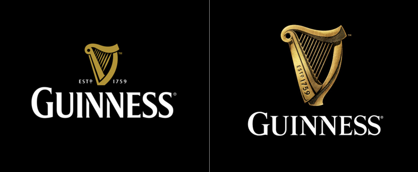
To oversimplify the Guinness logo would mean taking away its heritage, and there is no reason to do that unless you want to take the brand in a completely new direction.
But generally, the more visual character and personality a logomark has itself, the harder it is for the logo to take on the brand's personality and meaning. Unless of course, they both representing the same.
Recognizable
A logo has to be easily recognizable. This means whatever logomark you design, it has to be a shape that allows for quick recognition. Instagram actually does a pretty good job at this. While it seems somewhat generic at first, it's easy to recognize from far away.
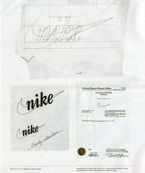
Or think of the Nike logo. Can you take a pen and paper and roughly draw the logo from the top of your mind in less then 10 seconds? I'd guess all of us can. This a good exercise to test visual brand recognition to some degree. You certainly wouldn't be able to draw the Coca Cola logo, but most likely you would be able to draw their iconic bottle shape, which serves as an icon as much as their wordmark does.
Functional
Of course, a logo must be functional. Most likely your logo will be used in many different scenarios, from digital to print, motion, physical product design and so on.
A logomark will also be used by many other people than yourself, so you want to make sure that whatever you design will stand the test of time. The more complex your logo mark is, the harder it will be to work with it, and the more chances there are for other people to mess it up.
If you have to give your logomark to your partners or employees accompanied by a 150-page brand manual, you might want to rethink some of your decisions. A great logomark is flexible in its application and should be able to be applied by anyone, even if that person is not a designer.
It's almost like you're designing a toy for kids, thinking about every possible scenario and keeping it so simple, no one can destroy it or use it the wrong way.
Relevancy
A great logo should reflect the time it lives in. It ideally feels fresh and relevant to its current audience. A logo can grow and evolve the same way a human being evolves over time. The reason we update a logo or visual identity is because the brand and character behind it changing and we like our visual centerpiece (the logo) to reflect this change.
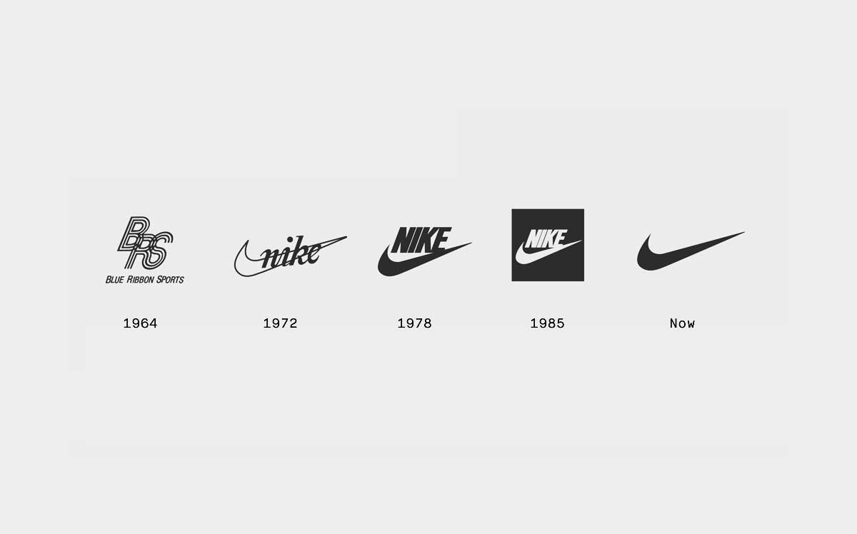
The Nike logo evolution above is just an example of how the brand identity has grown over the years. The changes are significant but the visual we all know and recognize remains intact. The brand's evolution isn't too radical to bother you.
In some cases, companies take more aggressive changes to their brand identity. And usually, we as the design spectator don't know the full reasoning behind it. Sometimes it's the wrong decision, sometimes it's the right one. In some cases, even those spectators who bashed the design end up adapting quickly.
__
Re-brandings and logo changes are difficult and ultimately there isn't a "right" or default way to do it properly. When re-branding big companies, it all comes down to communication and minimizing risk. It also depends on the company and brand itself. It's a classic "it depends" kind of scenario.
All we know is that we can't judge a brand by its logo, the same way we can't judge a book by its cover.
The logo of a company is very important, but ultimately it's just a vessel to hold whatever meaning you give to it. Having only a beautiful logo for a meaningless company is like putting a suit or dress on a person without any substance or character.
© 2021 House of van Schneider LLC
All rights reserved.
MORE ABOUT TVS
About DESK
Curated mixtapes
DESK partnerships
BECOME A FRIEND
Twitter
Dribbble
Instagram