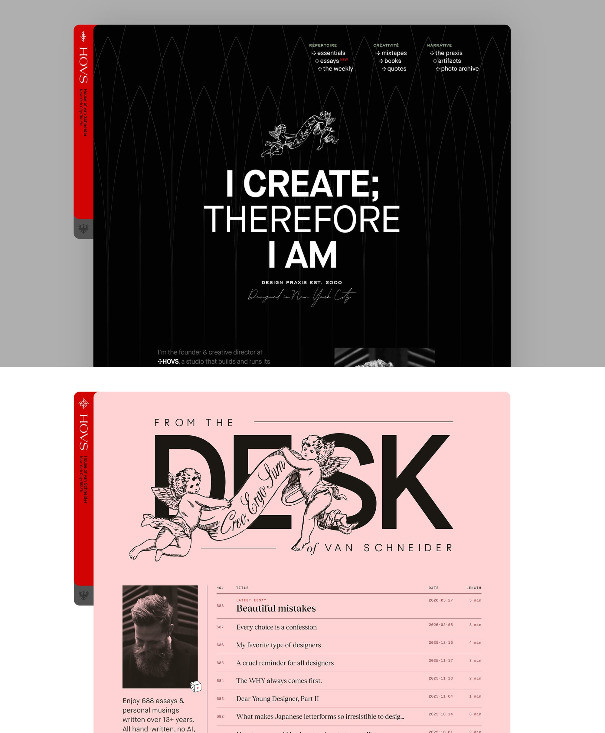
If you're reading this, you're already on it! In case you're reading this on your phone, I hope you can visit on desktop soon too. You know, the one with the big screen. The bigger the screen, the better. It works beautifully on tiny cute devices too, but I'd love for you to see it on your big screen first, the way it was intended to be seen.
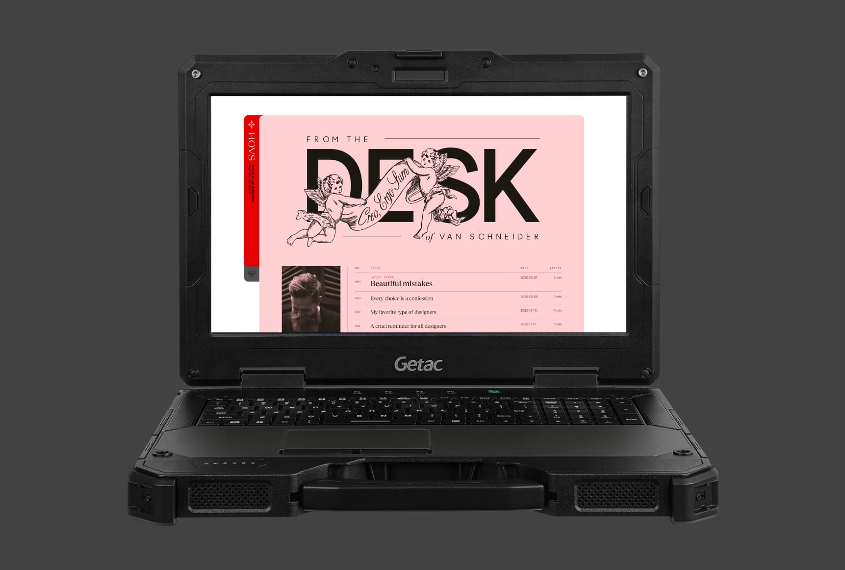
I struggled with this re-design for months. It's weirdly always the hardest with your own work, your own website. But one day, it all started to make sense.
The old DESK Magazine was trying too hard to be something that it's not. For many years, it was trying to be this glossy editorial magazine, with big images, big headlines, something that was trying to be read. And generally, there's nothing wrong with that. But over the years, it all changed. The internet changed, I changed, and my writing changed as well.
Today, I want DESK to be more personal. I want it to be this ledger or archive of my personal writing for years to come. I want it to be my diary of sorts. It should feel like something intimate, full of little gems for those willing to find them. In a way, its an ode to the old internet, the way I remember it at least.
There are close to 1000 articles that have been published since the launch of DESK, I'm still sorting them out, but the new DESK houses 664 of them so far.

Where will you land?
If you're feeling bored, or adventurous, you can roll the dice next to my profile photo and it might land you on an essay that fits a feeling you have today. Funny enough, I use this all the time now myself, wondering where I will land. Try it yourself (inspired by StumbleUpon, for those old enough to remember).
An alternative perspective: Judge it by its cover
Every article so far (almost 1000) had a custom designed cover for it. That is a lot of covers. I never thought about it until I put them all next to each other in a grid and noticed how they are their own graphic design gallery in a way. So I had this idea; what if I put some of my favorite covers (hundreds) all next to each other, on one big wall and you simply scroll and "judge" an article by its cover, without knowing whats behind it?
Introducing, "The Wall". It's just another way to browse my essays (:
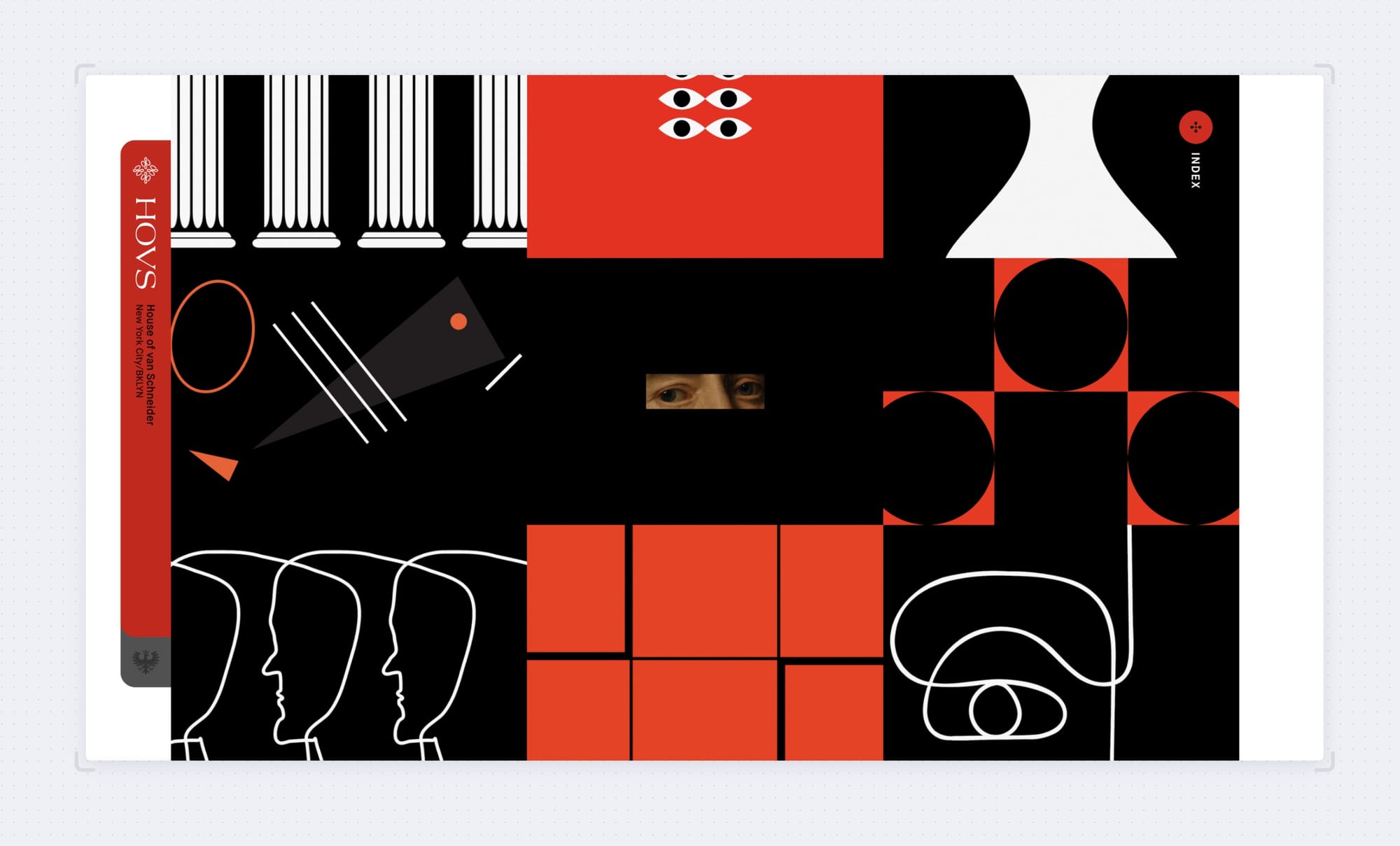
Fun fact: The new DESK does not rely as much on these covers anymore, which is sad but also very good for me because you must know these have been a pain in the ass to make and many essays never got published because I didn't have the time to do a cover that met my standards. They ended up becoming a barrier to publishing on a regular basis.
To the future!
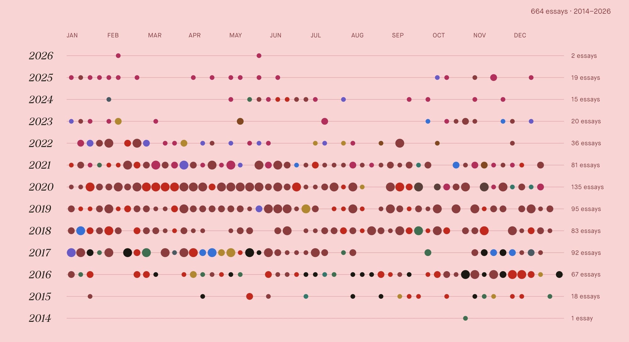
And then, there's this little visual at the bottom of the DESK blog. An embarrassing look for me, because you can tell that my writing/publishing has become less over the years, although to my defense, there are a couple dozen essays that I sent via email but never published.... but in order to inspire myself, I look at this graphic everyday now, and keep my habit of writing.
But that's enough news for today, there's plenty more to share and you'll hear soon from me again. Thank you as always for reading, especially to those who've been with me and DESK for over a decade now! You're the best 🖤
Oh and, if you're not subscribed yet, consider yourself invited!
Thank you for reading.
Yours truly,
Tobias
PS: The new mymind iOS app is finally live! But I will share a lot more about this news in the next weeks!
PPS: There's a new sub-page on my website specifically for mymind design artifacts. You can find it here. Hope you enjoy the browse, there's more coming soon!
PPPS: And yes, the new blog still runs on GHOST which I absolutely enjoy and highly recommend. Another little detail I love is that my personal website and my DESK blog now share a similar visual language.