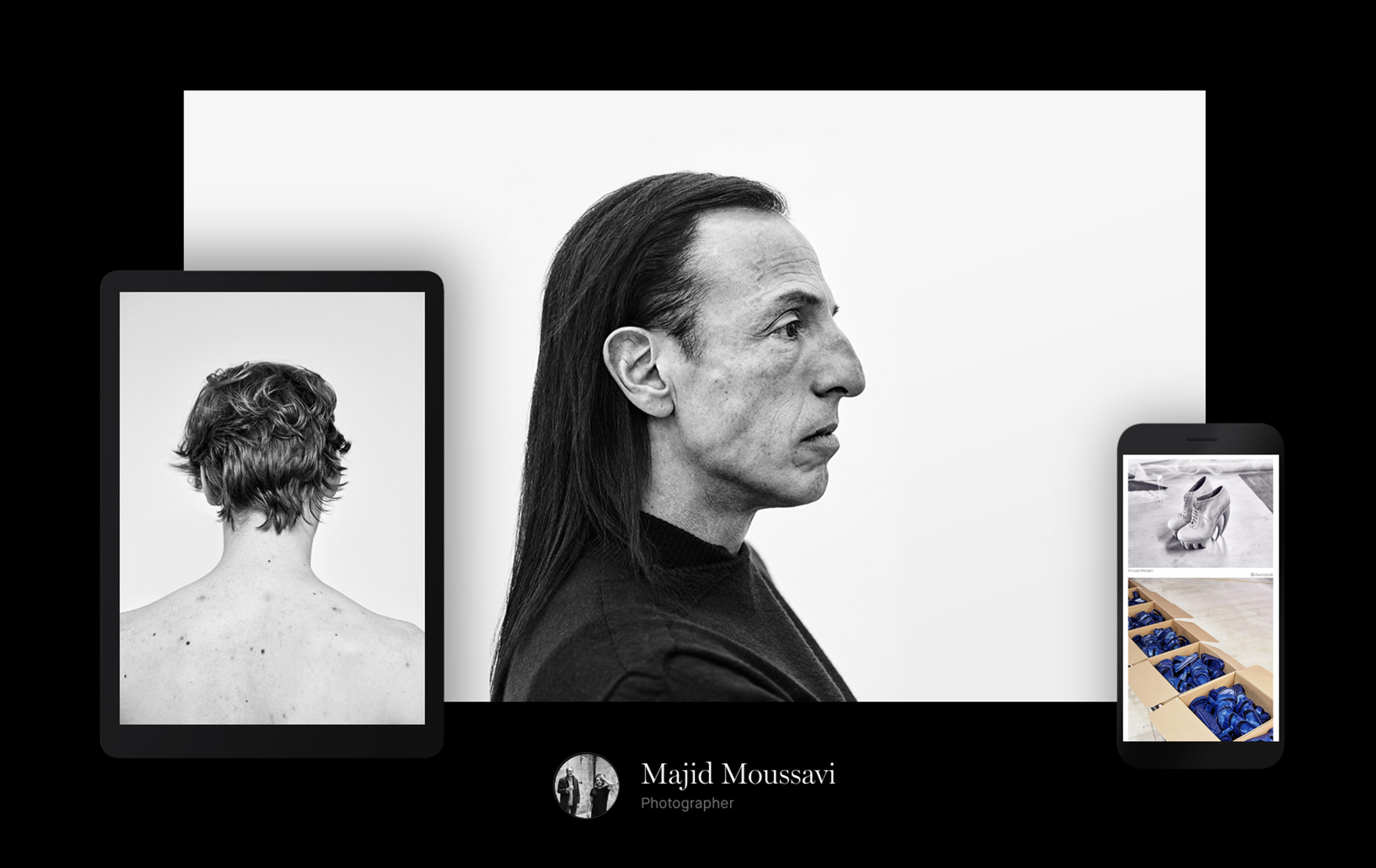
How to sufficiently capture architecture work in a portfolio? Relaying the grandeur of a building or the thought process behind a floorplan can be difficult online. Renderings only go so far without you there to explain them.
A good portfolio usually requires input beyond your main skills. To do your work justice, you need great photography, good writing, strong design. Thankfully, tools like Carbonmade take care of half of that for you. For the rest, we asked a few architects for their best advice. Here’s what they suggest when building your architecture portfolio.
Show diversity & original thinking
The jack of all trades vs. specialist debate is never-ending, but it seems that for architects: a range of skills is key.
“People want to see nice photos and diversity,” says Kendall Latham, an architect based in New York, New York. “You want to show you have proficiency in everything, but you should also show what you’re best at and enjoy the most.”
There’s nothing wrong with specialization. If you’re incredibly good in one area, you will be sought out for it. But diversity shows depth.

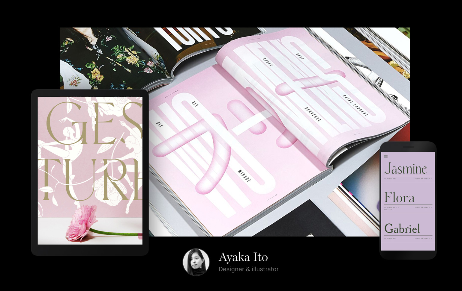
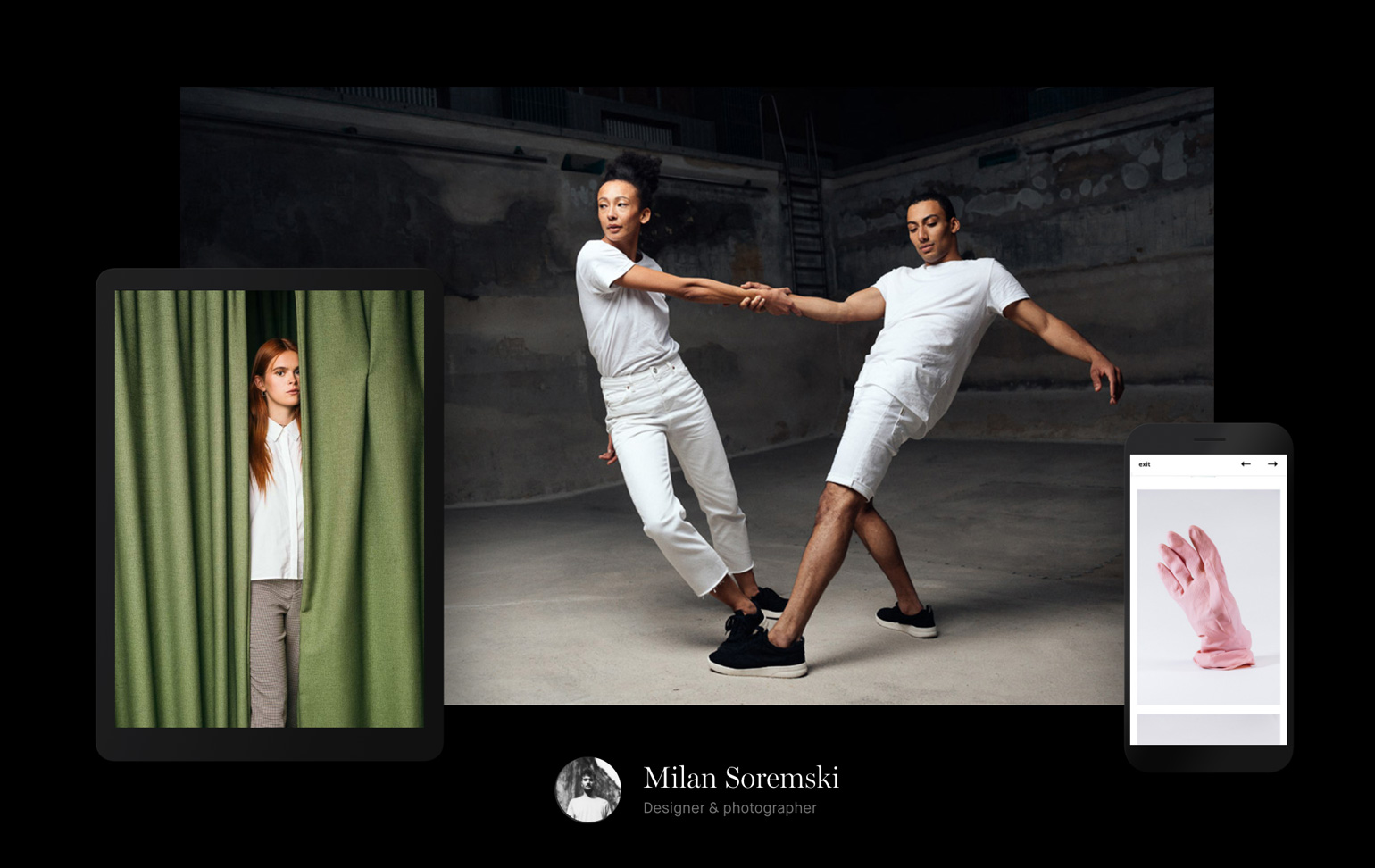
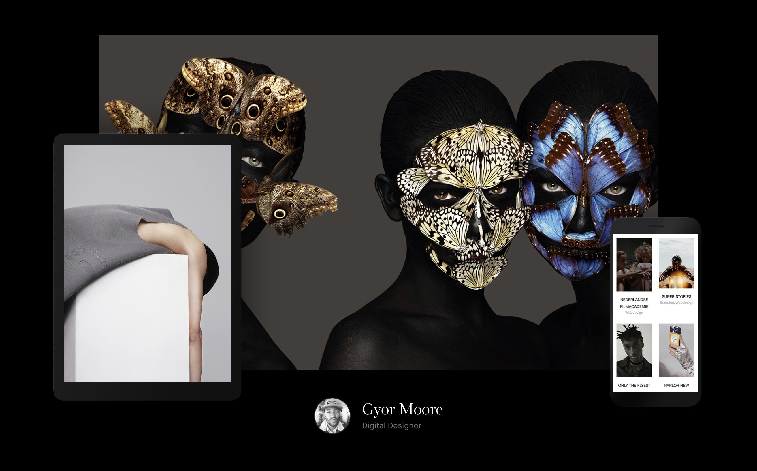
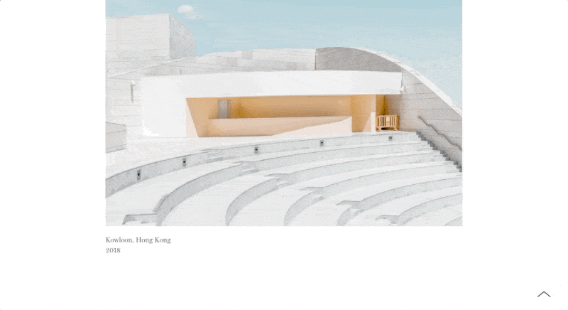
Part of Kendall Latham's "Glossier Flagship" project, with Gachot Studios – kendalllatham.com
“Depending on the architectural role, the employer could look first at the variety of your past experiences. If your portfolio shows different projects in different areas, automatically you become a more interesting profile,” says Silvia Verardi, an architect and interior designer from Milan, Italy.
Select a range of projects that show your strength in key areas. And beyond just different types of work, convey a diversity of thought and ideas.
“Usually, if you are an architect, you are supposed to be a creative, original, extremely flexible and out of the box minded professional (otherwise they would have been looking for an engineer!)” Verardi says. “So try to keep up with these expectations.”
"It’s not about chronology, it’s about the most important works. If you want to work in retail, there’s no point in showing a technical drawing for an engineering project."
Aim for simplicity and clarity
Make it as easy as possible for someone to learn about you and make the decision to hire you.
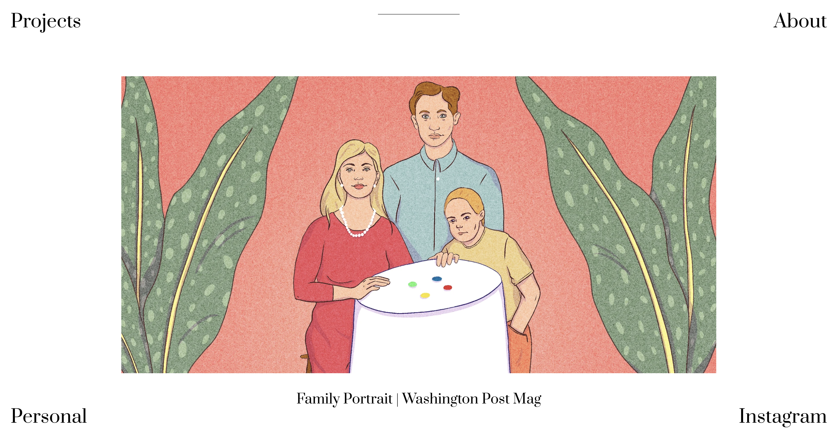
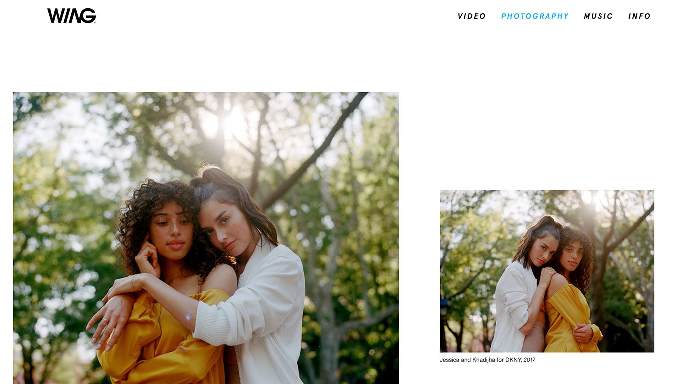
Remember, people scan when reading websites – and they have limited attention spans. So make it easy for them with bite-sized paragraphs and headlines they can scroll through. Include captions for your images so they can understand at a glance what they're looking at and why it’s meaningful.
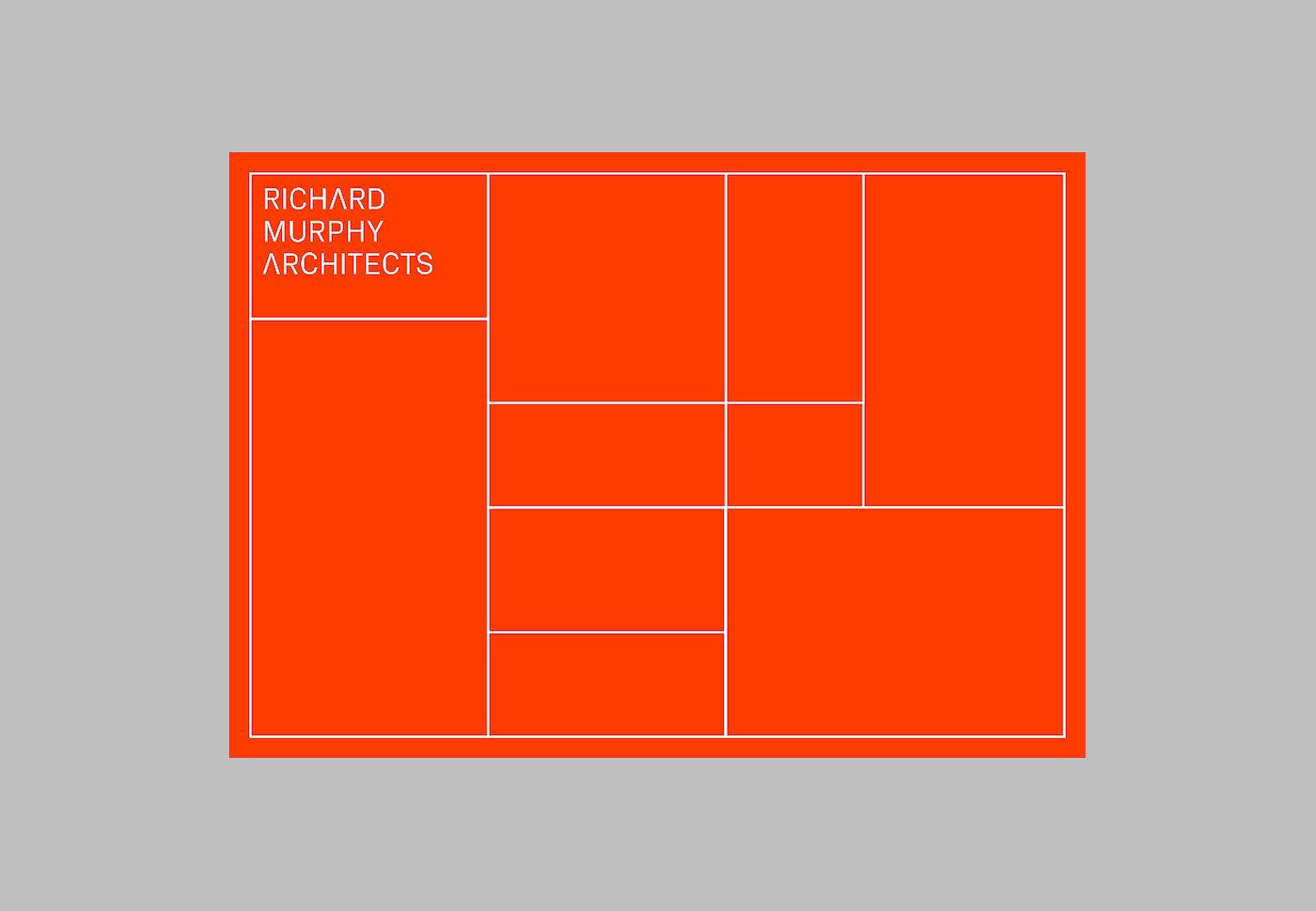
“Your portfolio should have a clear, easy-to-read structure, with this key information highlighted: project title, project phase, your role, main project data, year of realization,” says Verardi.

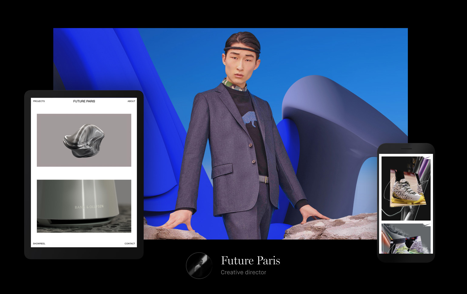
"Miami Design District - Retail & Dining" by Silvia Verardi – silviaverardi.carbonmade.com
Carbonmade makes this process intuitive. Working from a base structure, you can simply drag & drop to rearrange blocks and lay out your page. Think about the story you’re telling about your work with your portfolio, and aim for each case study to support that story.
“Simple does not mean less creative," Verardi says. "In fact, it should not be graphically monotonous: find a theme, a color, anything that acts as a fil rouge for the portfolio that makes it attractive and at the same time that gives coherence to the whole.”

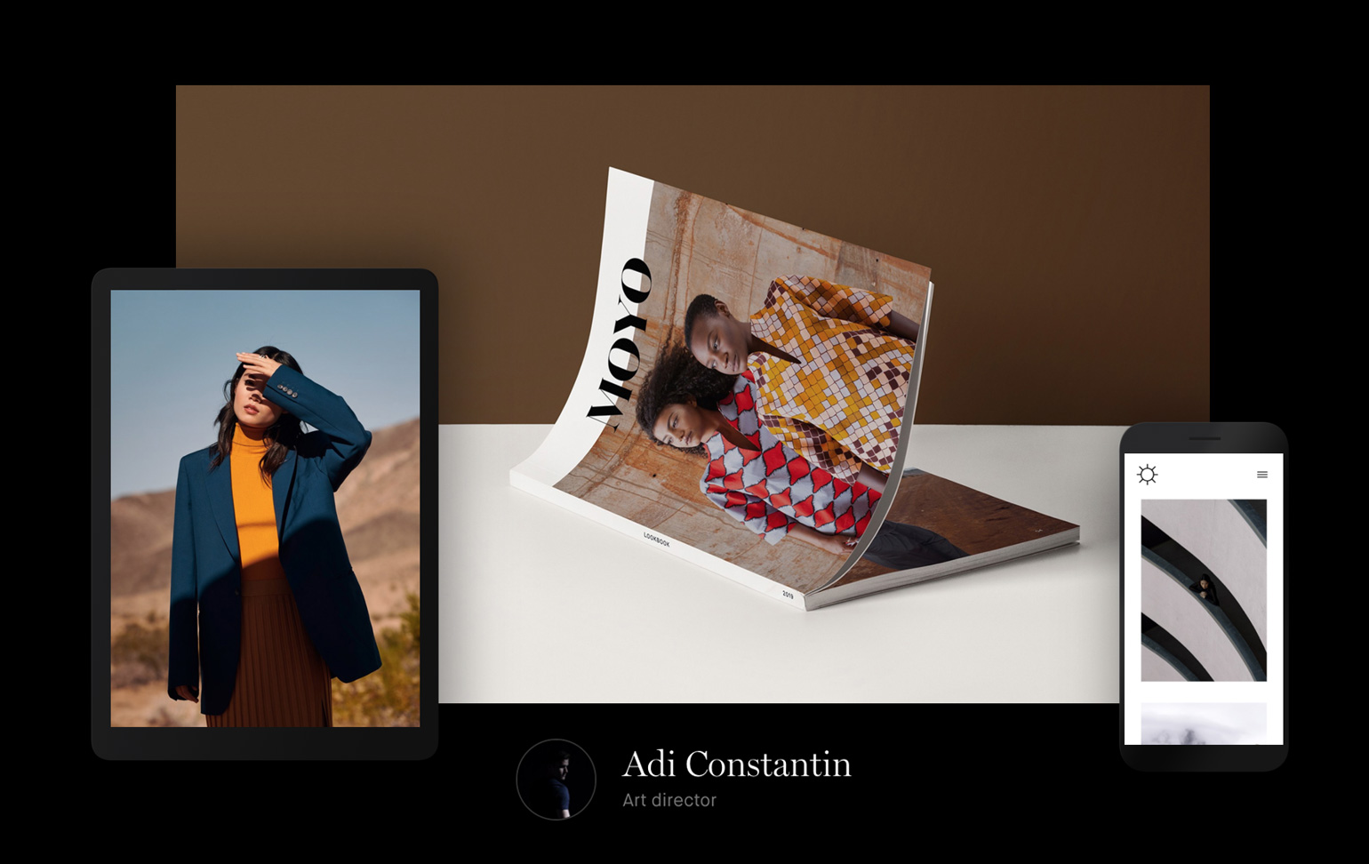
A scene from Kendall Latham's "Glossier Seattle" experiential project.
Curate for the job you want
The best portfolios are not the ones with dozens and dozens of projects. They are focused and cohesive. They paint a vivid picture of a person and what they offer. And that’s due, in part, to good judgment and restraint.
“Cater your work to show what you’re interested in,” says Latham. “It’s not about chronology, it’s about the most important works. If you want to work in retail, there’s no point in showing a technical drawing for an engineering project. Unless it’s showing technical ability, all of those things are less relevant.”
Your portfolio is not about the work you already did, but about the work you will do next. When selecting your projects, don’t just think about what looks best. Think about what you want to keep doing in the future.
“I believe the key to creating a great architecture portfolio is editing,” says Jeremiah Johnson, an architect from Minneapolis, Minnesota. “Prospective employers or clients have a finite amount of time, and while it's good to share your experience, the more projects you show the less time they will spend understanding your design thinking and process. Showing fewer projects with more depth will better illustrate your skills and emphasize your value as a designer.”

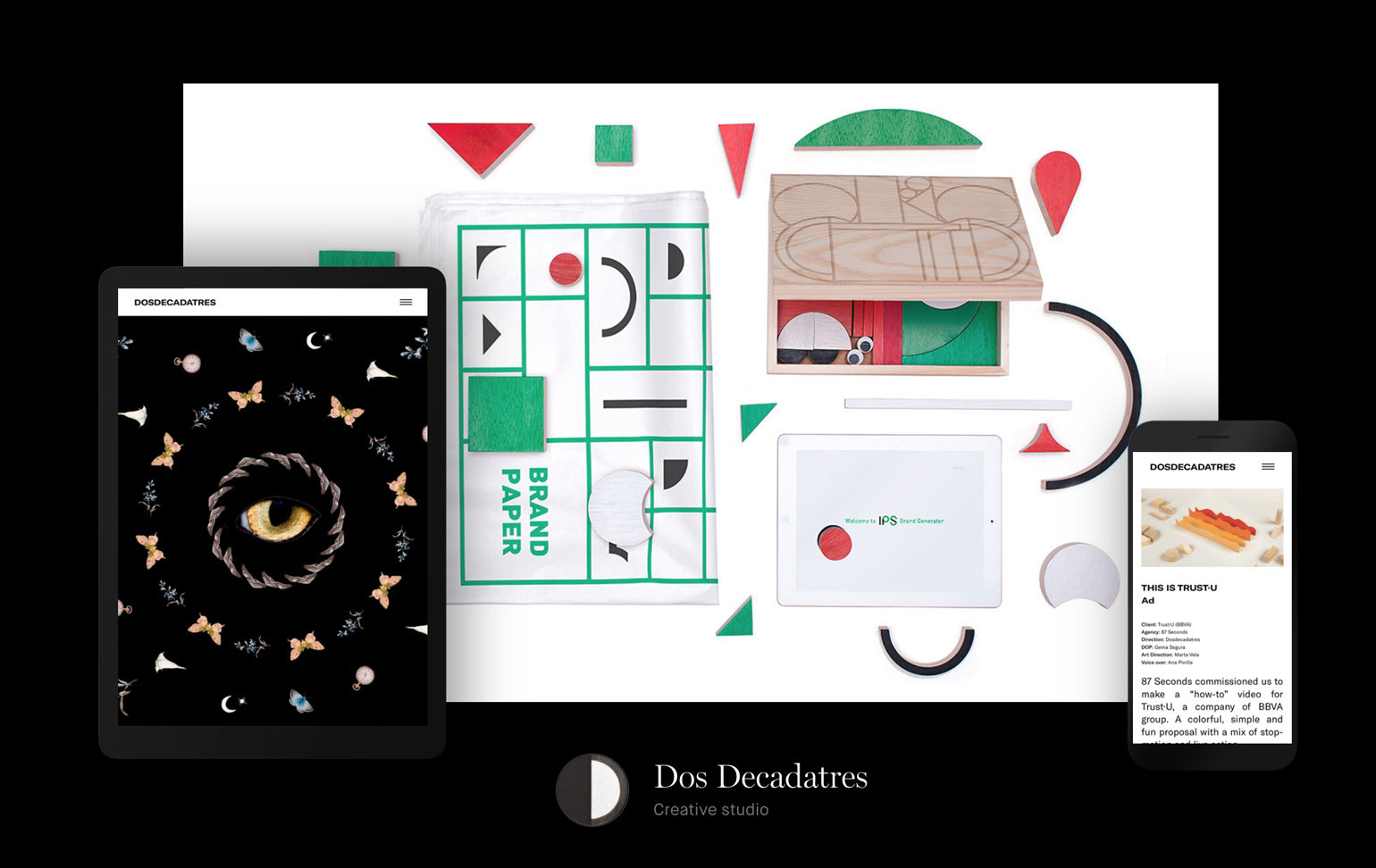
From Jeremiah Johnson's project, "prairiehouse." – jjohnson.carbonmade.com
Show credibility
“Choosing an architect isn’t an easy task, “says Yohanan Beeri, an architect from Jerusalem, Israel. “You confide in them so much without really knowing in advance.”
Unless you’re already a known and respected architect, it’s not enough to simply upload photos and share the expected rundown of your projects. Your portfolio is your opportunity to sell what you offer and build confidence in your potential client.

From Yohanan Beeri's "Jerusalem House 1" project – yohanan.carbonmade.com
One way to do that is through client reviews. Ask your favorite clients to give you a 1-2 sentence testimony you can include on your site. Add these to your About page or sprinkle them throughout your homepage to show you not only have experience, but a great reputation.
“I believe that when people are looking for an architect, they are trying to find someone who will understand their needs, someone they can rely on and trust. In my opinion, the best way is to read other client's reviews, and talk to them if possible.”
Mariana Antunes, an architect, interior and urban designer based in Porto, Portugal, agrees.
“It really depends if it's a private client or an office and what they're looking for,” Antunes says. “If it's a private client, the decision is usually based either on references… or when they can see themselves living, dining, working, etc. in one of your projects (and a great way to do that is, of course, through your portfolio).”

A scene from "3D Visualisation: House in the Countryside" by Mariana Antunes – antunes-mari.carbonmade.com
"Although they are indeed looking for highly qualified people, they are also and foremost looking for that 'something extra' the candidates can bring to the team."
Give us a glimpse of your personality
You might be up against a dozen other architects as experienced and talented as you. So what makes you stand out? Your unique point of view.
“Show your personality through your portfolio,” says Antunes.“A portfolio is like a biography, so try to find your own language and tell not only your architecture stories, but your own stories through it.”
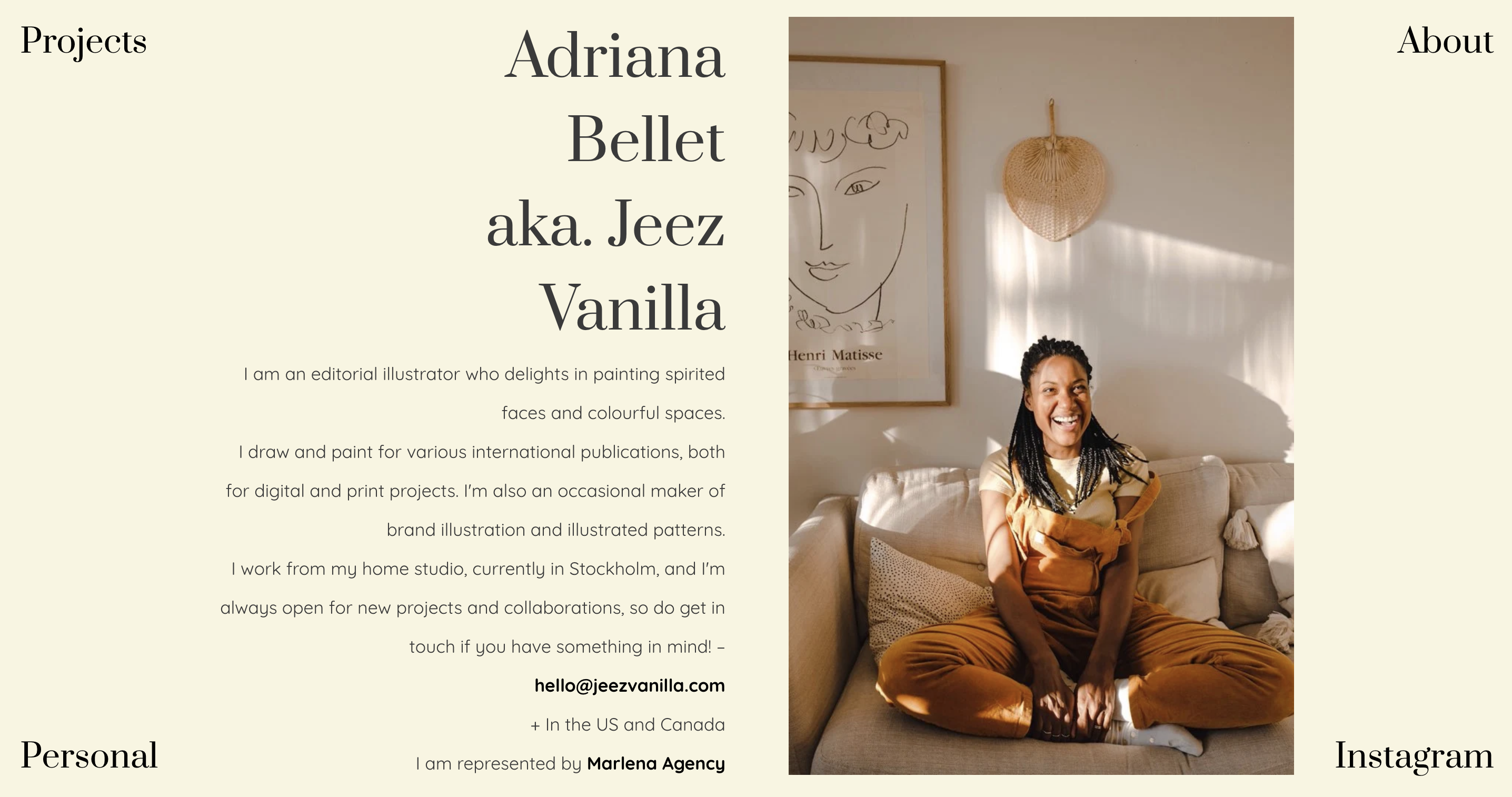
You can do this in your case studies and on your About page. Beyond the basic details, share how you approach a challenge and find a solution. Include philosophies that inspire your work. Show how you treat your clients and what those relationships mean to you. Share what makes you different, whether that’s a love for interior design or a glass-half-full attitude about life.
"When we're talking about offices or companies I see that, although they are indeed looking for highly qualified people, they are also and foremost looking for that 'something extra' the candidates can bring to the team," says Antunes. "Maybe you are not that amazing with software and stuff, but you're really creative and bring ideas and discussions to the table every day."

"Interior Architecture: GTL Apartment" by Mariana Antunes – antunes-mari.carbonmade.com
Aim to show, rather than tell. Instead of writing, "I pay attention to the details," SHOW us that through thoughtful, detailed case studies. Rather than saying "I have a future-focused approach," show us through your process and results. You can also convey personality through the way you visually present your projects.
“If you're a good sketcher, why not build your portfolio full of sketches and diagrams?” Antunes says. “Great images and realistic renders are, without a doubt, stunning and necessary in some cases, but I strongly believe that standing out is about showing what is really unique about you.”
Create case studies that illustrate your process
Great photos are important, but they’re not enough. Without knowing the process and problem-solving that went into those images, they’re no more than a pretty picture.
Again, your case studies are crucial. Each case study should walk us through the project from challenge to solution. Think of the project in phases and briefly describe each phase, helping us appreciate how you arrived to the images we see now.
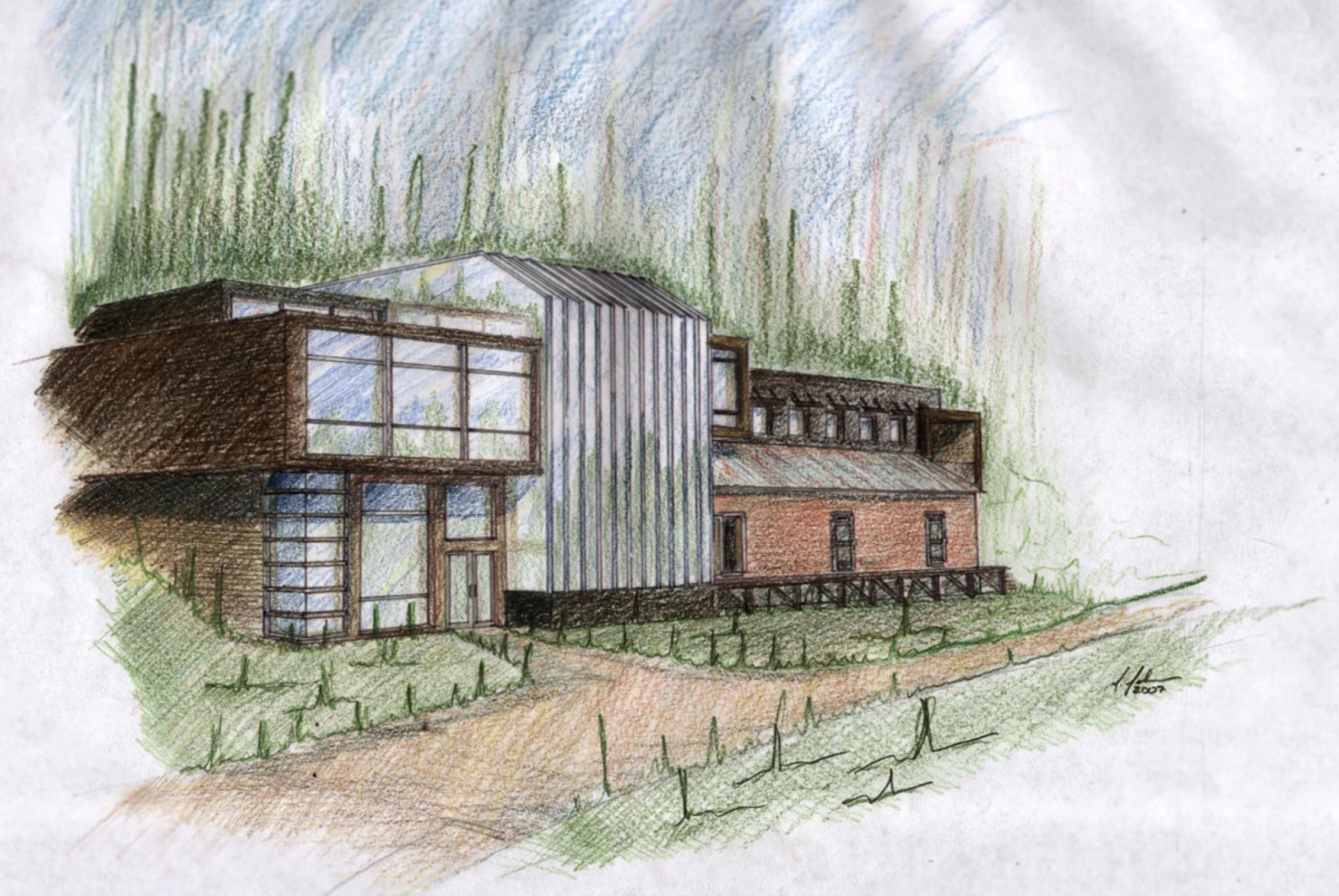
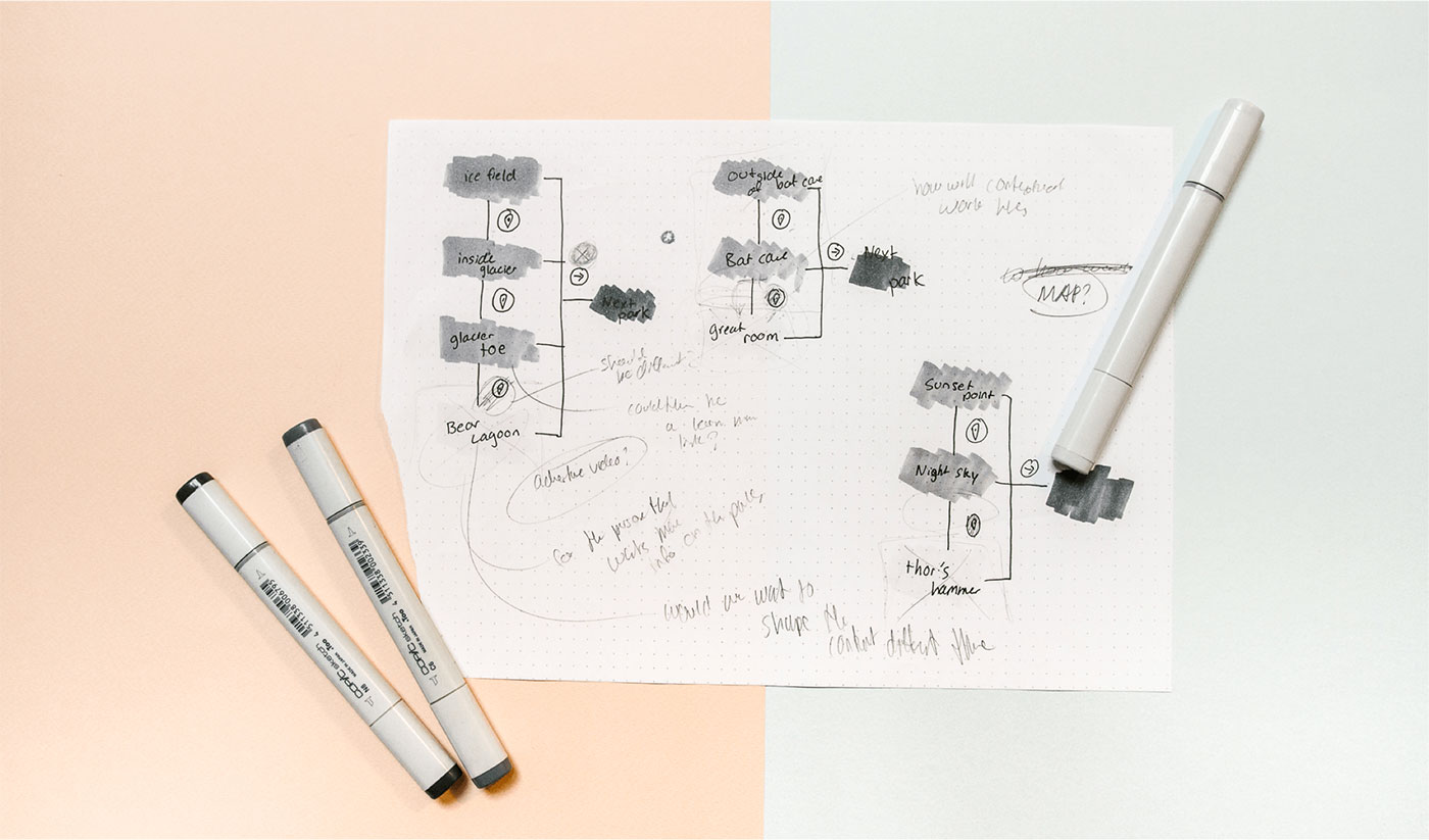
A sketch from Jeremiah Johnson's project, "The Powder Houses."
“When a client is looking to hire an architect they are looking for someone that can help solve a problem they have,” says Johnson. “The best way to illustrate an ability to solve these problems is to showcase your process, from how you understand a design problem and incorporate constraints, to how you craft a solution. When an architecture firm is looking to hire an architect, they are looking for candidates that have clarity of presentation, a broad skill set, and clear abilities to problem solve.”
After reading your case study, we should understand how you think, what involvement you had in this project (always credit your team and be clear about your role) and why this project was a success.
__
The Carbonmade portfolio tool is built for architects in mind. Simply drag & drop your photos into Carbonmade and it will do most of the work for you. With smart design features and automatic optimization, you can build your architecture portfolio in less than 15 minutes.
Sign up here to get started – it's free until you launch. And browse our Carbonmade Talentpool to see more architecture portfolios made with Carbonmade. Now go do it and launch your site!


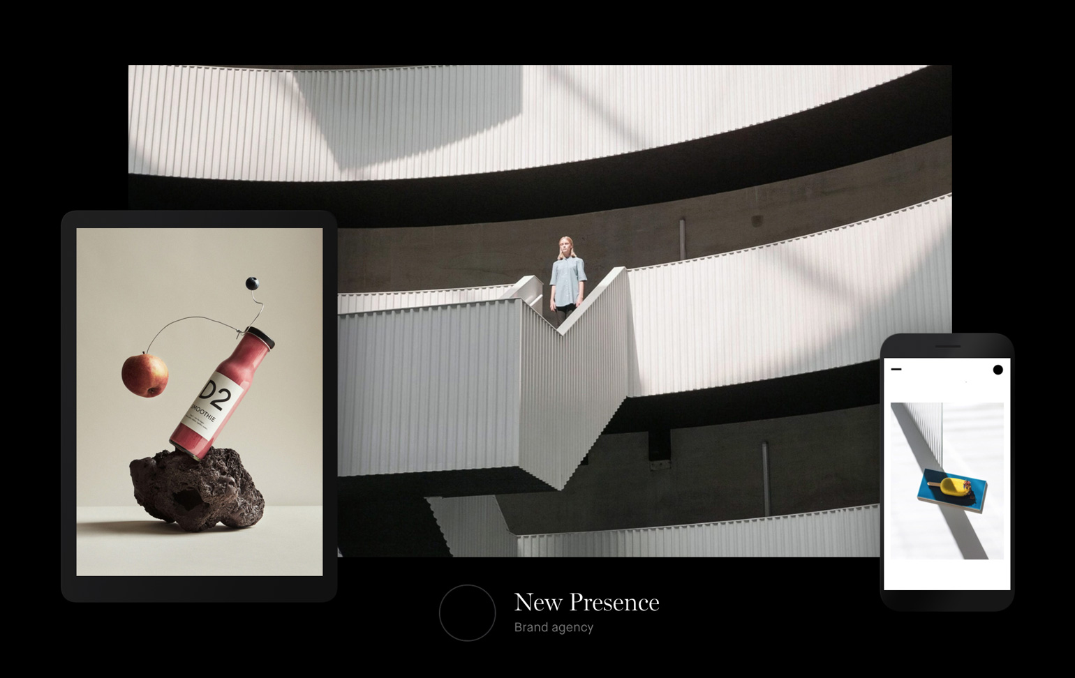


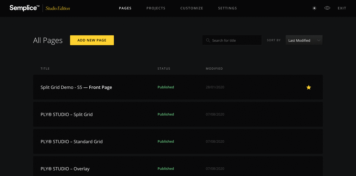
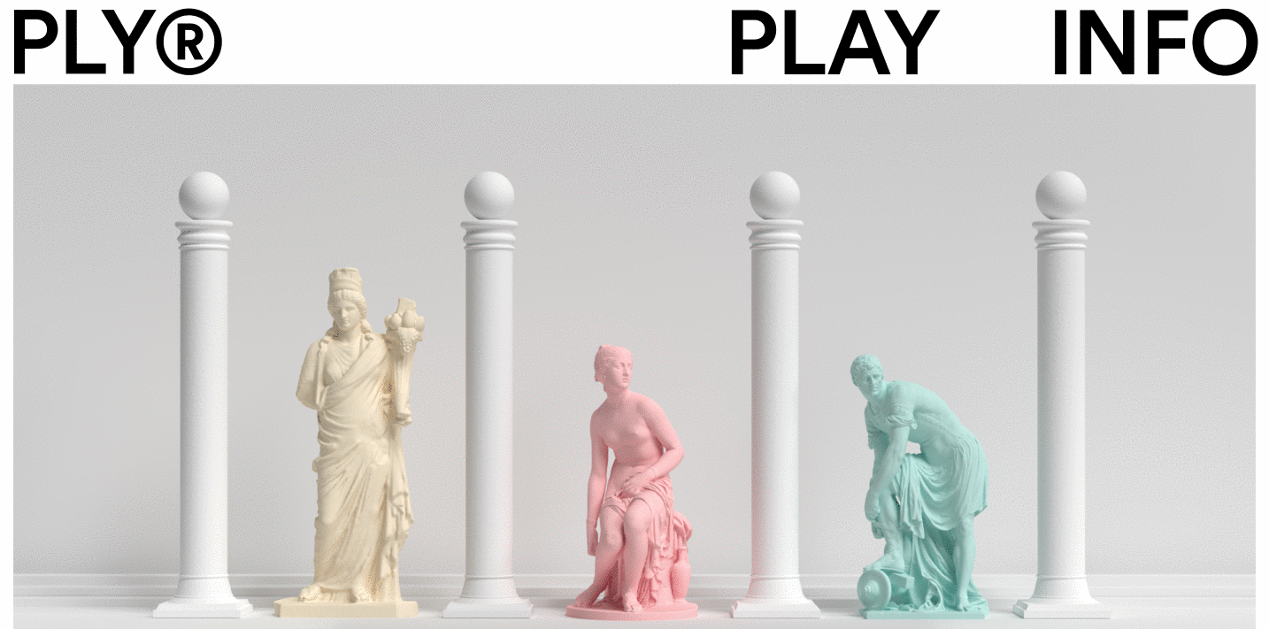

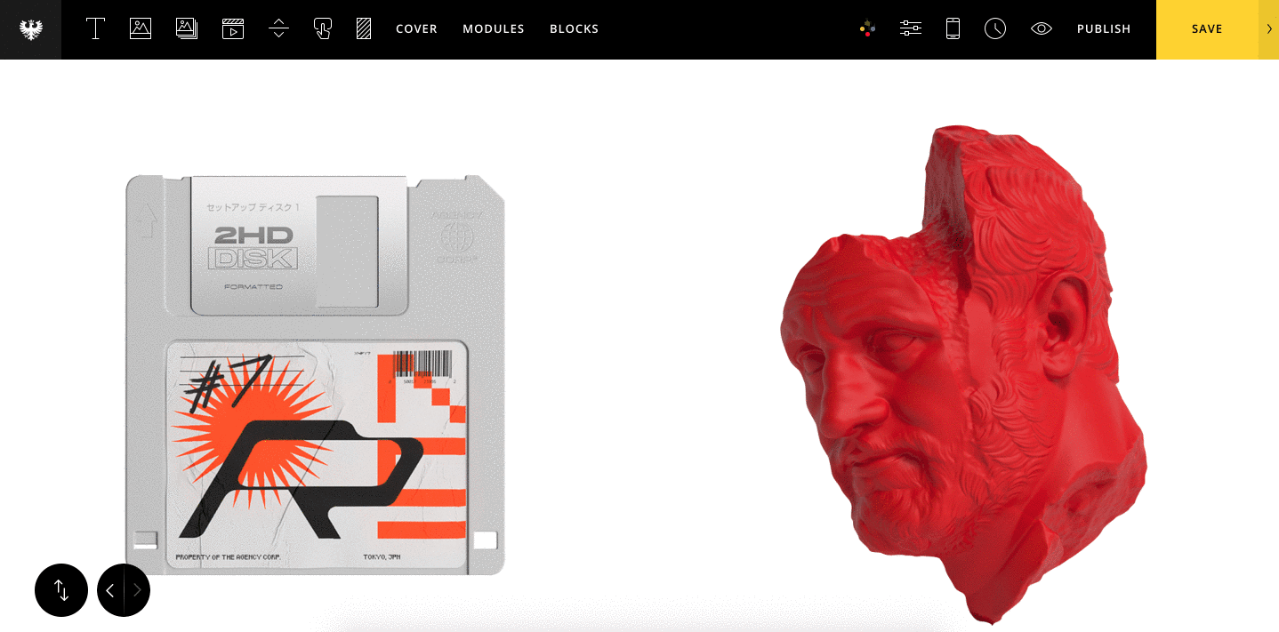
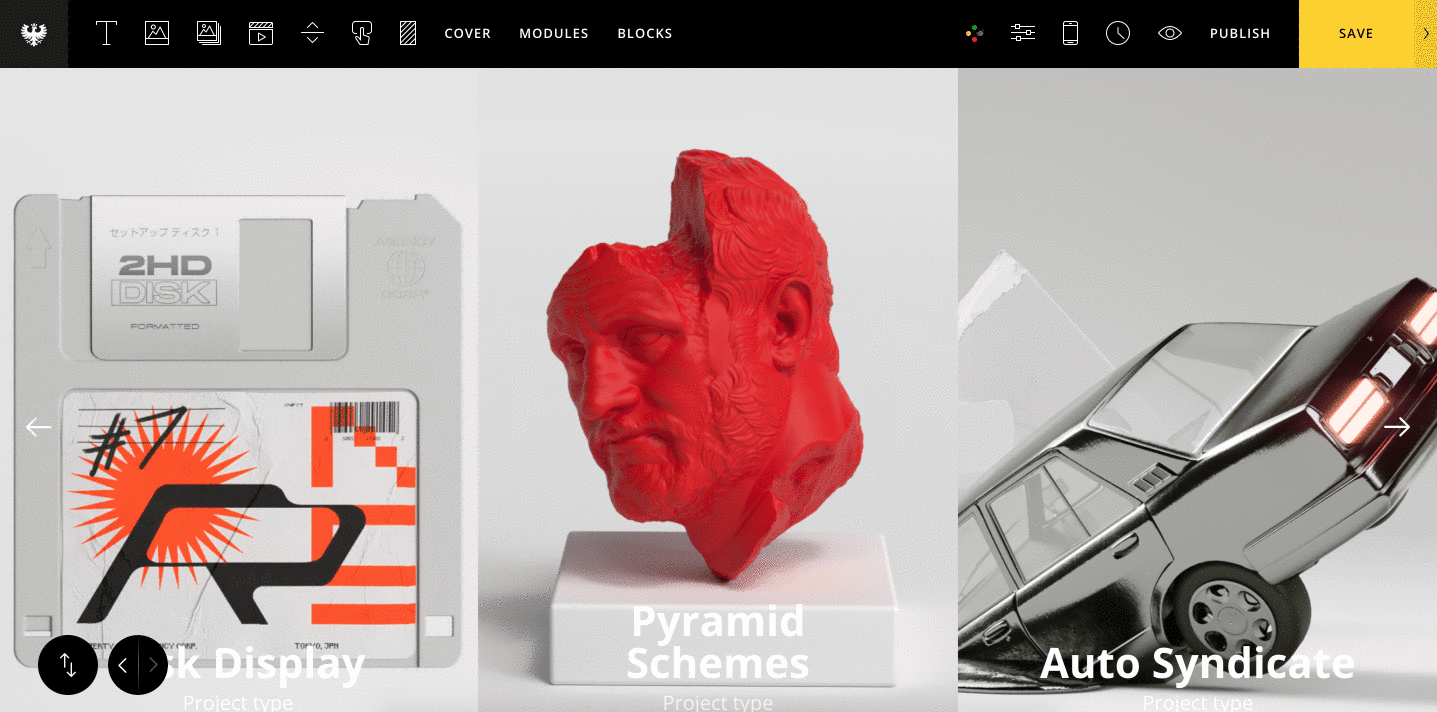
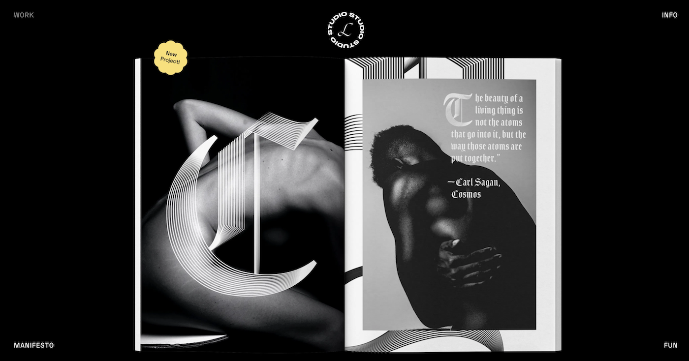
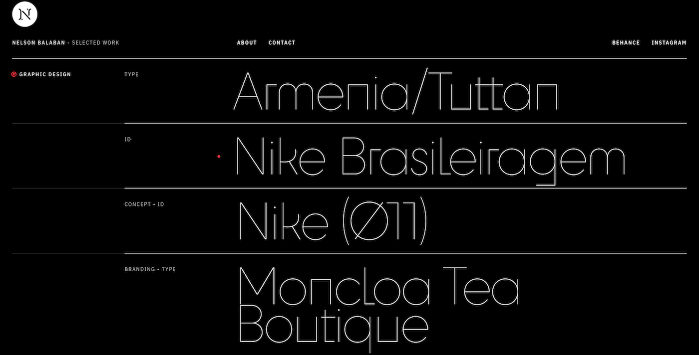
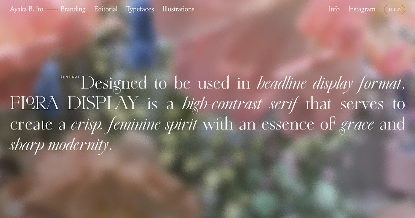
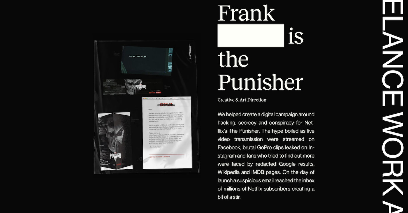
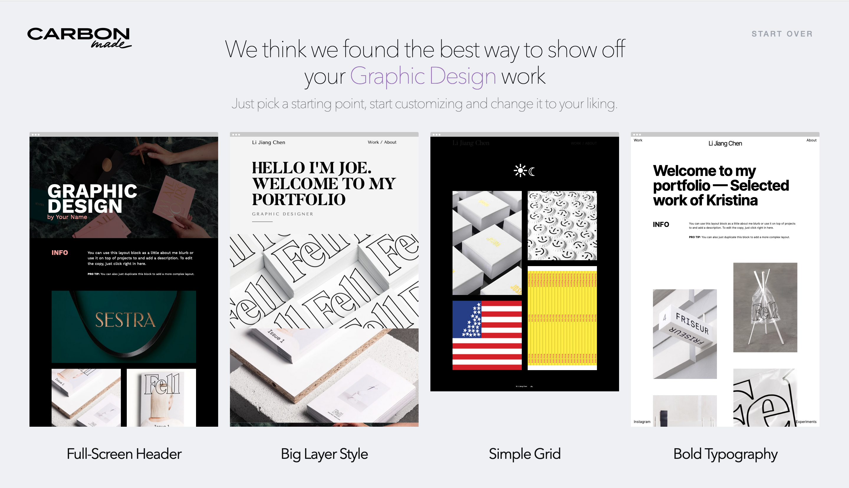
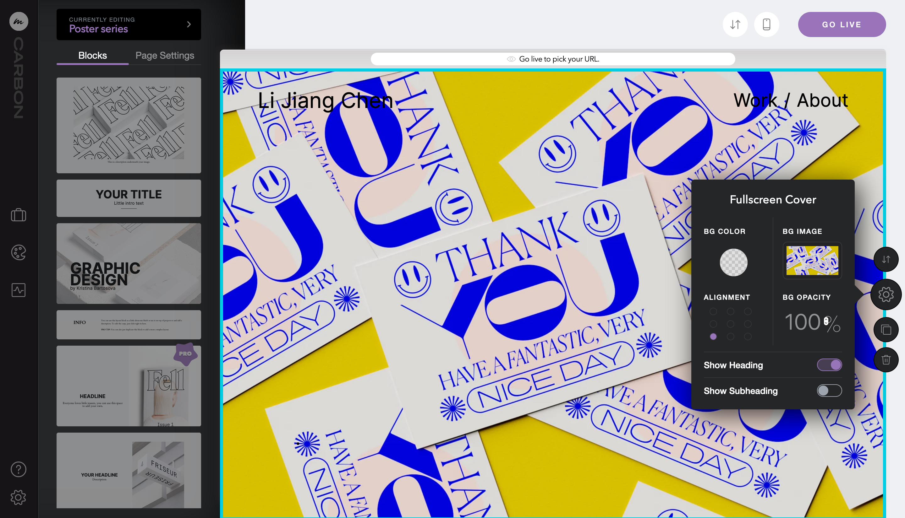
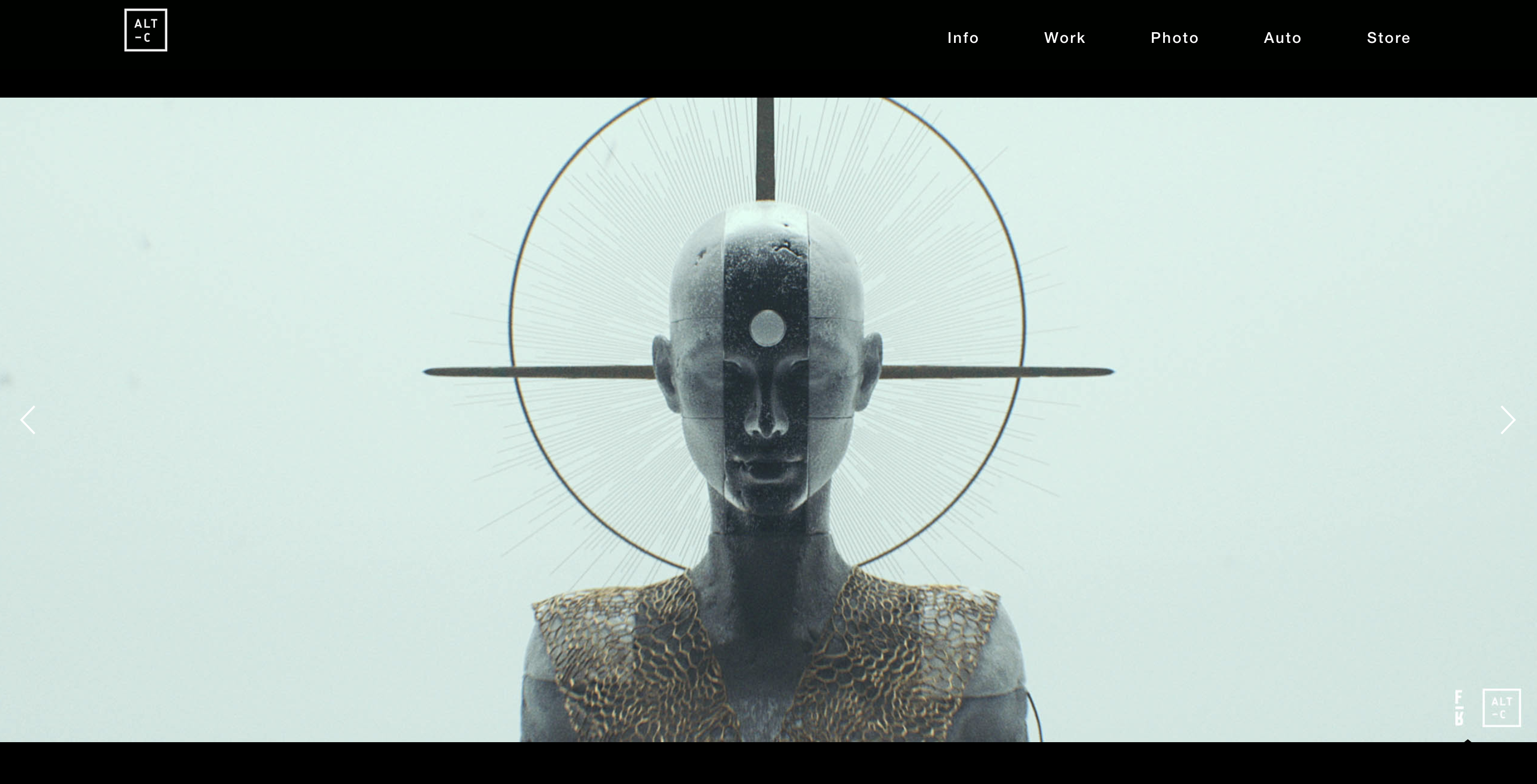
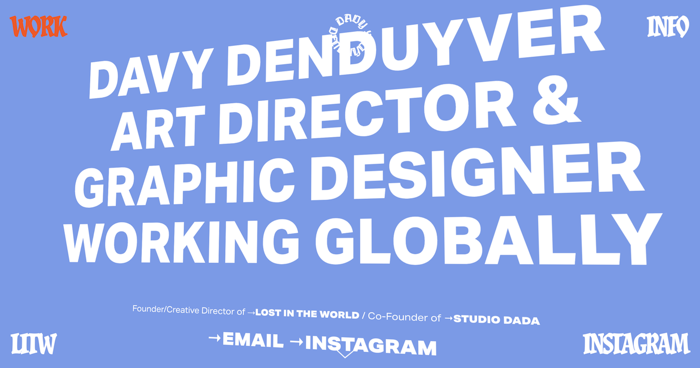
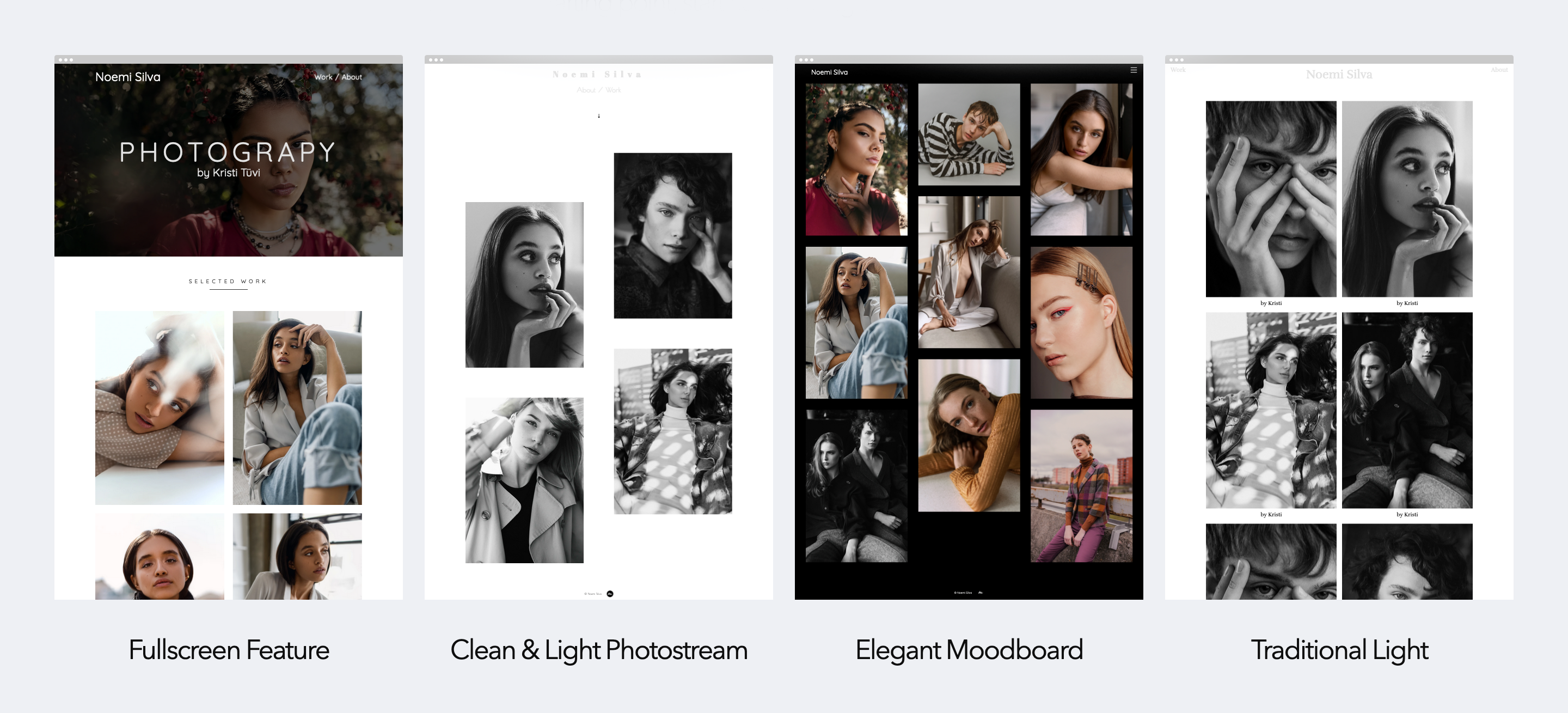
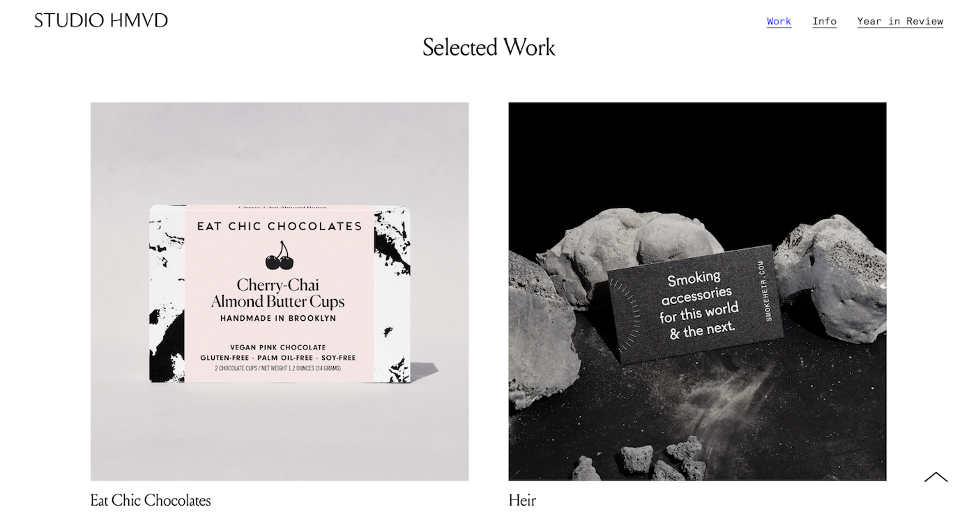
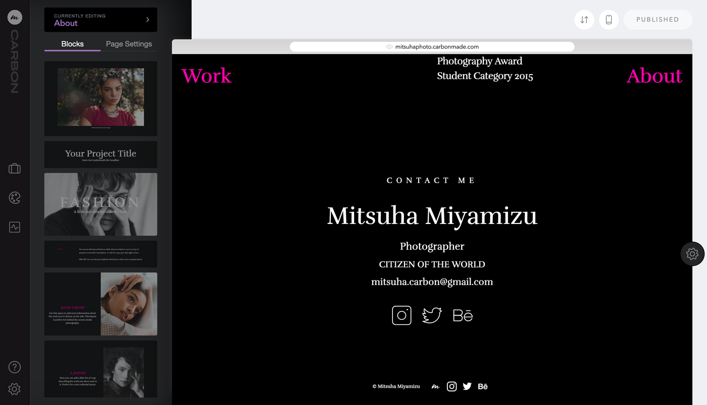
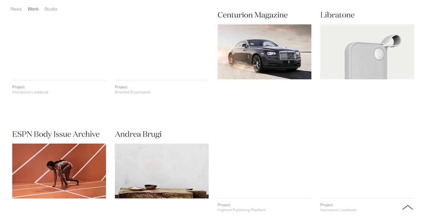
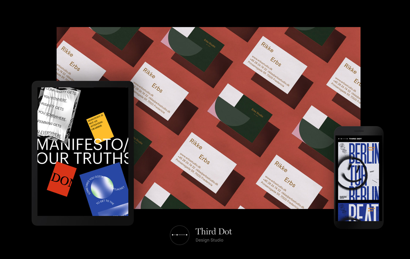
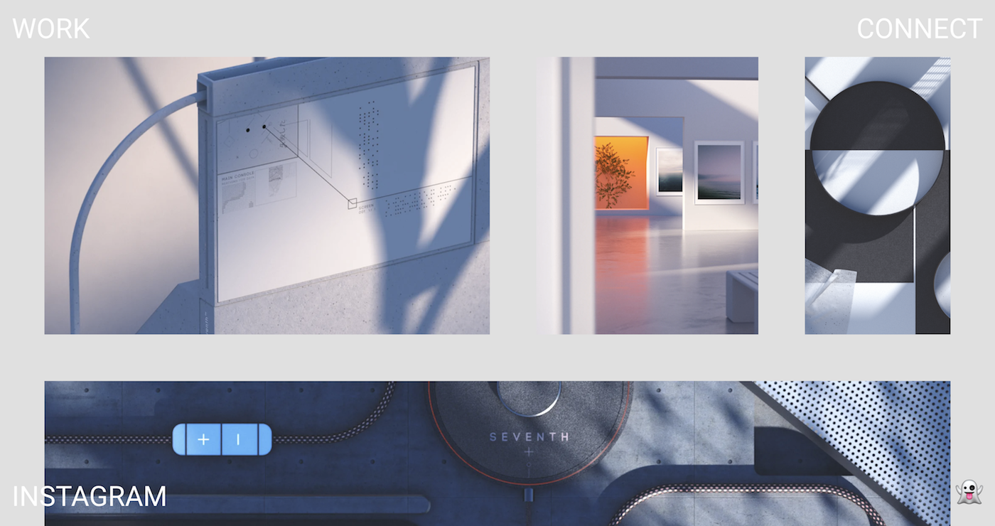
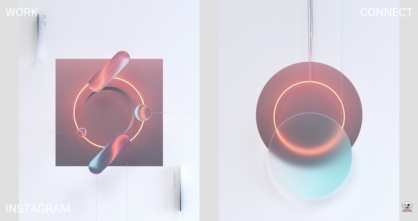
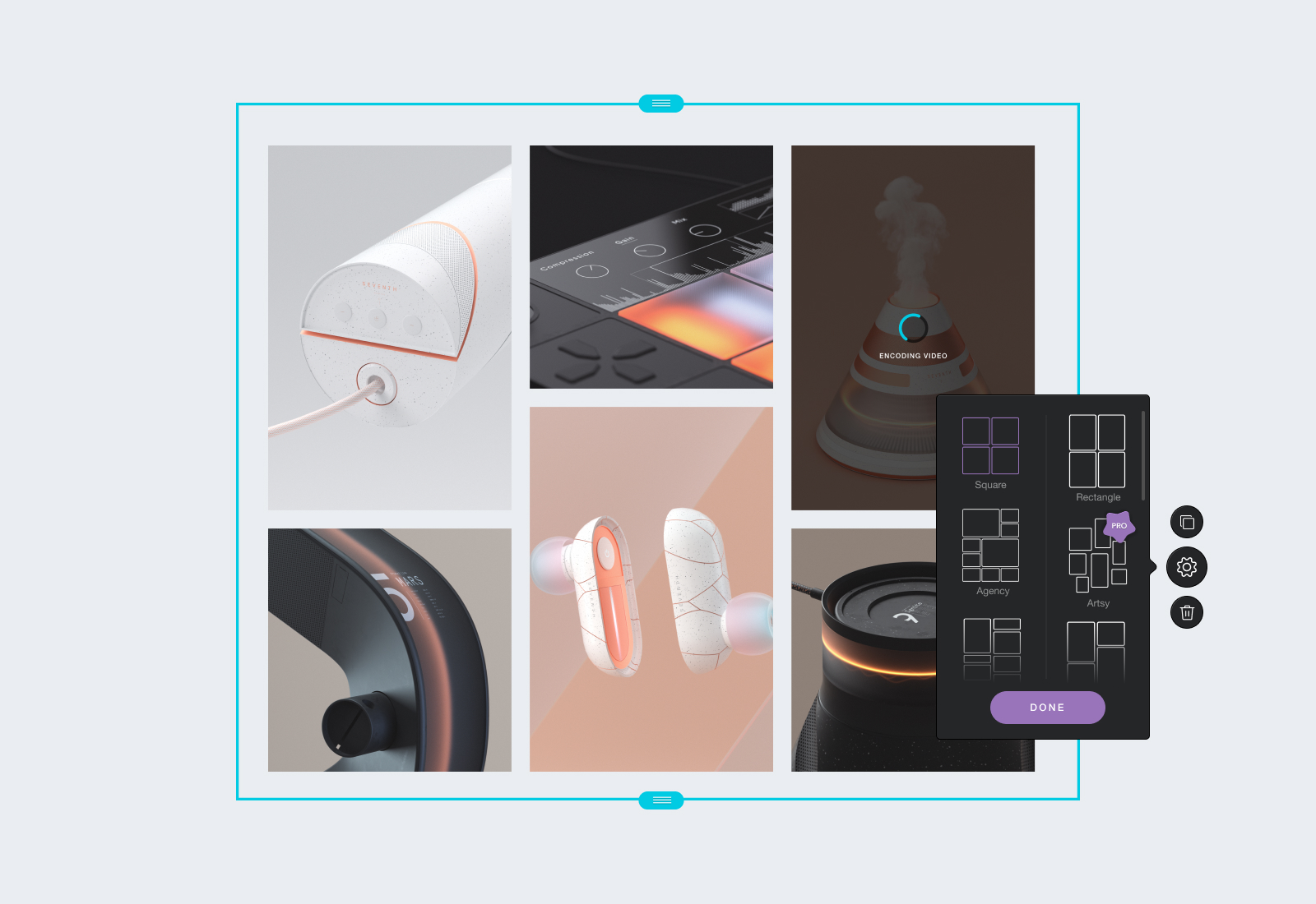
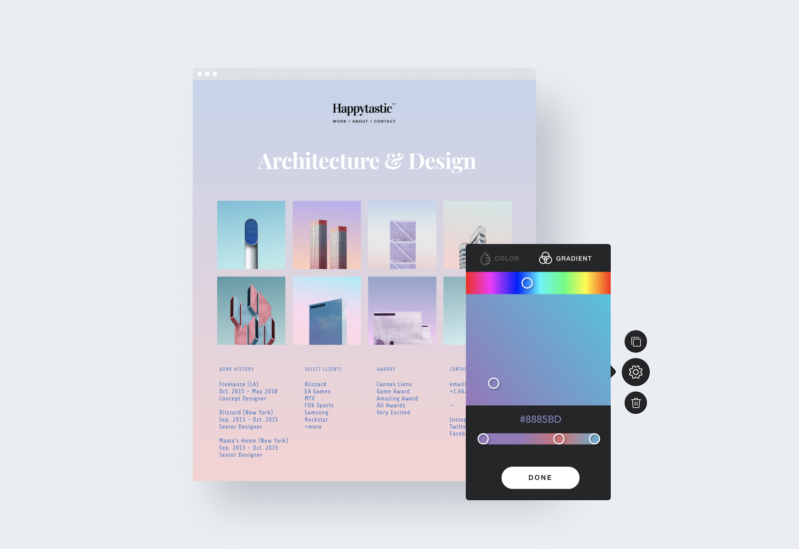
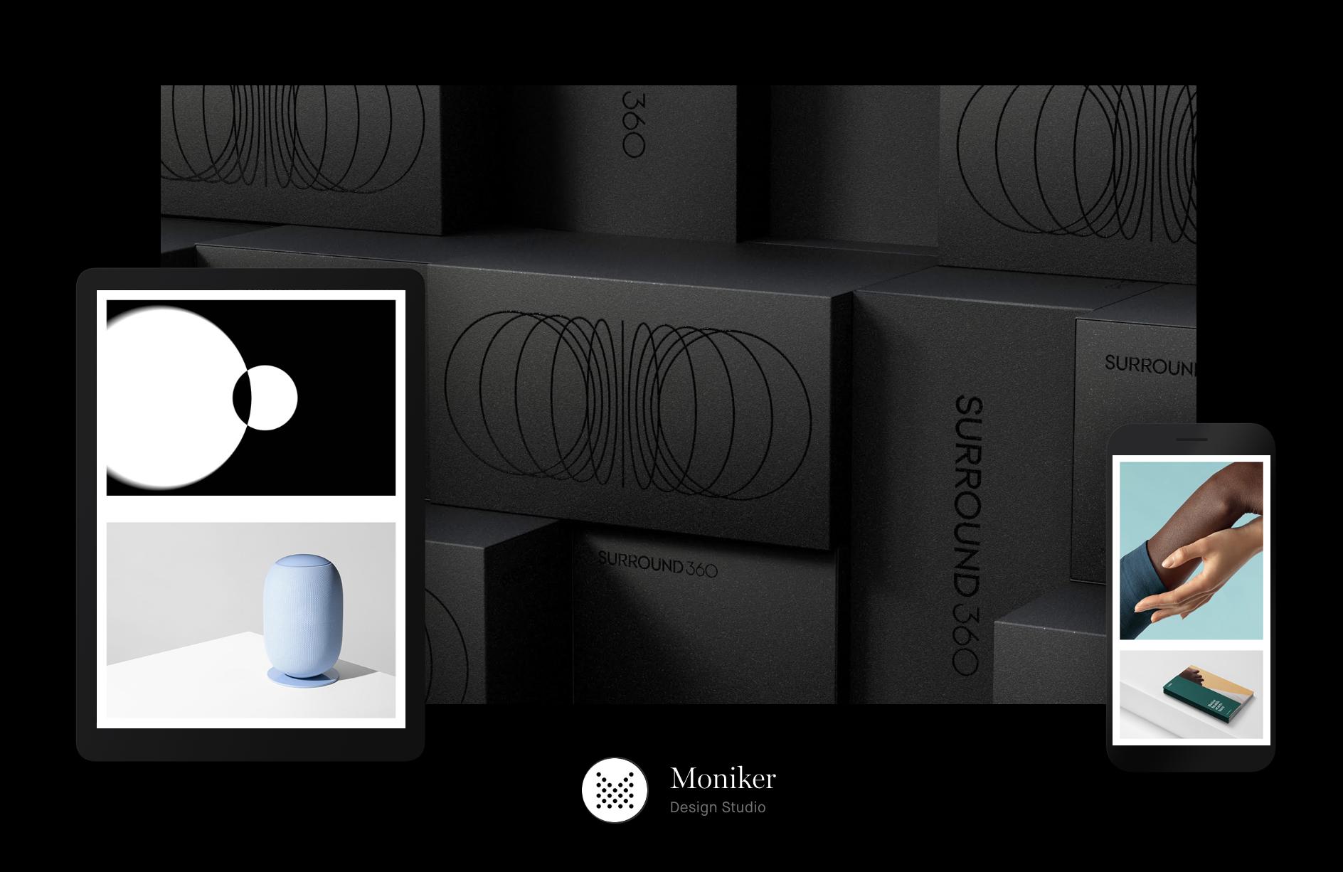
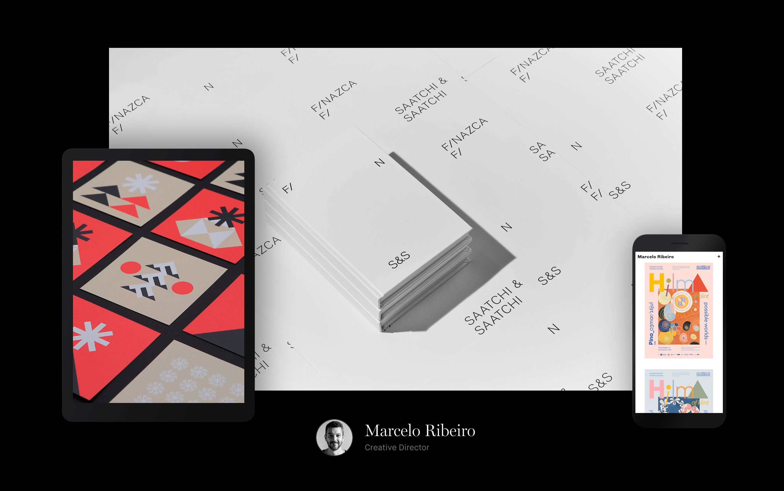
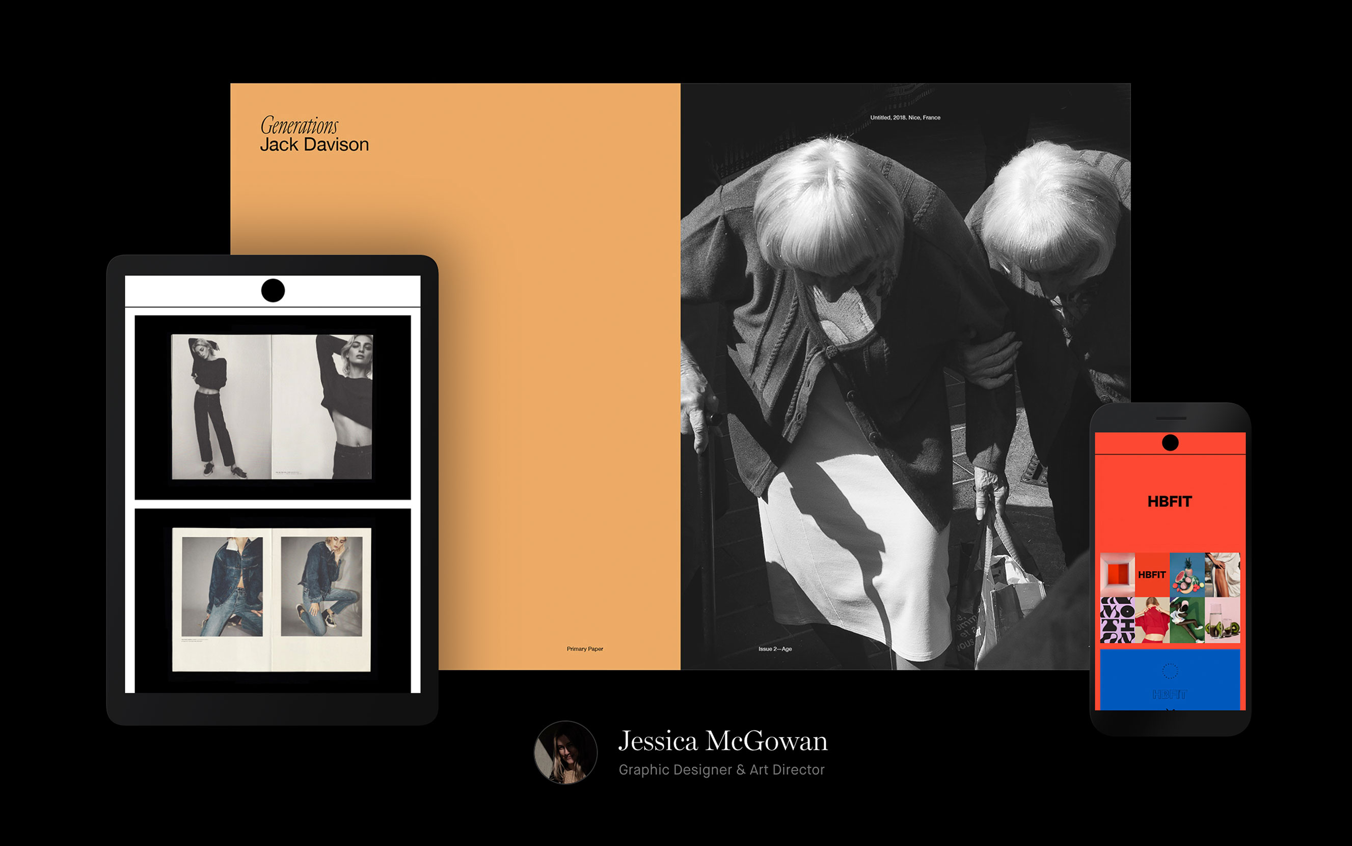
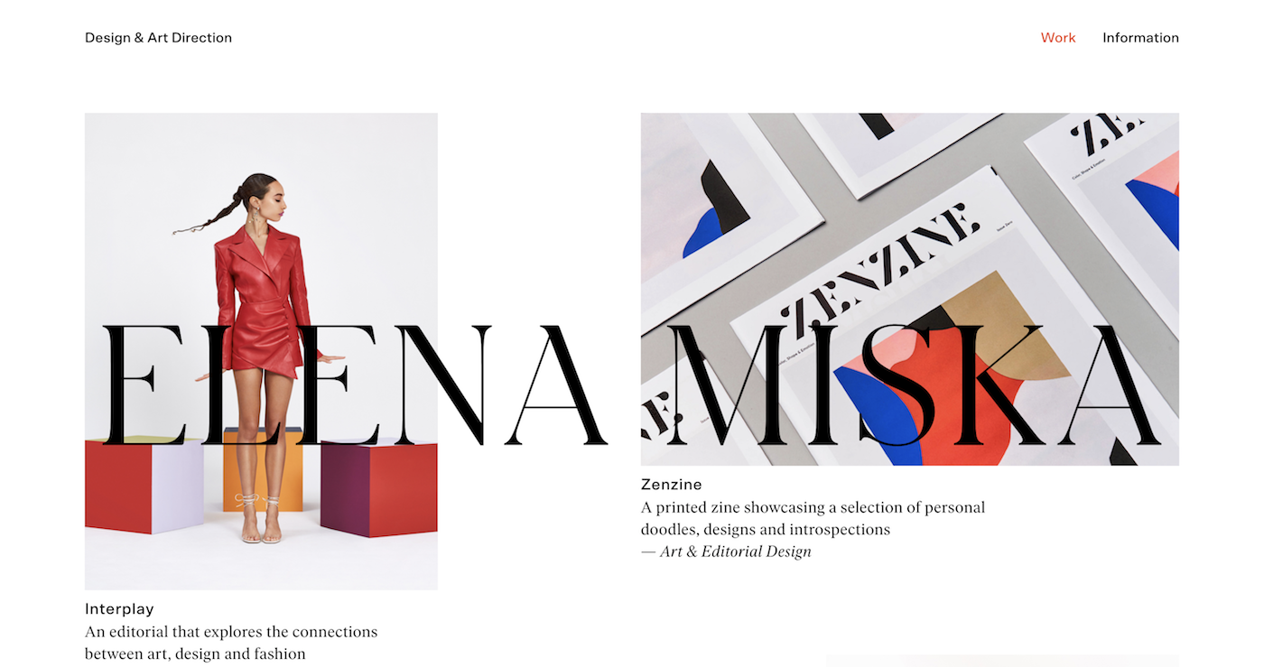
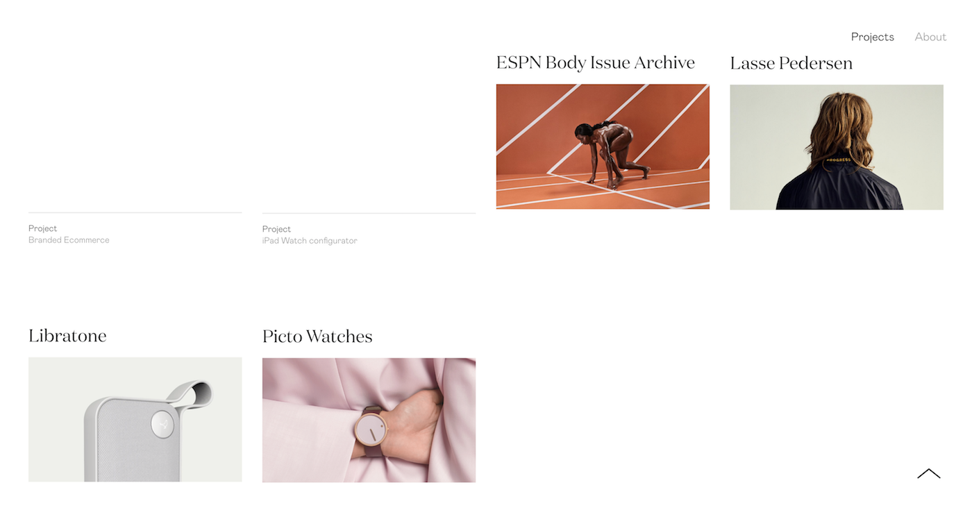
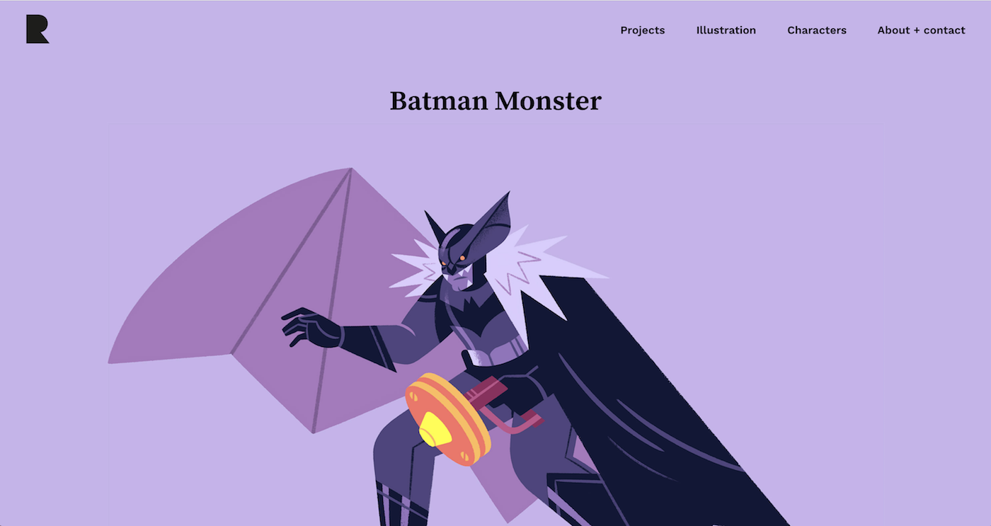
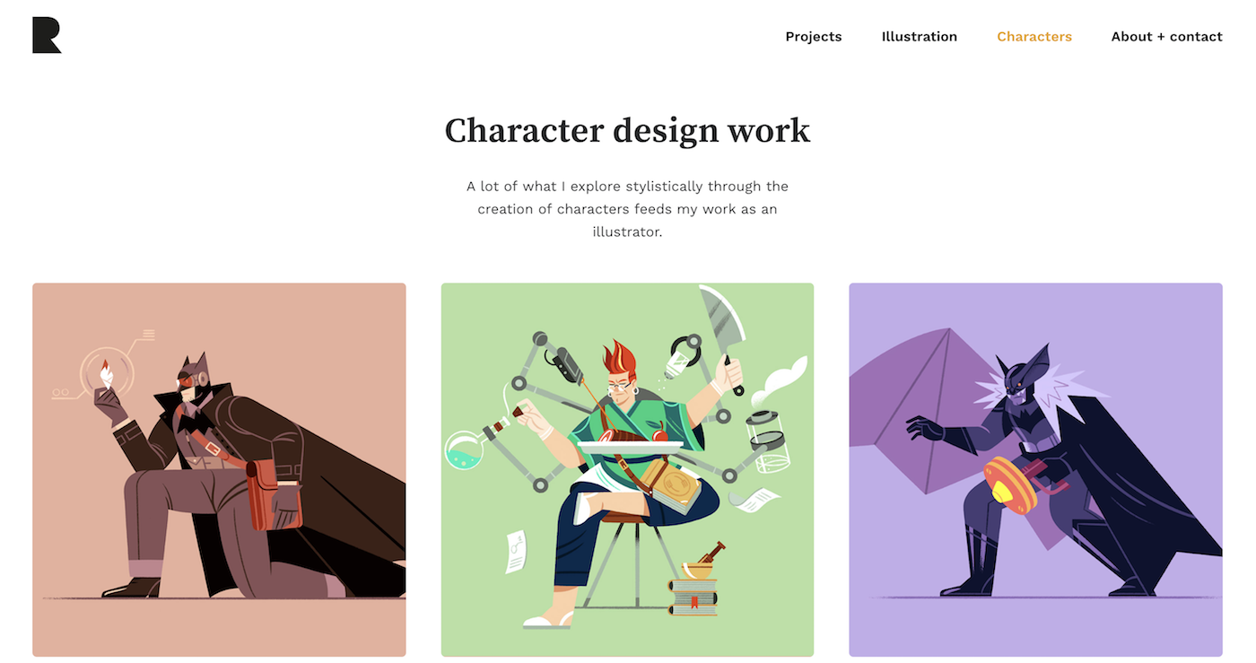
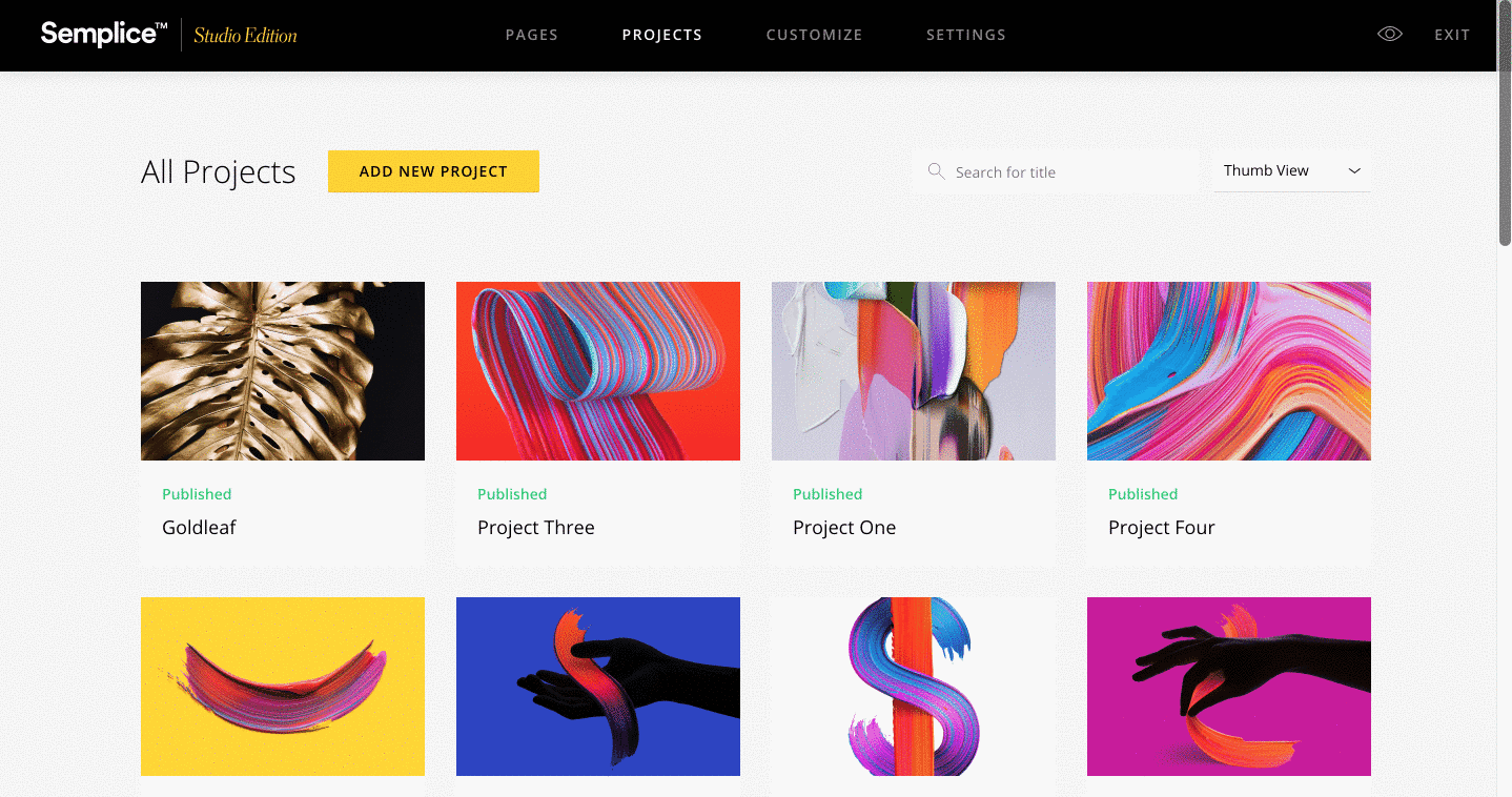
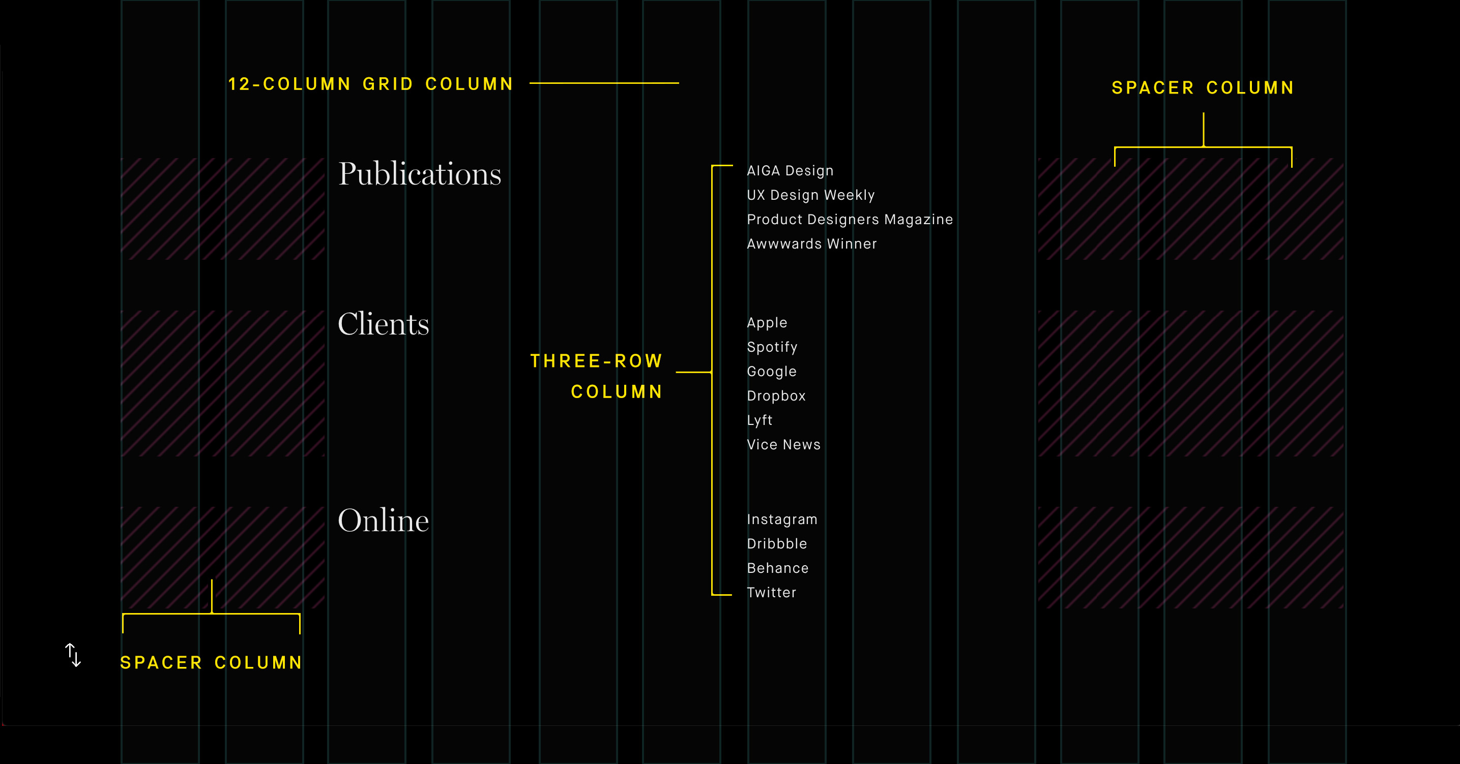
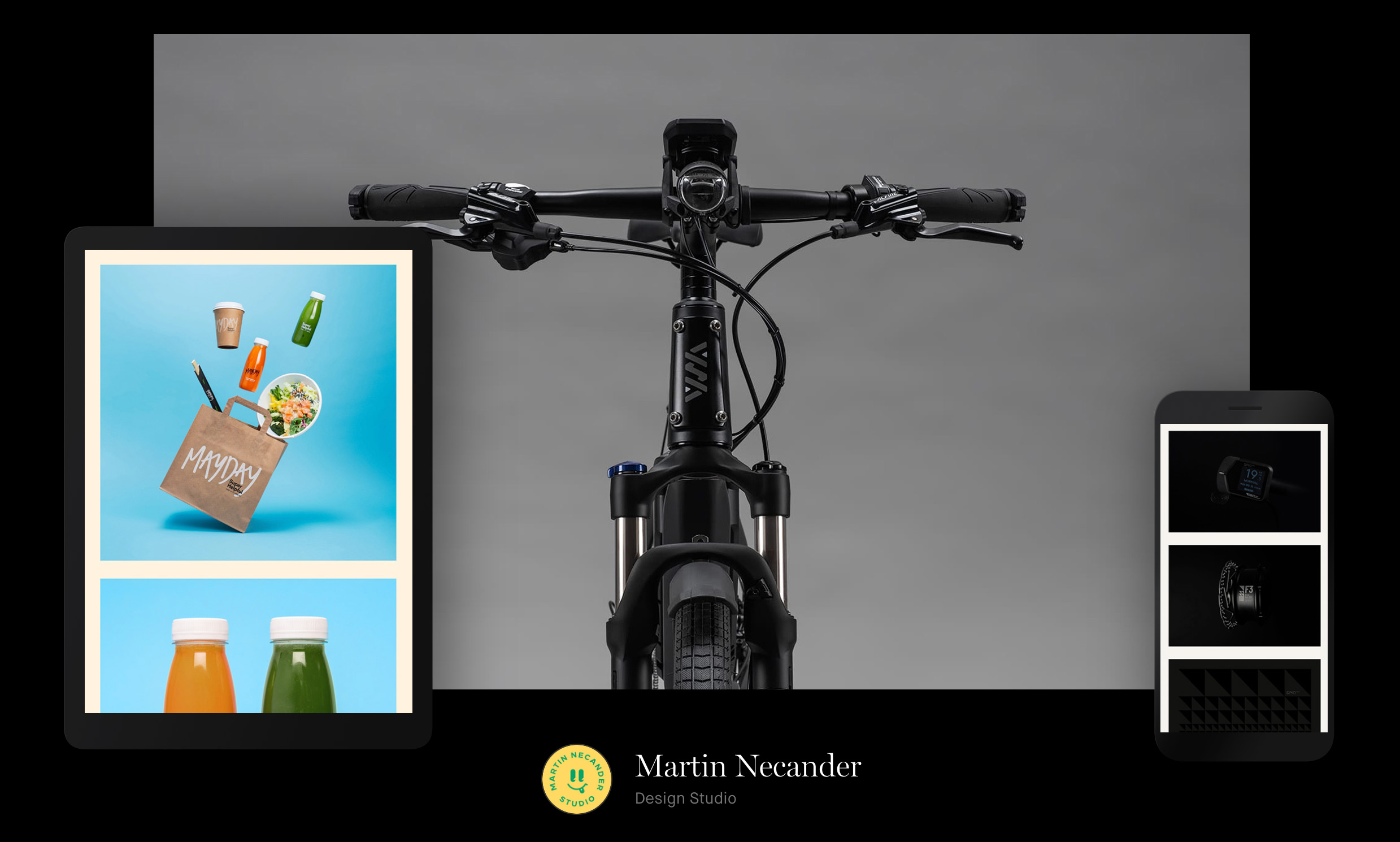
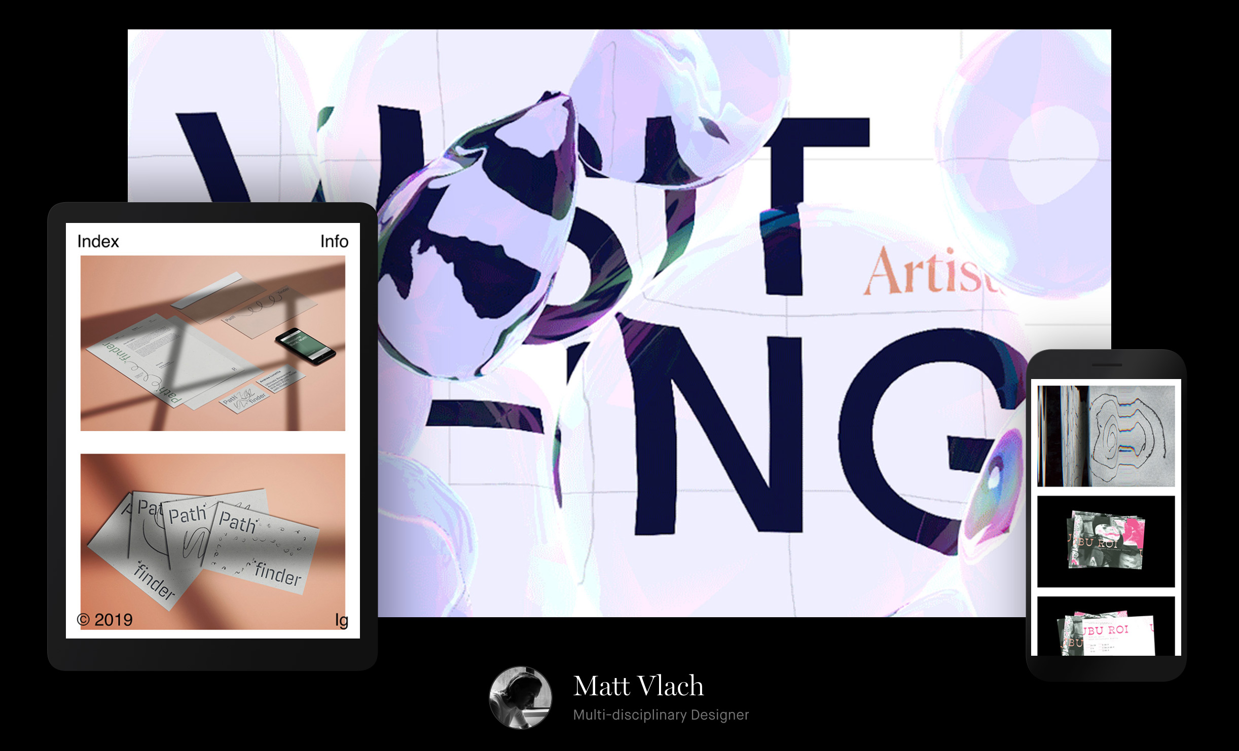
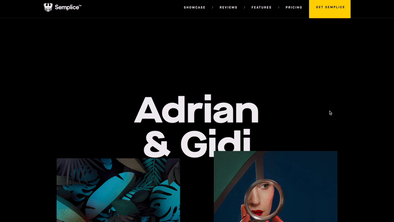
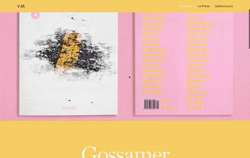
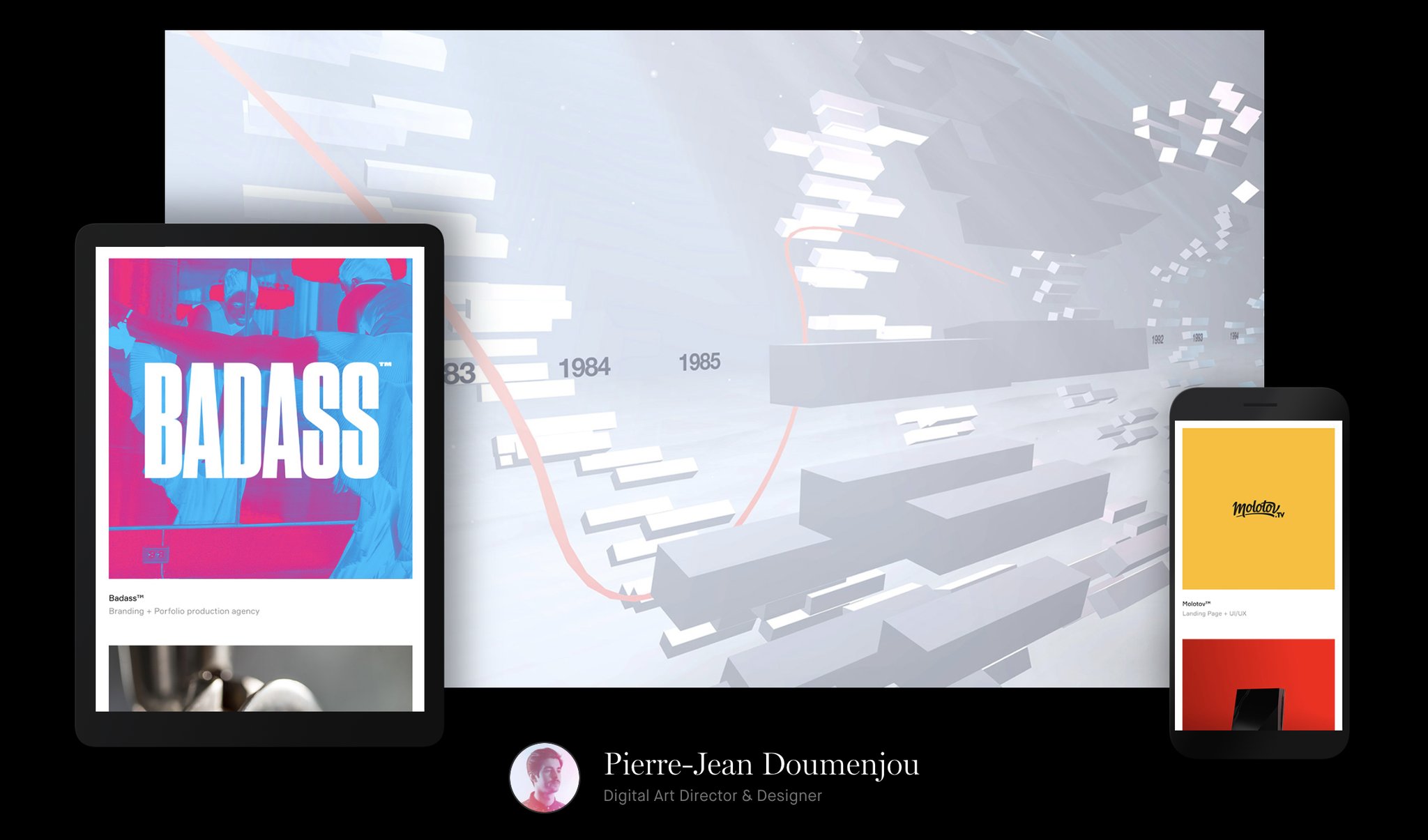
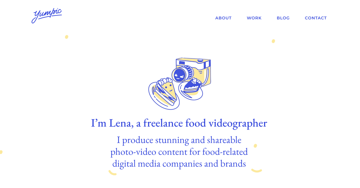
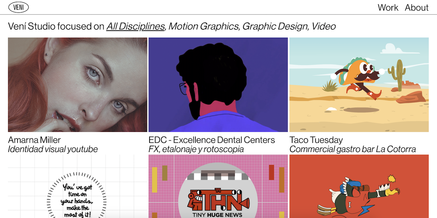
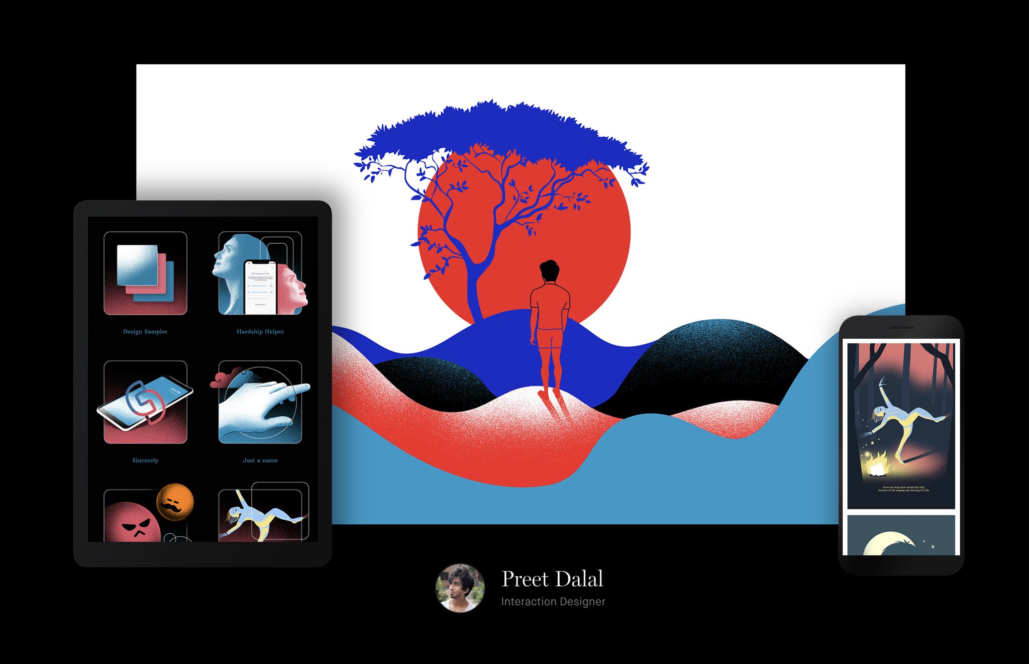
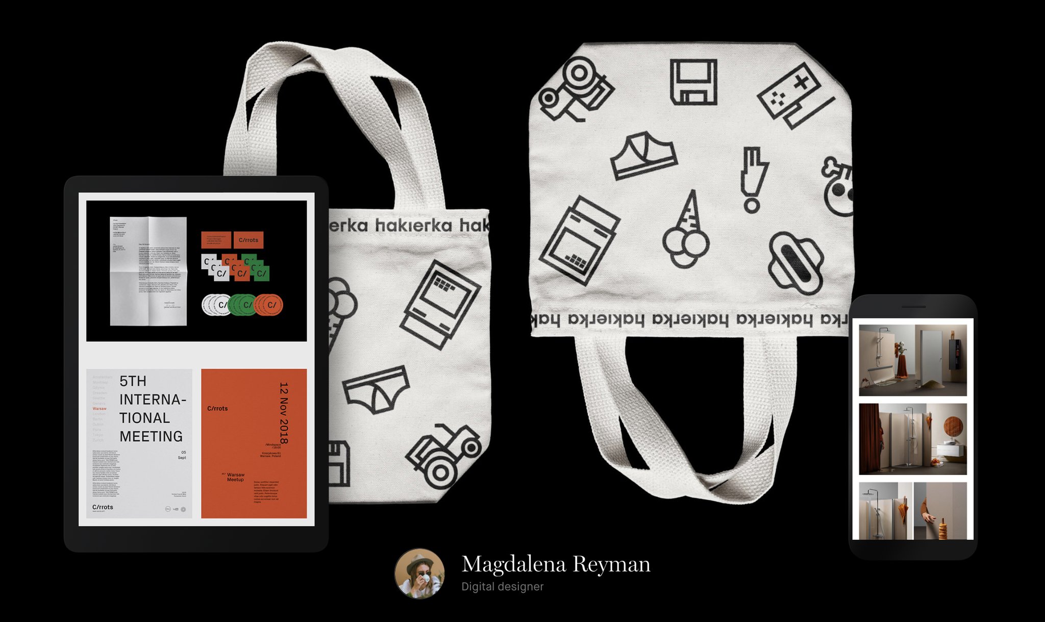
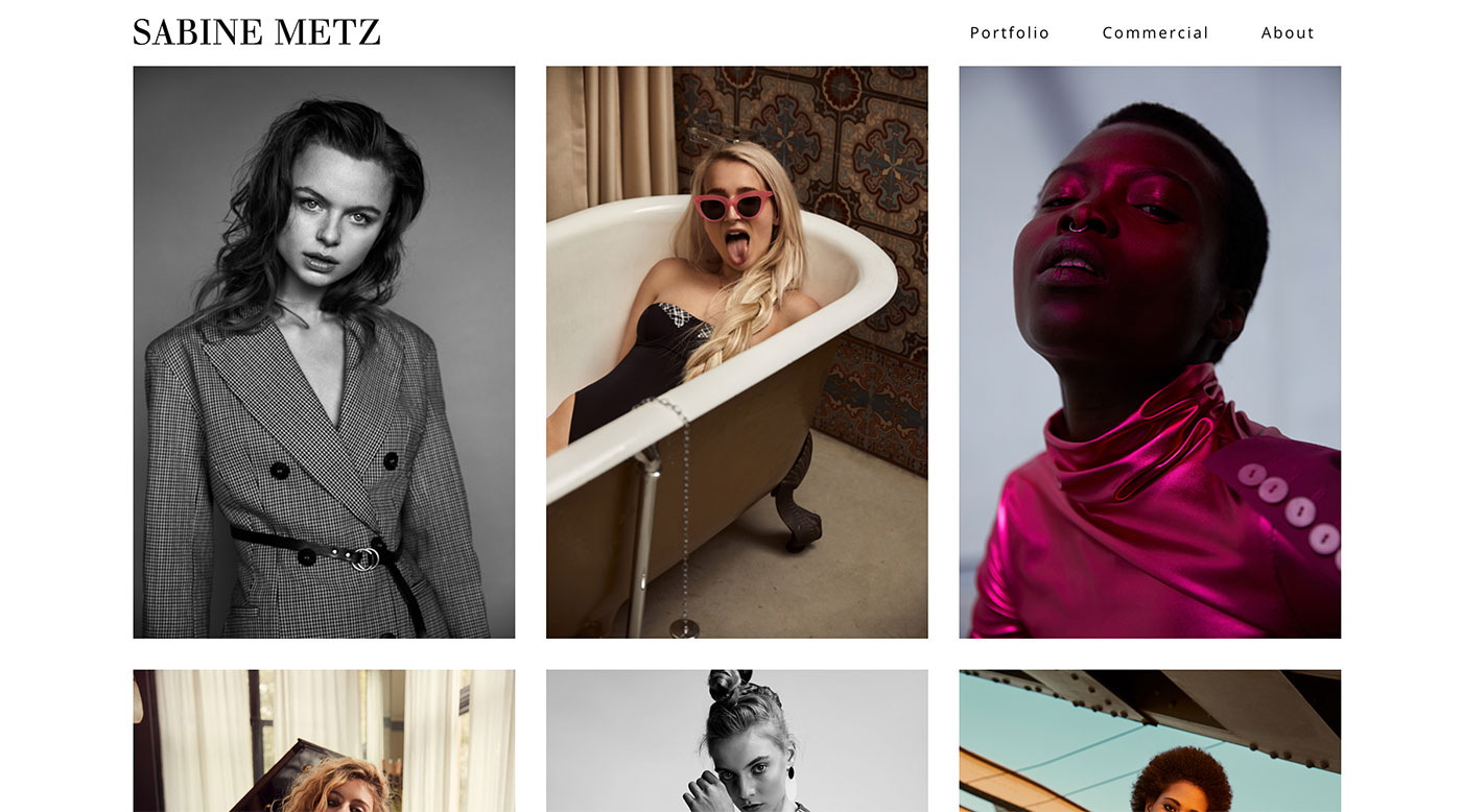
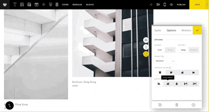
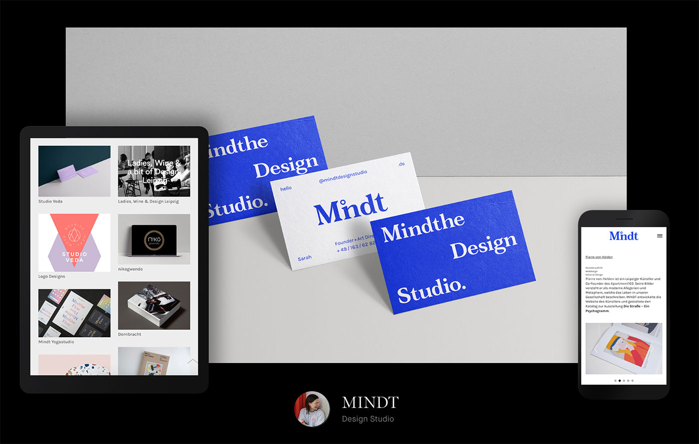
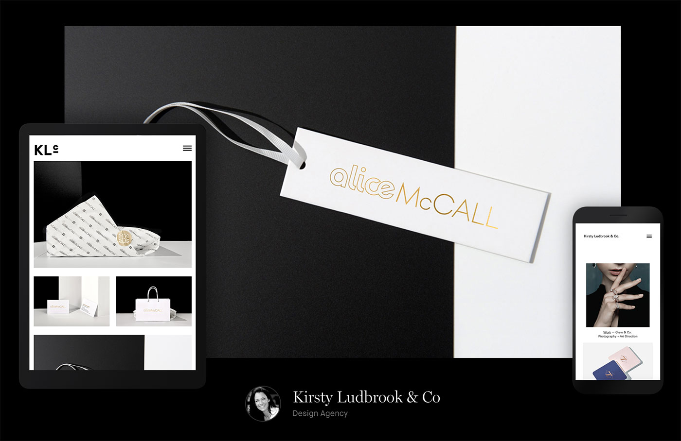
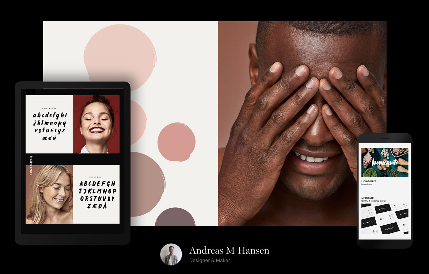
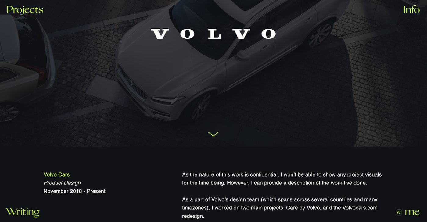
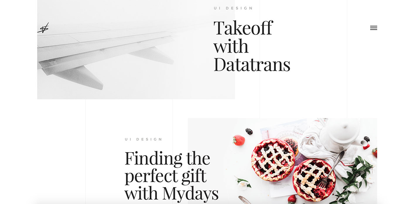
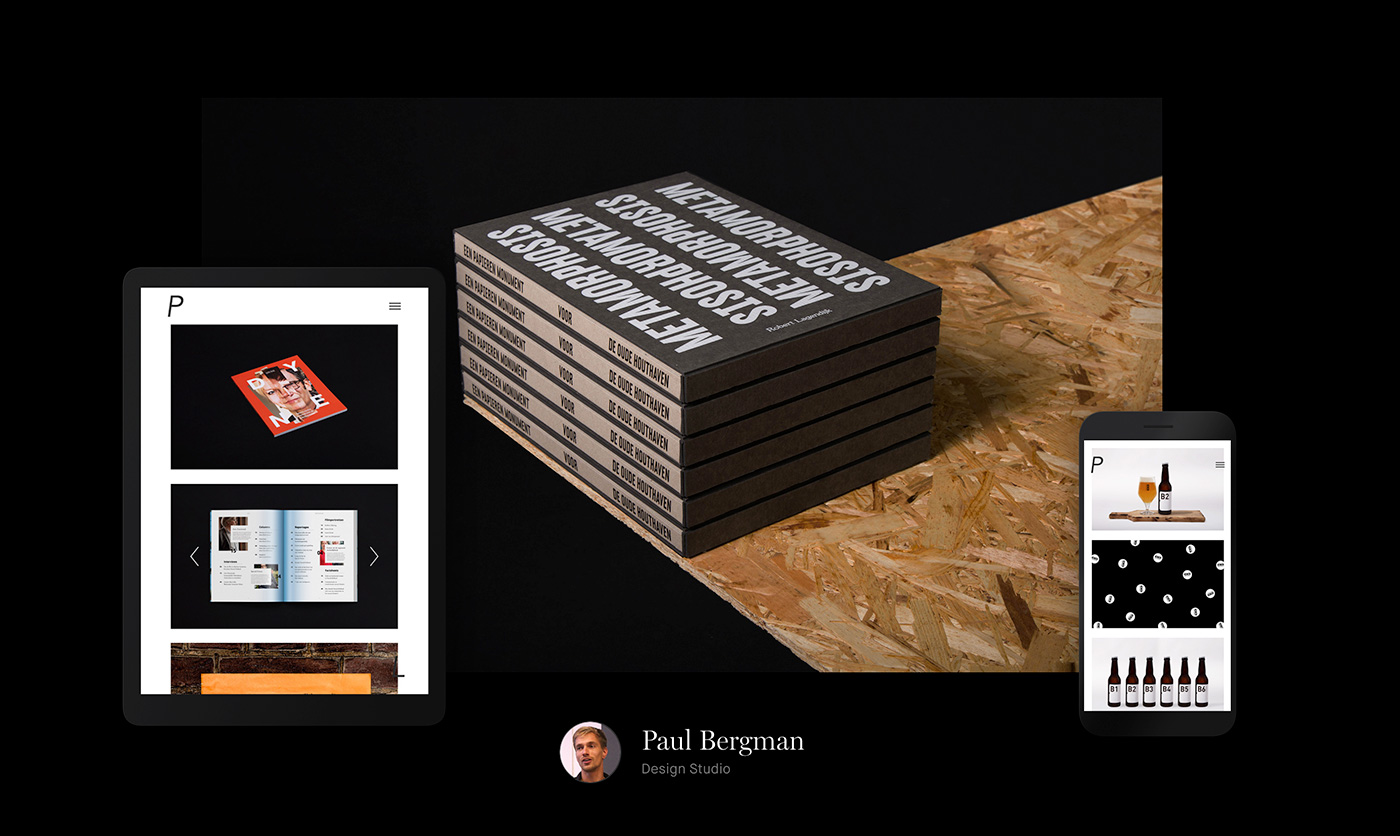
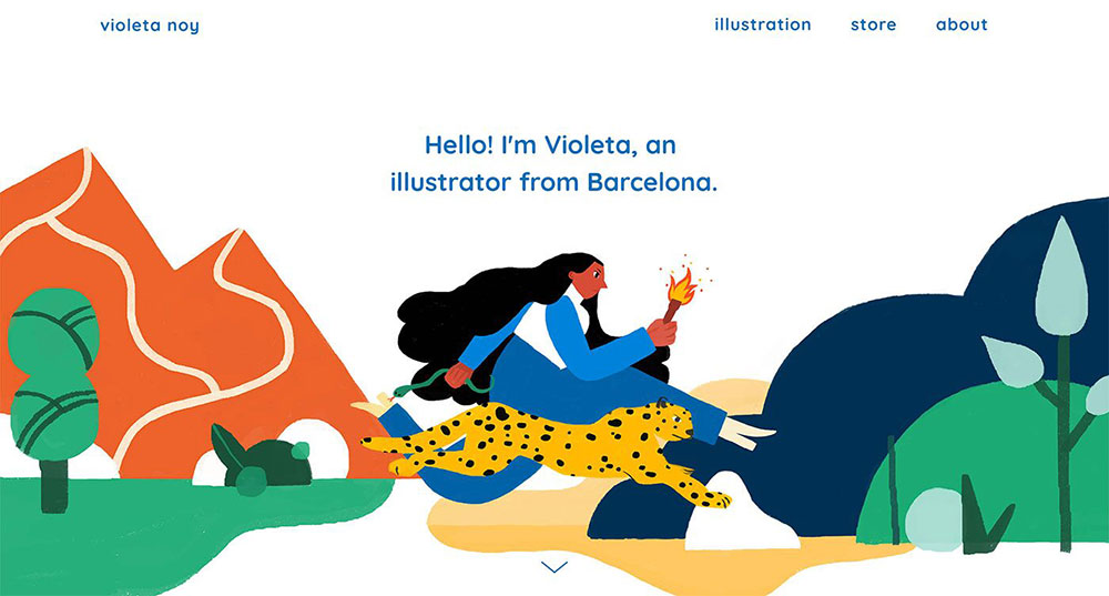
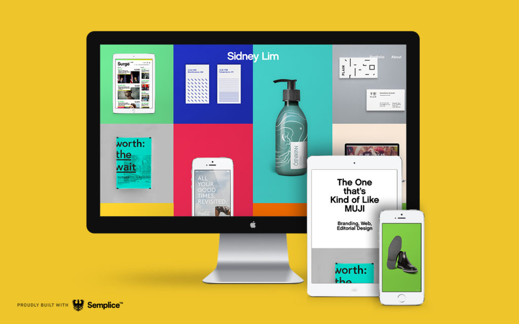
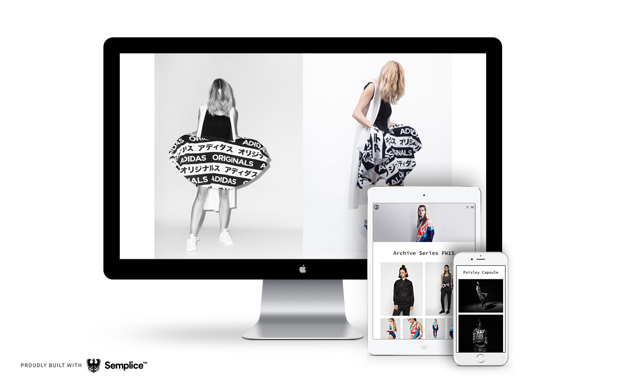
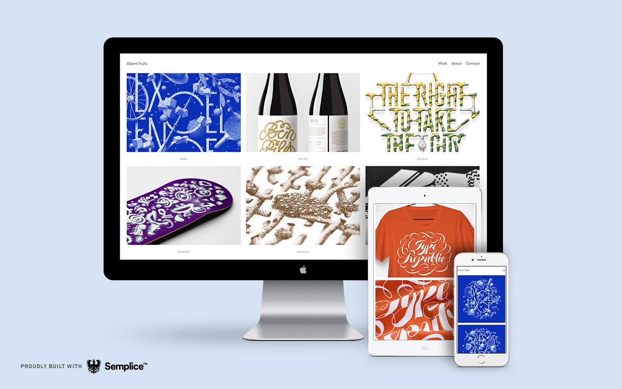
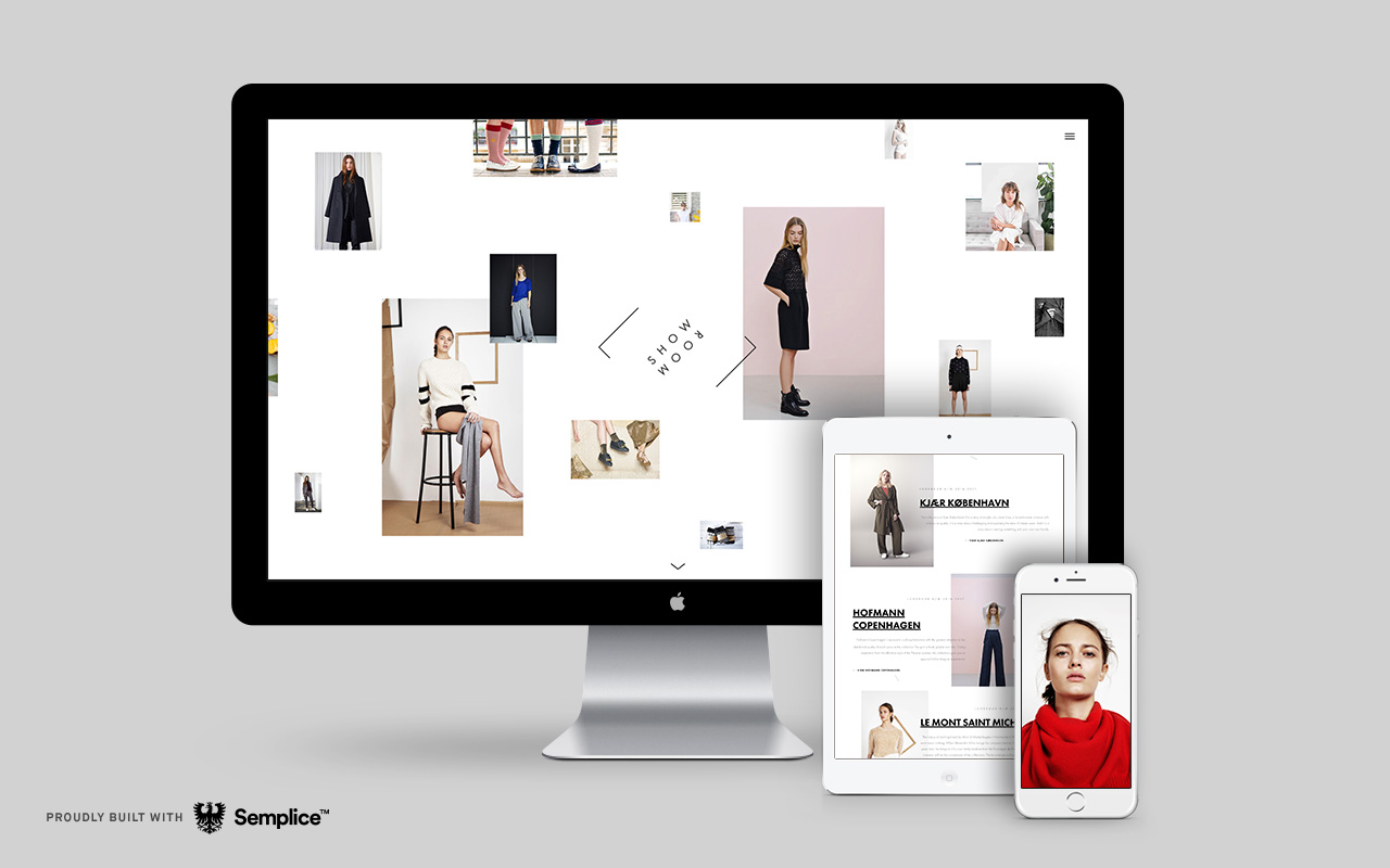
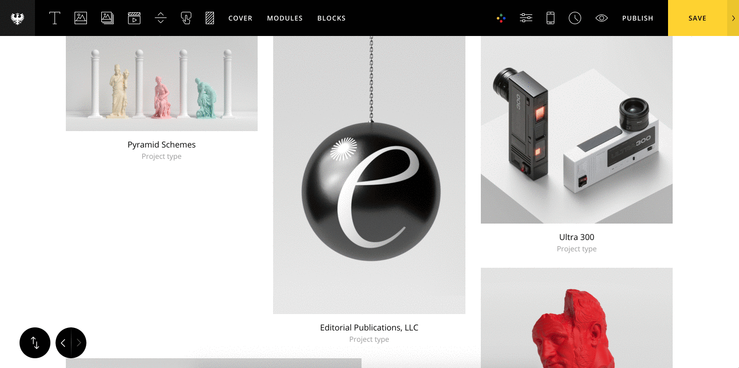 Let's also display our project title and category underneath each project thumbnail. To do this, set "Title & Type Visibility" to show both the project title and category.
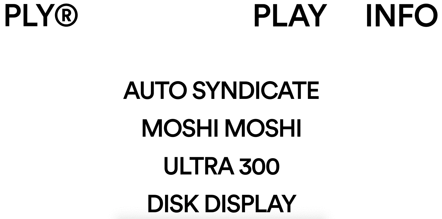

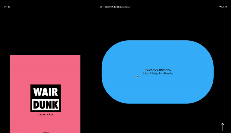
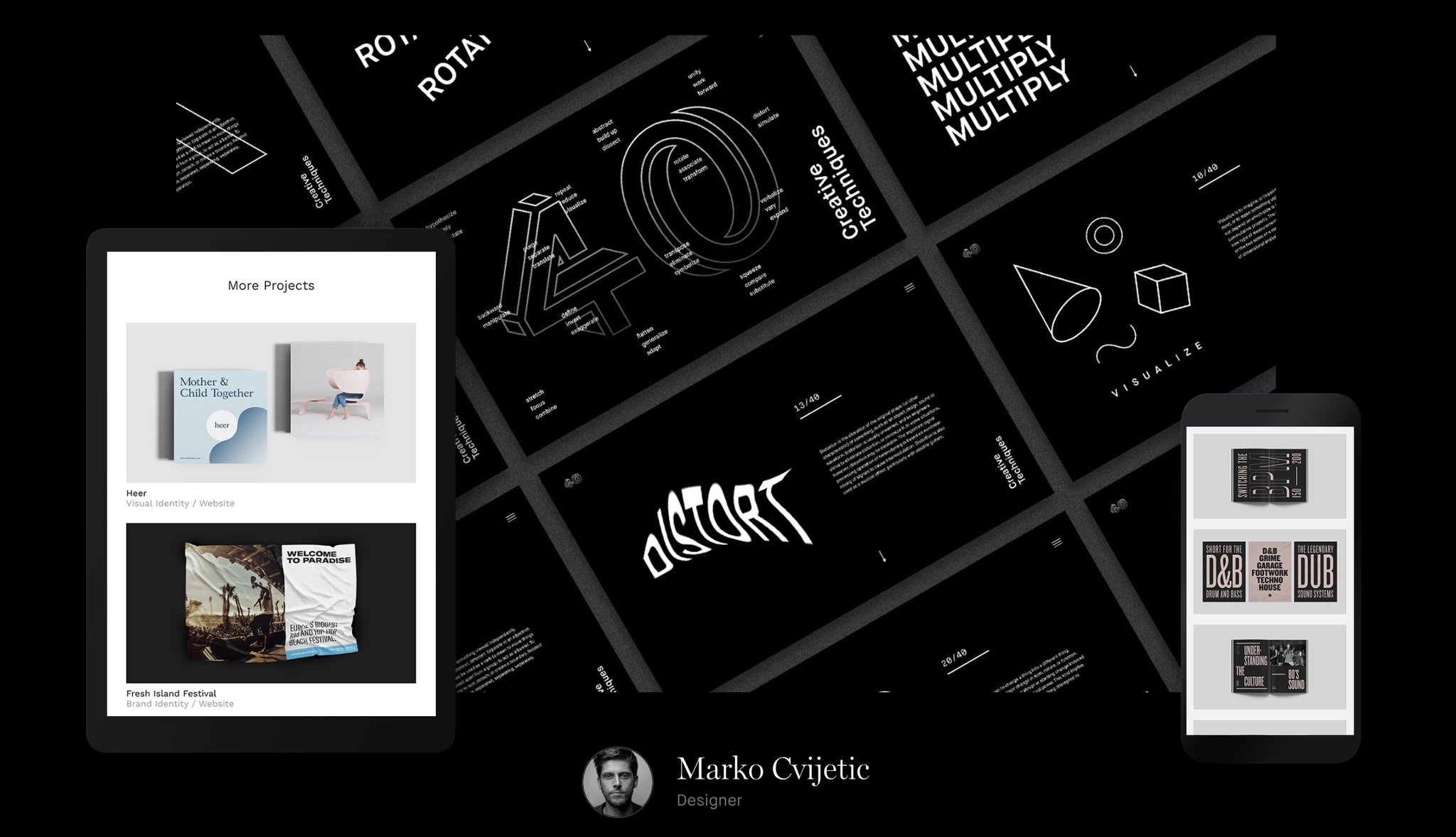
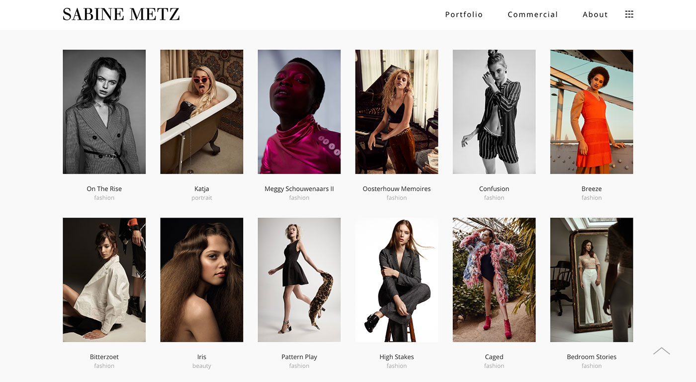
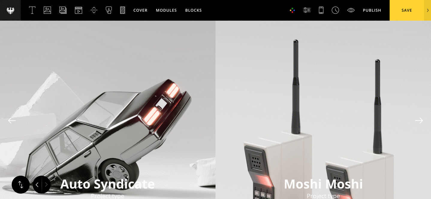 I'll keep the Title direction option to the default Vertical setting and style the grid accordingly. To get the cool mouse hover effect, set the Mouseover effect to "Original (Stick to Mouse)." I've also enabled the Title Mask effect. Note: this effect will only work if the Title direction is set to Vertical.