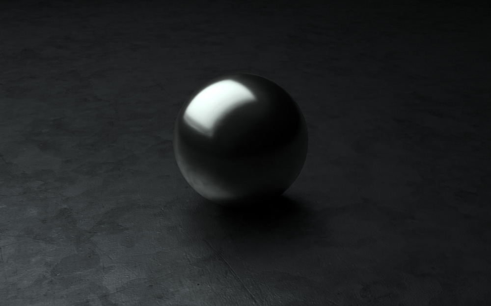
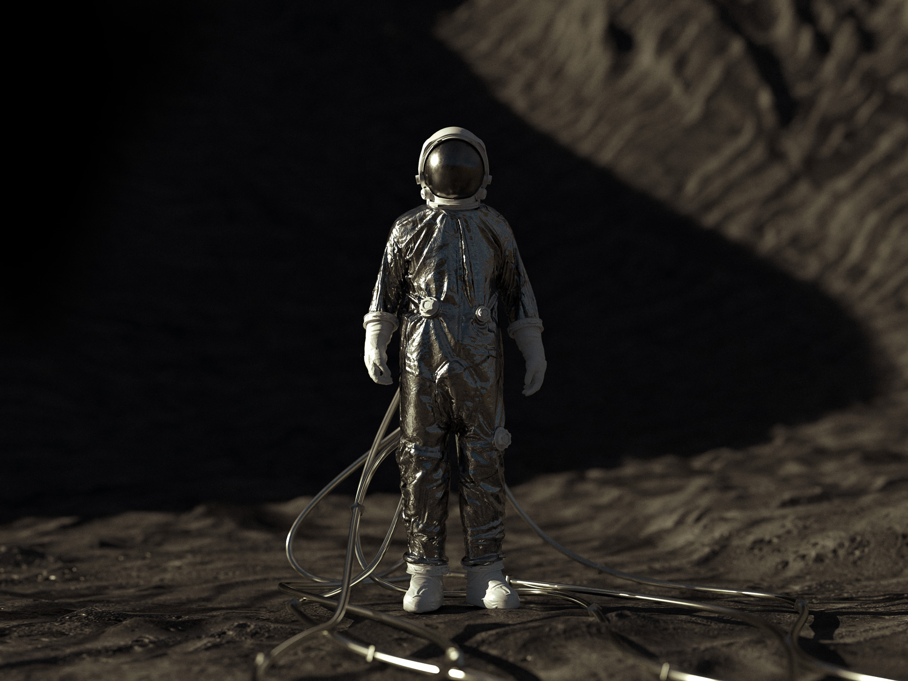
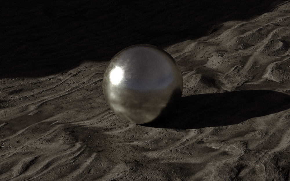
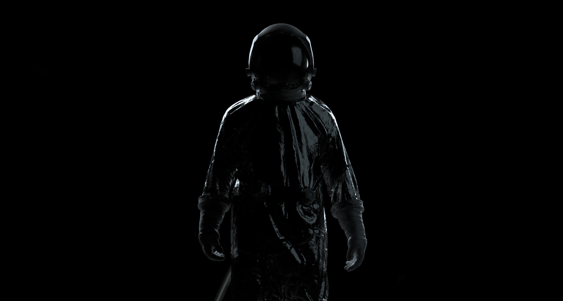
As we venture further into the world of 3D design, from abstract 3D art to 3D typography to creating geometric structures, we've arrived at a crucial point: lighting our 3D scene.
The difference between your standard 3D graphic and an image so cinematic and realistic, you wonder if it's a still from a movie, often comes down to lighting.
It's the glow from a streetlight. The reflection of light on water. The difference between direct overhead light and infused light from a window. The nuanced beauty of light that we experience every day, that takes effort and attention to perfect in 3D.

A cinematic 3D scene created using Adobe Dimension
Consider the fact that, when making an animated movie, it's usually someone's full-time job to focus only on lighting. Light is the essence of how we see and visually experience the world. The right lighting can set a mood, influence perception and evoke emotion. It's why it's impossible to leave lighting for last when setting up a 3D scene. Rather, your entire scene is centered around it.
Since our goal with 3D is to reflect the real world, some of the same principles we use for photography apply to 3D. Like photography, the right lighting as well as a keen awareness of your subject and composition are important. It all plays together to make a striking, believable image that resonates.
With this article, we'll share examples of various lighting techniques and give you general principles you can use in your own compositions. We will show you how you can get dramatically different results just from changing the placement of your light sources, and how you'll significantly improve the quality of your 3D work with purposeful, detailed lighting.
Setting the scene
First, let's take a look at a series of images that I created using Adobe Dimension. If you're not familiar already from our other articles, Dimension is Adobe's 3D scene design tool paving the way for designers and traditional graphic designers into the 3D world. (If you're just hearing about it or stepping into 3D for the first time, start with this beginner's tutorial.) Dimension offers default lighting set-ups for your 3D work, but today we'll be focused on manual methods to create your own lighting.
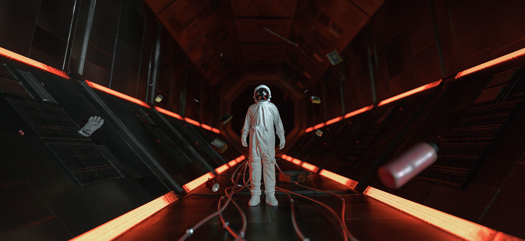
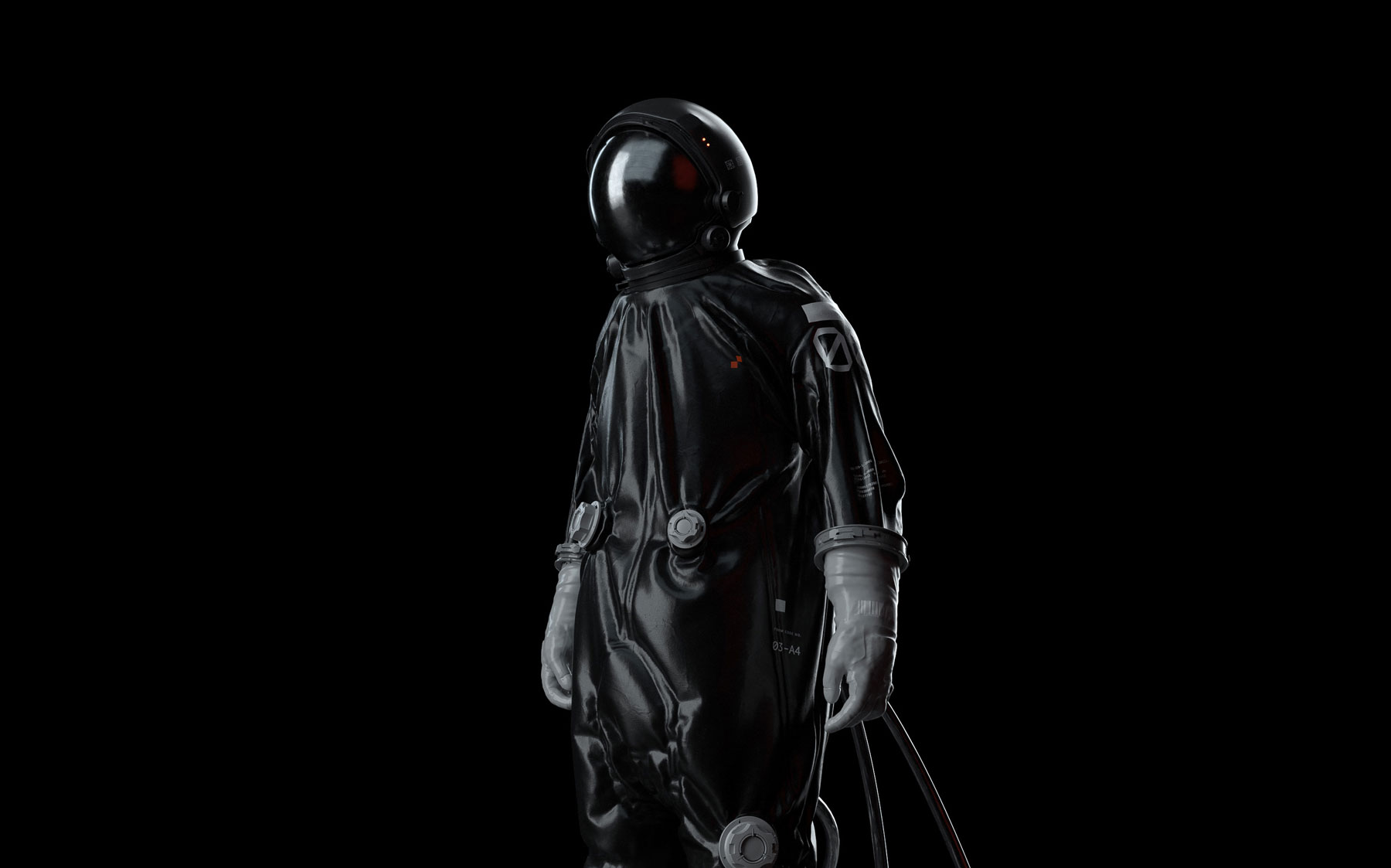
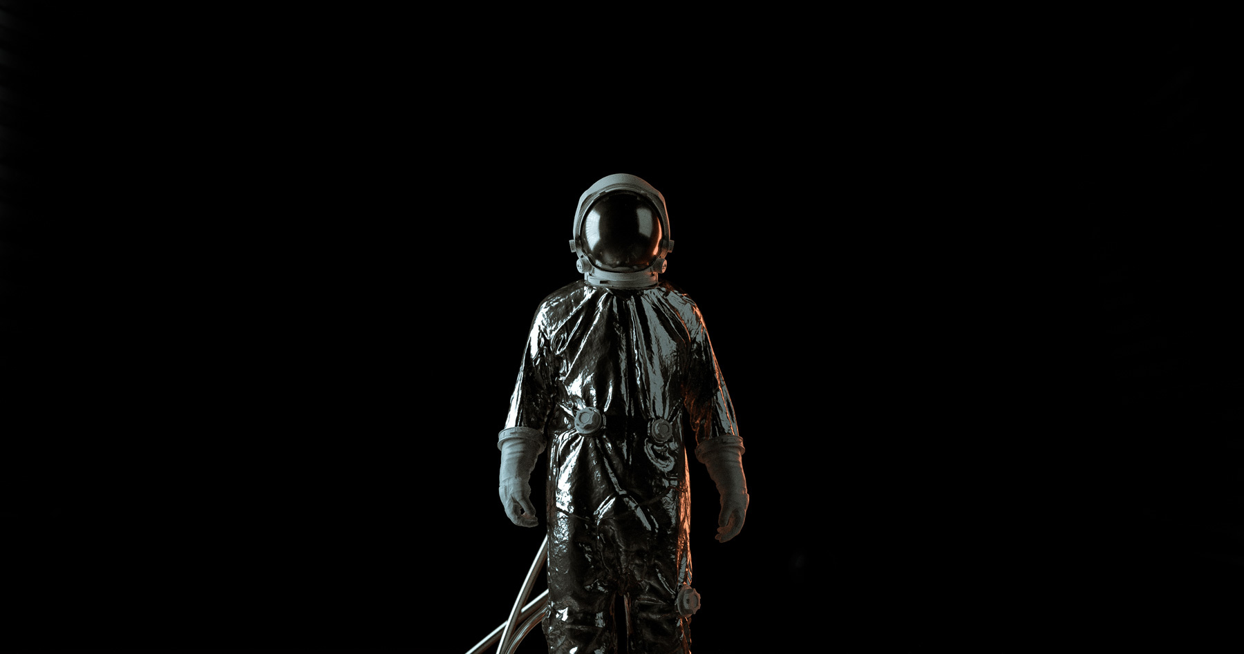
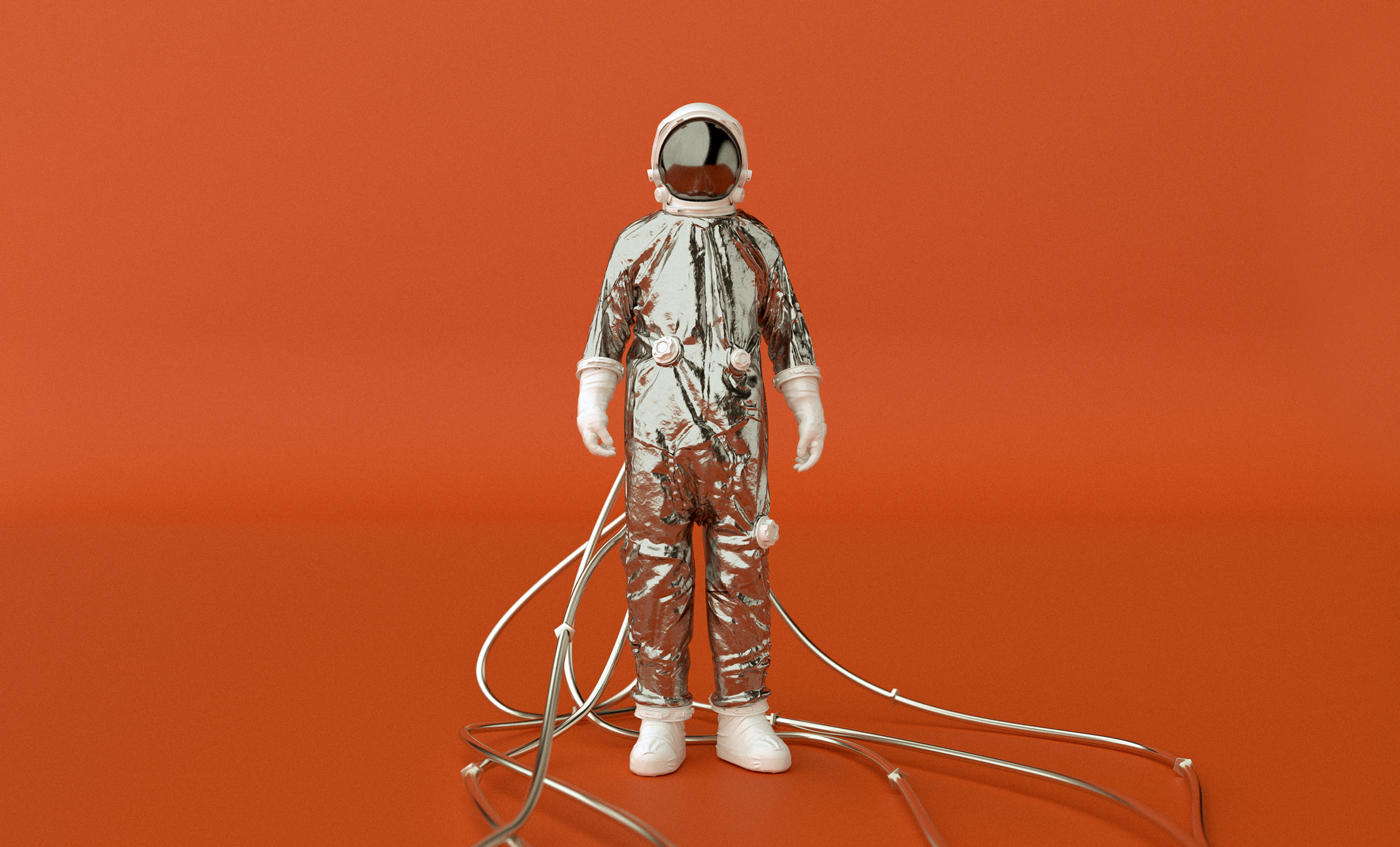
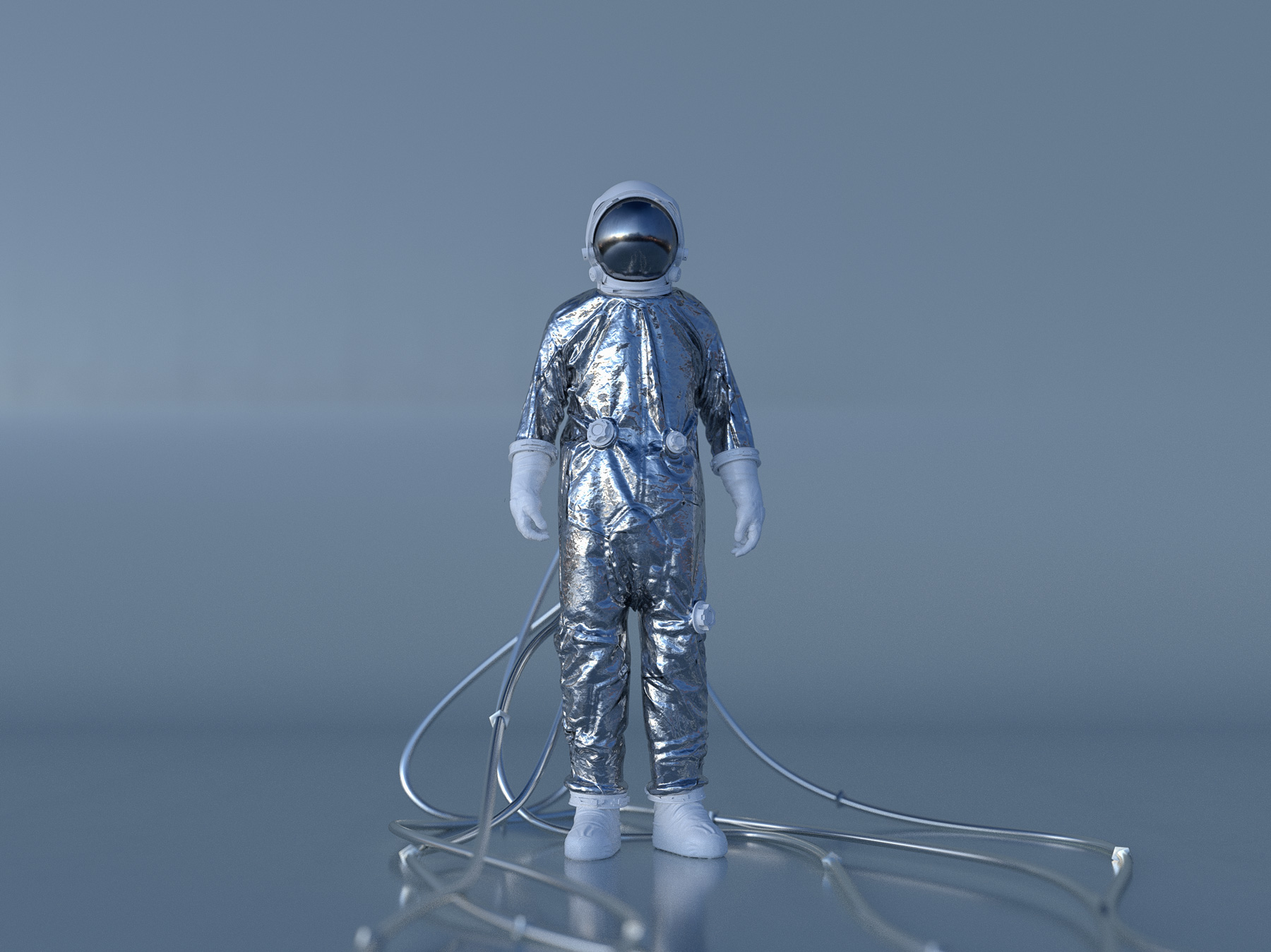
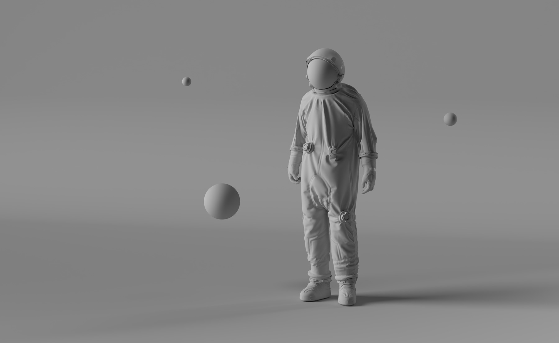
Being super inspired by the recent SpaceX launch, I wanted to create a simple scene with some sci-fi and space themes. Here is the result:


We'll use this image to examine the different types of lighting and how you apply them in 3D. Later, I'll show you how I achieved specific lighting effects for this image in Adobe Dimension.
The different types of lighting techniques
Just like the real world, there are many different types of lighting techniques that can create various effects. Placing a single light source in your scene, for example, results in dramatic shadows. Using only direct sunlight looks very different than soft, indoor light setup. Depending on the mood and feel you want from your image, you may have to experiment and find what lighting setup works best for your scene. So let's start with your main types.
Three-point lighting

A basic example of a three-point light system. From left to right: the key light, the rim light, and the fill light.
This is arguably the most important and commonly used lighting technique.
As the name implies, this technique uses three light sources to illuminate your scene: key, rim and fill. Each of these light sources play a unique role in lighting your scene. Your key light is the primary light source that will illuminate your subject. The rim light illuminates the back of your subject, creating depth and allowing us to understand the shapes of the objects in your scene. Lastly, fill light is meant to eliminate harsh shadows in your scene and add some even lighting.


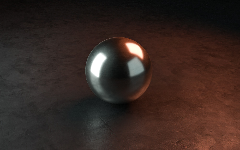
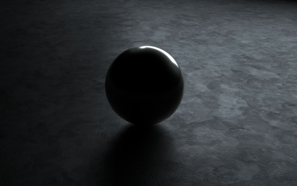
Placing a sphere is an easy way to view reflections in relation to our scene
Humans use light to understand objects and shapes with our natural eye, and three-point lighting gives us a full point of reference. This lighting technique is seen in every medium, including film, photography, product photography, event lighting and television.
Soft lighting

An example of a soft light setup. Note that the lights are placed far away from the subject, and are larger in size comparatively.
Soft lighting, as the name applies, means light is being distributed evenly throughout your scene. Harsh shadows are removed, creating a result that feels soft and balanced. This kind of lighting is commonly seen with product shots, or with traditional portrait photography. You can see in this scene it has changed our original image to feel much more calm.
To achieve soft lighting in your scene, simply place large light sources in your scene that are a good distance from your subject. The larger the lights, and the farther away from your subject they are, the softer your shadows will be. The default studio environment light when starting with Dimension is a form of soft lighting.


Single-light source

As the name implies, this technique uses just one light source. Single-light sources are typically used to create dramatic lighting, since having only one light means harsher shadows and areas where light is not illuminating your object. This creates a sense of drama and mystery.
This technique is used often in cinema as a tool to center your focus and set a mood. Use it to your advantage to create interesting moods, or where your subject does not clearly have to be defined. It's a simple method, but when used right can be the perfect lighting trick up your sleeve.


Direct sunlight

Sunlight is one of the easiest ways to light your scene. Note the harshness of the shadows due to the size and brightness of the light.
As the name implies, this lighting technique relies on a single light source: the sun. Direct sunlight is great when you want to replicate a natural outdoor scene. Using sunlight as your main light source will naturally result in harsher shadows, since sunlight is incredibly bright and the appearance of the sun is very small in relation to us on earth.
Using sunlight to light your scene is very popular for architectural lighting. Most 3D programs, including Adobe Dimension, include the ability to add a sun to your scene. These programs also typically aim to replicate the real effects of light from the sun based on it's positioning in the sky. For example, lowering the position of your sun will typically result in a "sunset" effect where light is much warmer and shadows are hugely elongated.


When using sunlight as a light source, I highly recommend using it alongside image-based (HDRI) lighting environment to get real-world reflections. This is because the sun exists within an “environment” or sky, and to get realistic results you will want to simulate both a sun and real-world environment.
More on environment lighting below.
Backlight

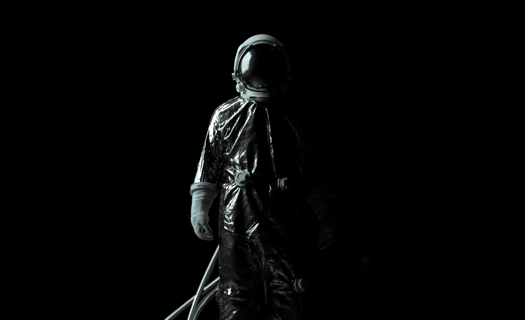
Backlight pertains to placing your primary light source behind your subject matter. As with the single-light source technique, this method will also produce dramatic results. It also adds a sense of mystery as it obscures the details and shapes of your primary subject.
This type of lighting is typically seen in film and in promotional sports photography. Though this lighting technique is one of the more rarer ones used, it's a great one to have in your back pocket if you're going for a cinematic vibe.


Environment or image-based lighting
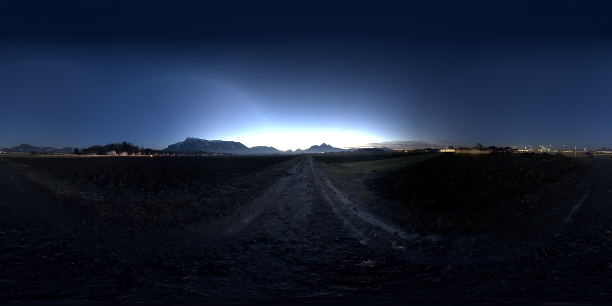
Environmental lighting generates light based an existing image, typically in the form of an HDRI (high dynamic range) image.
HDRI is a 32-bit image (meaning it contains huge amounts more of data) that stores a range of exposures, which is impossible to do with an 8-bit image. An 8-bit has pixel color values ranging from 0-1, whereas 32-bit can go as high as 100 (in case of the sunlight). This will differentiate a white object in the HDRI, for example, from a white LIGHT source. HDRI images can provide an incredibly rich source of light to your scene that replicates what we see with our naked eye.
Environment lighting is great if you want to quickly generate a simulated real-world lighting environment. Adobe Dimension includes these in the format of lighting presets, though you can use your own HDRI maps as well. The largest drawback to using environment lighting is you lose the ability to control the placement of your light sources, since the lighting is based on an image with predetermined light positioning.
An example of an HDRI image:

And now with that image applied to our scene:


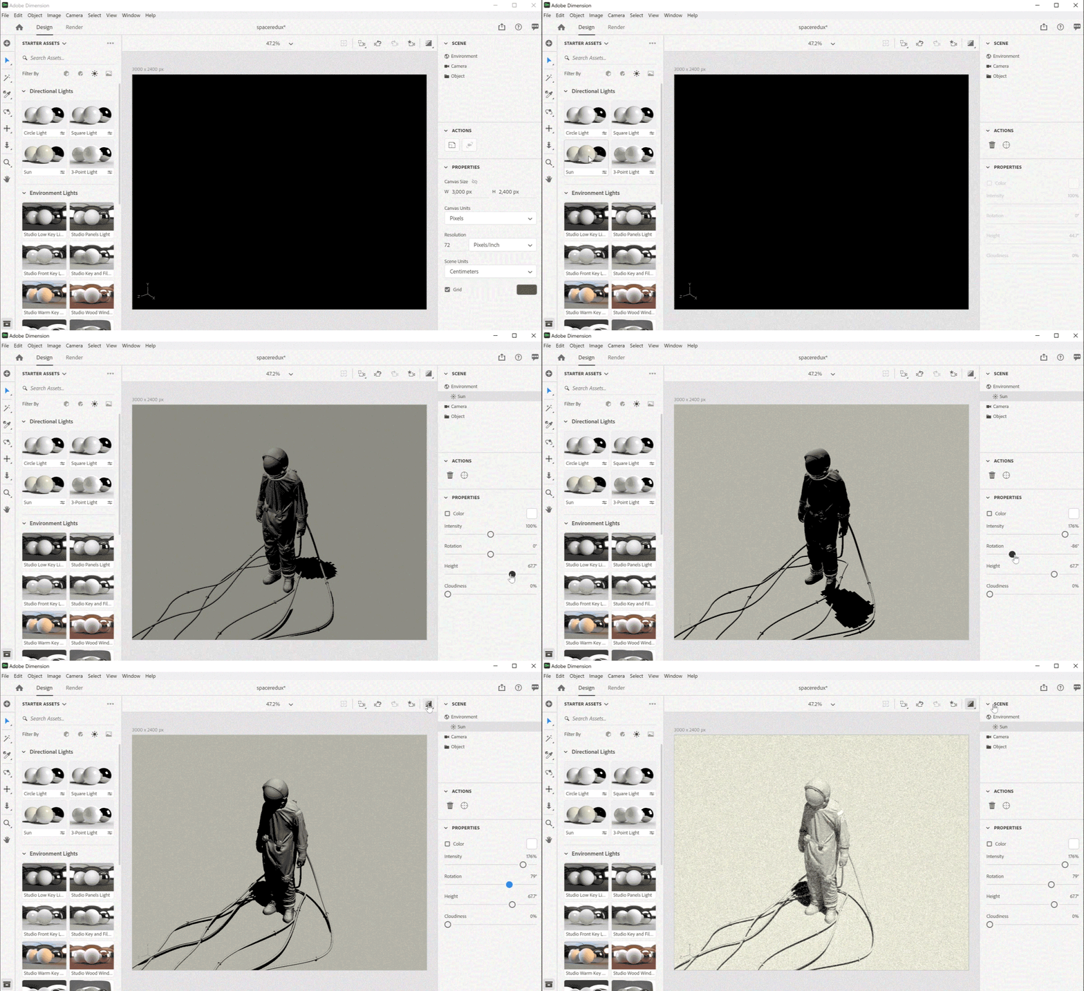
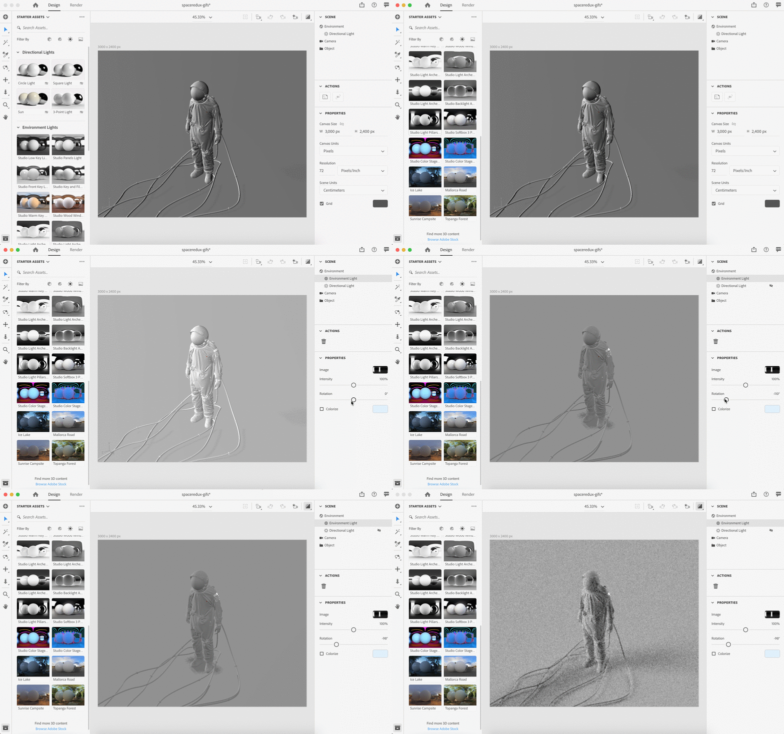
In Dimension, HDRI maps can be applied under the Environment lighting options.
Different types of light objects within 3D programs
There are various different light objects you can use to light your scene in any given 3D program. Some use different names for the same type of light tools or objects, but it's helpful to know the difference between each.
Directional lights
A directional light object is one that emits light in a single direction, much like the sun. Typically, the light direction can be adjusting in the program as well as the edge softness.
Point light
A point light will emit light in all directions from a single, small point. Light will be cast evenly, despite the direction the point light is rotated. These type of light objects are typically used for things such as light bulbs or candles.
Area light
An area light emits light that is confined within a single object, such as a rectangle or sphere. An area light object will simulate an effect very similar to real-world lighting objects, such as fluorescent lamps or lighting studio equipment. In Adobe Dimension, you can recreate the effect by applying a Glow material to an object. You can then even add texture to the light by placing an alpha mask into the Opacity slot.
Sun
We've talked above about using sunlight to light your scene. To achieve natural sunlight, you will need to use a sun object in your 3D program of choice. Typically, you can adjust the sun positioning, angle, brightness, and cloudiness.

Breaking down our 3D scene
Now that we've covered the basics of 3D lighting techniques and light objects, let's break down what I did to I achieve the results from our sci-fi inspired renders.
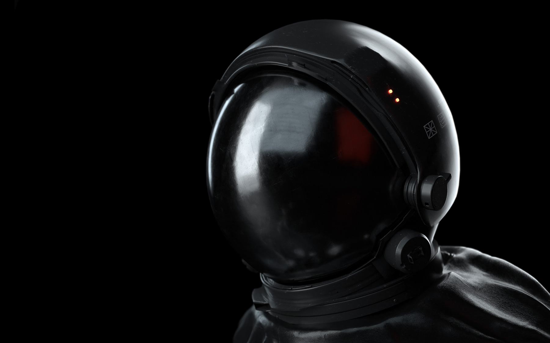
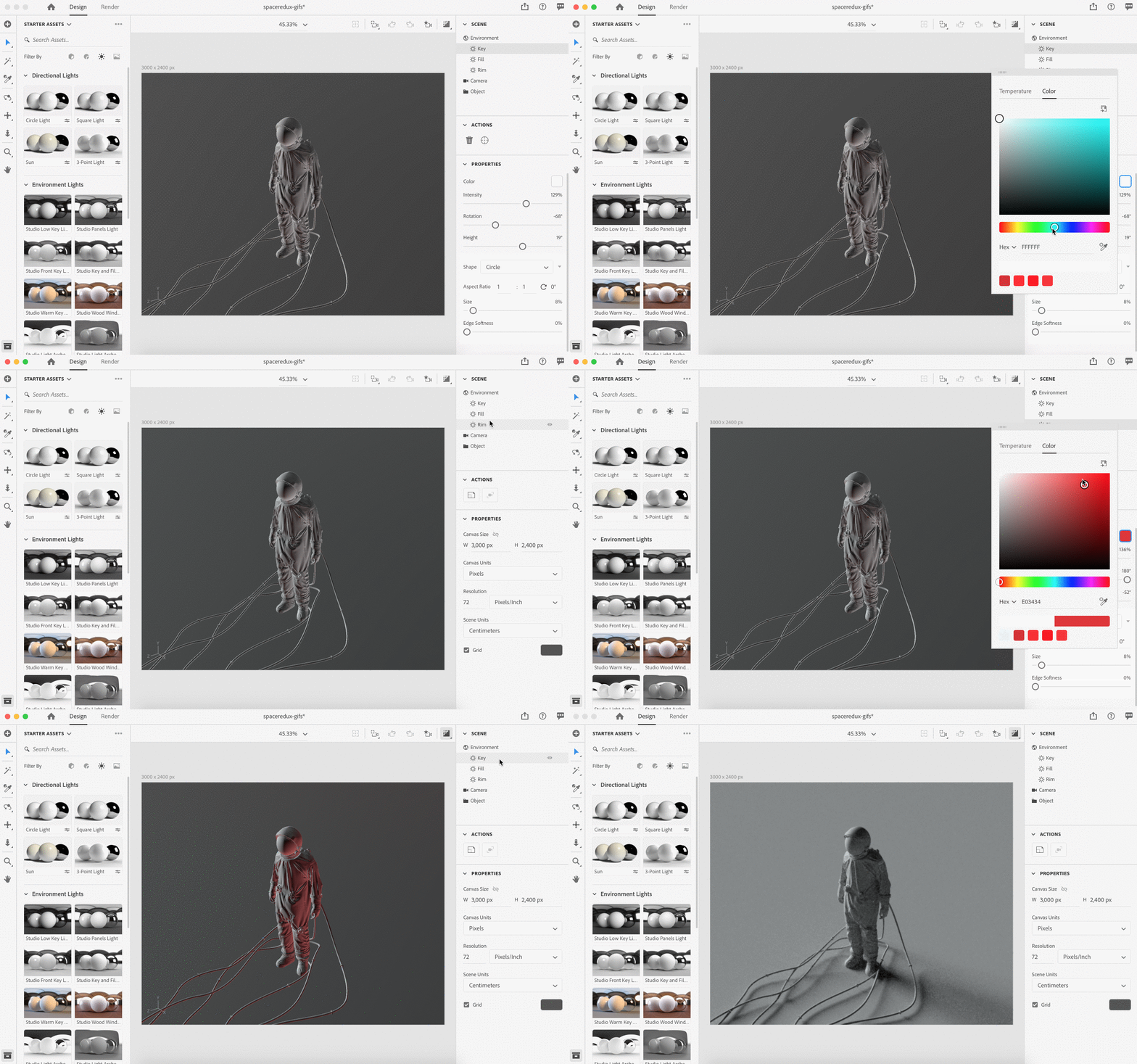
For this simple setup, the lighting is based on a three-point lighting technique. There is a large "key" light illuminating our subject. This is lighting the majority of our spaceman, along with creating the largest reflection in the helmet.

Next, I've added a large, soft fill light with a red tint set directly behind the camera to fill in the harsh shadows. I then also created a rim light to illuminate the back of our astronaut.

Additionally, I've also added some environment (HDRI) lighting to create some reflections in my scene for added realism. The environment lighting will create some additional reflections on our astronaut's visor and suit. Oftentimes, I will combine environment lighting with standard lights. This allows me to still have control over my main light sources, but get those real-world reflections from the environment map.
You can toggle on environment lighting in Dimension with a single click, and choose from a variety of presets.

Finally, I've added a highly reflective material to the visor of our astronaut, as well as applied some darker plastic materials for the suit. I've also applied some normal maps to all of my objects for added texture, more on normal maps below.
Here is an interactive embed of our scene, for further analysis:
Pro 3D lighting tips
Use clay first
I'm not talking about literal clay. Rather, remove all the materials from your models when setting up your lighting. This will allow you to view the lighting without the distraction of reflections or color. Later, when you are happy with your lighting setup, you can apply your materials to your objects.

Removing materials allows us to see our lighting clearly, without distraction.
Composition is key
The placement of your lights is very important. It's also important to place your objects in a way that will allow you to easily light and manage your scenes. For example, if you want a particular subject in your scene to stand out, you'll need to light them properly and place them in such a way that will naturally lead our eye. Try placing your subjects in areas that are most well-lit, ensuring not to make areas of secondary areas brighter than your subject area. For areas you want to be less distracting, try reducing the light.
Toggle lights one at a time
To get the best idea for where your lights need to be placed, try turning off all of your light sources and only keeping one on at a single time. This will help you understand where you need to make your adjustments to your light placements without the distraction of other light sources.

Be mindful of reflections
The materials you use in a scene can have a big impact on how your lighting reacts. Since some materials absorb light differently, such as metal as opposed to a fine cloth, you'll need to be intentional with your material choices. If you want a lot of reflections in your scene, consider using a lot of materials that are metal or contain a high amount of "roughness" or reflection. Sometimes, adding more reflective material to your scene can increase visual interest simply because of the light bouncing around and off of your reflective surfaces.
Sometimes it also helps to add objects to your scene that will bounce light and add additional reflections. An example of this is adding a floor object in your scene, or setting a "glow" value to objects you've strategically placed in your scene.
Use materials with normal (bump) maps
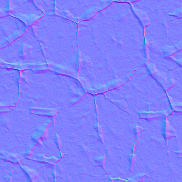
Another way to add realism and use lighting to its full potential is to create materials that have "normal maps." Normal maps, also referred to as bump maps, contain height information in the form of bitmaps that simulate textures or imperfections on the surface of your object, based on the way that light is hitting your objects. Since all real-world objects contain some sort of imperfections, they are incredibly useful for creating realistic scenes.

An example of a normal map.
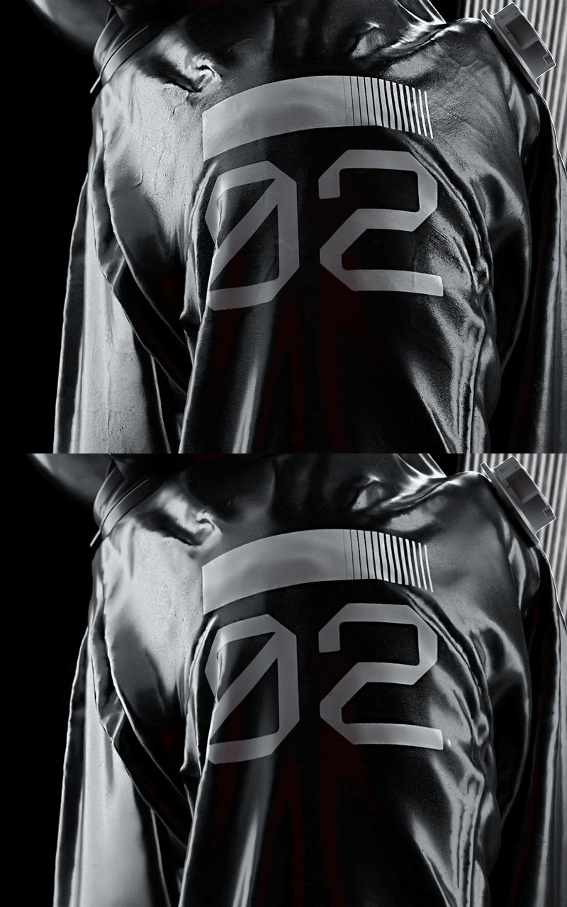
Here is a before and after of the same exact shot, with and without the normal map above being applied:

Adobe Stock has some fantastic materials that come pre-made and optimized for Adobe Dimension, with normal map information already included. I highly recommend using materials with bump maps applied over simply using the defaults of whatever 3D program you are using. You can also generate normal maps from images or textures in Photoshop as well. Personally, I find normal maps work best when scaled down, thus increasing the amount of tiled patterns and heightening realism.
Angles matter
Don't place lights directly in front of your subject. Avoid placing your lights in symmetrical positions from one another. Instead, always tilt them at off-angles or 45-degree angles in relation to your subject. By doing this, you'll avoid "washing out" your objects and allow for more shadows to play in your scene.
The larger the light, the softer the shadows
The larger your light source, the more light will diminish shadows and create a softbox for your subjects. In contrast, using smaller light sources means harsher and more direct shadows. If you are finding your shadows too harsh in your scene, simply enlarge them.
Add color
You don't have to use straight up white light for your scenes. Sometimes, you can bring interest just by adding a color tint to your lights to give it a different feel or that cinematic touch. In most programs, including Dimension, you can change the color of the light source.

Experiment!
Sometimes to get that "perfect" shot you may need to simply play with the lights in your scene. Each object and composition is different, so sometimes you may have to play with your light placements and colors to get the perfect look you want. Don't be afraid to move things around or break the rules.
Note: special thanks to Raoul Marks, Angelo Ferretti, and IUPUI University for the 3D models featured in this article.






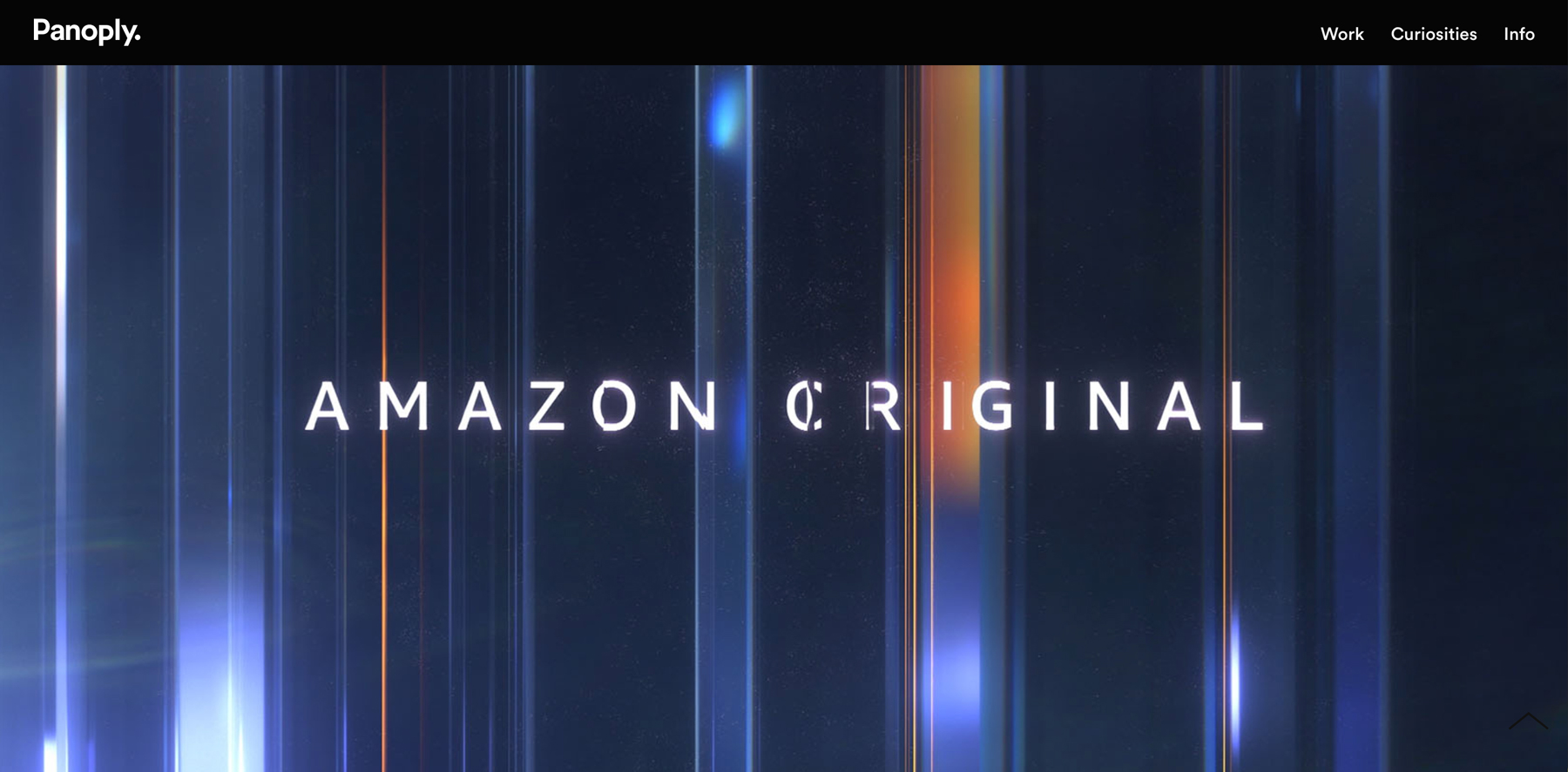
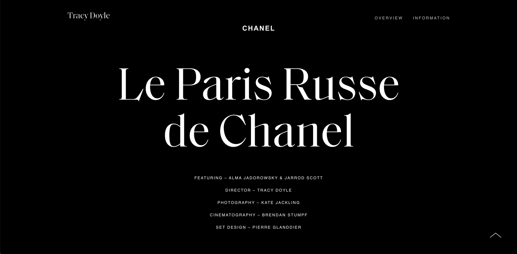

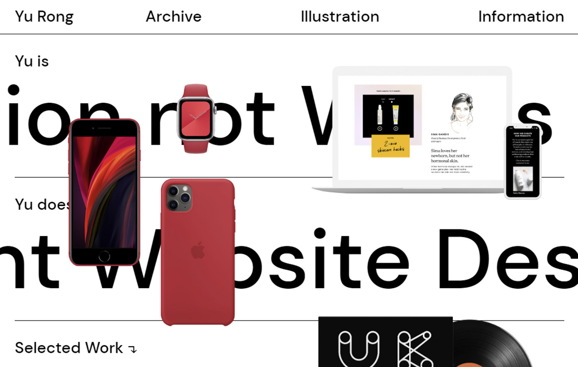
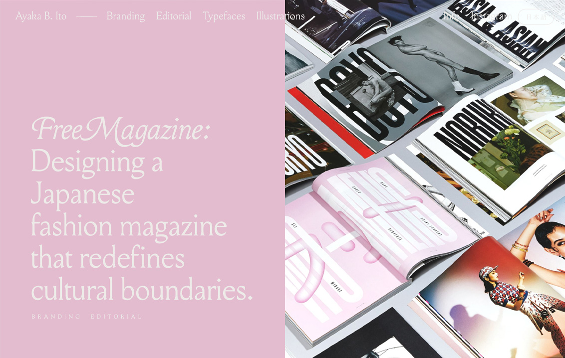
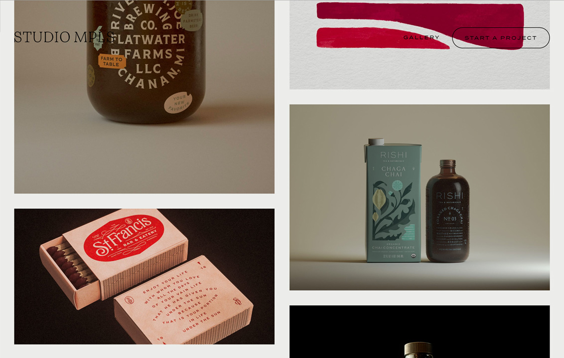
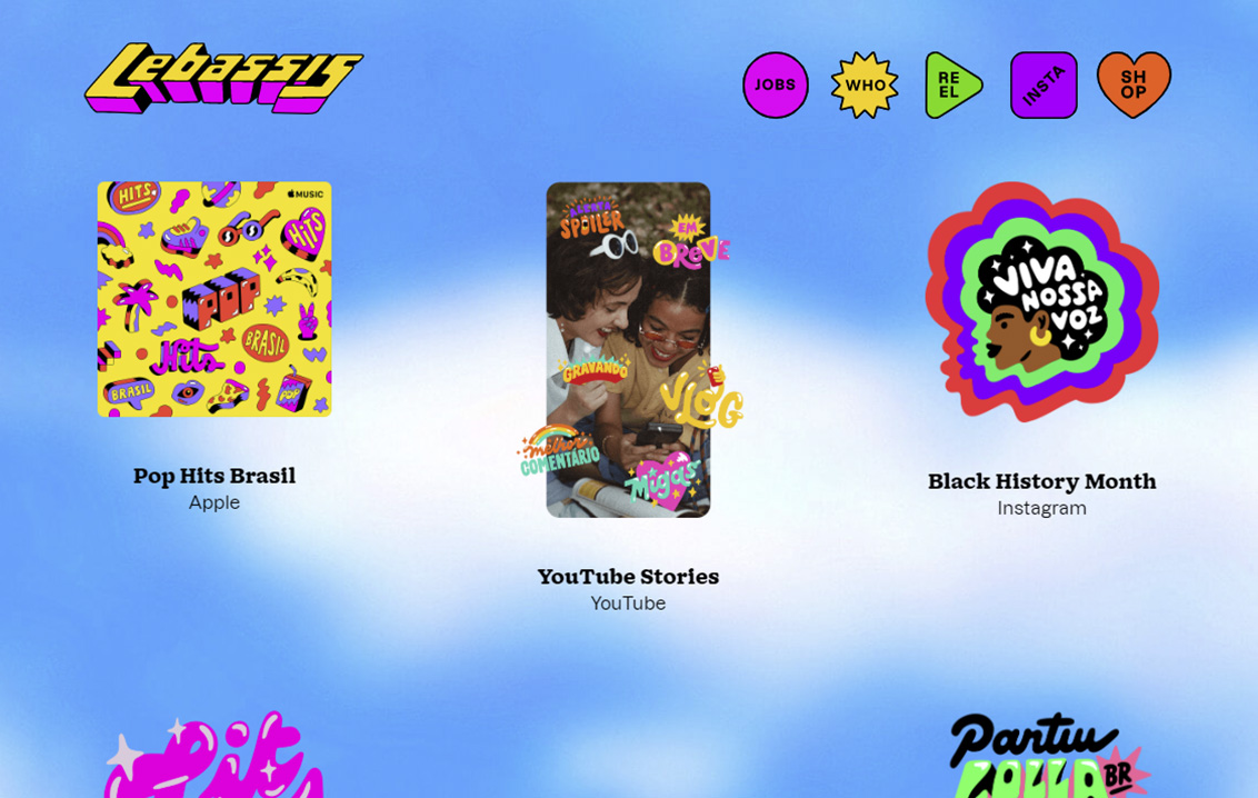


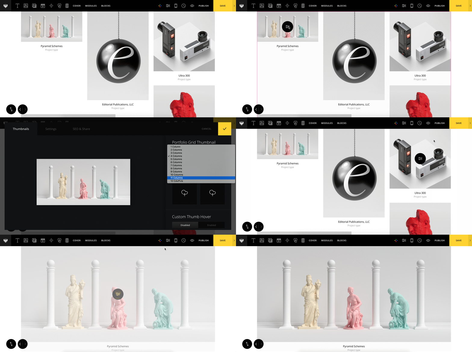 Let's also display our project title and category underneath each project thumbnail. To do this, set "Title & Type Visibility" to show both the project title and category.
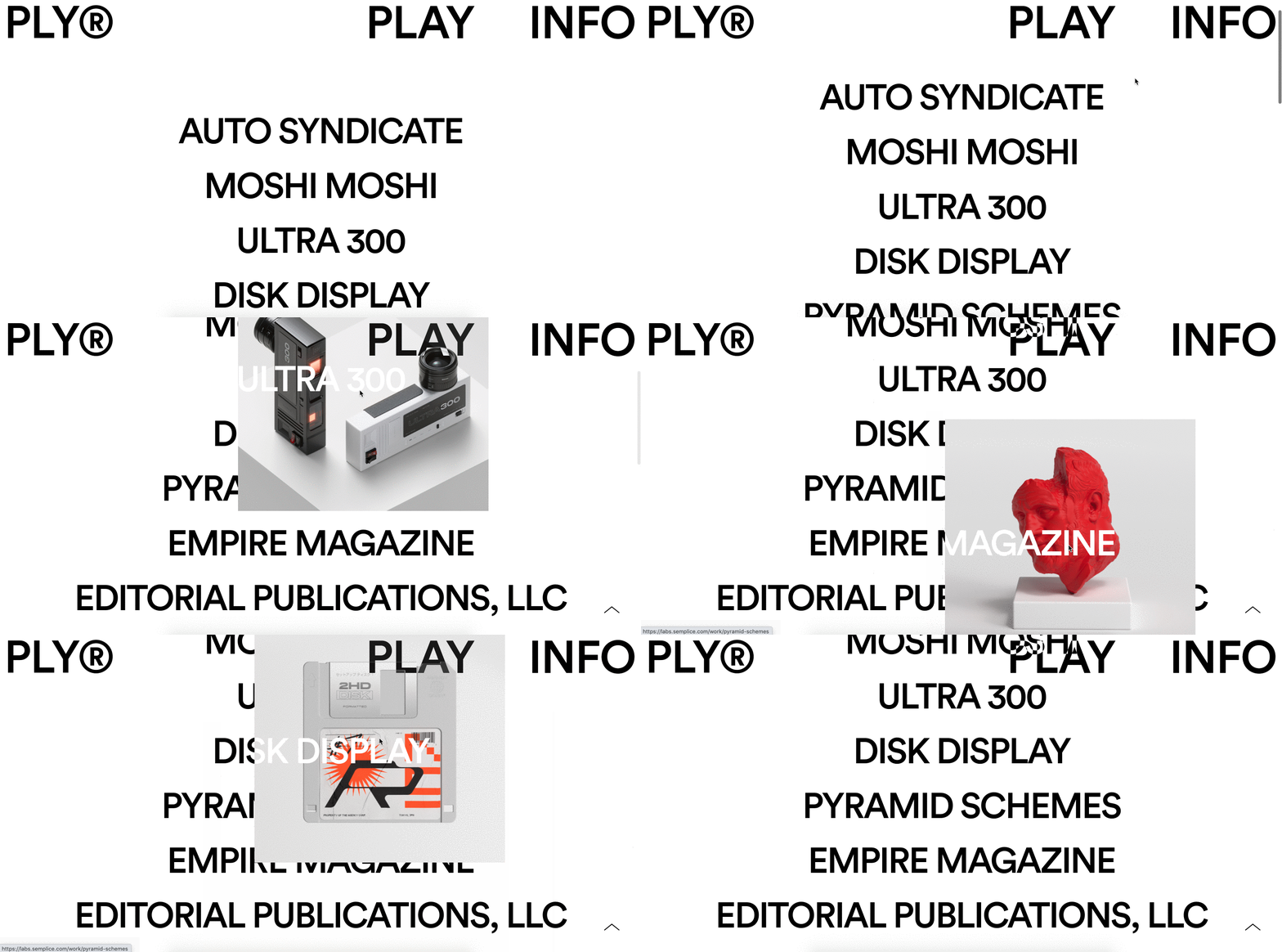

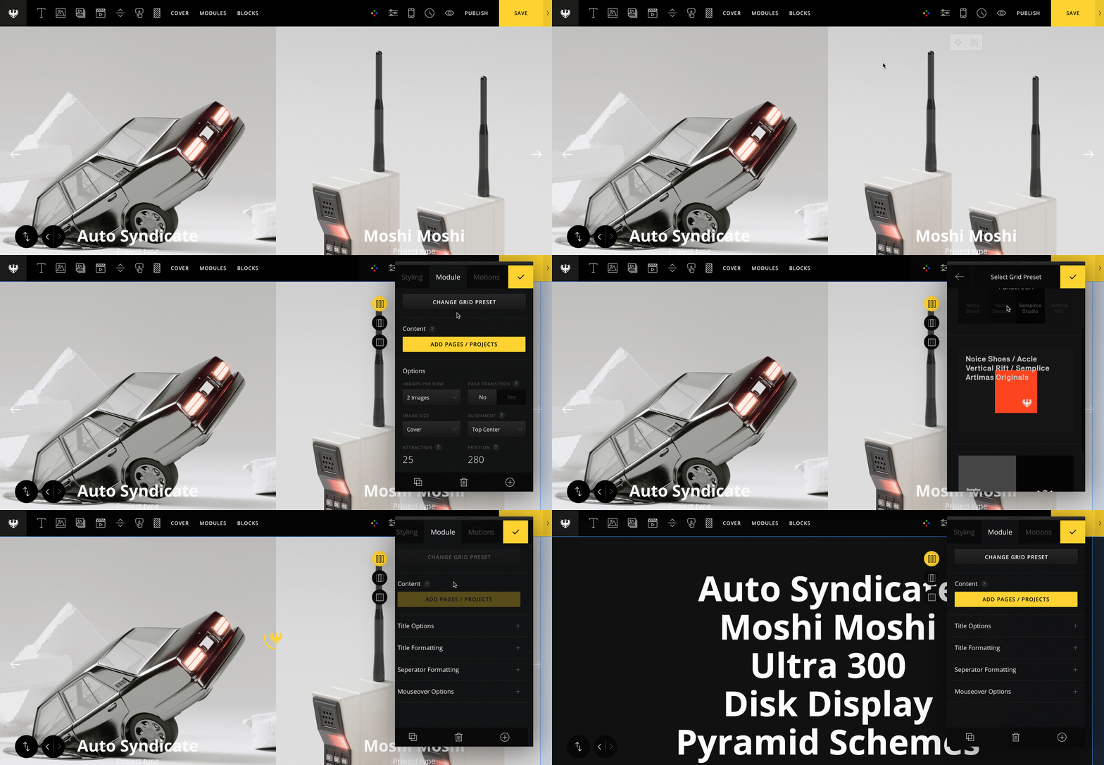 I'll keep the Title direction option to the default Vertical setting and style the grid accordingly. To get the cool mouse hover effect, set the Mouseover effect to "Original (Stick to Mouse)." I've also enabled the Title Mask effect. Note: this effect will only work if the Title direction is set to Vertical.