November 4, 2020No Comments

UX copy sells

When you write, you’re selling something: A story. A belief system. A product. 

UX writing is no different.

Your marketing copy sells your product. Your UX writing continues selling it.

Good UX copy affirms our decision to buy your product. It makes it enjoyable and satisfying to use, ensuring we keep using and paying for it. We then become walking advertisements every time we tweet about your product or recommend it to a friend.

And so, the same writing principles you'd apply to advertising or marketing can be valuable here.

Don’t stand in our way.

How do you sell a puppy? 

Not by talking about how cute, playful or loving it is. You just put it into the customer’s hands, stand back and it sells itself. 

A good car salesperson knows when their customer’s ready to buy. They don’t pitch harder at this point, reminding them how beautiful a car is, or how cool they’ll look driving it, or what a great deal this is. They let the customer take it for a spin. They give you as much time as you need to circle the car, sit in it and imagine yourself cruising down the highway with the top down.

A good retail employee knows following you around the store will just scare you away. Instead, they make their presence known. If you have a question, they're ready to answer it. If you need another size, they'll fetch it. When you emerge from the dressing room, they tell you how great you look. When you check out, they say you made a good choice. A smart retail employee knows you're already in the store with your wallet. So they let you shop.

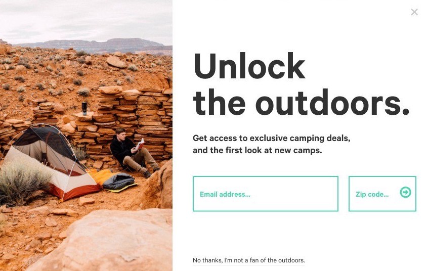
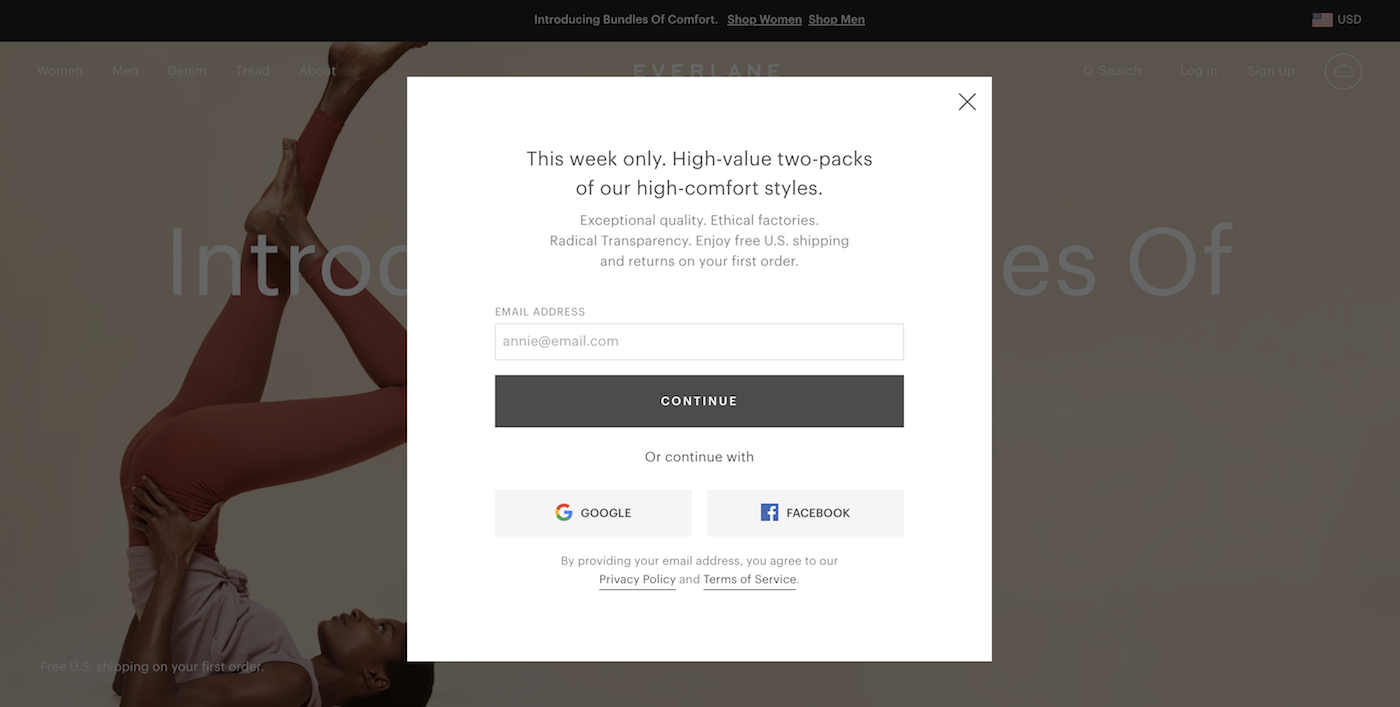
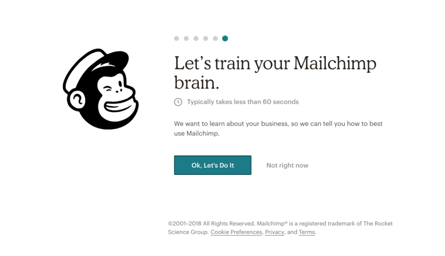
The best products sell themselves too. If someone’s reading your UX copy, that means they’ve already heard your pitch and chosen your product. Now put it in our hands and let us take it from there. Be there if we need you to point us in the right direction. Validate us when we complete a step or make the right decision. Then step back again.

On some occasions, more copy is required to help us understand or appreciate your product. In some cultures, people trust you more when you have more to say. But in most cases, less is better. If you feel like you need to write paragraphs of copy to explain your product, your product may be too complicated. Or you might be trying too hard.  

We’re already here. We’re sitting in the car. Let us put the top down and take it for a spin.

Speak to us, not about us.

As Vonnegut said, “Write to please one person. If you open a window and make love to the world, so to speak, your story will get pneumonia.”

We are just one person using your product at any given time. Talk to us, not the room. With that in mind:

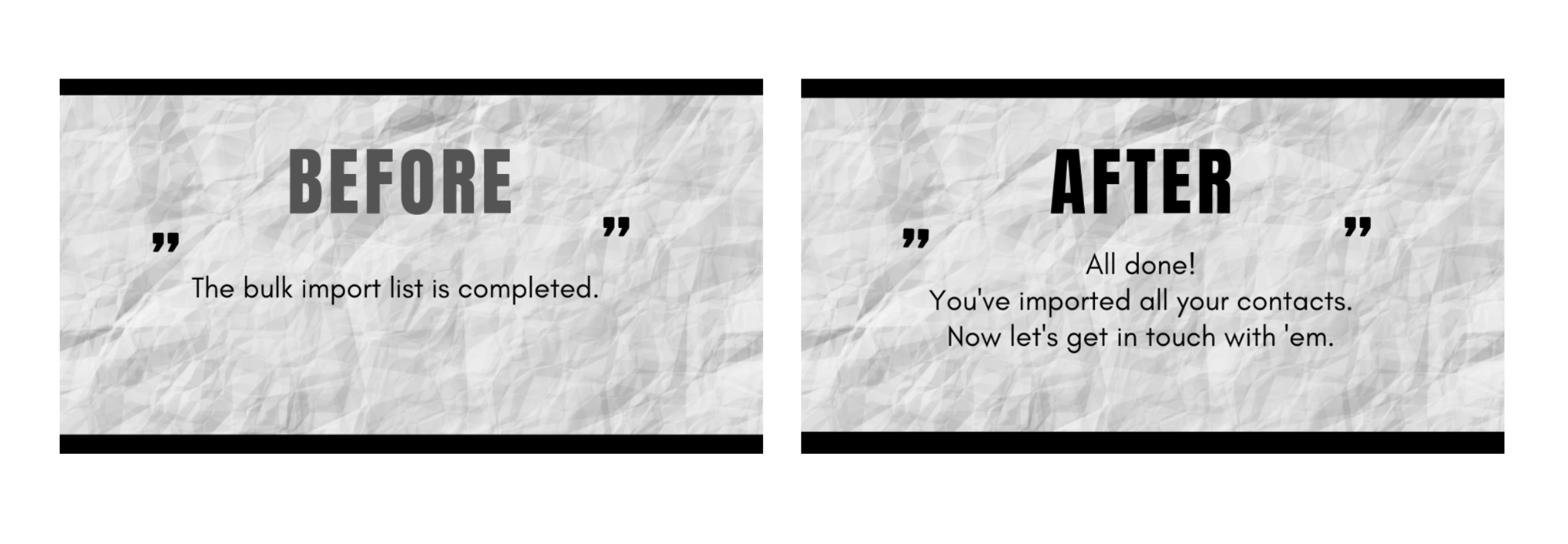
This: “The cart is empty”

Becomes this: “Your cart is empty.”


This: “Duplicate song on playlist”

Becomes this: “You already added that song.”


This: “Authorization access denied”

Becomes this: “Ask your admin for access.”


This: “Network connection lost”

Becomes this: “Check your wifi connection.”

We should feel like we’re having a conversation with you as we use your product. Which brings us to our next point.

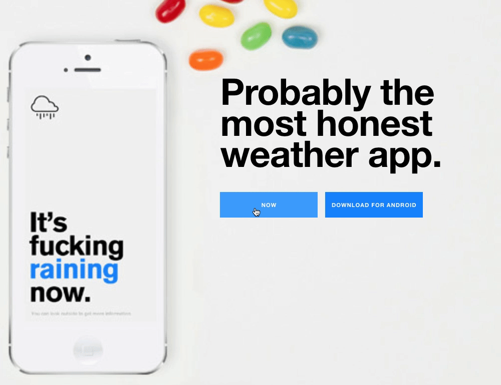
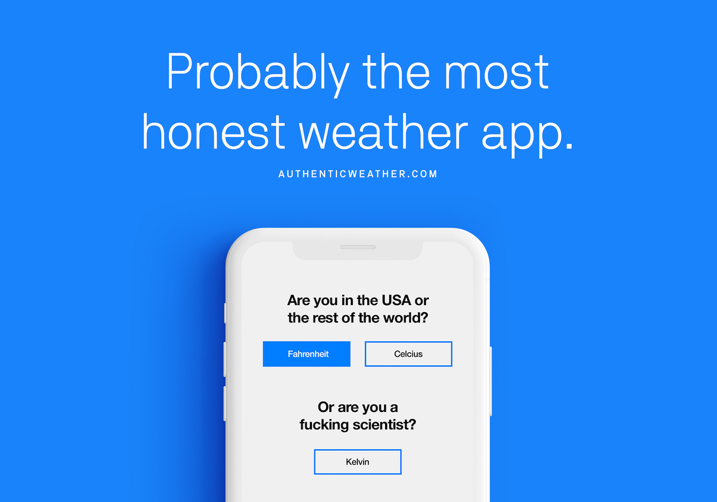
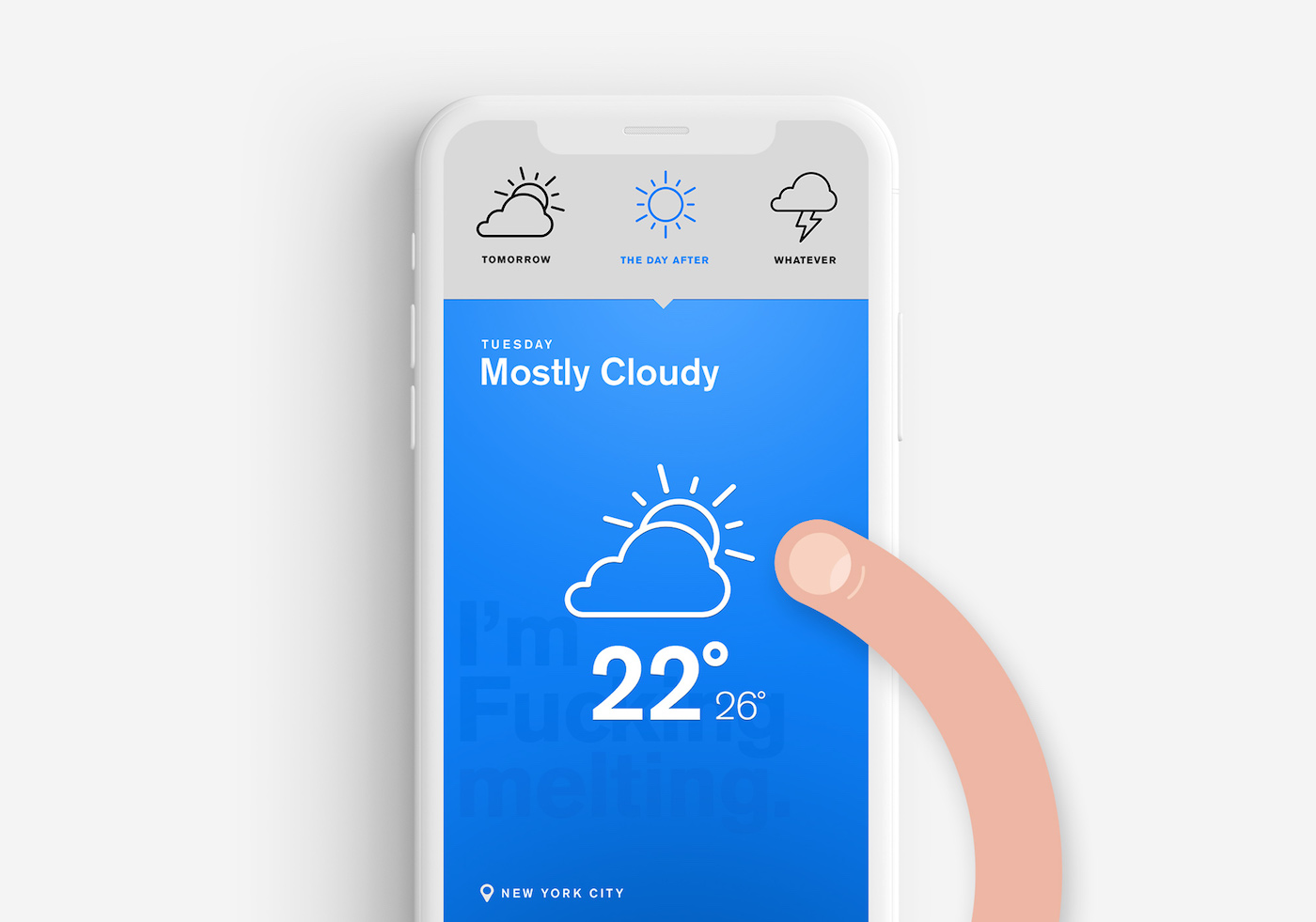
Write like a person, not a robot.

The most loved products feel human. So talk like one:

Don’t be afraid of contractions. We’re used to reading and speaking that way. An error message that reads “You’re not logged in” feels more natural than “You are not logged in.”

Cut the ten-dollar words. Usually, the word that first comes to mind is the right word to use. If you’re looking up synonyms, you’re overthinking it.  You wouldn’t say “Please check your inbox for authentication purposes.” You would say “Check your email for the login link.” 

Have a voice. Read through your text messages from your mother, your significant other, your best friend, your boss. They all write differently. They choose different words. They use punctuation differently. You can hear how they sound in your head, based on their unique voice. Your product should have a unique voice too. We talk about how to find your brand voice and apply it to your UX writing here.

When in doubt, read your writing out loud. Does it feel natural to say? Or does it sound stiff and awkward?

Write like you talk. It's not only easier to understand, it's more warm and personal. It's human.

Write for an international audience

Your sentence may feel natural to you, but does it to someone who speaks German as a first language?

Will that 80s American film reference make sense to someone who lives in Singapore?

Will that expression translate to something offensive in Japanese?

Will that sentence fit on a button when written in Mandarin?

Write your UX copy assuming it will be translated. Whether you have an international audience or not, it will make you a better writer. 

We have people using Semplice.com across the world, and it forces us to write without leaning on puns, references, slang or cliches. We use simple words, not fancy synonyms. We strive to be plain, not poetic. We do the same for our international audience here on DESK.

Read anything by Ernest Hemingway or John Steinbeck and you’ll see simple writing is powerful writing. When you’re not hiding behind stuffy vocabulary, every word rings clear.

Avoid cliches and hyperbole

The only brands who can say they’re “the best” are those that have an award or research to back it up. Otherwise, you’re not saying much at all.

The same goes for cliches like “unleash your creativity” and “optimize your workflow.” We’ve heard it all before. It doesn’t tell us anything useful or different.

The same goes for adverbs. Words like “effortlessly” and “seamlessly” require too much effort to write and are not seamless to read.

The same goes for adjectives. Cut phrases like “award-winning” and “life changing” and you’ll save room, and say more.

Same goes for "faster," "better," "bigger," "smaller," and “more."

These claims and phrases got old and died about 20 years ago. At best, we read right over them. At worst, they make us cringe. And when it comes to UX copy, they just take up precious space.

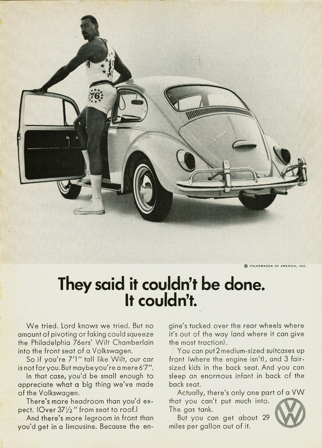
“Poor Faulkner. Does he really think big emotions come from big words? He thinks I don’t know the ten-dollar words. I know them all right. But there are older and simpler and better words, and those are the ones I use.” Ernest Hemingway

Keep your sentences short.

Read this sentence from Hemingway’s “The Old Man and the Sea":

“Every day is a new day. It is better to be lucky. But I would rather be exact. Then when luck comes you are ready.”

Now read this sentence from Henry James’ “The Golden Bowl”: 

“She had got up with these last words; she stood there before him with that particular suggestion in her aspect to which even the long habit of their life together had not closed his sense, kept sharp, year after year, by the collation of types and signs, the comparison of fine object with fine object, of one degree of finish, of one form of the exquisite with another–the appearance of some slight, slim draped “antique” of Vatican or Capitoline halls, late and refined, rare as a note and immortal as a link, set in motion by the miraculous infusion of a modern impulse and yet, for all the sudden freedom of folds and footsteps forsaken after centuries by their pedestal, keeping still the quality, the perfect felicity, of the statue; the blurred, absent eyes, the smoothed, elegant, nameless head, the impersonal flit of a creature lost in an alien age and passing as an image in worn relief round and round a precious vase.”

Did you actually read that last one? Or did you get turned around and lost halfway through? Me too. 

There are times for long sentences, especially in narrative-based writing, where you’re taking the reader on a journey, creating a rhythm and flow. But for UX writing, shorter is better. Use more periods. Use fewer commas.

It’s not about you. It’s about us.

We’re not interested in how hard you worked on your product. Or how advanced the technology is. Or how smart or fast or efficient the system is. We’re interested in what that means for us. How it makes our lives better, makes us look better, makes thing easier or otherwise benefits us.

You could talk about the better camera lens. Or you could talk about the sharper, higher quality photos we can take.

You could explain the layers of security in your highly encrypted checkout. Or you could tell us our information will be safe.

You could say you’ve been awarded for your fast delivery times. Or you could say we’ll receive our food in an hour, guaranteed.

Make it scannable

Want us to read your copy?

Then let us skim it.

We talk more about this here.

___

Read more from our UX copywriting series:

→ Content or design first?
→ Best practices for UX copywriting
→ We don't want to read your UX writing
My best products are a joke
→ Writing UX copy for buttons and links
→ Making your product a joy to use
→ What is UX copy?

October 27, 2020No Comments

We don’t want to read your UX writing

Both ad writers and UX copywriters share the same challenge: They are writing for an audience that doesn’t read.

Some might read your headline, if you’re lucky. They will only read your body copy if they’re sitting on the toilet or stuck on a train. They will avoid your digital banner ad at all costs. Humans famously have short attention spans. The internet’s only made it worse. 

According to a Nielsen Norman Group study, people are likely to read just 20% of the words on an average web page on an average visit.

We don’t read.

We scan.

It may seem even more difficult for UX writers, considering our copy is stuffed into boxes and underneath buttons and grayed out in form fields. But modern reading behavior is actually our advantage. While scanning, our eyes go straight to the headlines, buttons, bulleted lists and help text that allow us to complete our task in the most efficient way possible. Otherwise known as the UX copy.

Our goal as UX writers is not to captivate our readers. It’s to help people accomplish their goal. It’s a compliment to your product if someone can complete their tasks without paying much attention to your UX copy. (We say UX should be intuitive, don’t we?) With that in mind, we can take what we know about modern reading patterns to make our copy better. 

Lead with the conclusion

Journalists are taught to start their news articles with a “lede.” The lede summarizes the entire article in just a sentence or two, explaining the who, what, when, where and why of the story. It’s visualized as an inverted pyramid, beginning with the most newsworthy info. 

The idea here: Get to the point. Write an article that doesn’t require us to read the whole article. Do the same for your UX copy.

People often read in an F-shaped pattern online, starting with the content at the top left of your page and making their way down. Naturally, this means the copy at the top of your page gets the most attention. So lead with your main message on every page. You might just find, while prioritizing your content, that you don’t need the less important content at all.

This applies not just to your paragraphs and visual hierarchy, but to individual sentences. When we write passive, poorly structured sentences, our message gets buried. More on writing strong, active sentences here.

Write headlines that answer questions

The same rule applies to your headlines. Ideally, we can get answers and understand your main message by scanning the headline alone.

Say you have an issue with your coffee grinder and reach for the instruction manual. You likely won't read the entire manual, but rather skip ahead to the troubleshooting section that most closely describes your issue, scanning headlines like "Unclogging your grinder" and "Replacing the on/off switch." Your UX writing doesn't necessarily have to be this dry, but you can use the same approach. Include the benefit or the answer in your headline, or at least point us there.

We often feel pressure to be “clever” with our writing. This leads to puns, poetic lines and marketing speak that makes for useless headlines.

Consider an app that offers one day delivery for pet food.

You could write a headline that says: “Delivery times that make your tail wag” 

Or it could say this: “Pet food, delivered tomorrow.”

The latter answers the question before we even ask it: How soon can I get my pet food? The former doesn’t say much at all, but does make you gag a little.

Let it be a relief that you don’t need to write cute or clever headlines (although that doesn't mean you can't be funny or creative at appropriate times). You need to write headlines that work.

“On the average, five times as many people read the headline as read the body copy. When you have written your headline, you have spent eighty cents out of your dollar.” David Ogilvy

Don’t waste words

Knowing we don’t have our user’s attention for long, and not much of their attention at that, we have to choose our words carefully. 

Writing concisely is hard. As Blaise Pascal wrote, “I have only made this letter longer because I have not had the time to make it shorter." 

To that end:

– Remove buzzwords and promotional language. Adjectives like “cutting edge” or “revolutionizing” are useless, meaningless fluff. Plus, they’re cringey and played out. So are adverbs like “seamlessly” and “fully” and “very.” So are filler words and phrases like "of course" and "in order to." Cut them and your sentence gets tighter and stronger.

– Write your sentence, then write it again, but shorter. Keep rewriting until your sentence is at least half the length it originally was. 

– Don’t try so hard to impress. You could say “Increase your profitability” or you could just say “Make more money.” You could say "Suggested from your recent activity" or  "You might like this." While your exact wording depends on your product's voice, the most simple option should always win.

NN Group did a fascinating study around concise copy and usability, comparing different versions of the same paragraph. Some used promotional language, others used bullet points and tighter copy. The final, improved paragraph was 124% more usable than the original.

We talk more about writing concise UX copy here

Break your copy into short paragraphs and bite-sized segments

The only person reading long paragraphs is your high school English teacher, and she probably doesn’t enjoy it. 

– A good rule: Each paragraph should focus on just one idea. Only tell us what we need to know now, and reveal the rest later when it’s relevant (otherwise known as progressive disclosure).

– Use headlines to guide us through the page. 

– If you have a list or several points to make, bullet them out. 

Buttons and links should describe the action we're taking

If we’re trying to accomplish a task in your product, assume our eyes are jumping straight to your links and buttons.

We could land on a button that says “Learn More”

Or a button that says “See pricing”

If we haven’t read a single piece of content on this screen, which button is most useful?

Read more on writing for buttons and links.

Know when copy isn't the solution

Every additional second we spend, scrolling, clicking and searching increases the interaction cost (the sum of mental and physical effort) required to use your product. Your goal is to keep the interaction cost as low as possible.

Sometimes, especially when we're skimming a page, an icon does that better than a line of text.

Sometimes, the copy doesn't need to be improved. The design does.

Other times, the screen simply needs to be better optimized for the device we're reading on.

Know your user,  think about where they are in the process, what they need to do next and what gets them there as quickly as possible.

__

If you’re just joining our UX copywriting series, catch up here:

My best products are a joke
→ Best practices for UX copywriting
→ Content or design first?
→ Writing UX copy for buttons and links
→ Making your product a joy to use
→ What is UX copy?

October 8, 2020No Comments

How to create a UX writing portfolio

It may seem like UX writing is in a perpetual grey area. Like a lot of design disciplines, the field is having an identity crisis.

Trying to get a UX writer position is difficult because not many people know what it is, how to approach it or what skills even translate to UX copywriting.

When looking for positions in UX writing, you may come across titles such as:

  • Content Designer
  • UX Content Strategist
  • User Experience Copywriter
  • Product Writer
  • Content Writer

There are tons of overlapping skills in all these positions. Some might have varying degrees of product or marketing tasks, but all of them mean the same thing: You’re going to be writing research-backed, retention-focused microcopy.

Titles tend to trap you in a box. I have a background in content, but because I have worked so closely with products, I have tasks that translate to UX writing. It doesn’t matter your title; as long as you’ve written for products and/or about products in notifications, emails and onboarding, you can be a UX copywriter. 

Creating a portfolio to reflect your UX writing capabilities is one of the most frustrating things about the discipline. However, as soon as you know what the hiring manager is looking for, it becomes a whole lot easier. 

UX writing leaders are looking for three main things: That you have experience on a design team, familiarity with design systems and an understanding of the end-to-end UX design process. 

State your place on the design team

Hiring managers want to know how you fit in with the design team. The design team can also mean product team, tech team, creative team etc. — essentially, a team focused on the user journey.

It’s important to mention who you worked with, reported to and managed in your portfolio, as the hiring manager wants to know you can communicate with designers and have knowledge of the design workflow. They want to know if you can speak the lingo, have an understanding of UX and know how to work on a product.

If you’ve worked for a large company, your role is probably more concrete and easier to define. If you’ve worked for a startup —like me — defining your place in your team’s workflow might be more difficult. 

In my portfolio, I clarified like this:

“I worked with a multidisciplinary design team, under the CTO who served as art director and project manager. I wore many hats and UX wrote for the new website and app, defined the brand voice, and helped the front-end and back-end designers optimize behavioral flow through scriptwriting and user research.”

There are many ways to go about showing off your role in a design team, but for most hiring managers, this is a must-have.

"The hiring manager wants to know you can come in and begin communicating with the design team right away."

Learn the design system lingo

In a lot of job descriptions I’ve seen, the company wants you to have experience with design systems. Don’t worry, you most likely have the experience. 

Different design teams have different lingo. Working for several startups and often working alone when freelancing, I learned I did know a lot of the design team vernacular, I just wasn’t exposed to it the same way as UX writers in large companies. 

Learn the lingo and use the same terms in your portfolio. One of the ways I did this was by reaching out to UX designers and writers at large companies and walking through the job descriptions. They simplified the terms and helped me apply it when walking through my portfolio. 

The hiring manager wants to know you can come in and begin communicating with the design team right away. 

For example, here is a job description for a UX content strategist role at Zendesk:

There are tons of words in here which can be confusing to someone who has never been exposed to them, such as “navigational nomenclature”, “audits”, “standard methodologies”, “taxonomies”, etc.

If you have a background in content, chances are you have experience with these terms. Regardless, don’t be afraid of these words. When I construct my portfolio, I like to break down these words, simplify them and apply my experience to them. 

"Navigational nomenclature" essentially means using consistent words to navigate a user to an action in a navbar or CTA.

"Auditing" means doing usability analysis such as A/B testing, gathering user feedback or using analytics.

"Taxonomies" refers to information architecture. Do you have experience structuring product content for maximum accessibility?

In your portfolio, you should be using the same design lingo you see in job descriptions. However, do not force it. Hiring managers just want to see you’re familiar with the terms, but use them organically and sparingly. 

"The hero takes a journey, meets an obstacle and finally, triumphs. In this story, your user is the hero."

Define, in detail, your work in the end-to-end process 

The best way to define your place in the end-to-end design process is by creating a story of the user successfully completing an experience. Focus on how someone discovers the product, how someone onboards and the first use of the product. Include specific details around how you impacted this process with your writing.

Typical places UX writers have impact are:

  • Onboarding
  • Action flows
  • Buttons
  • Error messages
  • Notifications
  • In-app purchase flow

If you have any experience in these areas, you’ll want to share it in detail. 

Here is an example of how I did this in my portfolio:

The user journey is a big part of the end-to-end design process. The hiring manager wants to know you have a holistic understanding of the product development process from validation (user research) to building solutions (UX/UI) to validating solutions (analytics).

It's the classic story structure we learn about in school. The hero takes a journey, meets an obstacle and finally, triumphs. In this story, your user is the hero. So share their journey in your case studies: With a problem, goal and results – ideally, a success story. Here's how UX writer Tamara Hilmes introduces her case studies:

This serves as an outline for her case study, and she dives into the details from there.

Here’s another example of a more direct way to share your impact:

The writer shared what the copy looked like before and after they worked on it. This can be a useful approach, but most hiring managers will be looking for your thought process behind these decisions as well.

Create a narrative with your portfolio

The portfolio isn’t just a window into your experience. It’s also a glimpse into your personality. 

While this may not be a deal-breaker, the hiring manager also wants to understand your overall character and see if you have an eye for design and UX.

You can see an example here, where the writer lays out their approach and brings their voice into play:

Creating a UX writing portfolio is extremely challenging compared to visual creatives. While designers can convey their personality and style through images, the place to show yours is in stories around your experience. 

Share the context of your company, the context of your role, why you made the decisions you didand what you would’ve done differently. This shows your overall understanding of your work and conveys your style and personality.

October 1, 2020No Comments

How to learn UX copywriting? Understand iconography.

This is an excerpt from our upcoming UX Writing book, exploring how we (as designers and copywriters) can write copy that helps people use and love our products. Sign up for book updates here

Understanding where and when copy is necessary is just as important as knowing how to write it. 

Sometimes, a message can be relayed through the design without content. Other times, a simple icon is more effective than a line of text. And in other cases, an icon should be used WITH copy to convey the message. 

If you’re just now joining this series, this is as good a time as any to talk about cognitive load. Humans, like computers, only have a certain amount of processing power and memory in our brains. When we interact with a product, we are using those resources to make sense of the system. The less cognitive load (ie. mental effort) your product requires from the people using it, the better. The higher the cognitive load, the more work your user has to put in to complete a task. 

The goal, obviously, is to make things as easy as possible for our user. That means helping them complete their task correctly, as quickly as possible, with as little strain on their brain as possible. Which leaves us with questions: What do people recognize and understand faster? Icons or copy? What if it’s both? What if it’s neither? 

While much of it depends on the context – where a person currently is in your experience, what they already know, what they don’t know, what device they’re using and so forth – we can establish a few general rules around that help us know when to use what. Let’s start with icons. 

When to use icons

An icon is most often used for repetitive actions: Visiting your profile, searching, favoriting an item. If we’re going to interact with a UI element within your product – for example, adjusting the volume – we’ll likely see an icon next to it that identifies the element. 

Icons are meant to simplify a message or idea, making it easy to understand at a glance. They allow us to scan and intuitively navigate through a product through symbols we recognize. They save space for designers and copywriters, especially on mobile. 

And, importantly, icons can transcend language. It’s one of the main reasons you’ll use one. While copy requires carefully choosing your verbiage and dealing with the complexities of multi-language support, an icon requires no translation. 

But very few icons can achieve these goals on their own. 

An icon should be understood without thinking. And we can’t assume people across cultures, languages, age and capabilities will understand the same symbols we do. If your icon makes them pause for even a couple seconds, it’s not doing its job.

As Nielsen Norman Group puts it, “Icons are, by definition, a visual representation of an object, action, or idea. If that object, action, or idea is not immediately clear to users, the icon is reduced to mere eye candy — confusing, frustrating, eye candy — and to visual noise that hinders people from completing a task.”

While we could get into UX design 101 here, we’re more focused on icons in relation to copy. So here’s an easy rule: 

Use a label with your icons. 

Perhaps a few exceptions exist, like a hamburger icon or a magnifying glass, but even these can be misconstrued depending on the context. A magnifying glass could mean “search” or “zoom.” A hamburger menu may be standard to you, but not necessarily to your grandmother. A clock, which seems like a pretty obvious symbol, could mean “current time” or “browsing history.” 

More technical people than me would call icons paired with labels a “cognitive affordance.” The label helps us understand how the icon should be used.

All icons and no copy, and your product is as frightening to use as an Ikea manual. There are entire websites dedicated to translating Ikea manuals, which notoriously lack instructional copy and require you to decipher complicated visuals.

Pull a screen from any of your favorite apps and remove all the copy. You’ll likely be left with something akin to hieroglyphics, at best. 

Take the Spotify app, for example. Here we’ve removed the labels they include with their icons in the dock.

Most of us understand the first two icons at a glance. The icon on the far right, however, is open to interpretation. We’d have to stop for a beat and think, or even click to confirm what it is: A Library icon. While this is the main “problem” icon, Spotify chooses to label all of them.

The other icons on this screen are intuitive because of the context. A play button is one of those few universal symbols that can afford to stand on its own, especially given the fact that this is a music app. Placed within a search bar and next to the help text that reads “Artists, songs, or podcasts,” we know the magnifying glass means “Search.” The microphone icon is debatable – Spotify assumes we understand voice functions based on our previous habits. Some of us may still need to click the icon to find out.

Labeling your icons also primes your user, teaching them the language of your product. If Spotify first introduces the Library icon with a label, they could potentially use that icon without a label later to save space – only because they taught us earlier what it means. 

This goes both ways. If you’re using an icon with copy in one place, but we’re never going to see that icon again past this first screen, why use an icon with a label? Just use the copy on its own without the icon and save the space. Which brings us here:  

When to use copy

Knowing when to use copy over icons depends on the context and the complexity of the message. If you’re struggling for even a few seconds about how to represent a concept, action or message with an icon, don’t use an icon. If you had to stretch to represent it visually, the chances are high we won’t understand your visual.

However, that doesn’t mean you need to write paragraphs of text. The more concise your UX copy, the better. Progressive disclosure makes that possible – tell us only what we need to know now, and explain the rest later when it becomes relevant. This is what allows us to intuitively use your product: progressive disclosure, priming and building on learned behaviors.

When words are paired with design, they almost achieve icon status. (Words are visual symbols just like icons, aren’t they? They’re just shaped differently.)

You won’t even read the “Next” button during an onboarding experience because it’s within a button, possibly even paired with an arrow icon, within the contained onboarding experience. Plus, you’ve clicked through these things hundreds of times. You’ve got the muscle memory.

If you’ve decided you want to purchase a dress online, you’re not reading the text that says “Add to bag.” Because of its placement below or next to the product image, along with the size and prominence of that text, you click the link without thinking.

When it comes to UX, copy is the silent hero. Yes, UX copy should still be creative. You should still take every opportunity to infuse your brand voice into your UX. If your UX copy makes people laugh, it can transform your entire product. But speaking strictly about the user experience: You know your copy is successful when we don’t think too much about it at all. 

Deciding between icons and copy: A non-comprehensive checklist

Summing up what we’ve reviewed here, this checklist by no means covers all scenarios. But it may help as you form mental models around writing UX copy.

Use an icon if:

– You can immediately think of an icon that visualizes the message, concept or action. 

– Your users are going to complete this action repetitively, or see this message throughout the system.

– You’re identifying a core UI element within your product (such as volume control)

Use copy if: 

_ You're using an icon. (Include a label for your icon, with a few exceptions.)

– This is the only time your user will complete this action, see this message or learn this concept within your product experience.

– You can’t immediately think of an icon. If you’re straining to visualize it, we’ll struggle to understand it.

___

Read more from our UX copywriting series:

My best products are a joke
→ Best practices for UX copywriting
→ Content or design first?
→ Writing UX copy for buttons and links
→ Making your product a joy to use
→ What is UX copy?

September 17, 2020No Comments

My best products are a joke

This is an excerpt from our upcoming UX Writing book, exploring how we (as designers and copywriters) can write copy that helps people use and love our products. Sign up for book updates here

Humor has been used to sell products since the early days of advertising. But rarely do you see it used effectively within the product itself. And it’s a missed opportunity.

When done right, humor can change your entire product experience. When done really well, your user will screenshot and share your UX copy, meaning your product markets itself.

But being funny, assuming you don't have a natural gift for it, is a challenge. A key ingredient to a laugh is the appearance of effortlessness. Ironically, effortlessness can take effort. 

Looking at the golden age of advertising in the 60s compared to now, it seems humor has changed. Before, it was nuanced. A good joke in a print ad made you feel smarter, like an insider, further cementing your alignment with the brand. These ads still hold up and are referenced and revered by copywriters everywhere. It’s called the golden age for a reason. 

Ads have evolved since then (with some exceptions, like The Economist's sharp print and billboard campaigns). What was once a full-length print ad is now a two-sentence Instagram caption. What was once a paragraph is now a pun. What was once subtle is now on the nose. 

But it’s not humor that has changed. The context has. And that’s the first important lesson to writing funny copy.

It’s all about context.

Context is the time we live in.

It’s the language we speak.

It’s our culture, the current state of the world, our politics, our age. 

For your product, it’s also the type of tool you’re writing for, what your user just did, what they’re doing now, what’s coming next and how they feel at that specific moment. 

Humor must be designed. A funny confirmation message might be delightful the first time someone sees it, but if they’re seeing it every time they complete an action, it gets old fast. What may seem funny in isolation, while writing your microcopy, will not be funny if it confuses your user or hits them at a point in the process when they don’t want to laugh – they just want to accomplish the task at hand.

Finding opportunities for humor in your product UX

You don’t have to crack a joke on every screen of your product, and you shouldn’t. It’d be exhausting for you and everyone using it. But you can infuse humor throughout your product in the right places. These are good places to do so:

  • Loading screens
  • Empty states
  • 404 pages
  • Confirmation messaging
  • Help text
  • Placeholder text

Let’s look at a few brands that do this well.

Not for the first time in this series, we arrive at Mailchimp.

The Mailchimp monkey character is instantly recognized by marketers everywhere, because they use humorous copy and imagery to relate to their audience. 

Consider the image above. This is the screen you see when you’re about to hit send on an email campaign, blasting your email out to hundreds or thousands of subscribers. Mailchimp recognizes the equal parts terror and pride that comes with launching. Those drips of sweat rolling off the monkey’s hand as it hovers above the GO button says everything. And right below the “Send Now” button is a tiny caption: “This is your moment of glory.” 

Mailchimp recognizes your fear and simultaneously celebrates your accomplishment. The image has been screenshotted and shared countless times, because it resonates. On this screen, you can see designers and copywriters working together as a team.

Note that Mailchimp isn’t laugh-out-loud, roll-on the-floor hilarious. You’re not going to tell your wife about that Mailchimp joke when she arrives home from work. What Mailchimp succeeds to do is use humor to make their product fun to use. And that’s saying a lot, considering Mailchimp is an email platform.

I will once again point to my own product, Semplice.com, as an example. One of the biggest challenges people face when building their online portfolio is getting started in the first place. It’s a daunting task, one designers notoriously put on the back burner. So after you’ve first set up Semplice (a portfolio-building tool) and the hype is still high, we want to give you that little push you need to move forward. And your dashboard is empty, awaiting your creations, so why not?

We could have left this page empty or wrote “You have no projects to show” – and we did, for a time. But after we added this playful little jab, our users started screen-shotting and sharing this page on Twitter. It spoke to them in their moment of hesitancy and hopefully motivated them to move forward. As a bonus for us, their screenshots gave Semplice some free advertising.

Here's another example from a weather app I made called Authentic Weather. Authentic Weather was like any other weather app, with one distinction: its sense of humor. We took every opportunity in the app UX to make people smile, down to the button text.

Authentic Weather gained a cult following not for its superior weather service, but for its sense of humor.

Techniques for using humor

How you use humor depends on your product and your voice (read more about finding your band voice here), but this is a good place to start.

1. Know your user and the context

Comedians are funny because they meet us where we are. They take an everyday moment and make us see it differently. At their most funny, it feels as though they have reached into our brain and named something we’ve felt before. They get us. At their least funny, they read the room wrong and make an ill-timed joke that falls flat. Crickets.

It’s that buzzy word “empathy” we love to throw around as designers, actually being applied. Recognizing how a person may be feeling while using your product allows you to meet them there.

Are they trying to access important account information? Then don’t get in their way with a useless joke – they just want their user ID.

Is this a point in the process where people typically give up and drop off? Then it may be the perfect place to drop a lighthearted word of encouragement.

Are a significant portion of your users speaking another language? Make sure your joke translates to that language, or it will be lost on them. Many of our users at Semplice.com speak English as a second language, and it’s forced us to sharpen our writing and crystallize our humor to its most simple and clear form. Which is to say, it’s made our writing better.

Think about where we are and how we feel at this specific screen. How can you meet us there?

2. Lean into a misconception, stereotype, challenge, fear or negative aspect of your product experience. 

Which is to say, know your product.

It’s the same approach those beautiful ads from the 60s took: Self awareness. Making yourself the butt end of your own joke. Acknowledging what we're all thinking and flipping the script. Making us feel like we're all on the inside.

Look for those little moments where you can show self awareness. It begins with using your own tool, understanding how others use it and how it – or the task they are using it for – is perceived.

3. Don’t try too hard.

If you feel like you’re forcing it, don’t. Forced humor is never funny. It’s perplexing, distancing and worse: annoying. And an annoying product is a dead man walking.

Which brings us to our next point.

4. Don’t be clever at the expense of clarity.

Read anything about writing UX copy and you will find this advice, repeated again and again. If your message is lost in your joke, re-write your joke. If it’s still unclear, kill the joke entirely. It’s always better to be clear than funny, especially when it comes to UX copy. 

5. Strive for consistency 

If you make a punny dad joke on one screen and use deadpan sarcasm on the next, your users are going to be confused at best and offended at worst. 

Start by knowing your brand voice. Is your brand the type to make lighthearted jokes or use dark humor? Are you offbeat and clever or silly and charming? Whatever it is, be that consistently. Once we learn your language, your jokes have a place to land.

___

For more about writing UX copy:

→ Best practices for UX copywriting
→ Content or design first?
→ Writing UX copy for buttons and links
→ Making your product a joy to use
→ How to write concisely

September 1, 2020No Comments

The glue to your product UX: Consistent microcopy

Good UX copy is consistent. That requires making decisions about your brand voice, perspective, style and strategy from the beginning, and sticking with it.

– If your voice is technical or academic, and you throw a joke into an error message at random, it may feel jarring and confusing for your users. If you have a personal, casual voice and then shift to dry, legal language without warning, they’re going to feel wary. Establishing your voice, and maintaining it throughout your microcopy, builds trust and strengthens your brand.

– Go to any product and try to change your preferences. Does the option say “My preferences” or “Your preferences” or just “Preferences?” Any of them work. All of them were a decision by the copywriter. And those decisions change the way your product feels, whether the user is aware of it or not. It also allows people to use your product intuitively and reduces cognitive load. If you start switching it up mid-sentence (ie. “Check your return status under My Account” ) or between different parts of your product experience (calling it “My Account” in one place, and “Profile” in another), it’s going to make things disjointed and confusing. Does your product speak in third or first person? Decide now based on your voice, and keep it that way.

– Use your terms and names consistently. If you call it “scheduling” in one part of your product and “booking” in another, you’ll create uncertainty, which puts that important conversion at risk. Don’t use a synonym in an attempt to be creative or avoid repeating yourself. Use the same word you use everywhere else.

– Remember to make your copy consistent with the platform your user’s on. If they’re using it on desktop, it’s “click.” If they’re on mobile, it’s “tap.”

– Do you write your headlines in sentence form? Do you capitalize the first letter of each word? Do you use subheads or no subheads? Our brains get accustomed to these patterns and while we might not notice your product’s formatting or style, we will notice when it changes abruptly. And it will slow us down.

– Do you phrase your calls-to-action as questions or commands? When you open Netflix, it asks “Who’s watching?” This is a decidedly personal and casual approach, where it could have just as easily read “Select account.” If someone’s walking through your UX accustomed to answering questions, you may through them off with a command in the next step. 

The best way to stay consistent: Creating a style guide for your team. Include your voice documentation and examples, whether you speak in first or third person, how you format the main elements (headlines, buttons, error message, etc.), and the universal terms for your main features. Educate your team – your engineers, your designers, your copywriters, anyone who may touch the copy – and review your product as a whole to ensure consistency.

While this may seem creatively limiting at first, it will actually improve your writing. "Switching things up" is not the same as creativity. Once we have clear, sharp sentences, we can more effectively have fun with them.

__

This is an excerpt from our upcoming UX Writing book, exploring how we (as designers and copywriters) can write copy that helps people use and love our products. Sign up for book updates here.

Read more from the series:

Writing UX copy for buttons and links

Best practices for UX copywriting

How to write UX copy that makes your product a joy to use

July 6, 2020No Comments

Writing UX copy for buttons and links

This is an excerpt from our upcoming UX Writing book, exploring how we (as designers and copywriters) can write copy that helps people use and love our products. Sign up for book updates here

It’s widely known at this point that people don’t read, they scan. That makes your button and link text, in some cases, even more important than your body copy.

We have been trained to look for the Next button, click the Accept button or tap “Next” instead of reading introductory text. Our eyes go straight to the CTAs.

So your link or button copy serves two purposes: To set the user’s expectations and propel them forward. Meaning, one or two words can make or break your product experience.

First, the difference between buttons and links:

Buttons are generally used for the most important actions we take on your site or within your product. Think: clicking “Buy Now,” adding an item to our cart, completing a purchase.

You will also likely use buttons rather than links when guiding your user through a series of steps to complete a task, i.e. a “Next” button in a survey.

Links are typically used within body text as a soft CTA. You’d include a link within an article to link to other content. While buttons signal an important action, links encourage browsing.

Your copy may change slightly depending on whether you’re writing for a link or button.

Button copy should match the action

Your button should always clearly describe what action the user takes when they click it.

When they’re moving to the next step: “Continue”
When they’re completing payment: “Complete payment”
When they’re signing up: “Sign Up”

You get the idea. If someone is surprised by the result after clicking a button, it’s your copy’s fault.

That said, subtle differences in word choice can have an impact

A friend of mine working on an adventure resort website was tasked with increasing online conversions for trip estimates. After years using “Request pricing” for the button text, they A/B tested it with the text, “Get a quote.” The second option won by a landslide. Their theory: The word “pricing” seemed like a harder commitment. Getting a quote, on the other hand, felt less intimidating. They changed the button text and conversions skyrocketed.

Both “Request pricing” and “Get a quote” describe the action. They are both technically correct, in terms of best practice. But the second variation got more clicks.

If you’re focused on a specific conversion, it’s worth testing different copy for your CTA. You’ll never know if “Sign up” or “Create an account” (both of which say the same thing) perform better for your audience until you try both.

Just be careful to not get too clever. “Join us” is vague, and potentially confusing, compared to the straightforward “Sign up.”

Link copy can be more ambiguous

Since we’re not usually committing to anything or changing our experience in any significant way when clicking a link, the stakes are lower. You have more room here, both in length and tone, to be playful and exercise your brand voice.

However, descriptive, clear copy usually wins here too.

Your link could read simply, “Download the guide” or it could say more descriptively, “Download the quick start guide for easy set-up.” If I were scanning, I’d know immediately what the latter leads me to. Otherwise, I might have to read the surrounding text for context first.

Beware the “Learn More” trap

The classic “Learn More” button text is a cop-out I’m guilty of using myself (on this blog, even) with both links and buttons. Sometimes, it does the job. Most of the time, though, we can do better.

Take our Studio edition page for Semplice.com, for example. Most features link to their own sub-page, and we could have easily slapped “Learn More” or "Buy Now" on these buttons like we do elsewhere. Instead, we use the buttons almost as supporting text for body copy. Buttons like:

See all Grids
View Demos
Get Studio
See How it Works

Every button aims to play off the body copy above it. We’re not getting poetic or using puns, mind you. The text is still plain and clear, describing the action and setting expectations. Yet we’re using the buttons to build on the story and push the user forward.

Buttons & help text: The perfect pairing

Think about how your user feels and what they know or don’t know when clicking your button. Are they about to spend their money? Are they sharing their personal information? Are they wondering how much longer this will take?

The copy preceding your button should answer any questions they may have, but in some cases, help text can validate their decision, alleviate any concerns and give that final push they need to click.

With a short sentence beneath your button, you can assure them their payment is secure, their information won’t be shared, or that they’re about to make a great decision.

Airbnb knows its users are making a relatively big commitment when booking a place to stay. They understand you may be weighing options before you book. So, assuming the user may hesitate over that “Reserve” button, they assure you beneath that you won’t be charged yet.

Experian knows its customers worry that checking their credit score hurts their credit, so they explain with their button help text that it doesn't. The New Yorker knows you've been burned by subscriptions in the past, so they write "cancel anytime" below their subscribe button. It's here, with your buttons, that empathy (a word designers love to throw around) comes into practice. By thinking about how your user may feel when deciding whether to click your button, you can write copy that ensures they do.

This is another place your voice can come into play. Just make sure your message clarifies and supports, rather than distracting or adding complexity.

__

For more about writing microcopy:

→ Best practices for UX copywriting
Content or design first?
How to write marketing copy that isn't cringey
Finding your brand voice
How to write UX copy that makes your product a joy to use
How to write concisely

June 12, 2020No Comments

Best practices for UX copywriting

This is an excerpt from our upcoming UX Writing book, exploring how we (as designers and copywriters) can write copy that helps people use and love our products. Sign up for book updates here

Throughout this series, we have a resounding message: UX copy doesn’t have to be dry and technical. When done well, it is as much a part of your brand as the design itself. That said, there are best practices to follow for a reason.

An artist once told me that to break the rules, you first have to master them. Look at Picasso. As chaotic and crude his paintings may seem, all misplaced features and disjointed limbs, Picasso knew how to draw the human figure perfectly. It’s only by understanding the proper technique that he could turn it on its head, quite literally, in a compelling way. He learned to do it right so he could do it wrong.

People have basic expectations when using the web. Especially given their tendency to scan rather than read, it’s important to consider those expectations when writing UX copy. It’s possible someone will only read the headline before hitting a button. Or they might read the button and nothing else. If your product doesn't work the way they expect it to, the way they intuitively navigate other products or websites, they'll move on to something else that does.

We have plenty of room for creativity when writing microcopy, but we should first understand the way it’s typically done and why.

Learn these guiding principles as you would learn to draw the human form. By observing the lines and shadows, understanding the subtle nuances and eventually mastering the rules, you can then learn to be creative within them.

1. Always tell your user what’s wrong and how to fix it.

These typical error messages do not help the user:

“Oops! Something went wrong.”
“That doesn’t look right. Please try again.”
“Error: Code 500”
"Discount code can't be applied to this order."

These are error messages that do help the user:

“The page timed out. Check your connection and try again.”
“That password doesn’t match. Need a hint?”
"Looks like the server failed. Try refreshing this page."
“You've already used this discount code. Got another?”

Always aim to explain, as succinctly as possible, what happened and how the user can resolve it. Avoid leading them down a rabbit trail of help docs if you can provide the answer straight away in your error message. You’ll save your user, and yourself, time and frustration.

2. “Front-load” your headlines & messages. Lead with the answer.

Say we need to enable a specific setting before using a feature in your app.

You could say: “This feature only works when X is enabled. Go to settings and enable X to use it.”

Or you could say: “Please enable X under Settings to use this feature.”

The first message states the obvious before finally offering a solution. The second message gets to the point and allows us to understand in seconds what we need to do.

3. Always let your user know where they are and what happens next

You should always be guiding the user and telling them exactly what to expect, each step of the way. It’s a conversation that, if done well, your user doesn’t even realize they’re having.

This conversation happens through your help text, your headlines, your CTAs, your confirmation dialogues.

Pop-up dialogue that says, “It’s not possible to recover files after deletion,” tells your user to think twice before hitting delete.

A button that reads “Review order” eases a customer’s mind in a purchase flow, assuring them they’ll have a chance to look over their details once more before making their purchase. Likewise, a button reading “Complete order” says this is it, you’re about to pay.

With good UX copy, no one should ever “accidentally” make a purchase, pay more than they expected to pay, make a permanent action without sufficient warning or proceed to a step they’re not prepared for. Think about what questions someone may have at any point in a process, and answer that question before they ask it.

4. Only relay the information your user needs, at the time they need it

Say you’re looking for a bathroom in a museum. If the sign said “Turn right, take the steps to floor three, turn left, then left again and the bathroom will be on your right,” you’d likely pee your pants before finding your way to the bathroom.

Instead, you expect to see a sign with the bathroom symbol and an arrow. You follow that sign to the next turn, where another sign awaits you. Sign by sign, you eventually arrive at your destination. The signs allowed you to navigate without thinking, which is to say, they reduce cognitive load.

Don’t overwhelm your users with paragraphs of instructional text. Relay only the most important information someone needs to know at that step in their journey, then progressively share more as it becomes relevant.

This only skims the surface, but we’ll dive deeper soon and share what this looks like in practice.

__

If you're just now discovering our UX copywriting series, catch up on these articles:

How to write marketing copy that isn't cringey (relates to UX copy, too)
Content or design first?
Finding your brand voice
How to write UX copy that makes your product a joy to use
How to write concisely

May 30, 2020No Comments

How to write marketing copy that isn’t cringey 

Somewhere between the golden age of advertising in the 60s and now, we’ve lost something. The internet, despite its wondrous benefits, has turned advertising – a word that used to invoke pride, cunning, allure – into the exact opposite: marketing.

The medium and the volume, along with ever-increasing competition and ever-decreasing attention span, has cheapened what used to be an art. 

Companies are desperate to capture attention and will do so by whatever means possible, whether that’s a pop-up ad, a “follow-back” Instagram giveaway or a clickbait headline. 

Copywriting has suffered the most. Despite everyone becoming a self-proclaimed “storyteller” these days, we have little to say beyond “Buy now and save $45.” 

In creating and marketing my own products over the years, I’ve learned that small choices make all the difference between “sales-y” copy and copy that sells. 

Start with the most straightforward option

Cheesiness usually comes from trying too hard. We’re trying to be clever or trying to get sales or trying to sound smart and it usually results in the opposite. Take that pressure off yourself and start simple.

If you're marketing a product, the best approach is to simply lead with the benefit. Take the thing you’re writing about and distill it down to what makes it valuable. Write that down in a sentence. Refine from there.

As an example, let’s take one of our Semplice marketing pages promoting features for Studios and agencies. One benefit of Semplice, for this audience, is the ability to create landing pages quickly for campaigns. 

In that section, we could have easily used a headline like: “Made for marketing” 

It’s simple, it’s alliterative, it has a nice ring to it, right? But it’s not really telling us much about the value of this offering. 

Instead we use the headline: “Create landing pages in minutes.”

It’s not fancy or clever, but you understand the benefit immediately. This headline implies Semplice is made for marketing projects by explaining exactly how.

Avoid these worn-out phrases

Here I’ll use the fake product name, Torte, as an example.

“With Torte, everything is easier.” - Any sentence that starts out “With X product name,” followed by a benefit, sounds sales-y right from the start. We already know you’re talking about Torte. Cut the first part and lead with the benefit. 

“Buy now” - This phrase is so embedded in our brains, most of us automatically default to it when writing marketing copy. If you want to avoid sounding like an As Seen on TV product from the 90s, don’t use it. Go with Upgrade, Purchase, Add to Cart, Subscribe, Join – whatever makes sense for your product. The words “buy” and “now” make you sound like some hair-growth product sold on the Shopping Network.

“More than a cake pan” - This is a lazy way to say you’re actually selling me a cake pan. Take a walk and you’ll see “More than an X” on billboards, shop signs, posters, everywhere. Sure, your cake pan might also work well for brownies. Sure, your pool supply company might also offer decorative lawn ornaments. But telling me you’re “more than” what you are doesn’t actually tell me anything.

"For just $9.99" - Again, we left this in the As Seen on TV era. Remove the word "just" and your trust factor automatically goes up.

Your button text is more important than you think

Button text is underrated. Most of us don’t think too much about it, but it can change the whole feel of your marketing page and mean the difference between a drop-off and a new customer. It can also cheapen your product, if you’re not careful.

I’m sure someone could point to an A/B test where the phrase “Buy Now” led to more conversions, but I’d argue it’s never elevated a brand. Whenever possible, be as specific as possible with your button text. 

Instead of “See More” use “View Demos”

Rather than “Purchase” use “Choose Size”

Instead of “Buy Now” use “Add to Cart” 

Rather than “See All” use “Shop all Backpacks”

This helps you avoid sounding cheap and what’s more, it’s best UX practice. You user should always know exactly what to expect when they click a button, and “Add to Bag” accomplishes that much better than “Buy Now.” 

It’s important to understand we are not trying to be more creative or artsy with our word choice. I’m not suggesting “Explore More” instead of “Learn More” just for the sake of switching it up. I’m recommending specificity, whenever possible.

Shorter isn’t always better

We’re inclined to think the shortest option is the best option. And a lot of the times, that’s true. But when it comes to headlines, our attempts to be concise can lead to meaningless, clichéd copy.

Read these headlines and tell me what I’m offering you:

"We've got you covered."

“Go further.”

“It’s here.”

“Made for you.”

“Better than ever.”

Yes, some of this depends on the context. But we can still likely do better. 

Apple has made us believe the best headlines say nothing more than “Bigger. Better.” And it can work. But don’t feel the pressure to make short punchy headlines when a longer headline would set your product up more effectively. If you find you need a subhead for every headline to explain what the headline means, your headline is probably weak – and your reader is probably annoyed.

__

For more advice on UX & marketing copywriting, read these articles:

Content or design first?
Finding your brand voice
How to write UX copy that makes your product a joy to use
How to write concisely

May 13, 2020No Comments

Behind the Carbonmade onboarding UX (a case study)

Designing an effective onboarding experience is a balancing act between solving as many potential questions or roadblocks as possible, while at the same time not overwhelming the user with too much information.

Onboarding flows might be my favorite part of a product. It's one of the most crucial elements of the entire experience.

A great onboarding experience can increase your conversion rate, engagement and brand recognition while lowering the barrier of entry – meaning, how fast someone can start using your product the way it's mean to be used.

Our usual onboarding requirements:

✅ From a technical perspective, we need to collect a minimum amount of data for operational purposes. Usually that's the email address, a username, a password or other information we need to create an account and maintain contact with the user.

✅ From a brand perspective, we can use the onboarding experience to set expectations and help the user understand what our product is all about.

✅ From a UX perspective, onboarding should guide the user through basic functionality, making them familiar with essential features or highlighting important parts of our product. Almost like a little tour – not too long but not too short.

I ultimately like to see the onboarding experience in three parts:

Part 1: Account creation - There is no way around it. It can be right at the beginning or further in the experience, but it has to happen at some point. Account creation is usually boring, but it doesn't have to be if done right.

Part 2: Core onboarding - What preferences do we need from the user to make the experience as personalized as possible from the start? What information does the user need to know upfront to have an optimal experience? The decisions here depend on your product.

Part 3: Extended onboarding - Here we make use of progressive disclosure, meaning we slowly reveal important information where the user needs it the most. The extended onboarding can be time or drip based, or it can be triggered by specific achievements or "experience levels."

While there are best practices for onboarding experiences, every product is different and benefits from different approaches. So as I walk you through our onboarding experience for my portfolio tool, carbonmade.com, keep in mind that all of our decisions here may not apply every product. It just depends on the nature of your product and what you're trying to accomplish or solve.

But before we dive into it, here's the entire onboarding in one single video:

Behind the scenes of the Carbonmade onboarding experience

Step 1️⃣ — Minimize forms and cognitive load

For Carbonmade, we decided to go with a phased approach to minimize forms and cognitive load. Meaning, we keep decisions bite-sized, so you don't have to think too hard.

The majority of people don't enjoy filling out forms. It feels like work seeing a dozen input fields all together on a page. The more forms, the more your user needs to work. And the more work your user needs to do, the higher the risk of dropping out.

So we start light. Just one simple question: What's your name?

Everyone has a name. That's easy.


Step 2️⃣ — Commence hyper-personalization

Following our minimal approach, we're asking another simple question: What do you do?

To make it even easier, we autocomplete up to 130 professions and support the user with placeholder text inside the field and help text below the field. (Whenever possible throughout this experience, we aim to use actionable placeholder content in place of additional UI elements.)

The majority of people will pick one of the most popular suggestions. But those who type in something more specific like "Photo Editor" are pleased to find we thought of them too.


Step 3️⃣ — The effort heuristic & perceived value

After you complete the first two steps (your name and your profession), we take over and start personalizing your experience based on the preferences you entered. This third phase takes you through a journey of "creating your portfolio" on the fly and preparing a couple starting point layouts created for your profession.

Here we very intentionally create suspense to make use of the effort heuristic and increase the perceived value of our product. Our goal here is to communicate that magic that is happening in the background. And we don't want to rush through it:

"When a performed action happens faster than expected, users may not appreciate the effort put into it or believe that the action happened at all." (Great article here that describes how the perceived value and perceived functionalism can be explained through the effort heuristic.)

Ultimately, personalization and custom layouts for each profession is one of our biggest features, and we want to make sure that value is highlighted and understood.

Step 4️⃣ — Unpacking the goodness

This is where the real experience starts. There's a lot to unpack in this screen but every single little detail has its purpose. Let's break it down:

Personalization in copy — We add your first name as a logo to each preset option. It's a little detail that feels special once you notice it. We are specific about the headline copy, emphasizing that this is now all about YOUR profession.

Visual identification — Each layout is personalized for your profession. If you sign up as a 3D artist, you'll see 3D work everywhere. If you sign up as a photographer, all verbiage and layout designs revolve around photography. Another small (but big) detail, and if I didn't point it out here you wouldn't even notice. But subconsciously you feel understood seeing work you can identify with on the screen.

Aspirational identification — Each layout option has a title specifically designed to align with a certain personality type, or at least one we aspire to. Instead of using quirky layout names or generic terms, we use titles you might use to describe your own work. Again, a small detail but subconsciously you'll lean into one direction, based on your personality and aspirations.

Value verbiage — We take care to make every word in this experience relays value. Once again: it's the tiny, seemingly negligible details that add up to a lot. When you hover over layout options, for example, we use the word "Customize" instead of "Select." The word "Customize" implies you have control.

The paradox of choice — To avoid overwhelming you with options, we limit your choices to four layouts. But we know making this foundational decision can still introduce a little bit of panic if you fear being locked into your choice. To avoid drop-off at this point, a friendly note appears in the lower right corner that looks like a personal message. We wait a second or two before it pops up. Our goal? Circumvent this potential barrier by telling you this is not a final decision. You'll be able to customize everything later, so you don't need to worry about making the "wrong" decision. Existential crisis averted.

Everything you see in the above screen is designed to motivate you to pick a layout and feel confident in your choice, which keeps you moving onto the next step toward conversion. It also serves as a primer for what you can expect from the Carbonmade experience moving forward.


Step 5️⃣ — The final step

We made it! All we need is your email address and you have an account. That's right, no password. The "magic link" login is yet another intentional decision to make this experience as effortless for you as possible. But we're not done until we're done. Here's how we get you to the finish line.

Employing the sunk cost fallacy — Here we take advantage of a very human tendency: When we've put in effort and time into something, we feel the need to see it through to the end. Otherwise, all the investment we made was for nothing. It's a nuanced psychological behavior; if we would've made this any longer, you may have dropped out. If we would've made it much shorter, there wouldn't be enough "investment" from your side to justify an account creation.

A progress bar is an example of another UI element that makes use of the sunk cost fallacy. It reminds you of the effort you've made and subconsciously prods you to keep going. "You're almost there," we're trying to say. "Why give up now?"

In Carbonmade's case, we achieve this with a simple headline: "Don't lose your progress." With goal-oriented language, we're telling you that you're almost there. You'll be able to edit your portfolio in just seconds.

Social proof —  Social proof, also known as informational social influence, is a way for us to connect with other humans by gaining insights on what they approve or disapprove of. It's used in advertising, product design or even social situations.

At a critical moment (the final step of onboarding), we use social proof to give you that final nudge to the finish line. It's at this point we choose to feature user reviews. When we see other people we respect are using a product we're about to use, we know we're joining the pack. It might also help us understand that this is not a scam (although, even scams these days know how to use psychological UX principles).


The last act: Extended onboarding

At this point, you already have an account. The first big part has been completed. Now, our extended onboarding comes into play to address any potential roadblocks and introduce essential functions of our product.

We didn't have extended onboarding for Carbonmade at first. We simply dropped users straight into the app. But soon we learned people were experiencing an overwhelming sense of information overload. They completed the initial onboarding, but it was too much information at once after that, so they procrastinated on building their site and ultimately dropped out.

Since then, we've added contextual tips and explicit affordance (visual cues that help you know how or when to use a feature) to progressively lead you along, rather than dumping it on you all at once.

Think of it like a video game. Instead of watching one long tutorial and attempting to memorize everything upfront, a computer game usually gives you small little tasks to complete and accomplish along the way. And before you even notice, you're playing the game and using shortcuts you didn't know before. That's progressive disclosure. It's a way of carefully designing an experience that only gives you the most necessary information at the time you need it the most.

The visual design itself can play a part here too. When you're first hopping into Carbonmade after sign-up, we fade the UI a little bit in the background as we introduce key concepts. You can't interact with the UI just yet, but it gives you a spatial sense of what you're about to see without overwhelming you.

Every product is different, but when it comes to the extended onboarding, you have to decide which two or three things your user actually needs to know, of the hundreds of things you think they need to know. Anything more than 2-3 bits of information will annoy your user and lead to drop-off.

It's important here to focus on communicating holistic concepts – that is, the foundational elements or philosophy behind how your product works – rather than narrow features or functionalities. In our case, we only need you to know this: 1. Everything revolves around blocks and 2. Everything is drag and drop. Just have some fun and try it.


Our onboarding experience is constantly evolving and always changing. It's a never-ending process of improving messaging and making (and changing) decisions based on the data we collect. For Carbonmade, our onboarding decisions so far have served us well – you can try it out for yourself here. I hope it will inspire you for your own designs.

April 14, 2020No Comments

How to write concisely

This is an excerpt from our upcoming UX Writing book, exploring how we (as designers and copywriters) can write copy that helps people use and love our products. Sign up for book updates here

The three hallmarks of good UX copy: Clear, concise and useful. Here we will discuss how to write concisely. We will keep it short.

At this point, we’re all aware that people read about 20% of the words on a web page. If your copy’s too long, they either won’t read it or they will read it, because they have to, and get frustrated by it.

When it comes to UX copy, people shouldn't have to "read" it at all. UX copy should be understood and acted upon at a glance, without much thought or labor. When executed well within a design, it's almost telecommunication, part of a continuous movement between your product and the user. If your copy's too long, the movement becomes slow and awkward.

First, a list of cumbersome phrases and words you can nearly always cut from your UX copy:

“In order to” 

Too long: “In order to add this item to your cart, you must select a size.”
Better: “To add this item to your cart, select a size.”
Even better: “Select a size.”

“That” 

Too long: “This will overwrite the settings that you already selected.”
Better: “This will overwrite the settings you already selected.”
Even better: “This will overwrite your previous settings.” 

“Please note”

Too long: “Please note, this will change your settings globally.”
Better: “This will change your settings globally.”

“It is recommended to” or “We recommend”

If you’re stating it, we can assume you’re recommending it. Cut it and get straight to your point.

“You must”

Too long: “You must select a size first.”
Better: “Select a size.”

“There is”

Too long: “There is an issue with the server.”
Better: “The server is down.”

(The first example here is also passive voice. We’ll get to that in a minute.)

Other practices that will help you write succinct, efficient copy:

Make use of progressive disclosure

Pretend you’re playing a video game. A wizard stops you in your path and asks, “Do you want an amulet or a healing crystal?” You answer crystal. The wizard then reveals the path to the crystal. When you secure the crystal, the wizard appears again, pointing you to your next goal.

The wizard doesn’t reveal all the information upfront. He only points you to your next destination, giving you the information you need at the time you need it, nothing more. This is called progressive disclosure, and it's important to a successful user flow.

Only include the information your user needs to know right now, at this step in their journey. It will naturally help you write concisely, one sentence at a time rather than one heavy paragraph at a time.

Avoid passive voice

We’ve talked about this before, and we’ll keep hammering it in until it sticks. With a few exceptions, passive voice makes your sentences clunky and confusing. A good way to avoid passive voice: Start your sentence with a verb. 

Passive voice: “The date should be entered in a 00/00/0000 format.”
Active voice: “Use 00/00/0000 format”

See how much easier and faster that is to read? Works better visually too.

__

Important: While do you want your copy to be brief and scannable, concise does not only = short. You don’t want your UX copy to sound robotic. You want it to be clean and efficient. 

For more UX copywriting tips, read our other articles from this series:

Content or design first?
Finding your brand voice
Making your product a joy to use

March 24, 2020No Comments

How to write UX copy that makes your product a joy to use

This is an excerpt from our upcoming UX Writing book, exploring how we (as designers and copywriters) can write copy that helps people use and love our products. Sign up for book updates here

Study a speaker on stage. A bad speaker passively dumps information on their audience, more concerned with hitting their Keynote bullets than connecting with the crowd. A good speaker delights and inspires their audience. At the end of their talk, people feel ready to jump out of their seat and take action. 

Good UX copy is like a good speaker. It makes its users feel lighter, encouraged and capable. So to write UX copy that moves your users, similar principles apply.

Use positive tone & language 

Naturally, the words you choose and the energy behind them provokes a different response in your reader. Positive, encouraging messages are more likely to inspire confidence than negative ones. Guilt or shame certainly has an effect on people and it can work well in advertising, but it’s rarely useful (with exceptions) in your UX copy. 

You may be familiar with “confirm shaming.” Desperate to secure leads for their newsletters, companies shame visitors for opting out. To escape the pop-up window, they have to click text that reads something like “no thanks, I prefer to stay out of the loop” or “no thanks, I don’t like great deals.”

To opt out of newsletters, visitors must click a link that inherently insults them.

This approach might be effective, but I don't know that it's ethical. It may also leave a bad taste in people's minds about your brand. Besides, there are much smarter ways to get people to do what you want than cornering them. A headline that motivates visitors to sign up may be harder to write than a shaming opt-out link, but it’s can be just as effective. 

A newsletter pop-up on Everlane.com motivates sign-ups through positive language.

People may be drawn to negativity, but they are motivated by positivity. And the goal here is to motivate. Use language that inspires action and you are more likely to get the response you want.

As an example, see the onboarding process for our portfolio system, Semplice. Onboarding by nature exists to drive people forward. It’s your first impression. Someone is using your product for the first time, and you want them to feel confident and excited about each next step. So we aim to motivate on every screen. 

Each time we ask someone to enter their information, we give them a positive little push with the help text. To keep newcomers moving forward, we encourage them to “go with their gut” when choosing their set-up. We use inclusive, action-oriented phrases like “let’s start” to make them feel like we’re in this together. 

This approach builds confidence in your user and trust in your product. You can apply it to any experience in your own product: Your headlines, your helptext, your confirmation text, your error messages.

Instead of "Form submitted," say "Success! We received your message and will write back soon."

Instead of "You forgot to enter your email address" you can say, "Please enter an email address."

Rather than "Uh oh! Something went wrong," use "Let's try that again."

Instead of "Your form contains errors," say, "Please enter a valid address."

(There's a lot more to say about writing good error messages – we'll be writing about that soon.)

Notice Mailchimp's use of phrases like "We want to help" and "Let's do it." Positive language that immediately instills confidence and trust.

This doesn't mean you need an exclamation point in every sentence, or that you need to congratulate your user every moment like they're a child. It's about infusing positivity into your messages, with the words you use and the mood your messages evoke. Your goal is to create some momentum. Positive, goal-driven language is part of your product’s combustion engine, creating movement in your product.

Affirm & build confidence

As the voice of your product, you are omniscient. At any point in time, you should know where the user is and anticipate what they will and should do next. 

Work screen by screen or step by step and think about how the user feels in that moment. Aim to affirm their decisions and build confidence with every action they take, leading them along to their goal.

With our Semplice onboarding, we build confidence from the first step by a. validating their decision to use our product and b. making them feel like they are part of something bigger. 

Later in the onboarding flow, we ask the user to tell us their profession. We know creative types well enough to understand even this simple question may trigger insecurity, so we playfully assure them it’s not a life or death decision.

Designers talk all day about intuitive design. UX copy plays a big part in that. Make them feel confident about the action they are taking with your help text, and affirm their choice after they take it with confirmation text. Like the friends and family cheering runners on at each milestone of a race, you’re there on the sidelines to help your user reach the finish line. 

Write in active voice

The way you structure your sentences changes their energy. You want your UX copy (and almost anything you write) to have forward-moving energy. That’s active voice.

Example of active voice: “She ate the pizza.”

Example of passive voice: “The pizza was eaten by her.”

Do you feel the difference? The second sentence is wordy and falls flat. The first is clear and strong.

Here’s what’s happening: Grammatically, “she” is the subject of the sentence. When the subject is doing an action (eating the pizza) it’s considered active voice. When the action is happening to the subject (eaten by her) it’s passive voice. 

Always try to make your subject (he, she, I, the girl, the dog, the wind, etc.) do the action, instead of the other way around. This will almost always make your sentences more concise too, which is good for all copy, but especially UX copy. Active voice is Grammar 101, and we’ll do a lot more of it soon.

__

For more UX copywriting tips, read our other articles from this series:

Content or design first?
Finding your brand voice

November 21, 2019No Comments

Finding your brand voice

This is an excerpt from our upcoming UX Writing book, exploring how we (as designers and copywriters) can write copy that helps people use and love our products. Sign up for book updates here

Your voice is what sets your brand or offering apart from others. It’s the combination of the language you choose (both visual and written), the tone you use and the feelings you evoke in your audience.

Just like an artist or an author, your voice comes across in everything your company puts out into the world – including your product experience itself. Through your UX copy, your voice can make your product a joy to use. And anyone who's ever worked on one knows that’s the key to a successful product.

We most often hear people talk about brand voice in the marketing department. It’s the concern of those selling our product – the people writing ads, social posts or website headlines. 

In fact, if you read any article about UX writing, it will make a point to separate UX copy from marketing copy. UX copywriting is about helping users accomplish their goal, they say. Marketing copy is about persuading someone to use your product in the first place. The chief concern of UX copy, these articles point out, is being useful, clear and concise. Based on this sentiment, you might assume your product copy isn’t the place to “be creative” with your writing and exercise your brand’s voice.

In truth, your microcopy is one of the most important places to cement your voice. It’s how people experience your brand, step by step, button by button and screen by screen. If someone is interacting with your product every day, as one might hope, they will see your UX copy again and again. Your product copy is the taste your brand leaves in their mouth. 

If marketing copy sells your product, UX copy continues selling it. So at the risk of contradicting every piece of expert advice currently out there: UX copy should not only be useful, clear and concise. It should be compelling, emotional, funny, motivating or whatever your brand voice strives to be.

Before we can write great UX copy, then, we need to know our brand voice and how to write in it. Let’s first look at how this works in practice.

How your voice sets your brand apart

Two products can look exactly alike, but their brand voice makes them different and allows them reach completely different audiences.

Take an app our company built years ago called Authentic Weather. Hundreds of weather apps exist on the market. They all essentially do the same thing: tell you the weather. Sure, some may offer a more detailed forecast or a fancier map. But when it comes down to it, the average person could get by day to day with any of these apps. The difference with Authentic Weather, and the reason it reached 1 million downloads its first month after launch, is entirely its voice.

Authentic Weather’s voice is decidedly irreverent. It throws the “F” word around like confetti. Its outlook, even on the sunniest day, is bleak. The Authentic Weather voice is funny (at least our target audience thinks it is – others might describe it as offensive). That’s what sets Authentic Weather apart from every other weather app that does exactly what it does. People don’t use Authentic Weather because it’s the most useful or accurate weather app. They use it because its voice makes it fun.

Or consider a brand people love for its voice: Mailchimp. Here, voice is executed in both writing and design throughout the product experience. You encounter Mailchimp’s voice every time you use the product, whether you’re adding emails to your list or sending off a newsletter.

Here’s how Mailchimp describes their voice: “Using offbeat humor and a conversational voice, we play with language to bring joy to [our users'] work. We prefer the subtle over the noisy, the wry over the farcical. We don't take ourselves too seriously.”

In the image above, notice how Mailchimp addresses its users personally as “you.” See how it empathizes with how the user is feeling while completing a specific action. Notice how motivating the headlines and help text are, how conversational. These are all the decisions the company made when creating its brand voice. And you feel that voice throughout the product experience because of the microcopy.  

Creating your own brand voice

Ideally, you will work with a copywriter or content strategist to define your voice before you start building your product. Your voice will influence not only the copy, but the design and product experience itself. But you can refine your voice no matter what phase you're in or who you have on your team. 

Here’s how to create a brand voice that sets you apart from every other Uber-meets-cat food app out there. 

Know your audience

To connect with your audience, you need to first understand who they are. What do they like? Where are they from? What’s important to them? What is their level of education? What kind of conversations are they having? What type of words are they using?

If your target audience is middle-class mothers in Iowa, you will likely use different language than you would for millennial men in New York.

Seek to understand where your readers are coming from. Then you can get on their level and write copy that means something to them. That might require doing a survey, researching online or simply observing the people already engaging with you. Or it might require all of the above. You don't necessarily need to pay someone to create an extensive user research report, but you should spend time getting to know the people who use your product – and those you want to use it.

Identify your adjectives

Whether content already exists for your brand or not, there are hints of your voice already out there. You’ll find it these places:

  • How your team speaks in meetings
  • How you pitch your product in an elevator
  • The internal presentations you share with your team
  • What other people say about you online

These hints may not reflect the voice you want for your product, but they’re a good starting point as you decide what you do or don’t want it to be. As you observe these little hints, start making a list of adjectives that come to mind and see if a theme emerges. 

“Honest” and “irreverent” are two adjectives I used before to describe Authentic Weather’s voice. Two of Mailchimp’s words are “plainspoken” and “genuine." What are your words? Be as specific as possible and avoid generic adjectives like “inspiring.” The more pointed your words, the easier it will be to write consistent content later. 

Maybe you imagine your brand to be a bit quirky. Write it down. Maybe your whole product pitch is about motivating people to change their lives. “Hopeful” could be a fitting adjective, in that case. Some adjectives that may or may not come to mind: Approachable, sincere, sentimental, playful, confident, straightforward, optimistic, sarcastic, intellectual. Write them all down. 

Now decide which ring most true and feel right for the voice you want to achieve. Narrow it down to a list of five or so adjectives that seem spot on. These adjectives will guide you when writing for your brand. You should filter all your work through these words.

Choose your person

If your brand was an existing person, dead or alive, who would they be? This may seem like a silly exercise, but it can be helpful when you’re actually sitting down to write. 

This is not the time for “31-year-old Jesse from London with a high power career, interested in health.” User personas are too broad for our purposes right now. This is also not meant to be someone who you personally admire. This is about your product. Find a person who evokes the qualities you have or want for your brand voice. That person may be James Dean, Michelle Obama, Huck Finn or Lady Gaga. It could be a character from a movie or a book. It could be an actress or a historical figure.

Choose your person and write down what you like about their voice. What type of language do they use? What’s their outlook on life? What sort of “air” do they have about them? What is the public opinion of them? 

This person internally represents your brand voice, at least until your voice takes its own shape and can stand confidently on its own. Nobody may ever know you are writing that sentence as though David Letterman was saying it, but it will help you write consistently through that filter. 

Put it to work

Now that you’ve defined your audience, found your adjectives and chosen your person, try it on for size. With your notes in front of you (this is your voice guideline now – always keep it nearby), try writing about your product in your new voice. Take a slide from your pitch deck and rewrite it. Pull a line from social media and filter it through your adjectives. Find some copy on your website or in your product experience and write it fresh, like your “person” might say it.

Don’t worry about perfection yet  – think about consistency. Try to make your writing sound like the same person is saying it. See if it represents your brand in the way you want it to. Tweak your voice if it doesn’t, until it does your product justice.

__

Defining and mastering your brand voice is the beginning. Applying it to your UX copy is the next step, and one that requires thought and care.

It is true that we should be mindful about how and where we exercise our voice in our UX copy. You shouldn’t crack a joke at the expense of clarity, leaving your user lost and unamused. Context is also important. If someone sees your same clever message in your app every time they use it, it will quickly lose its charm and just get annoying.

But setting out from the start with your voice in mind will help you infuse it throughout the entire product experience. 

In a coming article, we’ll talk about where and when it makes sense to exercise your brand voice within your product, and how tone and context come into play. Until then, practice your voice. It will make your product better the whole way around.

July 18, 2019No Comments

What is UX copy?

Once upon a time, designers were just designers. We didn’t have web designers, type designers, product designers, infographic designers – and we certainly didn’t have UX designers. Designers weren’t too concerned with differentiating themselves. They just designed. 

With the evolution of technology came new breeds of designers with new specialties: 3D designers, app designers, UX and UI designers. Today, a traditional graphic designer may not know the ins and outs of UX design and vice versa. But no matter a designer’s specialty or title, they build on the same foundation. They follow the same core principles of color, balance, shape. 

The principles of writing UX copy don’t stray that far from any other types of writing. Sure, some different best practices apply. You have to work within different limitations. Your audience and their expectations may be unique. But when it comes down to it, the main key to writing good UX copy is knowing how to write good copy.

Of course, there are certain goals we seek to accomplish when writing for a website or a digital product. So let’s first back up and define what UX writing means today.

What is UX writing?

UX copy (or as some like to call it, “microcopy”) is messaging that guides a user through a product experience, whether that’s a website, app, platform interface, database or CMS.  It’s the buttons, headlines, captions, hints, help text, error messages, form field placeholders  – the bits and pieces of text that tell us where we are in a process and what we should do next. The term microcopy is, in fact, dated. UX copy isn't micro. It's essential.

Written well, and someone will intuitively use your product or website without even thinking about the microcopy. Written really well, and your user might smile and share a screenshot of it with their friends. Our goal in this series, whenever possible, is to write UX copy really well.

As every article ever written on the subject will tell you, good microcopy is clear, concise and most importantly, useful:

Clear - UX copy should be simple and easy to understand at a glance.

Concise - UX copy gets to the point as quickly as possible.

Useful -  UX copy helps people accomplish a task, reach the “aha!” moment and successfully use your product as it’s intended to be used.

If you know your copy is useful, it is likely as clear and concise as needs to be. If it’s clear and concise, that doesn’t necessarily mean its useful. 

Put simply, microcopy is the content people see while using your product. The length, tone and style of that content depends entirely on the brand, the product, the context and the task at hand. 

How does UX copywriting differ from other copywriting?

The main difference: Where other types of writing may seek to inspire, create intrigue or stir an emotion, UX copy’s main goal is to help. It cannot usually afford implied meaning, mystery or other complexities. If your microcopy makes someone laugh or stop and think as a side effect, that’s great. But your main goal is to help someone understand your product, use it the way it’s meant to be used and have the best possible experience doing so. 

That said, UX copy isn’t all that different from advertising copywriting. An official UX copywriter will tell you otherwise, but think about it:

Advertising copy sells something – a product, an idea or a belief system.

UX copywriting sells the product in a more nuanced way. In providing an enjoyable experience for a person and helping them understand the product, the microcopy solidifies the relationship between the brand and that person. It makes them want to keep using it and share it with others. It continues selling the product long after it’s been sold.

Looking at most tech products from the last ten years, you might assume UX writing cannot be creative. When we think of system messages, we think of sentences like “Error: Can’t find object.” Nobody said our products had to sound like robots, but given the rushed nature of these projects, the limited space and the fact that the developer is often the one writing the copy right before launch, that became the norm. UX copy can in fact be creative, and constraints like limited space make the creative challenge all the more satisfying.

Who is supposed to write UX copy?

We are slowly starting to see UX copywriters pop up the way UX designers have, and it’s nice to have someone on your team dedicated to the job. But you don’t need to be a UX copywriter to write good UX copy. Your standard copywriter can do it. Designers can do it too. They should.

As we’ll discuss at length soon, creating a great user flow with effective copy is a team effort. And great copy works in tandem with the design to accomplish its goal. 

The truth is that, in a fast-paced industry, anyone on the team might be composing the UX copy as they work to meet a deadline. Which is precisely why we can all benefit from learning how to write good microcopy, whether we are a writer, designer, engineer or strategist.

It’s our hope that this series inspires you to do so, helping you learn to not only write and recognize great UX copy, but also make your products more fun to use. If you haven't already, you can read our first article in the series right here. And more is coming soon!

July 5, 2019No Comments

Content or design first?

This is the first in our new UX Writing series on the blog, exploring how we – as designers or copywriters – can write better, smarter, more effective copy for our digital products.

The age-old question: Should design or content come first?

Despite all the talk of teamwork in our industry, creative departments still work mostly in isolation. We may gather for a grand strategy meeting at the beginning of a project or schedule weekly standup meetings to check items off a list. We might swing by someone’s desk to answer a question or give feedback on a specific problem. This doesn’t necessarily amount to collaboration.

We all know designers and copywriters should not work in silos. We know design and copy should inform each other, rather than one being retrofitted to the other. This is especially true for UX writing, which must work in tandem with design to do its job well. Effective collaboration between design and content, however, is easier said than done.

Despite our best efforts, content always seems to come last. We mock up designs with Lorem Ipsum. We build pages with placeholders, the same headline copy & pasted for every section. Sometimes we go so far as to do QA on a site with filler copy.

It’s only later we realize the layout doesn’t quite work. The section breaks when the real headline is in place. The final content from the copywriter is much longer than the space we allotted for it. The page and the message feels disjointed. So we make revisions, passing it back and forth between teams. Each time we get new content from the copywriter, we plug it in and hit send, having mentally checked out of this project at the design handoff weeks ago.

The project finally launches. The team does a post mortem and finds the design and content phases blew way past their budget. We see the final site and cringe. This doesn’t look as nice as the pretty Lorem Ipsum-filled pages we designed. User testing reveals a problematic experience: people are confused about what they need to do and how they need to do it. The copywriter throws their hands up. They were just filling in the blanks they were given. Everyone shakes their head and moves onto the next project.

Of course, this is a hyperbolic example. But if you’ve worked on even a few team projects as a creative, it's a familiar story.

Let’s get one thing out of the way right now: If it comes down to one or the other, copy should come first. It’s almost always helpful as a designer to work with real content. Not only is it easier than blindly mocking up a meaningless layout, but it gives context for the goals and story we need to tell.

But in a perfect world, a designer and copywriter should be working closely on a project together, from strategy to concept to final product. Of course, in the typical fast-paced environment of our industry, it’s difficult to make that a standard part of the process. So how do we start giving content, specifically UX copy, its proper place in a web project? How do we stop talking about collaboration and actually do it?


1. Stop using placeholder copy

From the beginning, real copy should be included in the design. But as we all know, it's not realistic to have final content at the start of every project. This means designers must play a role in copy creation.

Designers are communicators, and the content is as much a part of our work as the visuals. If you don’t have content provided for you, write the copy to the best of your ability based on the goal of the project. It doesn’t have to be perfect. This just gives your copywriter a point to work from. It more properly accounts for the correct space for content in your layout. It makes your intended UX more clear to your audience, be that your creative team or your client. It sets the project up for success the whole way around.


2. Share every design draft with your copywriter

Whether or not copy has been provided, the copywriter should see the designs as early as possible (assuming you have one on the team). This allows you to refine the story together, rather than rushing it at the beginning or end of the project.

Collaboration is as easy as sharing the link to your Figma file with your copywriter as you work on it. If a writer sees your first draft, they can say, “This headline would work perfectly with that image” or “The introduction won’t be nearly that long. Let’s do this instead.” It saves you and the client from getting hooked on a design that won’t work. And it allows the copywriter to write content that actually fits the design.

“Writing is designing with words. Designing is writing without them.” - Robert Hoekman Jr.

3. Respect your deadlines

We start every project with bright eyes and hard deadlines, then quickly let them slide. Yes, some of it is outside our control. But if we’re striving for collaboration, we must give ourselves time for it. If you don’t meet your design deadline, it sets other team members or project phases behind. This can result in rushed copy (whether you are writing it or someone else is) that doesn’t do its job well. Respecting deadlines leaves more room for creative, strategic thinking between teams.

4. Don’t depend on the copywriter to fix design problems

We’ve all done it: brushed off a design problem saying it will be fixed when content is in place. The reality is that even good copy can’t fix bad design. Bringing real content into the picture from the start will help avoid these issues. But even then, we have to recognize and admit when the root of the problem is its design. If you or your copywriter find yourself working too hard on the content for a specific part of your project, it’s a sign there’s likely something wrong with the design. There are times when the copy has to do the heavy lifting, but more often the two should work naturally together.

5. Leave ego out of it

Especially in an agency setting, we tend to take the defense, blaming the other team for whatever is wrong at any given time. This is not collaboration, and it doesn’t result in effective design. The best way to avoid ego getting in the way is to seek an objective audience. Together with your copywriter, run your work by a couple members on your team who aren’t working directly on the project. They may validate a pain point you were questioning, or notice something you overlooked altogether.

_

The truth is that no matter how admirable a team’s intentions, we will not always be working closely together on every project. There will inevitably be times when we are filling in the blanks. It’s not ideal, but it’s fine. It’s this fast and loose nature of web design that we enjoy anyway, right? Besides, all is not lost.

The beauty and curse of digital is that nothing is ever finished. This means that while the designs may appear final, may be approved, may seem polished and pixel-perfect, they can still be changed if there’s a better way. It’s possible, no matter how much your creative director, client or developer says otherwise. When we’re writing UX copy (whether we're the designer or an official copywriter), it’s our job to not only consider the design but also see beyond it. 

Just because that headline fits the design perfectly doesn’t mean it’s the perfect headline. Just because it's approved doesn't mean it can't be changed. This may seem obvious now, but when we’re working against a deadline or working with an existing design, it's easy to forget. We can become so focused on what's in front of us, on getting the job done, that we forget to do what’s right for the experience. Writing a longer headline may mess up that design a bit. It’s going to piss off your designer, whether that’s you or someone else. But if it’s the right copy, it will be worth it. Good copy makes good designs better. Bad copy, copy meant just to fit boxes and fill spaces, only makes for a pretty mockup.