August 11, 2020No Comments

Can a utility brand be an emotional brand?

An emotional tech product is a lifestyle product. It doesn’t necessarily solve a problem. It’s there for entertainment. It’s not a product that people need, it’s a product they choose. Think Netflix, TikTok or Instagram.

A utility product is a service. It exists simply to fill a need, improve a process or connect one thing to another. It’s meant to be used, not necessarily enjoyed. You want to be in and out, quickly. Examples: Google Docs, your banking app, your weather app.

More and more lately, the lines between the two are blurring. Utility apps are marketing themselves the way emotional apps do. They are appealing to our personal values and emotions rather than simply offering solutions to a problem. They are attempting to build a community around their product. They promise their product is more than just the service they provide. It’s a lifestyle.

Take the 2017 Dropbox redesign, for example.

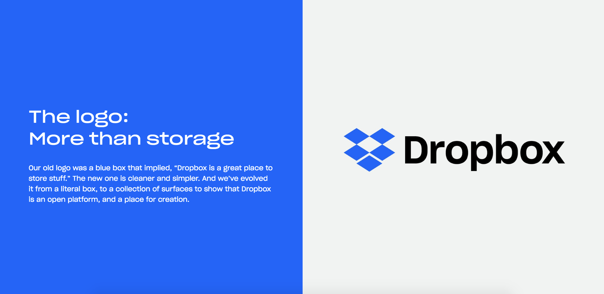
The new Dropbox logo was released with lines like “Making the everyday more extra­or­dinary” and “unlocking creativity.” Vibrant ads started popping up around Brooklyn, joining the likes of whiskey and Adidas billboards, with headlines like “the world needs your dreamy energy.” 

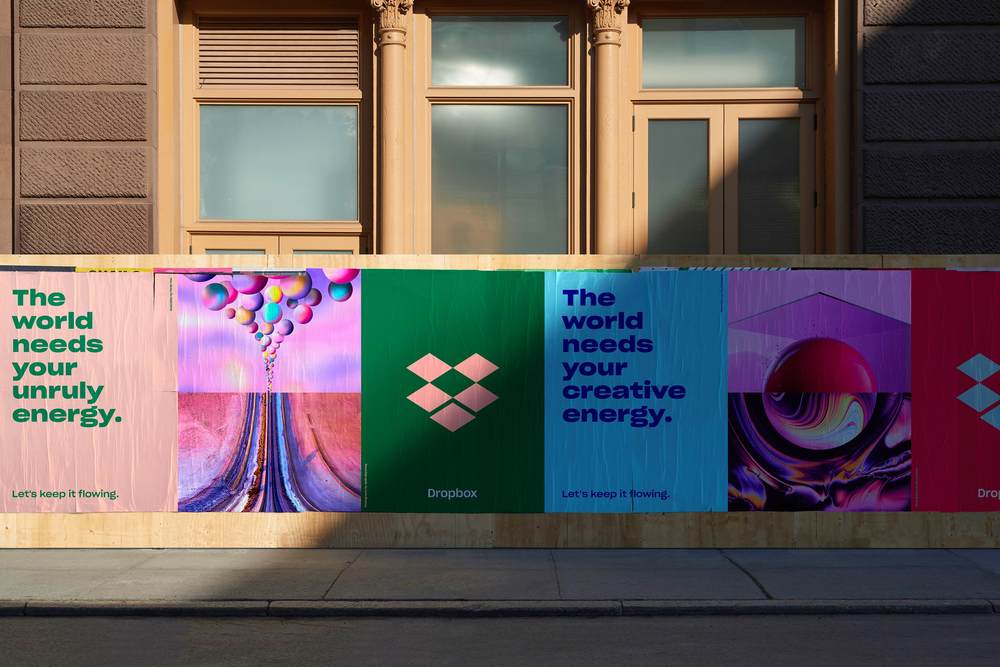
The redesign was a departure from the tech company look; it was aesthetically pleasing. It felt fresh and modern, which is essential as times and styles change. But while Dropbox has expanded into creation tools like “Paper,” I still consider it a utility product. At the end of the day, most of us simply use Dropbox to store and organize files. I don’t *love* Dropbox, but I use it. And that’s okay. We don’t want it or need it to be more than that. 

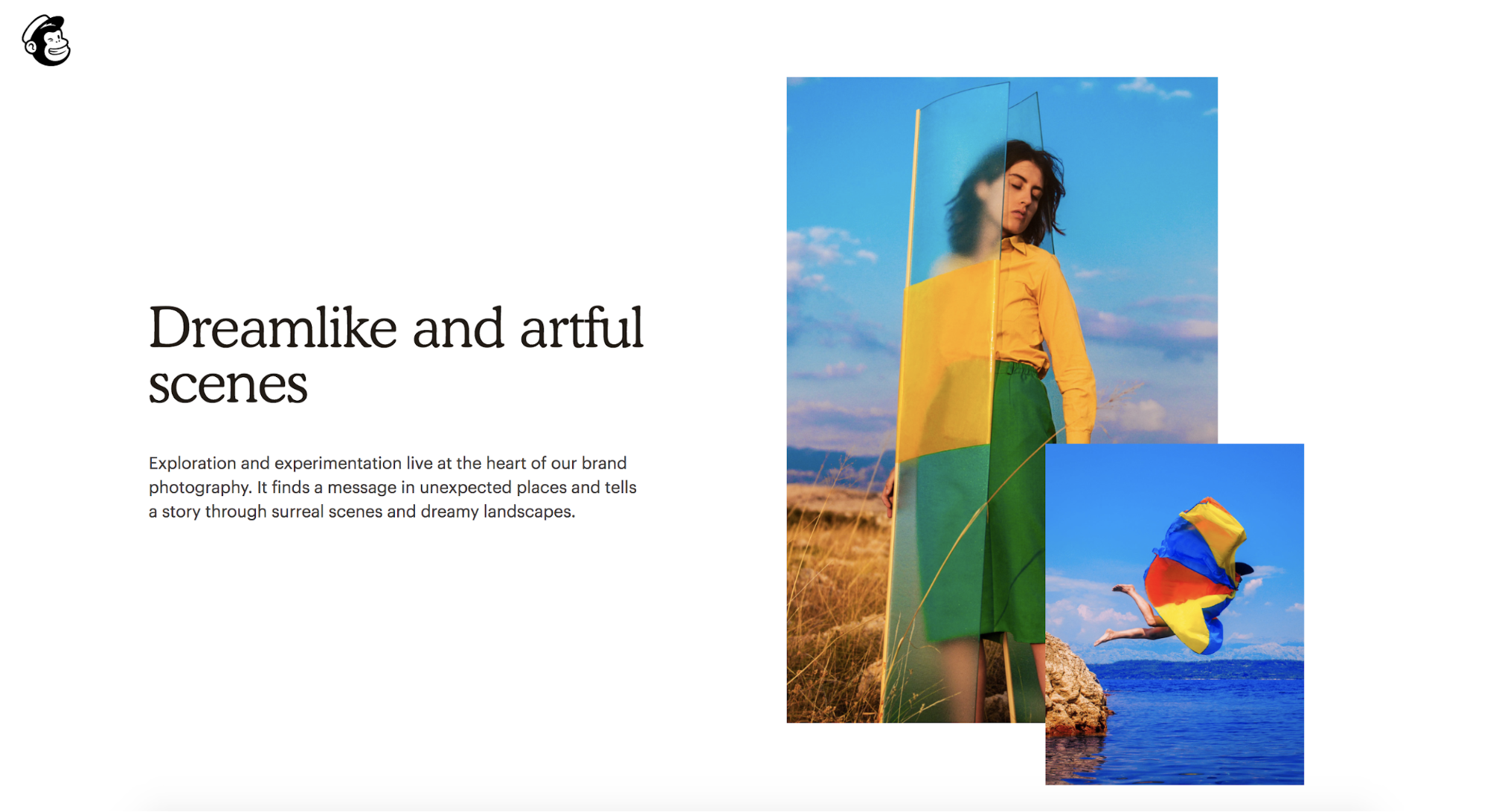
Or consider the Mailchimp redesign from 2018. While many creative folks use Mailchimp, it is ultimately a tool for creating emails and marketing campaigns. It’s a means to an end, not the end itself. It’s the medium, not the message. Yet the new brand uses whimsical illustrations and “artful scenes” to present its offering. Again, we see a utility product marketing itself as an emotional product.

Of course, it makes sense that a brand would play on emotions to sell their product. It’s not sneaky or misleading. A brand wants to connect with people, and people are emotional beings. 

When you set out to buy a hammer, you’re not necessarily looking for a community, or a hammer “that’s more than a hammer.” You just need to nail something, and this is the tool to do it. You would likely choose the first solid-looking, affordable hammer you set eyes on.

But what if you learned that your grandfather swore by a specific hammer that hangs in his toolshed to this day? Or that this hammer has been used for over a century by the proud working class? What if I said this specific hammer enables creativity? That it’s the centerpiece of a sculptor’s or artist’s profession? I could go so far as to say this hammer allows art and creativity to exist. So do email clients and online file storage. 

But let’s look at the other side. Two companies that are non-emotional, utility tech products and own it: Slack and Basecamp. These companies also use playful imagery, but their message is straightforward. Slack is where work happens. Basecamp solves the fundamental problems of growing businesses. Both of these brands offer a tool, and that tool does their job well. That’s it.

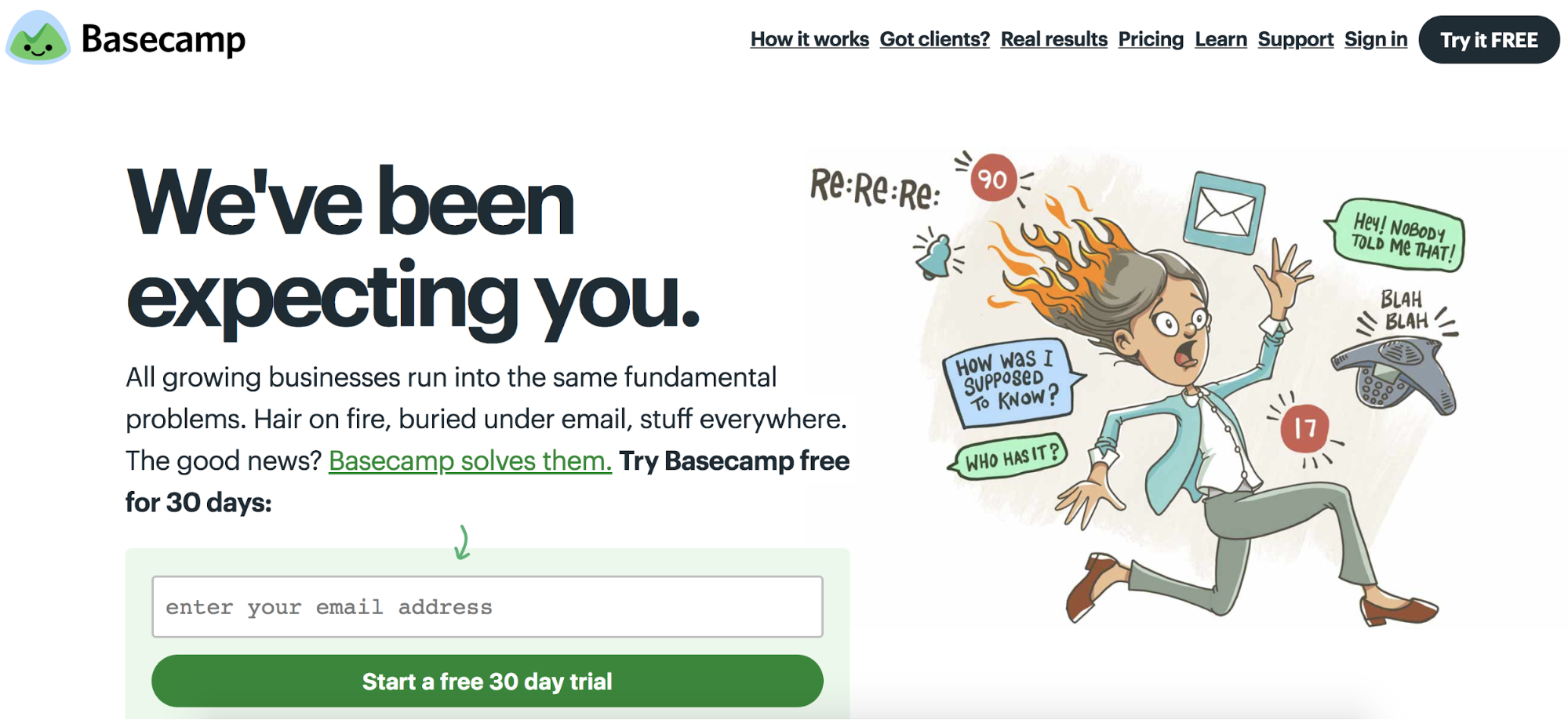
Maybe it’s enough for a product to be functional. 

Last year or so, Slack redesigned its logo. Naturally, the design community was is an uproar. They Tweeted about the logo and Slacked the Slack logo to each other on Slack asking for everyone’s opinion and the only one I had was: Why does it matter? 

People use Slack because it’s faster and easier. I like the logo and I generally enjoy the way Slack works, but I don’t love it like I love my favorite sweater. If something comes along that’s better, I will use that. It’s a utility. Nothing more, nothing less.

Slack is not Nike. The app’s design is pleasing and modern, but I don’t choose Slack because it inspires me or aligns with my values. And that’s OK. I understand that some people feel differently or have a more emotional connection to Slack, but I’d guess that most use Slack because their company uses it, and because it just works. 

Yes, brands exist that offer both emotion and utility. Apple is an obvious example. Apple was at the forefront of this marketing approach, and they’ve always done it well. Apple products were never just computers or smartphones, they were tools that enable creativity. Before Apple entered the mainstream, it focused heavily on the creative class. Everyone knew that if they want to be taken seriously as a designer or filmmaker, they better use an Apple product. Apple computers are a tool that became a lifestyle, even a cult. So it is possible for a product to successfully do both.

Maybe it’s companies like Apple that have inspired this wave of emotional marketing for utility products. Or maybe, perhaps through social media, we as consumers are signaling that this is what we want from a product. Or maybe the agencies for these brands are pushing trendy strategies like content marketing as a one-size-fits-all marketing plan. 

The approach can clearly work. But as more and more brands get on board, I start to question it. Does every utility brand need to market themselves as a lifestyle brand to succeed now? Or is it enough to simply provide a great product that solves a problem? Utility brands can have personality, but is it accurate to market a time-tracking app or note-taking tool like a Coca Cola commercial? Do I now need to politically align with my note-taking app? Does my hammer need to encourage freedom and creativity? Or can it just be a hammer? 

In this quest to connect with consumers on an emotional level, are we sacrificing clarity and honesty? Will it all start to feel contrived, confusing and trite?

Perhaps tech companies need to be more realistic about who they are as a brand and what they actually offer to consumers. Maybe, as utility brands, they should be more focused on delivering value through functionality, utility, privacy and discretion, rather than promoting lifestyle values. 

Maybe a good tool doesn’t need to inspire. Maybe a tool that works well, speaks for itself.

May 30, 2020No Comments

How to write marketing copy that isn’t cringey 

Somewhere between the golden age of advertising in the 60s and now, we’ve lost something. The internet, despite its wondrous benefits, has turned advertising – a word that used to invoke pride, cunning, allure – into the exact opposite: marketing.

The medium and the volume, along with ever-increasing competition and ever-decreasing attention span, has cheapened what used to be an art. 

Companies are desperate to capture attention and will do so by whatever means possible, whether that’s a pop-up ad, a “follow-back” Instagram giveaway or a clickbait headline. 

Copywriting has suffered the most. Despite everyone becoming a self-proclaimed “storyteller” these days, we have little to say beyond “Buy now and save $45.” 

In creating and marketing my own products over the years, I’ve learned that small choices make all the difference between “sales-y” copy and copy that sells. 

Start with the most straightforward option

Cheesiness usually comes from trying too hard. We’re trying to be clever or trying to get sales or trying to sound smart and it usually results in the opposite. Take that pressure off yourself and start simple.

If you're marketing a product, the best approach is to simply lead with the benefit. Take the thing you’re writing about and distill it down to what makes it valuable. Write that down in a sentence. Refine from there.

As an example, let’s take one of our Semplice marketing pages promoting features for Studios and agencies. One benefit of Semplice, for this audience, is the ability to create landing pages quickly for campaigns. 

In that section, we could have easily used a headline like: “Made for marketing” 

It’s simple, it’s alliterative, it has a nice ring to it, right? But it’s not really telling us much about the value of this offering. 

Instead we use the headline: “Create landing pages in minutes.”

It’s not fancy or clever, but you understand the benefit immediately. This headline implies Semplice is made for marketing projects by explaining exactly how.

Avoid these worn-out phrases

Here I’ll use the fake product name, Torte, as an example.

“With Torte, everything is easier.” - Any sentence that starts out “With X product name,” followed by a benefit, sounds sales-y right from the start. We already know you’re talking about Torte. Cut the first part and lead with the benefit. 

“Buy now” - This phrase is so embedded in our brains, most of us automatically default to it when writing marketing copy. If you want to avoid sounding like an As Seen on TV product from the 90s, don’t use it. Go with Upgrade, Purchase, Add to Cart, Subscribe, Join – whatever makes sense for your product. The words “buy” and “now” make you sound like some hair-growth product sold on the Shopping Network.

“More than a cake pan” - This is a lazy way to say you’re actually selling me a cake pan. Take a walk and you’ll see “More than an X” on billboards, shop signs, posters, everywhere. Sure, your cake pan might also work well for brownies. Sure, your pool supply company might also offer decorative lawn ornaments. But telling me you’re “more than” what you are doesn’t actually tell me anything.

"For just $9.99" - Again, we left this in the As Seen on TV era. Remove the word "just" and your trust factor automatically goes up.

Your button text is more important than you think

Button text is underrated. Most of us don’t think too much about it, but it can change the whole feel of your marketing page and mean the difference between a drop-off and a new customer. It can also cheapen your product, if you’re not careful.

I’m sure someone could point to an A/B test where the phrase “Buy Now” led to more conversions, but I’d argue it’s never elevated a brand. Whenever possible, be as specific as possible with your button text. 

Instead of “See More” use “View Demos”

Rather than “Purchase” use “Choose Size”

Instead of “Buy Now” use “Add to Cart” 

Rather than “See All” use “Shop all Backpacks”

This helps you avoid sounding cheap and what’s more, it’s best UX practice. You user should always know exactly what to expect when they click a button, and “Add to Bag” accomplishes that much better than “Buy Now.” 

It’s important to understand we are not trying to be more creative or artsy with our word choice. I’m not suggesting “Explore More” instead of “Learn More” just for the sake of switching it up. I’m recommending specificity, whenever possible.

Shorter isn’t always better

We’re inclined to think the shortest option is the best option. And a lot of the times, that’s true. But when it comes to headlines, our attempts to be concise can lead to meaningless, clichéd copy.

Read these headlines and tell me what I’m offering you:

"We've got you covered."

“Go further.”

“It’s here.”

“Made for you.”

“Better than ever.”

Yes, some of this depends on the context. But we can still likely do better. 

Apple has made us believe the best headlines say nothing more than “Bigger. Better.” And it can work. But don’t feel the pressure to make short punchy headlines when a longer headline would set your product up more effectively. If you find you need a subhead for every headline to explain what the headline means, your headline is probably weak – and your reader is probably annoyed.

__

For more advice on UX & marketing copywriting, read these articles:

Content or design first?
Finding your brand voice
How to write UX copy that makes your product a joy to use
How to write concisely

May 27, 2020No Comments

The universe of shared brand equity

Look at any tech or direct-to-consumer company today and you will quickly notice a visual trend: Simple, sans-serif logo. Short, punchy tagline. Clean, approachable branding.

Companies like this are popping up left and right, offering different products or services to the same demographic. While our assumption is that a brand wants to stand out, these do the opposite. 

Designers may sneer at the lack of originality, but the creators of these brands and products have discovered a fascinating approach: Why stand out if you can fit in? 

Entering the shared brand universe

There’s the obvious side effect to any trend: Everything starts looking the same. 

It’s become difficult to differentiate between today’s tech brands, they all look so similar. And I don't think it's because the creatives who work on them are unoriginal – perhaps quite the opposite.

One recipe for success is to fit into the existing space. By borrowing values and a visual story from other brands, you’re playing off established associations and perceptions in a consumer’s mind. It’s not a far leap for them to trust your brand if it looks like one they already enjoy buying.

Say a consumer purchases a mattress from Casper. Buffy looks like the same company but sells a comforter. Brooklinen the exact same but it sells bedsheets. Thus, the consumer follows the breadcrumbs between these brands for the complementary products they need. They’re familiar with the visual and messaging style, and it translates easily across a spectrum of commodities.

One consumer can be a customer of all of these brands, and these brands maximize on that potential. It works. 

If you want to be the Casper of razors, just look exactly like Casper. If your comforter company wants to reach the same consumers as Chobani, design your branding to match.

Lookalike companies are borrowing from a trusted, established aesthetic. The brand itself isn't at the center anymore. It's part of a family that’s familiar and comfortable to the consumer. It doesn’t have to work too hard to fit into our lifestyle because visually, it’s already part of it.

The risk of feeling and looking replaceable is real, but it seems to pay off.

The benefit of playing to trends

Compared to 10 years ago, the quality of design (especially UX/UI design) has improved greatly. Today we're able to execute on a simple product within days, because we’ve established conventions for everything we do. We don't have to rethink and redesign everything from scratch. Modern design systems and standards are a practical convenience; they not only save us time, they work.

Conventions are shortcuts for our minds, allowing us to execute faster. Likewise, trends are shortcuts for how we perceive the world around us. By leaning on trends, these modern brands have found a loophole to reach customers. 

We can talk about cheating or cutting corners. We can scoff at the apparent lack of innovation. But what is a visual brand if not a cue for your associations, preconceived notions, culture, upbringing, lifestyle? These brands are doing what brands are meant to do. In that light, they’re doing it well.

The question is whether the benefits outweigh the consequences.

What do we lose?

Creativity and originality are nearly synonymous. But maybe originality is an idealistic value. Maybe homogenization is a practical one. Perhaps we don’t always need to be “different” to achieve our goal. 

I struggle to find an answer to it. On one hand, I'm a creative person who values original ideas. To me, a brand is a personality that should be unique. To me, good design means making something that lasts. Something strong enough to stand on its own. 

But my ideal view of design may not be the right solution for all problems.

As designers, we can play trends and conventions to our advantage. It can be a smart and strategic decision to join the "shared brand space.” If I look at it purely from a commercial perspective, I can as easily see why the sameness is so effective. There are two sides to the coin. It’s a fight between my mind and my soul.

May 19, 2020No Comments

How can we build an extension of your mind?

For the first time last week, I wrote about a new project that has consumed a large part of the last year for me.

I shared my frustration with the current landscape, how instead of mastering our tools, we’ve let our tools become our masters. Modern tools pull us in with flashy features and the promise of an easier life. Yet we spend hours managing, organizing and cleaning up the mess these tools create for us.

Our note-taking apps and hard drives have become graveyards of information. Our carefully considered systems and structures become obsolete only shortly after we put them in place. There's a disconnect between the way we like to organize ourselves and how our tools like to organize us.

Our tools tend to see the ideal version of us, which is also why we're attracted to them. They promise a better, more efficient *you.* But the assumptions our tools make about us are not who we are.

Are we failing to keep our shit in order, or are our tools failing us?

We’re only human, after all. And knowing this, I believe there is a way to leverage how our mind already works, rather than trying to change it.

Creating an extension for your mind

To create a tool that complements how your mind works, we first have to understand what that means, both philosophically and practically.

If our goal was to create a NEW mind, we'd have to change the way your mind works right now. We would fall into the same trap as every other tool, forcing you to adapt to structures and mental models that conflict with the way your brain naturally operates. Instead, we're trying to build an extension of your mind. One compatible with the way you're already thinking and working.

The reason you're constantly trying new tools or setting up new structures is because they're aspirational by nature. You can compare them to strict weight-loss diets. They seem great in the beginning, but they're abandoned soon after. They're just too much work to sustain.

The most effective diets are those that stick with you. And the diets that stick tend to be those that fit into your existing lifestyle and way of thinking. They give you power, rather than holding power over you.

It's the same with everything else in life, including our knowledge and productivity tools.

So how does our mind work?

If there is one thing we know about our brain, it's that we know very little. While we’ve made advances in neuroscience over the years, the brain is still one of the least understood parts of our body.

But let's see what we do know. To build an extension of your mind, we're interested in three fundamental questions:

1. What type of memories do we have?
2. How does the input of these memories work?
3. How are these memories accessed?

We’ll start with the first: The types of memories we have in our minds.

💭 Implicit memories

Your implicit memories are usually acquired over time and unconsciously. They can affect your thoughts and behaviors in ways you don't even notice. Riding your bike is an implicit memory; even after years of not riding your bike, you'd still know how to do it. Same with swimming or brushing your teeth.

Simply put: Implicit memories are automatic memories. They're enabled and recalled by past experiences no matter how long ago you experienced them. They last a lifetime.

💭 Explicit memories

This is what we mean when we talk about "remembering something.” An explicit memory is consciously recalled. Explicit memories can be episodic, meaning they relate to a specific experience in your life, such as a holiday or traumatic event. Or they can be semantic, meaning they relate to facts or general knowledge you've acquired for a specific purpose.

Both implicit (unconscious) and explicit (conscious) memories are usually filed under your long-term memory, which can be recalled later or added as automated functions of your behavior.

Your short-term memory or "working memory," on the other hand, is what you're currently thinking about. It’s the part of your brain that helps you remember a small amount of information for a short period of time while you juggle other cognitive processes.

Since your memories are scattered all over different parts of your brain, depending on the type of memory, we rely on strong connections between neurons to complete the picture. And those connections can be strengthened or weakened over time depending on how they’re used. If those connections weaken, we lose access to our memories or can only dredge up partial information. And our minds attempt, whether accurately or inaccurately, to fill in the rest.

Memories tend to be formed more strongly if they're related to a strong emotional experience, and if the experience involves a combination of your senses.

You have no trouble accessing a memory of coffee with a friend because it involves multiple points of access in your mind. You remember seeing your friend, seeing the interior of the coffee shop. You can remember the taste of the coffee. You remember the smell of the cake in front of you. You can hear the chatter around you and the sirens across the busy street of New York.

These are all data points in your mind. If you can access one of them, they can trigger each other so you can eventually recall the entire memory. The fewer access or trigger points a memory has, the harder it will be for you to recall it.

If our experience isn’t accompanied by strong emotions or involves multiple senses, we'll need to work even harder to commit it to memory.

This idea of memory indexing is still only a theory, but we know when it works and we know when it fails. For example: You know this feeling when you're talking with a friend and trying to recall a specific fact you learned, but you can't seem to access it?

Interestingly, you CAN recall that you learned the fact, yet you can’t bring the full memory to the surface. Meaning, you know that you know it, but you just don't know it right now. Often what that means is that our neurons aren't firing the way we want them to be.

This is where our brain fails us, and it does so often.

Say you’re trying to recall an article you saw a week ago while browsing. You remember you saw the website, but you can't seem to remember which publication it was. You do know if someone showed it to you, you'd remember it again.

It might help if a friend helped “trace your steps” or threw a bunch of triggers at you, such as a color or keywords. The more trigger points, the more neurons firing, making connections and giving you the information you know you have in your mind, but just can't access.

Today, we’ve come to terms with not knowing everything – because we know where to find it. We have Google and Wikipedia, both great collective databases with a vast universe of information and knowledge. But these collective databases are full of things that aren’t connected to our own memories, which makes it harder to find that one thing we care about.

What we don't have is an extension for our OWN mind. One that picks up where our brains stop doing the work for us. One that enables us to collect pieces of information that might seem trivial in the moment, but important a week later when we’re trying to tell a story at a dinner party.

An extension of your mind should work the exact same way as your mind already works, but better. Think of it like your own little knowledge base, but without the effort of categorizing everything. It should be a supplement. Like an enhancement drug for your brain, but without the side effects.

This extension of your mind should be as messy and intuitive as your real mind, but it should sort itself automatically when you need it to. It should be a place for the information in your brain to spill over, without the fear of losing it. It shouldn’t aim to change how your mind works, or even teach it something new. It should support your mind, without you even having to think about it.

September 23, 2019No Comments

Your first 3D design tutorial with Adobe Dimension

For many creative folks, 3D design is still considered a final frontier. In our minds, it's a landscape marked with steep learning curves, expensive software and overwhelming interfaces. Little known to most of us, Adobe has been quietly changing that story.

In recent years, more designers are seeking to break into 3D design and more clients are asking for it. Yet for many of us, it still seems daunting and inaccessible. Only designers who have dedicated years of their life to the trade can master the complex tools and techniques required for it, or so we tell ourselves. Until a couple months ago, I'd see an artistic or hyperrealistic 3D image in someone's portfolio and couldn't fathom how they even began to create something like it.

With Adobe Dimension, Adobe has removed the barriers (real or imagined) between designers and 3D design. Originally created for 3D mockups and brand visualizations, Dimension has evolved into a powerful 3D rendering tool that allows you to create rich 3D visuals. What's more, it's easy.

Our team at Semplice.com recently released Warped Universe, a collection of abstract illustrations creatives to for their work. This was our first deep dive into Dimension. We began experimenting with Dimension's rendering tools and Photoshop's built-in 3D features to see how we could take these illustrations out of the two-dimensional world and into the dimensional space. We were both impressed and excited with the results, and so was our audience. Designers wrote us asking how we turned the flat illustrations into 3D, and we were thrilled to realize we could easily teach them.

In this tutorial, we will show step-by-step how to take your own designs and finally break into the wonderful world of 3D design.

What we're making

With this easy 3D design tutorial (including a video option, if you prefer it) we will create an abstract 3D illustration using Adobe Photoshop and Dimension. We'll use Photoshop to create our basic 3D shapes, then switch over to Dimension to setup our 3D scene, create beautiful, realistic lighting, apply real-world materials and finally render out our 3D visuals.

While this tutorial walks you through creating a specific visual, the technique and steps can be applied to any design. Once you get a feel for Dimension by following these steps, I encourage you to experiment on your own and see what else you can create.

Here's the image we'll be making today, rendered out to show different angles and perspectives.

3D abstract tutorial illustration created with Adobe Dimension and Photoshop


What you will need

Optional video tutorial

If you prefer following along visually rather than following the steps below, watch this video tutorial. It goes through the exact same steps with the same result.

Step 1: Creating our shapes in Photoshop

We'll start by taking flat artwork and converting it into 3D objects. We will then bring these 3D objects into Dimension (in the future, you can expect Adobe to bring some of the native 3D creation functionality into Dimension itself). For simplicity's sake, we will convert flat circular shapes into 3D objects, but you are free to introduce more complex designs.

OK, let's do it already.

First, create a new document in Photoshop. Set it to 2000 x 2000 pixels with the background set to black.

Now let's create our circular shapes. With the Ellipse tool in Shape mode, start laying out some circles on your canvas. Be sure your Shape options are set to 'Combine Shapes', so all your shapes are created in one layer.

When laying out your circles, add both large and small circles. This will create a nice variation in your shape later.

Pro tip: It also helps to have your shape set to 'Circle' instead of 'Unconstrained' in the Path Options.

Your circles should look something similar to this:

Step 2: Extruding the Shapes

Now we will take our two-dimensional shapes and magically transform them into 3D. From the 3D menu up top in Photoshop, choose the 'New 3D Extrusion from Selected Layer' option. You should now see all your circles change into cylinder shapes.

Caution: avoid circles that are too small, or too closely spaced together. If your shapes are too complex, you will get an error message during the extrusion process.

Pro tip: You can use the camera tools in the lower-left corner of your screen to orbit the 3D canvas and get a better view of your object.

Next, with your scene selected, look for the Deform options under the 3D Properties window. (If you don't see this option, you probably selected the 3D mesh layer is selected and not your scene.) We will use these options to create, bend and twist our cylinders into abstract objects.

These are the options I've set below to create our abstract shape, but feel free to play around with these settings to create your own unique shapes and effects.

Here is the result these exact settings will give you:

Don't fret if yours doesn't look exactly like mine. If you used different extrusion depths, twists or tapers in the previous step, you will see your own unique shape.

Now, let's give our tube shapes a nice rounded cap. Still under Properties, simply go to the cap options and set a cap. Here is what I've used to create a nice beveled edge.

And here is the latest result with our new cap settings:

Optional: Optimizing our 3D object

As an optional step, you can use a free tool called MeshLab to improve the geometry and clean up any jagged edges in your 3D mesh. Use the subdivision tools to add additional geometry, smooth out your edges and do some general cleanup. You can view their documentation for more information on how to use the tool.

Step 3: Exporting our 3D shape

Hurray! We've got an awesome looking 3D shape already. But we're not done yet. Now we need to export our 3D object so we can bring it to life in Adobe Dimension.

To export your object from Photoshop, go 3D > Export 3D Layer and choose 'Wavefront OBJ' from the 3D File Format option. You can leave all the options set to the default.


Step 4: Setting up our scene in Dimension

Next, let's set up a nice little studio scene for our happy little objects to live in (thanks, Bob Ross!)

Open Dimension and go to File > New. Set your document to 1,920 x 1080 pixels with 300 DPI.

First, we'll add a nice curved plane. You can download one for free here. Once you've downloaded the file, go to File > Import > 3D Model in Dimension (or use the plus sign in the left-hand menu) and import your 3D plane.

With the curved plane selected, set the position X, Y and Z values to 0 if it isn't already.

Step 5: Importing our 3D abstract artwork

Next, import your 3D object by following the same steps as above.

With the 3D model selected, use the Move, Rotate and Scale tools to put the object in the middle of your curved plane and move it into position.

Use the rotate (1), pan (2) or zoom (3) tools to position your camera within the scene and put your object in frame.

Pro tip: For an even faster method, hit the (F) key to zoom the camera to your object's current position.

Now let's add a few more elements for fun. If you are looking for 3D assets to use in your scene, Dimension provides an array of options in the Starter Assets Panel on the left. You can also find additional assets, both free and paid, created to work perfectly in Dimension on the Adobe Stock 3D website.

From the Models panel, let's add some spheres surrounding our abstract tubes. Looking pretty cool, right?

Step 6: Setting our materials

Now we can start having fun with our object materials. This is where our 3D design starts coming alive.

From the materials panel, select the Plastic material. Now set a color of your choosing with the roughness set to 50%. Setting the roughness to 50% will give our object a nice sheen without too many reflections.

Now go ahead and apply materials to the rest of your scene. You can also find more high-quality materials to use on Adobe Stock.

Pro tip: You can apply the same material to several objects by selecting all of your objects and applying a material.

Step 7: Creating our lighting

The difference between an obvious graphic and a photorealistic 3D image comes down to lighting. Adobe Dimension's lighting presets makes it simple to create lighting that reflects off your object in a realistic way.

Dimension uses image-based lighting, so you can either upload your own image or use one of their own lighting presets. For our purposes, let's choose 'Studio Light Pillars Dark A.'

Next, you can play with the rotation values to get a lighting effect that looks best to you for your scene. Lighting is key to great 3D imagery, and finding nice contrast with your shapes may take some tweaking.

Pro Tip #1: It helps to use the render preview to see how your scene is looking in real-time.

Pro Tip #2: More lighting options can be found on Adobe Stock 3D.

Step 8: Setting our camera

Now we can use the camera tools to get some interesting angles and depth with our illustration. This will also add some depth of field for a more dynamic image. Just play around with settings like Field of View, Focus and Rotation to see what you like.

PRO TIP: You can use the bookmark tool to save different camera views within your scene.

You can also use the focus option in the Camera settings to add some depth of field to your view.

Step 9: Rendering our scene

We're almost done! Now we just have to render our scene.  I recommend using the Low option in Dimension to get an idea for how your scene looks, and then using an option like Medium or High when you're happy with the results. I chose PSD as my output type.

Pro Tip: You can also export via a weblink to share 360-degree views with stakeholders or embed on your portfolio.

And here is the result of our render. Take a close look at those reflects, the shadows, the textures and shapes. You made that from mere circles just minutes ago!

And now, after some post-processing adjustments in Photoshop (because what designer ever knows when to stop):

Adobe Dimension tutorial abstract 3D visuals

Experiment even further

Now that you've learned the basic principles for creating 3D objects in Photoshop and rendering your objects in Dimension, you can use these same principles to experiment further with more complex designs.

As I mentioned at the beginning of our tutorial, we've been doing this with our Warped Universe illustration pack. For example, here's a 2D image from Warped Universe:


Here's a 3D topographic shape I made with that illustration using Photoshop and Dimension:

For this one, I used the "3D extrusion from depth map" option in Photoshop. Depth maps create 3D geometric based on the light and dark values of an image. The lighter the area of the image, the higher or more intensified the 3D extrusion effect will be.

So I simply took that flat illustration above and generated some clouds on top. I then darkened and blurred the imagery.

Now here's the result in Photoshop after converting the flat image to a 3D extrusion depth map:

And here it is in Dimension:

You can also use the depth map option with the 'sphere' preset to render your flat images to spherical objects. Below is the result of a Warped Universe illustration I converted to an abstract spherical object:

You can experiment with various light presets and materials to give it different textures and styles, basically turning it into a completely different image:

Adobe Dimension tutorial abstract 3D visual

Now that you know the basics, how you use and experiment with them is really up to you. Take one of your own flat illustrations or designs and walk it through the steps, see what it turns into. This opens up endless possibilities for your work and hopefully soon, your career.

As Bob Ross also said, "There's nothing wrong with having a tree as a friend." Oops, wrong quote. He said: "Talent is a pursued interest. Anything that you're willing to practice, you can do.” Thankfully, with Adobe Dimension, this interest is now easier to pursue.

If you do create something with Dimension, be sure to share your designs to Behance, selecting Adobe Dimension under “Tools Used” in the Basic Info tab. On Instagram, tag #AdobeDimension and #CreatewithDimension. This allows the Dimension team to find and promote your work!

For more 3D inspiration made with Dimension, visit the Dimension Behance gallery

__

Read our other 3D design tutorials with Dimension:

Creating packaging & prototypes with Adobe Dimension
A beginner's tutorial to creating 3D typography 
The unexpected addition to our creative workflow

August 26, 2019No Comments

The dilemma for small product teams

As a small team working on a product, you face an eternal conflict: When do you focus on adding features, which adds value to your product, and when do you focus on fixing bugs?

Every week a small team pivots to fix bugs and clean up the product, you are not working on new features that improve your current offering, making your existing users happy and bringing new ones. But wait on those bugs too long and you’re sacrificing the integrity of the product. Any perceived value is lost when someone clicks a button and gets an error. Large product teams can afford to do it all. They can simultaneously bug fix and build new features to keep their product moving forward. For a small product team, it’s a balancing act.

In New York, the impending shutdown of the L train was dreaded city-wide. In 2012, Superstorm Sandy flooded the Canarsie Tunnel, causing severe damage to the train system. When it was announced the L train would be shut down for 15 months to make serious repairs, the entire city went into panic mode. The L line connects Brooklyn to Manhattan. Thousands of people ride it every day to commute to work and back. Shutting down the L and re-routing these people would not only be inconvenient and expensive, but it would also disrupt the entire flow of the city. 

Talk to anyone in New York and they could tell how you how the imminent #lpocolypse would affect their life negatively. Yet these repairs were necessary to keep the L train running into the foreseeable future, and to keep people safe. Keep it going as-is and the public is at risk, and the issues eventually become irreparable. Fixing the “bugs” was unavoidable, despite bringing the entire city to a literal halt. 

Then, this year, the local government found a solution that eliminated the need for a complete shutdown. New tech became available that will allow the train to keep running, for the most part, while the city fixes it. Some night and weekend closures will still be necessary but compared to the alternative, nobody could complain. The collective relief throughout the city was palpable. 

On hopefully rare occasions, a shutdown is necessary for your product. If you can’t significantly improve it while keeping your existing product alive, you have no choice but to pause and rebuild, accepting the consequences in the meantime. But more often, you can find a middle ground. Your existing users, after all, are the ones who will use and support anything new you create.

Smart product teams see two or three years down the line and plan smart, strategic sprints that strike a balance. Smart product teams strive for the solution that keeps their audience moving forward in the tunnel. 

December 19, 2017No Comments

My Jump from iPhone to Android: An Unsponsored Pixel2 Review

First of all, this article is NOT sponsored by Google. But if anyone from Google is reading this and wants to send me the Pixel XL, please do, because I’d love to test that phone as well.

A little over a month ago I switched to the Pixel. I’ve been on iOS and the iPhone pretty much since its inception or just shortly after. I think the iPhone 3G was my first iPhone. I never even thought about switching, not only because I was a little Apple fanboy, but also because there was just no reason. I liked the iPhone and I liked iOS. Whenever a new iPhone came out, there wasn't even a question about getting it or not getting it. Even if I couldn't afford it, I wanted it.

I briefly tried using an Android device a couple years ago but abandoned it after less than a week. Android always felt like a shitty operating system to me, not refined and just thrown together. But something is different this time.

I probably would have not switched if iOS hadn't let me down so much since the new iOS11. My iPhone was basically unusable for the last couple weeks; even after I got the iPhone8 I just wasn’t happy with it. My iPhone kept crashing, iOS kept freezing and apps behaved in a weird way. I knew these things would eventually get fixed, but it was reason enough to finally give Android a try again.

So I did, I switched to the Pixel2. The regular size, not the Pixel XL, because I like smaller phones. The iPhone5 is probably my favorite when it comes to the form factor and the Pixel2 is fairly close to it. I immediately enjoyed the Pixel2 and was surprised how far Android has come since I last tried it.

I’m still using my Pixel as of right now. I’m not sure when or if I will change back to my iPhone again. It could happen, you never know. And as I’m traveling a lot right now, I can promise you that my phone usage is way above the average, which is perfect for such a review. Keep in mind this is a casual and personal review, I'm not comparing specs or anything, there are enough tech website out there who do that.

But let me tell you about my main observations so far:

Messaging

This was my major concern. I may not be that addicted to iOS, but I’m definitely deep into Apple's ecosystem when it comes to iMessage. The good thing is, since I'm traveling I can't receive iMessages right now anyway – and I don't miss them so far. I moved most of my conversations to WhatsApp and since it also has a MacBook app, the switch happened without any problems. I'm sure there are a couple iMessages right now from friends who get sent into the void, but that's okay. Eventually after informing them that iMessage doesn't work anymore, everyone happily switches to WhatsApp. (because iPhone users are allergic to the green SMS bubbles)

Camera

The camera is a weird one. I don’t photograph that much on my phone anymore, but I have mixed feelings about it. In low light, the camera is absolutely better than the iPhone. I’m actually surprised by HOW good the Pixel camera is in low light.

Here is an example, no editing and straight from the phone. The picture was taken on the plane with very little light available.

In normal daylight I’d say the camera performs generally the same as the iPhone, but it has some weird quirks that are either bugs, or just feel different because I'm so accustomed to the iPhone camera.

For one, the colors are significantly different depending on the angle you hold your phone, which can be frustrating. If I'm trying to photograph something yellow up close, for example, it almost appears white and completely washed out. If I then tilt the camera a bit or try a slightly different angle, the color is accurate again.When it comes to color temperature, the Pixel seems to give a more blue light whereas the iPhone has a warmer feel to it.

This doesn't bother me too much since I edit the pictures anyway, but it takes some time getting used to. I like the camera because it is incredibly good from a technical perspective, but it all feels a bit unpredictable and sometimes doesn't make sense.

Here is another picture I shot with the Pixel2, no edits:

Hardware & Feel

The Pixel feels great in my hand and less slippery than the iPhone7 and 8. It also feels much lighter, at least compared to the iPhone8 with its glass back. You could argue the Pixel feels less premium because it's lighter, but I prefer it this way. I can feel the difference since I'm carrying it my pocket all the time. I personally think that the iPhoneX or iPhone8 feel too heavy for their size and form factor which makes them feel less premium and more clunky. I think there's a fine balance where weight contributes to a premium feel, but at some point it tips over and makes a phone feel clunky instead.

I appreciate the less rounded corners and the grippy hard plastic on the sides of the Pixel2. Some may not like the bezels but I really do. Today I’m way less excited about fancy hardware on phones than I was a couple years ago. Now I just want a phone that feels great in my hand and is practical to use. As long as there are no major turn offs (like the notch on the iPhone X) I’m pretty forgiving when it comes to a phone's hardware. For me there is a difference between a phone that looks great on renders (with fancy edge to edge screen) and a phone that I just love using and having in my pocket.

Oh, and of course: The Pixel has a USB-C port. Which means I can plug it straight into my MacBook without needing an adapter. I stopped carrying an extra USB-C cable because I can just charge my phone with the same cable that I use to charge my MacBook.

PS: My Apple AirPods work without any problems on my Pixel as well. So no big deal here either.

Unlock Experience

One of my absolute favorite Pixel2 features is the fingerprint unlock on the back. It’s just SO much better than where it is on the iPhone. When taking my Pixel out of my pocket with one hand, the fingerprint sensor is automatically positioned exactly where my index finger is while at the same time having a strong grip on the phone. When I unlock my iPhone with one hand using the thumb on the home button, I feel like I'm about to drop my phone.

With the Pixel2 you can also use the fingerprint scanner on the back of the phone to pull down your notifications (you just swipe down on the sensor). I use this all the time to get a quick glance at my notifications, especially since I can keep a strong grip on my phone without needing to use the touch screen at all.

The only downside to the Pixel unlock placement: If the phone is sitting face-up on your table, you can’t unlock it with your finger without taking the phone in your hand (because you need to place your index finger on the fingerprint sensor on the back). But I’m happy to trade that for having a secure grip on my phone while using it on the go. I also assume this would be an issue with the iPhoneX as you would need to move your face above the phone on the table. Same issue, different phone.

The Software

The software switch from iPhone to the Pixel fairly easy. Google even offers a cable that connects your Pixel and iPhone to transfer all the data. It didn’t work as seamlessly as I expected as some contacts didn’t get imported and my pictures sadly didn’t transfer at all. Not a huge deal, and could simply be something I did wrong.

After that, everything worked perfectly fine. The whole Android system has improved significantly since I last used it. I could easily find every single app I used on iOS in the PlayStore, which made this whole thing even easier.

I'm surprised to say the Android experience feels less clunky than iOS, overall. It feels more like a strong mini computer in my pocket rather than a mobile phone. I think I just grew tired of the limiting ways I can use iOS and I've really started to enjoy Android in that regard. Of course, the whole integration of Google services (which I use often) helps a lot. Google Now and other Google services integrate so nicely into your phone that it just becomes a joy to use. (And yes, I am aware that Google is listening to everything I say; privacy is probably one of the bigger concerns you might have when using Android. I don’t even know if there IS any privacy anymore, but that's a whole other conversation.) The Google Assistant is absolutely amazing compared to Siri (which I never liked) and I've started using it for small Google queries or things like setting my alarm or calendar reminders.

And the Global Back Button! Holy shit, this thing is so good, I don't know if I can go back to iOS without having it. Android has this back button in the lower left corner of the screen. It's always there like the iPhone home button, but  it's a back button that works across the system and across all apps. It's the best thing ever, not only because it is ALWAYS there but also because it is JUST IN THE RIGHT position! I always disliked iOS for having the back button in the top left corner, the most impractical position on a mobile phone, especially when using your phone with just one hand.

The downsides of Android are still the same as what they were a couple years ago. While the operating system feels more productive than iOS, there are many little issues and inconsistencies that bother me. It’s almost like someone worked their ass off to make a beautiful unlock screen, but spent no time designing and refining the experience for browsing photos. Pinching and swiping through the photo gallery is absolutely horrible on Android and I have no idea how they even managed to get this approved and shipped. It all feels like a prototype rather than a finished product. Android generally still lacks the refinement and consistency that iOS delivers, yet I believe Android has great potential as a future operating system for mobile.

And all of this not only applies to the operating system, but also to the majority of apps I've used so far. They're all working, but they're not as nice and refined as the ones on iOS. You can easily see how these Android apps were built as an afterthought long after the iOS version was shipped. I think this all just has to do with the fact that the majority of people who used Android in the recent years just didn't care as much about smooth UI experiences, whereas Apple has always led with quality, curation and perfection. Android is catching up, and I think it is catching up pretty well.

Another picture shot on the Pixel2, at night in low light

___

Using Android for a month now, I'm motivated to work on it myself. There is so much potential and I'm curious why Google (with their stock Android) hasn't managed to get this whole experience a bit more rounded. But as we all know, internal company politics is the answer to many of these questions.

For now I will stick with Android, although I’m open to trying new devices such as the OnePlus or any of the Samsung flagship phones. I’m not too sold on the Pixel specifically, but more sold on using Android in general. Every time I've picked up my iPhone8 in the last few weeks it felt clunky and old, like when you used an iPhone5 for a while and then picked up the iPhone 3G again.

Weirdly enough, I just feel more productive using Android. As I mentioned before, it's like a powerful mini computer in my pocket rather than just a smartphone. And for some reason, I really enjoy customizing everything to my liking. The widgets on my home screen, the Google Now screen, and of course customizing my app and unlock screens with the wide range of available launcher apps.

I'm happy to say I’m not a fanboy of either iOS or Android. There was a time where there was no question about getting the latest iPhone – I bought it immediately as soon as it came out, if I could afford it. Today I’m not as “religious” about phones as I was a couple years ago. I just want something that works.

I hope this review gave you a little bit of insight, at least from my personal experience. I'm sure there are many other, more professional reviews out there comparing specs and whatnot.

I will definitely keep you posted on how things are going.

Have a great week,
Tobias

July 23, 2017No Comments

Missed connection – we met on a street corner

Date of connection: July 7, 2016 - Lower East Side

You were on the corner of Orchard and Rivington, looking down at your phone.

You were in a crowd of other people also looking at their phones but somehow, you stood out. Maybe it was the way you were vigorously swiping your screen and cheering loudly. Maybe it was the way you were hunched over, neck stuck out and spine permanently bent in an upside down U. Maybe it was the way you nearly walked into traffic to catch a Bulbasaur.

I knew it was love at first sight.

I casually made my way to where you were standing, eyes on my own phone. I pretended to be chasing a Charizard, but I wasn’t trying that hard. I just wanted to be near you.

You glanced up and we briefly met eyes.

“I just leveled up,” you announced. It was the sexiest thing I’d ever heard anyone say.

It’d been so long since I’d spoken to anyone but the voices on my video game headset, so I only mumbled in response. You smiled and then shuffled away to stock up on Poké balls.

I stood on that corner every day for three weeks, waiting for your return. The location was actually convenient for me, it being a Pokéstop, so I gathered lots of potions and eggs while I waited. I set a Lure, hoping it’d draw you and wild Pokémon right to me.

Hundreds of players came and went the first week. The next, only dozens. Then just a trickle, one person here and there.

Then, just three weeks later, none.

By that point, you must have already mastered the game. You’d moved on. The whole world had moved on to the next big trend in just three short weeks.

But I didn’t.

I’m still here, at the corner of Orchard and Rivington, more than a year later. It’s hard sometimes like in inclement weather, but love will find a way. A passerby even gave me a fidget spinner to stretch my fingers between Pokemon battles, or maybe because he thought I was a panhandler.

All that to say, I’m here. One trainer, Pokemaster4u, reaching out to another.

Don’t forget me.

January 30, 2017No Comments

My Favorite Type Foundries to Find Typefaces

One of the questions I hear the most is “What are your favorite typefaces?”

The truth is, they change all the time and my answer would probably change every time you ask me. But what doesn’t change is the list of type foundries I follow, the source of all the goodness.

I probably spent tens of thousands of dollars on typefaces since I started designing. I love typefaces, they are the core of everything I’m doing and every cent spent is worth it. I guess what I'm hinting at is: If you like a Typeface and use it, pay your favorite type designer.

Below a list of some of my favorite type foundries I try to visit on a regular basis. It's important to mention that most of these type foundries create typefaces that just fit my personal taste. Further below at the end of the article I list a couple more resources and type foundries with more variety of typefaces. The ones I list at the top are specifically the ones I always loved the most.

Milieu Grotesque

Easily one of my favorites. I found their typeface Maison Neue a couple years ago, it was just released and no one was using it so I ended up applying it as my main typeface for everything related to my personal brand. You can see it in use on my business cards from early 2013.

Maison Neue has been my typeface I use for everything since years.

Since then the typeface became fairly popular. It’s funny, once you discover a new typeface you want to tell everyone, but at the same time you want to keep it for yourself. (which isn’t good for the type designer of course)

Lineto

Most of you probably know Lineto. We (when I used to work at Spotify) used Circular for the new Spotify re-branding and I personally love Akkurat, Brown and many more typefaces they published. As much as I love Lineto, you will have some difficulties getting the typefaces for your digital products since they only offer their fonts with a self-hosted license. (and Lineto is famous for being very expensive with those)

Colophon

Colophon is a London/New York based type foundry which I count to one of my favorites. Their most popular and latest typeface is probably Apercu.

Swiss Typefaces

I think I own pretty much all typefaces from this little type foundry. The last project I did was the branding for Ada Blackjack where we used their typeface Euclid & Romain. You can see an example below.

Branding project I helped design in 2012 using the Euclid typeface


Klim Type Foundry

Klim Type Foundry is a one man type foundry located in New Zealand with absolutely stunning typefaces. Definitely worth a follow. One of my favorite typefaces is probably Domaine Display.

Binnenland Type

I remember a couple years ago (actually, I think it was around 2005) I fell in love with their typeface T-Star and since then it has been one of my favorites which I used in many of my personal projects.

Filip Matejicek

Not so much a type foundry but I fell in love with his Pano typeface. He also runs a small type foundry called Heavyweight on the side as much as I could find out. I try to check back every now and then and see if there is something new.

Grilli Type

Grilli Type is a little independent swiss type foundry you should definitely follow. Probably the most well known typefaces (and my favorites) are GT Walsheim and GT Haptik.

Radim Pesko

Small type foundry based out of London founded by Radim Pesko. Really nice selection of typefaces, especially Agipo and Fugue.

Letters from Sweden

Another one of my highlights. Letters from Sweden, a small'ish type foundry based on Sweden and founded by Göran Söderström. Can't even decide which typeface is my favorite here, they're all wonderful and I'm about to buy pretty much all of them.

Editions 205

Another type foundry , but this time from France. Probably one of my little secrets so far, especially typefaces like Plaak and LeBeaune really made me fall in love with their work.

Dynamo

And because we haven't had yet enough of it, another swiss type foundry. Especially liking their Prophet and Favorit typeface.

More resources & type foundries

Optimo
Another swiss classic you should definitely bookmark. One of my favorites.

Commercial Type
Another great type foundry. My favorites are probably Austin and Graphik, both stunning typefaces.

Hoefler & Co
Lot's of classics in here, and a great resource for web typography.

URW++
A classic German type foundry you should bookmark.

Novellnoire
Another swiss foundry with a more experimental selection.

Hfdfonts 
You probably heard of the typeface Brandon. Lots of very solid typefaces in their selection I really like.

House Industries
Famous for their typeface Neutraface I and Neutraface II. Used it many times myself and I'm sure you've seen it as well.

Fontbureau
Another classic you probably already follow.

Dalton Maag
Another one of the big ones you probably already know. as recommended by @jms_bk on Twitter - Thank you! Also https://typesupply.com and https://www.productiontype.com/ and https://www.theleagueofmoveabletype.com

Also recommended from Twitter are Fort Foundry, thank you @mds

//EDIT: Another one that just came in via Twitter is Schick Toikka founded by German Designer Florian Schick and Helsinki based Designer Lauri Toikka. Especially loving the Noe Display typeface here. Thanks so much for the tip @ThibaudAllie

I hope you enjoy this list of type foundries and it helps you finding some of your new typefaces for your future projects. Also, I know it's sounds kinda unnecessary to say, but please support your favorite type designer. Don't share fonts illegally, especially if you do end up using them in commercial projects. Your type designers will thank you.

Have a great week,
Tobias